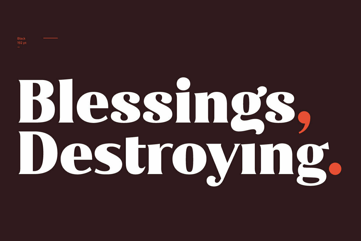
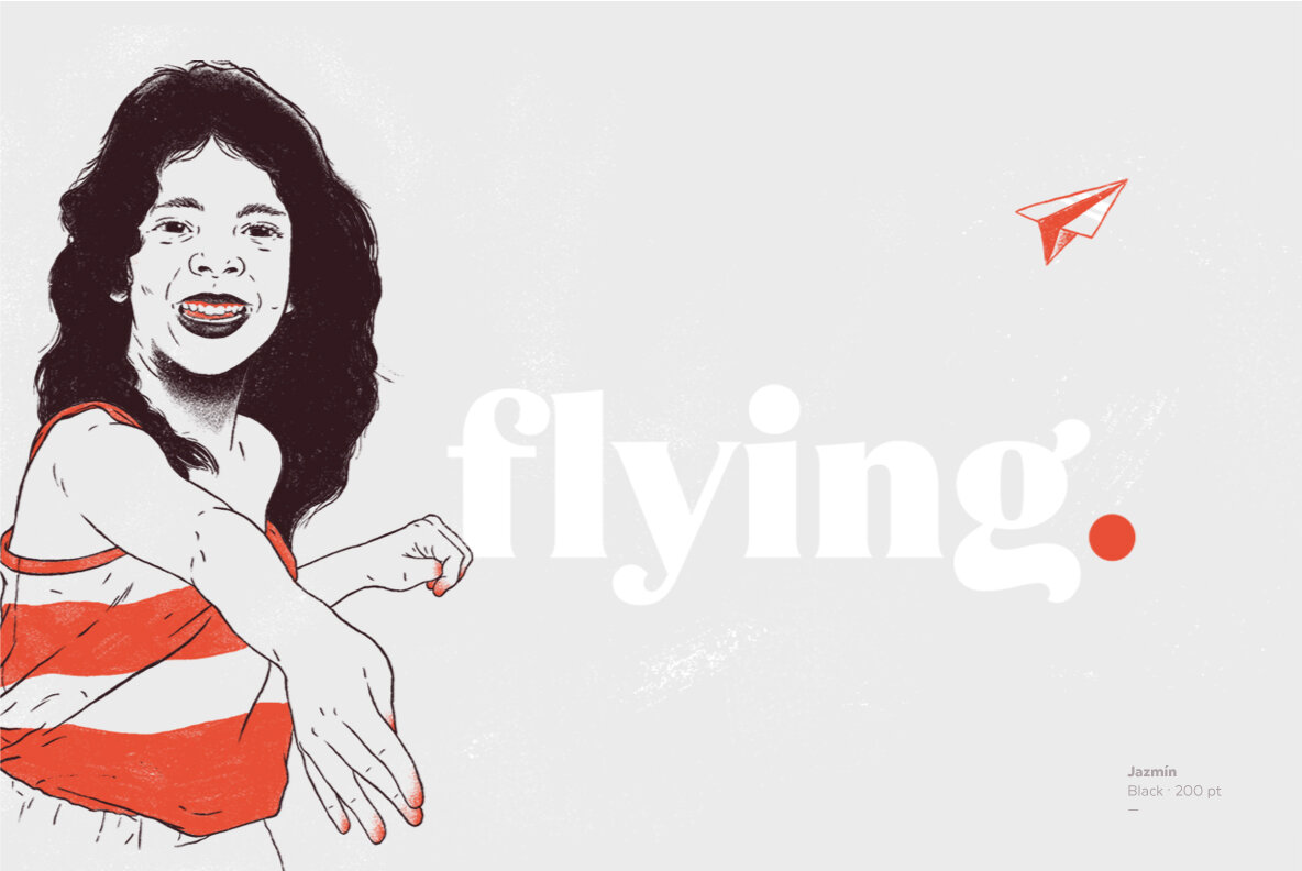
Say hello to Jazmín, a significantly re-imagined take on Globe Gothic. With one descender in the past and one ascender in the present, Jazmín expresses a personality that is both playful and refined. We especially like the memorability of characters like the f and g, which balance an illustrative sensibility with typographic pragmatism. In other words, both form and function.

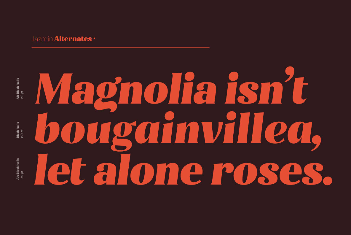
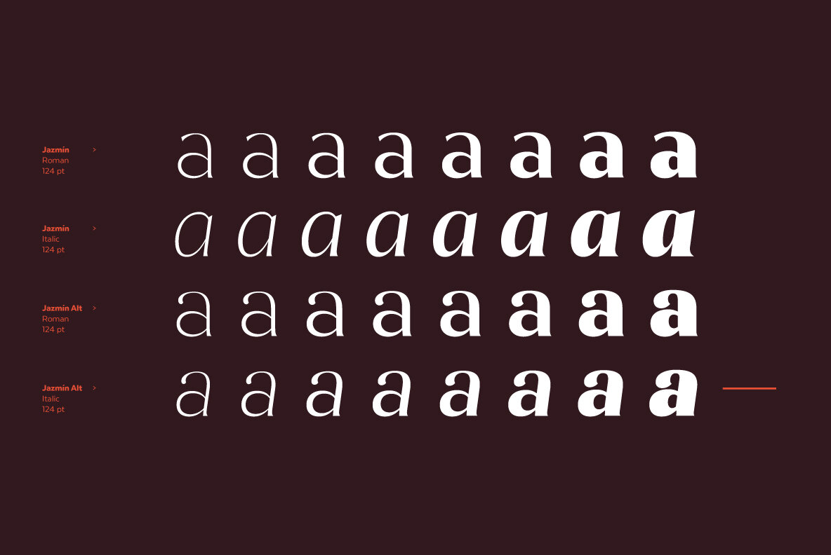
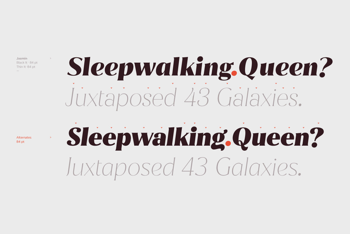
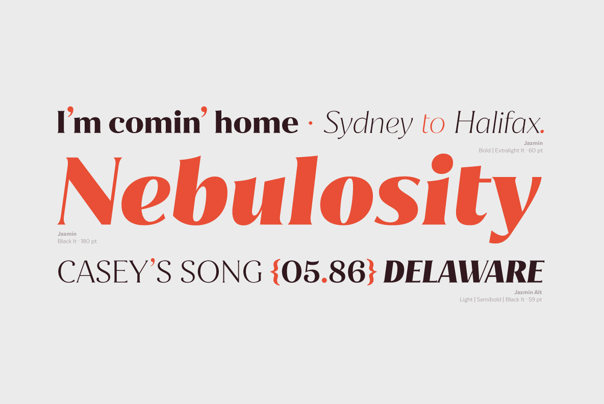
And where most typefaces this unique are merely display faces suitable for a logotype or perhaps an environmental accent, LatinoType has built a robust and surprisingly versatile family in 8 weights with an enormous character set, making Jazmín suitable as a key player in a visual identity system. Plus, it features stylistic alternates, giving designers discretion on when to tone things down a bit or turn them up.

Jazmín by LatinoType.

Discuss this Project

Leave a Reply

This site uses Akismet to reduce spam. Learn how your comment data is processed.

The Forktales Podcast™: Interviews with restaurant industry leaders and visionaries

Restaurant and advertising industry headlines and thinking

Reviews of restaurant experiences from around the globe 

Reviews of our favorite design, business, & restaurant books

Our favorite typography and fonts

Inspiration in your inbox

Get the latest inspiration in your inbox every Monday morning, for FREE!

"*" indicates required fields

This field is for validation purposes and should be left unchanged.

Delicious Bits in your Inbox!

Get the latest and greatest content delivered to your inbox for free!

"*" indicates required fields

This field is for validation purposes and should be left unchanged.