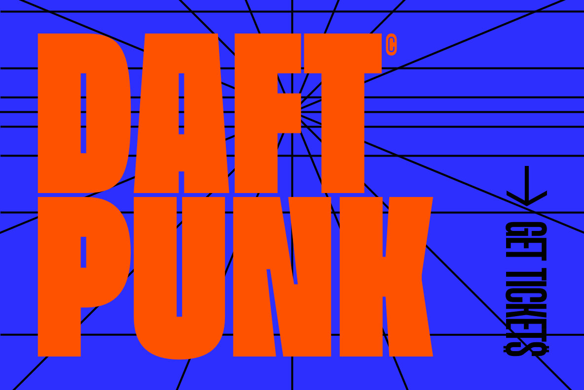
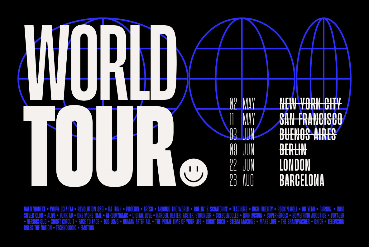
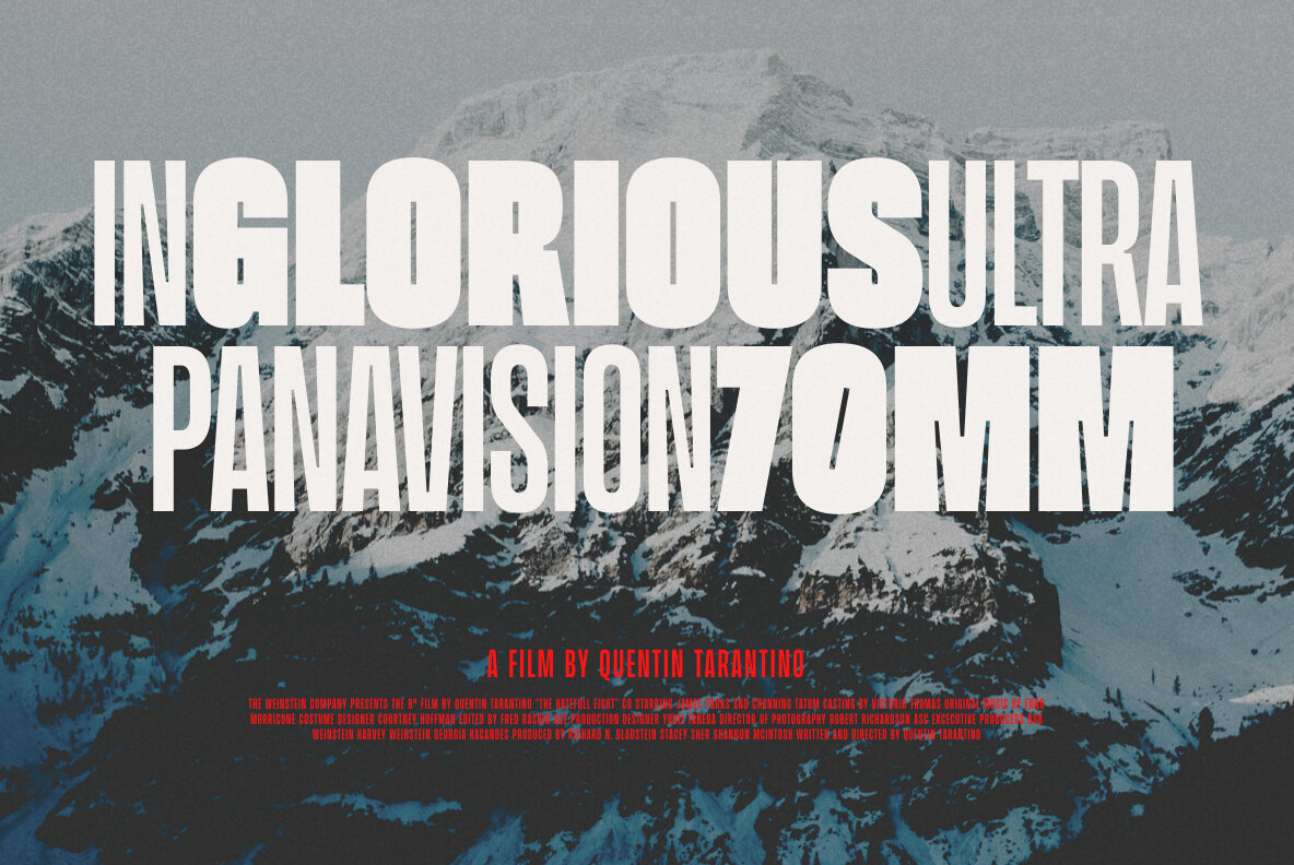
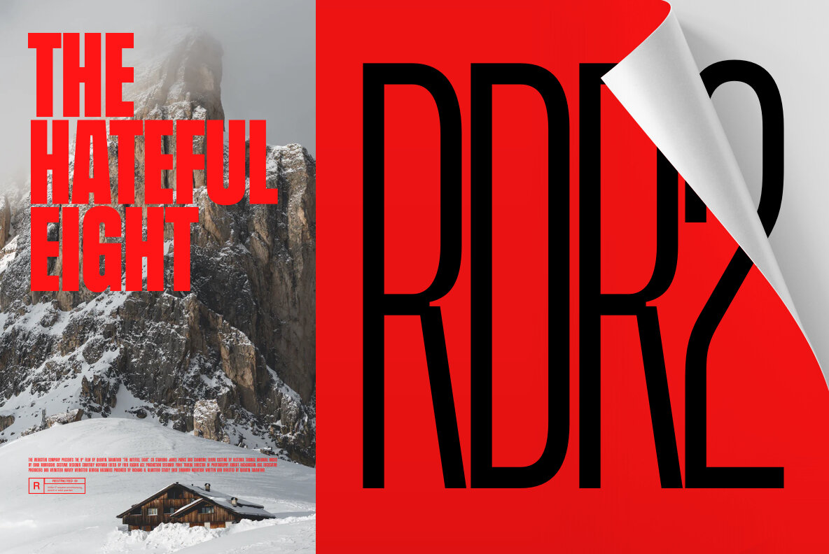
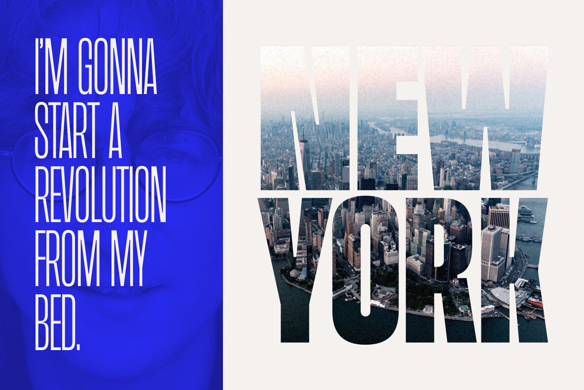
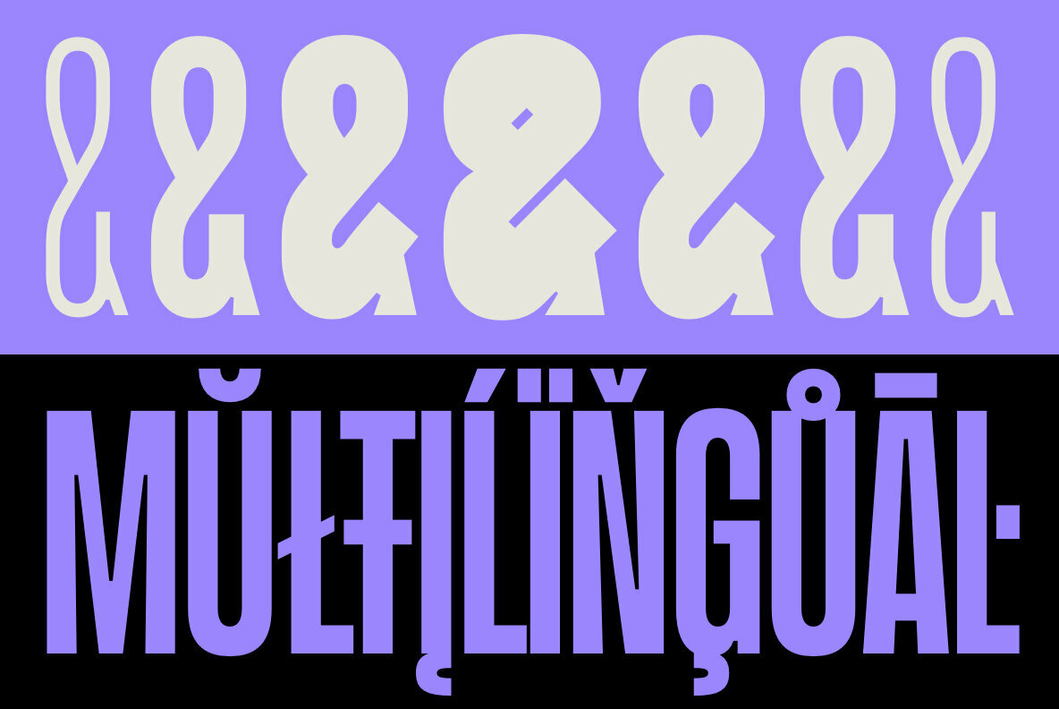
Beni isn’t what you would call a shy typeface. This display sans sports heroic proportions with touches of whimsy and, certainly, a nod to the 80’s. Kinda like Christopher Reeve’s Superman roles. Also like the man of steel, Beni is ready for anything with a surprising range of weights, all while maintaining the typefaces most memorable character features.

We especially like the N, the visually juicy punctuation marks, and the small spur on the leg of the R that boosts legbility.

This is a typeface that would take charge in any visual identity system for which such a big personality is needed. And despite its presence, we’d see the underlying geometric construction as a sign that Beni will play well with other typefaces and textures.

Beni By Nois

Discuss this Project

Leave a Reply

This site uses Akismet to reduce spam. Learn how your comment data is processed.

The Forktales Podcast™: Interviews with restaurant industry leaders and visionaries

Restaurant and advertising industry headlines and thinking

Reviews of restaurant experiences from around the globe 

Reviews of our favorite design, business, & restaurant books

Our favorite typography and fonts

Inspiration in your inbox

Get the latest inspiration in your inbox every Monday morning, for FREE!

"*" indicates required fields

This field is for validation purposes and should be left unchanged.

Delicious Bits in your Inbox!

Get the latest and greatest content delivered to your inbox for free!

"*" indicates required fields

This field is for validation purposes and should be left unchanged.