
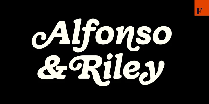
We’re in a pretty awesome era of typography design. As a culture, we’ve steamrolled through the age of geometrically perfect sans-serif letterforms that debased classic serifs from their position of power. The love of fresh, industrial and architectural looks found in sans-serif typography has given way to the reclamation of more organic and softer vibes found in the typography of the 1970s and the Art Nouveau era before that.
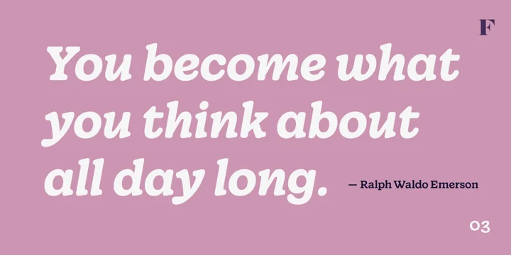
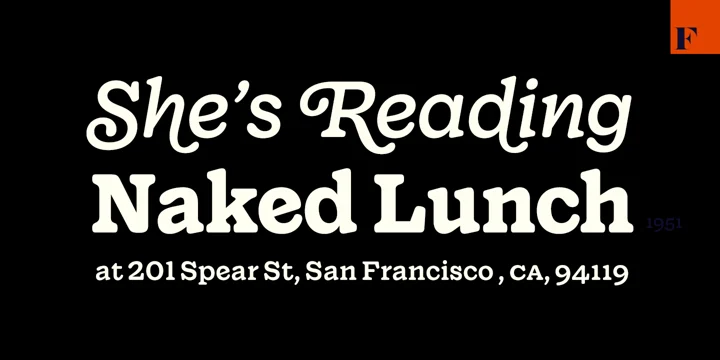
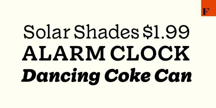
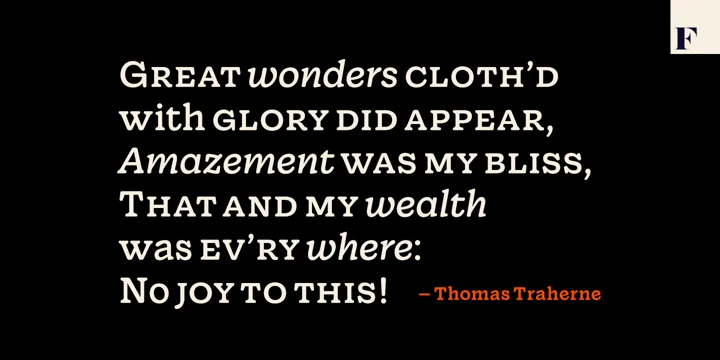
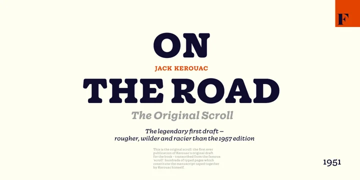
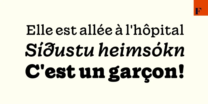
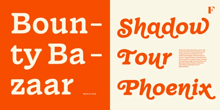
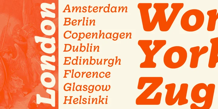
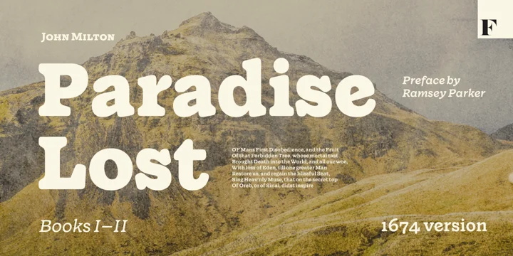
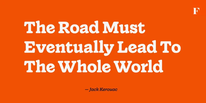
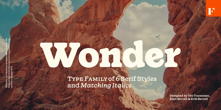
Wonder is exactly what the name suggests. It truly is a wonderful take on classic serif with softer, more wholesome visuals derived from the rounded edges and overall curvature. The family’s suite of 12 weights and variants set a foundation for beautiful hierarchy without losing readability.
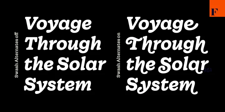
I find the italic variants of the family to be especially noteworthy where every letterform has been considered with a steady hand and attention to detail.
Designed by Emil Bertell, Erik Bertell, Teo Tuominen and published by Fenotype.


