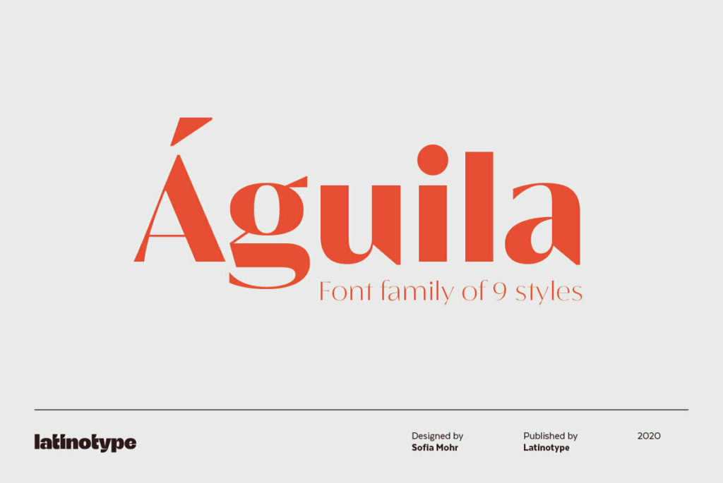
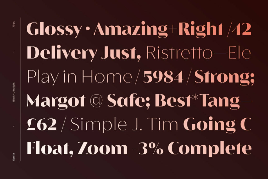
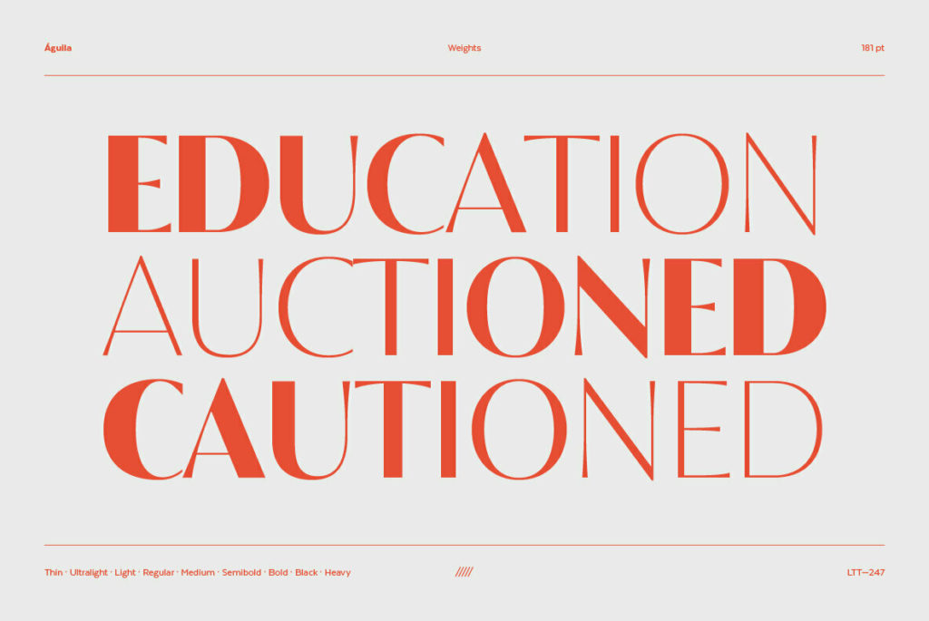
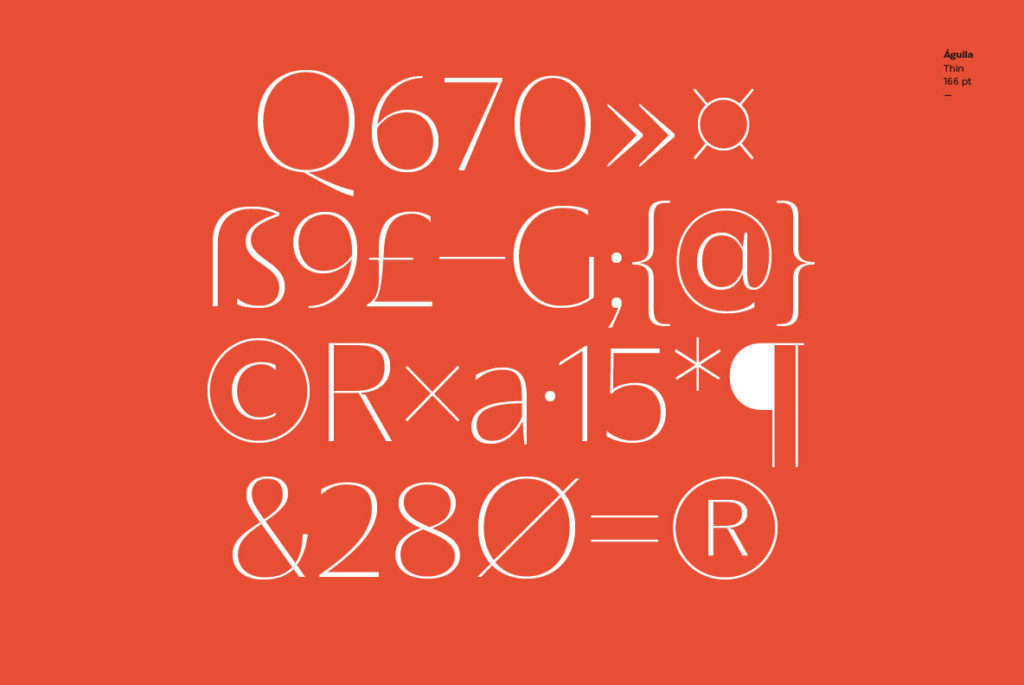
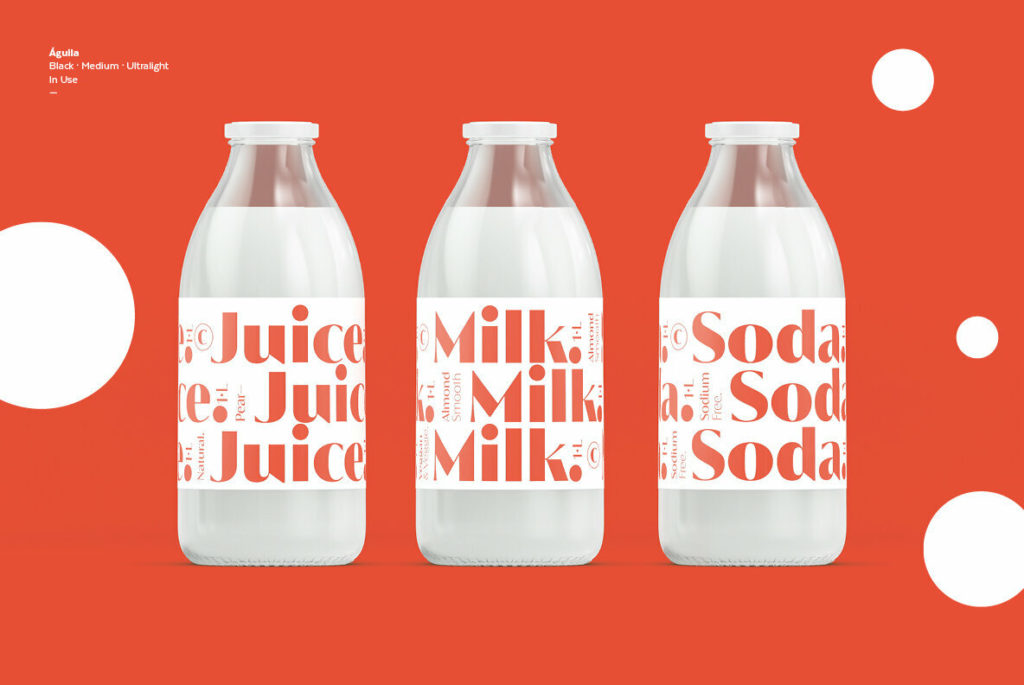
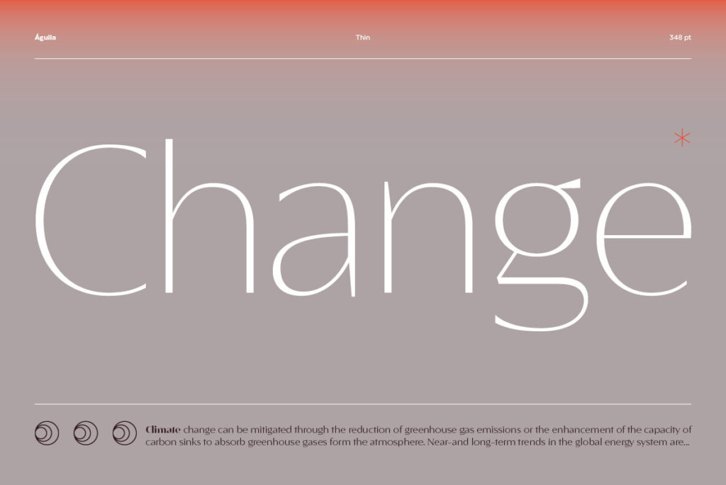
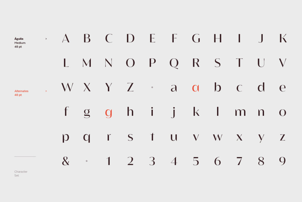
Águila, which is Spanish for eagle, is an aptly named display face that is strong, sophisticated, and perhaps a bit dangerous. The extreme contrast of stroke weights (especially in the heaviest its 9 weights), is reminiscent of Didot. As a result, Águila feels tailor-made for fashionable brands. But the similarities to Didot’s more austere forms end there, with Águila sporting a confident ensemble of triangular shapes, razor-sharp semi-serifs, and a general flare for the dramatic. We could envision this big-personality typeface paired with restrained a geometric sans that could allow Águila’s strengths to shine.

Águila by LatinoType

Discuss this Project

Leave a Reply

This site uses Akismet to reduce spam. Learn how your comment data is processed.

The Forktales Podcast™: Interviews with restaurant industry leaders and visionaries

Restaurant and advertising industry headlines and thinking

Reviews of restaurant experiences from around the globe 

Reviews of our favorite design, business, & restaurant books

Our favorite typography and fonts

Inspiration in your inbox

Get the latest inspiration in your inbox every Monday morning, for FREE!

"*" indicates required fields

This field is for validation purposes and should be left unchanged.

Delicious Bits in your Inbox!

Get the latest and greatest content delivered to your inbox for free!

"*" indicates required fields

This field is for validation purposes and should be left unchanged.