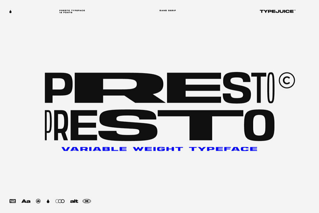
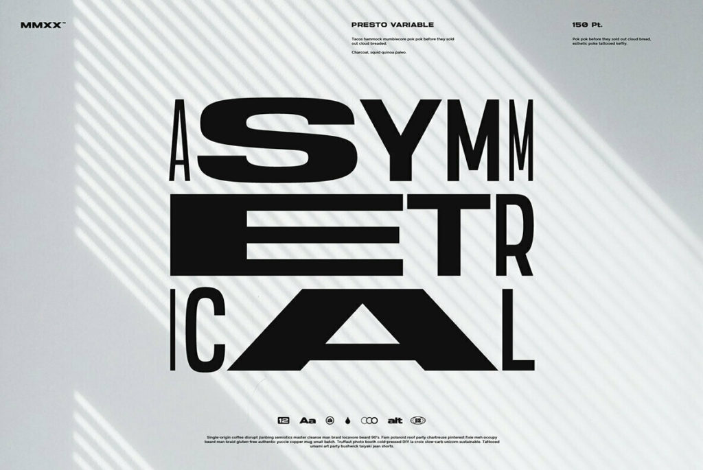
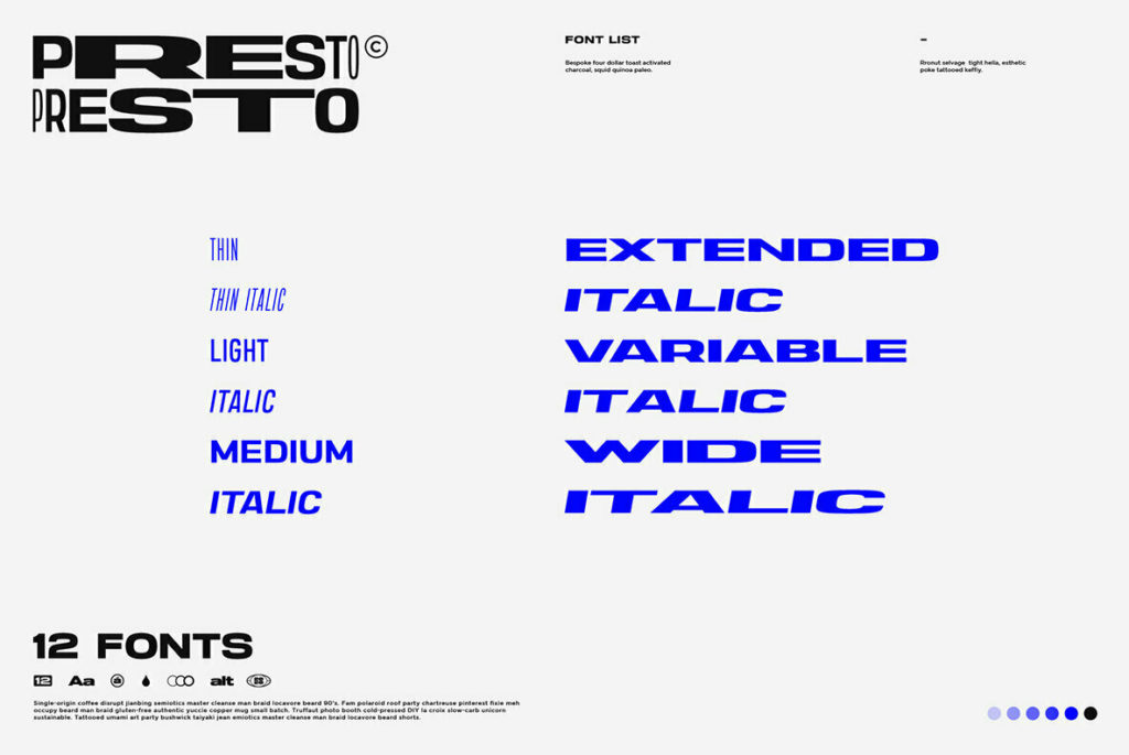
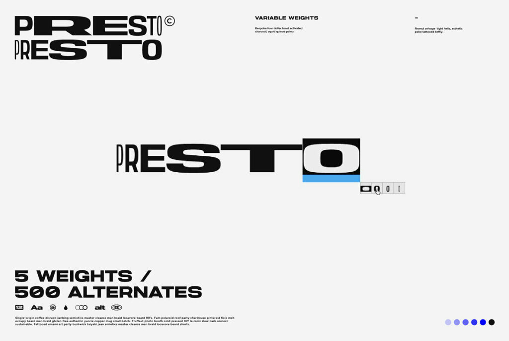
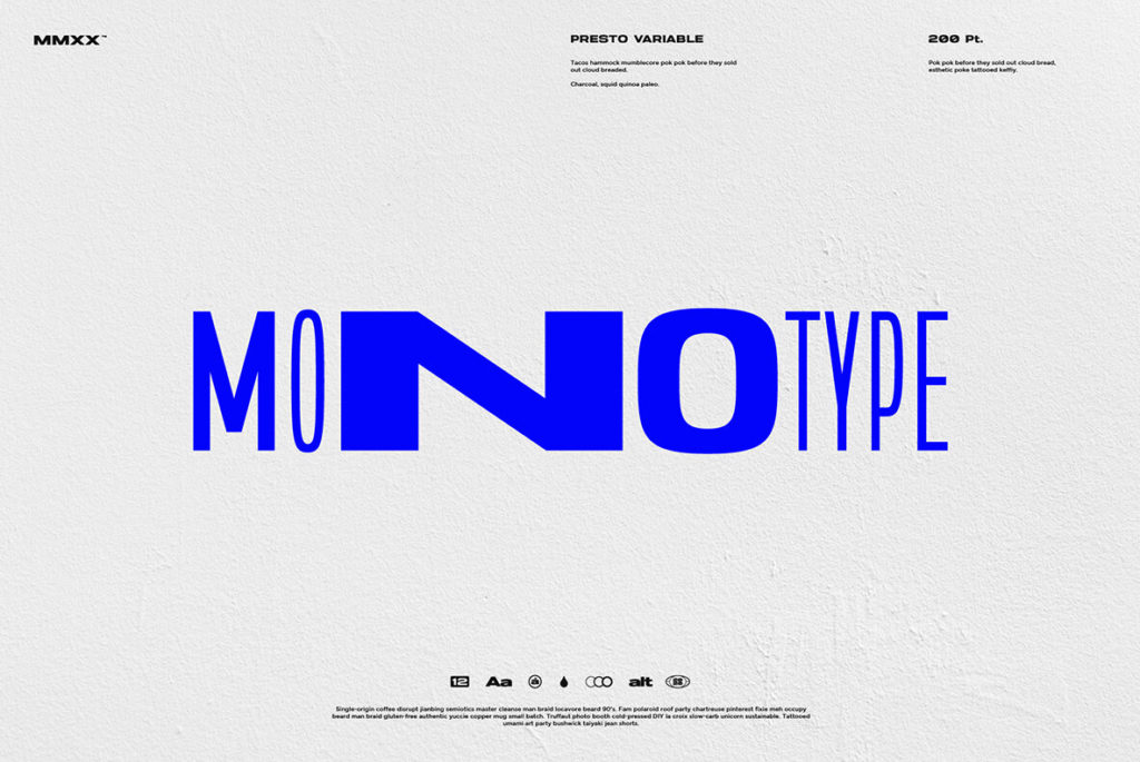
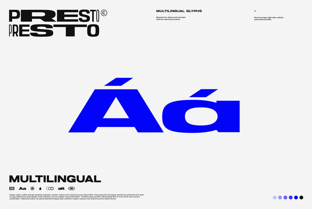
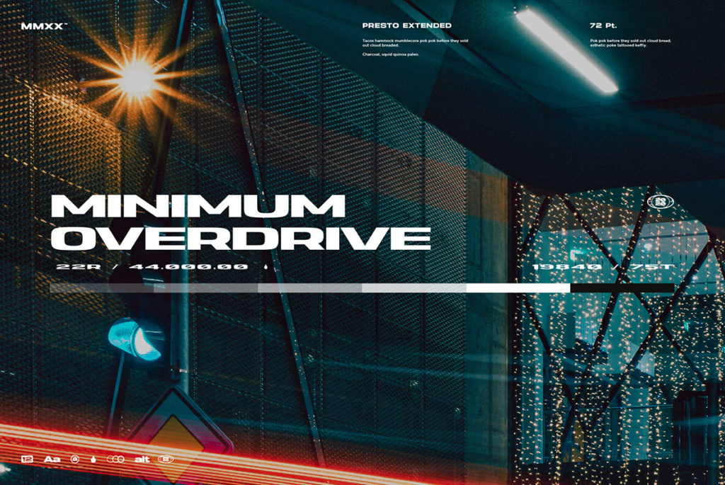
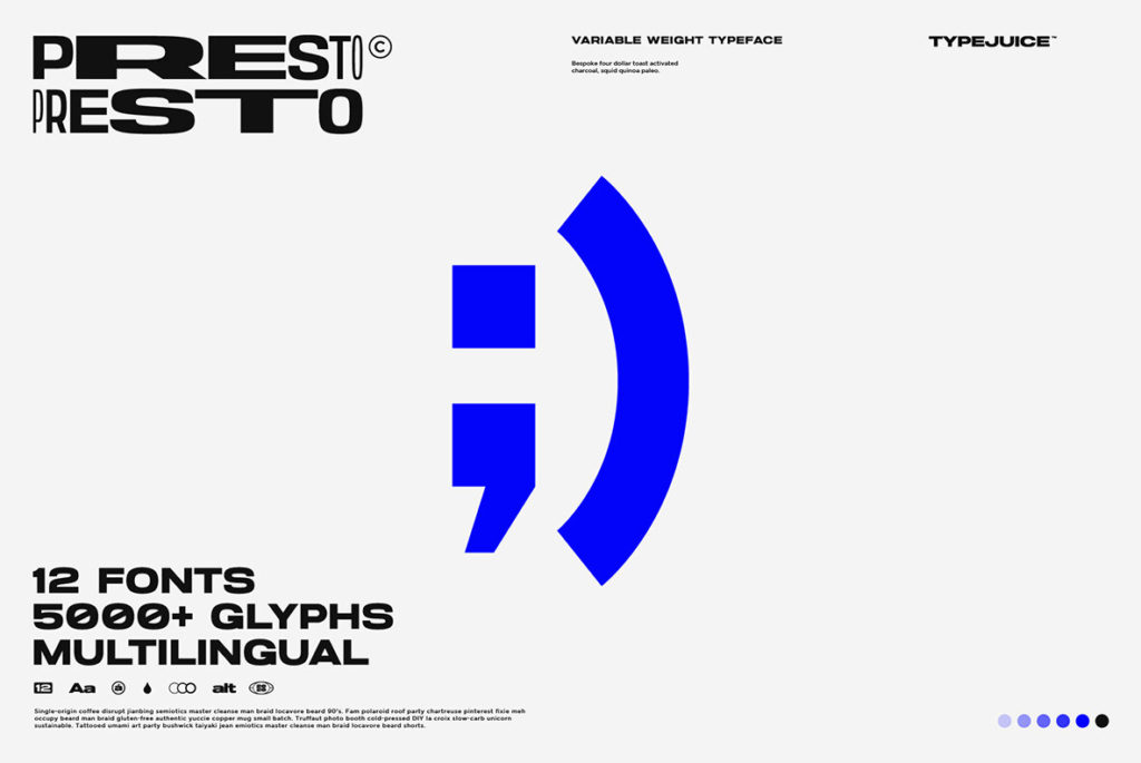
In our unending survey of the world of typography, we’re on the lookout for typefaces that are both practical and recognizable—traits that are often in tension with each other. Recognizability becomes even more of a challenge with sans-serifs, where there are simply fewer opportunities to distinguish one typeface from another. Presto solves this problem not so much in the individual characters, but through the development of an extremely versatile typeface with loads of weights, widths, and alternates. These alternates give character-by-character control, perfect for typesetting brand type or headlines, while the range of fonts in the family allows Presto to also serve as a workhorse for body copy. It’s a win-win for designers looking to get a lot of bang for their typographic buck.

Presto by TypeJuice


Discuss this Project

Leave a Reply

This site uses Akismet to reduce spam. Learn how your comment data is processed.

The Forktales Podcast™: Interviews with restaurant industry leaders and visionaries

Restaurant and advertising industry headlines and thinking

Reviews of restaurant experiences from around the globe 

Reviews of our favorite design, business, & restaurant books

Our favorite typography and fonts

Inspiration in your inbox

Get the latest inspiration in your inbox every Monday morning, for FREE!

"*" indicates required fields

This field is for validation purposes and should be left unchanged.

Delicious Bits in your Inbox!

Get the latest and greatest content delivered to your inbox for free!

"*" indicates required fields

This field is for validation purposes and should be left unchanged.