Virtuose by Supply of Fonts

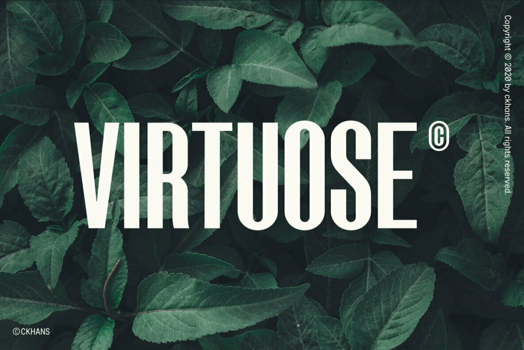
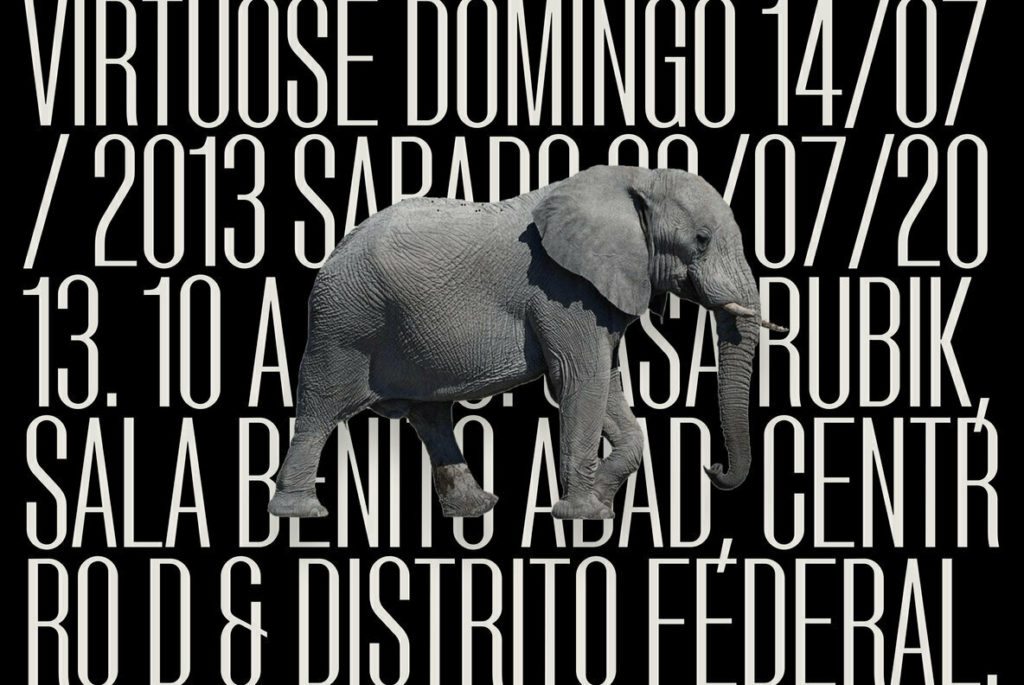
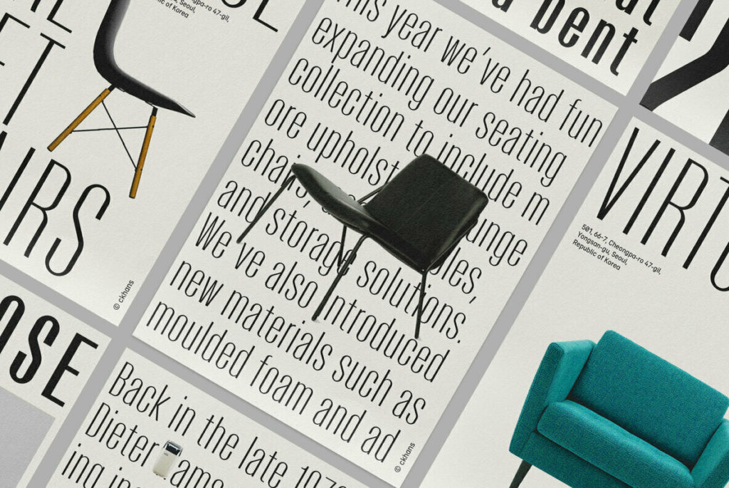
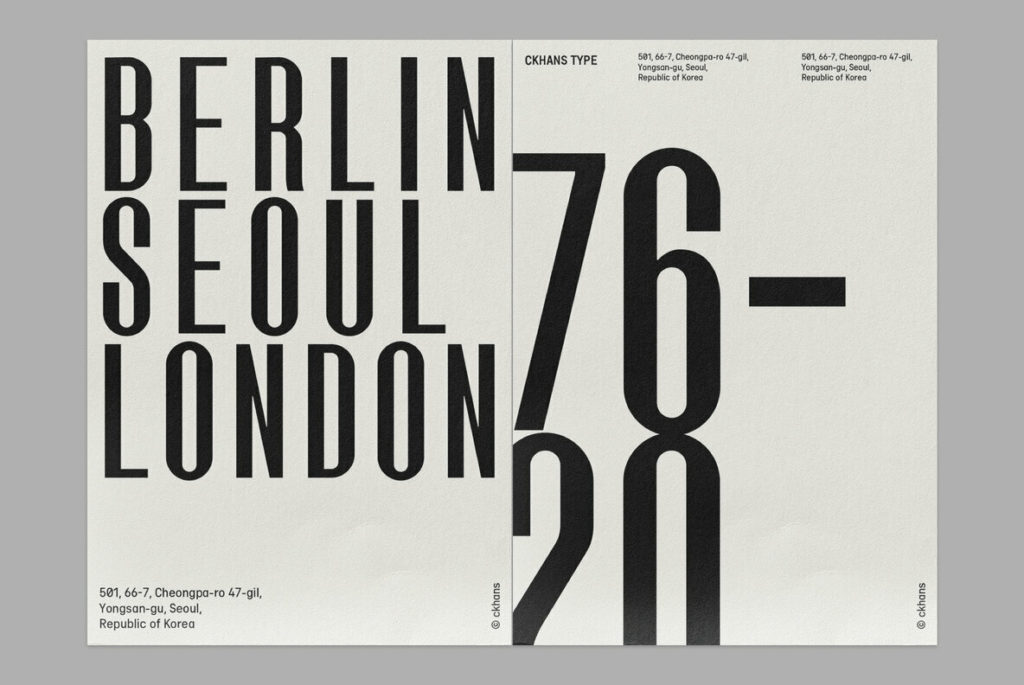
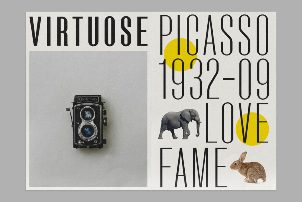
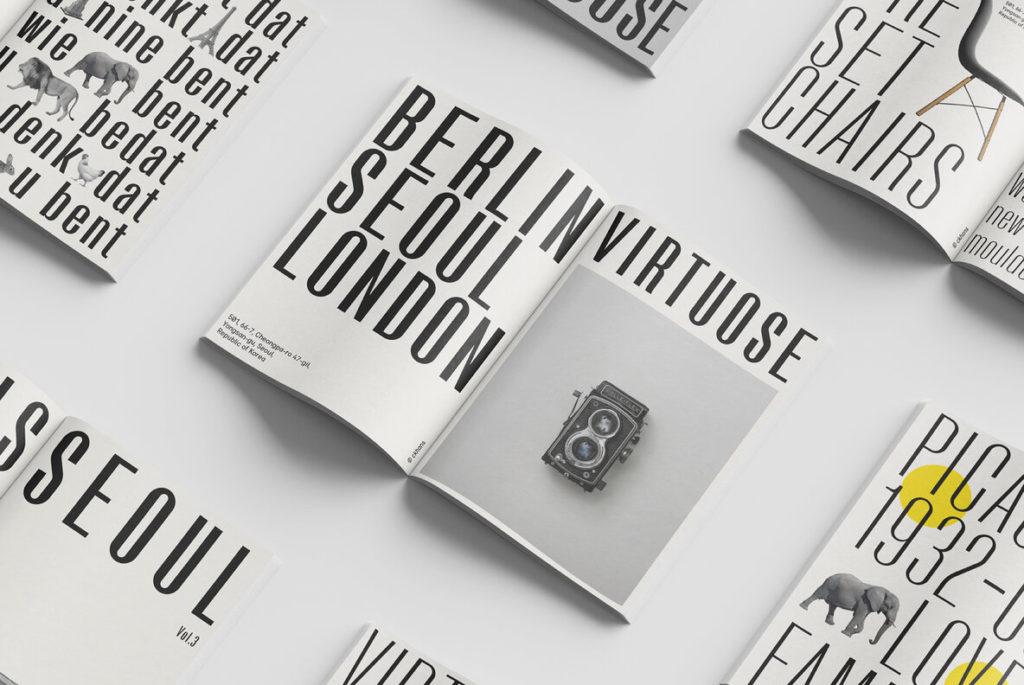
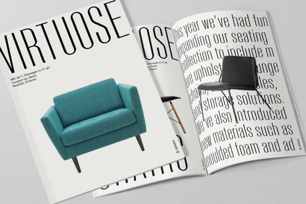
It’s an open secret that many designers have a special affinity for condensed sans-serif typefaces, myself included.  Type families like DIN, Trade Gothic, and Knockout are mainstays for bold and functional headlines, logotypes, and more. The only problem is that this style of typeface can become monotonous, cold, and lack identifiable features. Enter, Virtuose, a condensed sans that introduces warmth and character through the use of contrasting strokes which become more apparent in the boldest of the family’s 9 weights. The result is a sans with the sophistication of a serif. It’s a best of both worlds typeface that would play well in brands that emphasize confidence, polish, and attention to detail.

Virtuose by Supply of Fonts

Discuss this Project

Leave a Reply

This site uses Akismet to reduce spam. Learn how your comment data is processed.

The Forktales Podcast™: Interviews with restaurant industry leaders and visionaries

Restaurant and advertising industry headlines and thinking

Reviews of restaurant experiences from around the globe 

Reviews of our favorite design, business, & restaurant books

Our favorite typography and fonts

Inspiration in your inbox

Get the latest inspiration in your inbox every Monday morning, for FREE!

"*" indicates required fields

This field is for validation purposes and should be left unchanged.

Delicious Bits in your Inbox!

Get the latest and greatest content delivered to your inbox for free!

"*" indicates required fields

This field is for validation purposes and should be left unchanged.