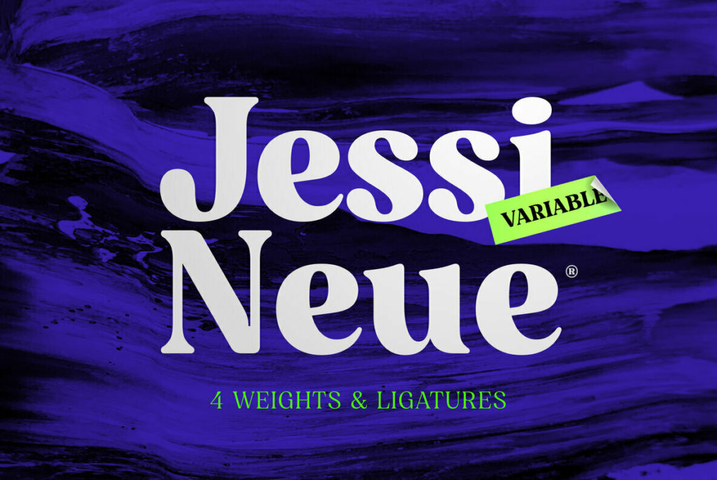
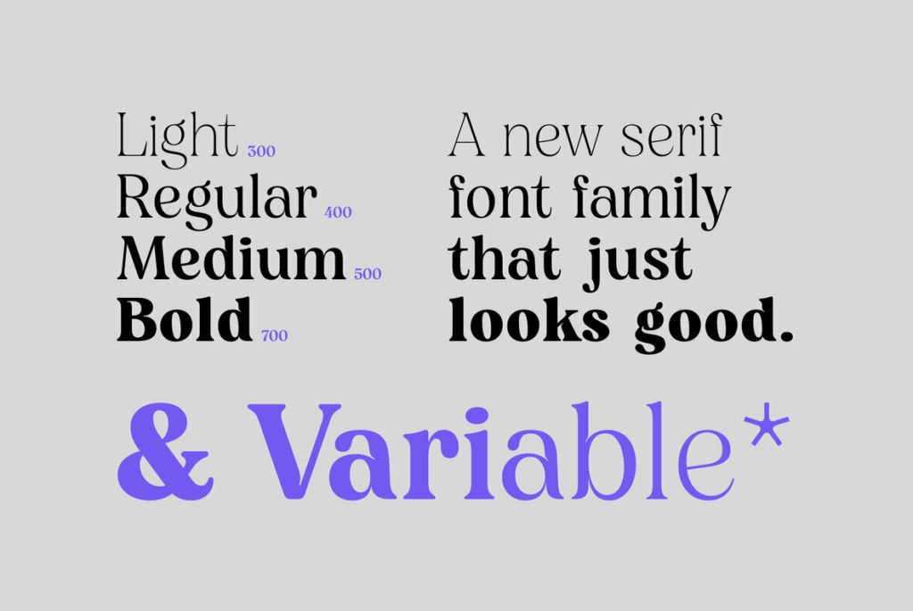
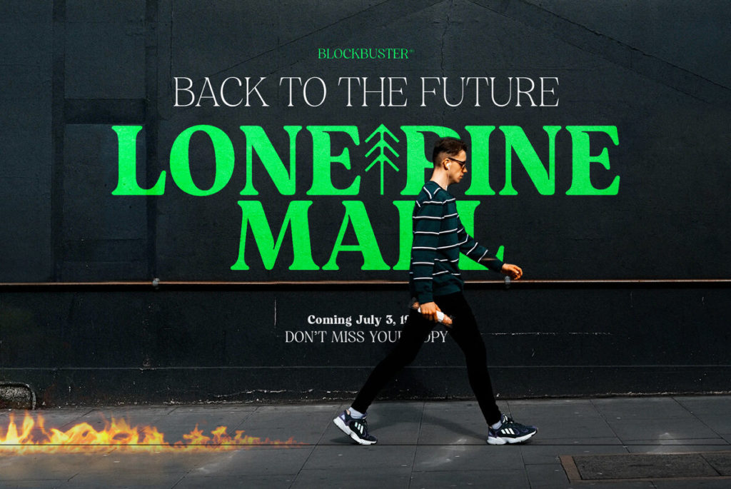
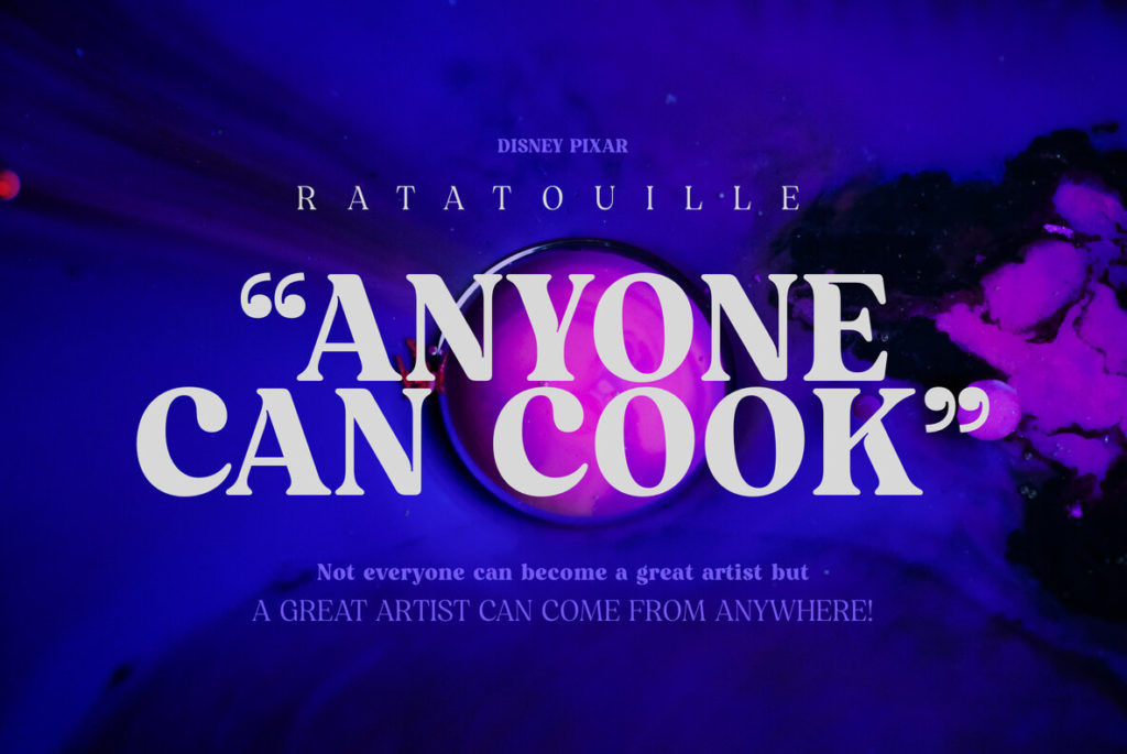
When gut-checking any creative work, a sure sign that something is remarkable is when it solicits an involuntary sound, e.g. “ohhhhh.” That’s the sound I made while flipping through type samples for Jessi Neue by Nois, a serif typeface with loads of character and unique details.
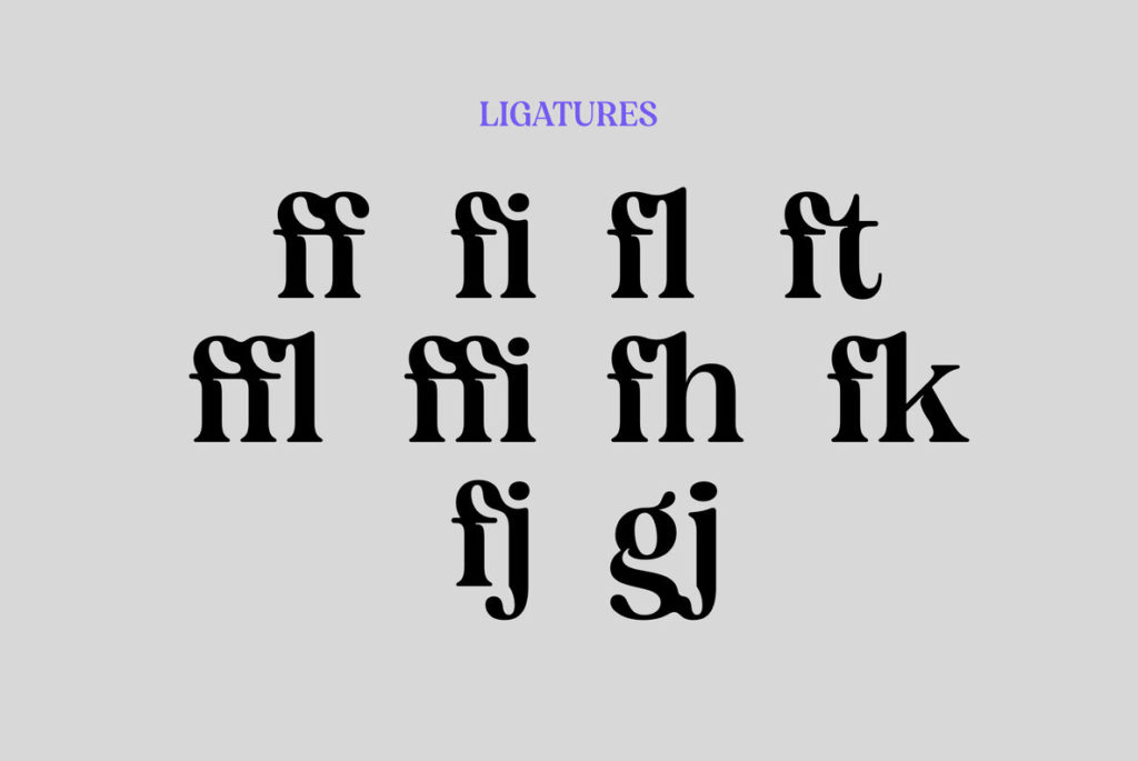
The recent 70’s brand type revival (see Chobani’s yogurt-textured brand type for a strong example), is a refreshing break from the more austere sans-serifs that have dominated brand type for the last couple of decades. The catch is that such a specific look can quickly become tired. Jessi solves this problem by starting with the familiar soft finials and flowing shapes of 70s type and adding distinctive cut-in “crotches” where strokes meet at tight angles. The result is a visual caricature of the 70s liquefied aesthetic that double’s down that decade’s Art Nouveau influence. These details actually increase legibility on-screen, and would serve to preserve sharp details in print once ink bleed has partially closed those shapes in.