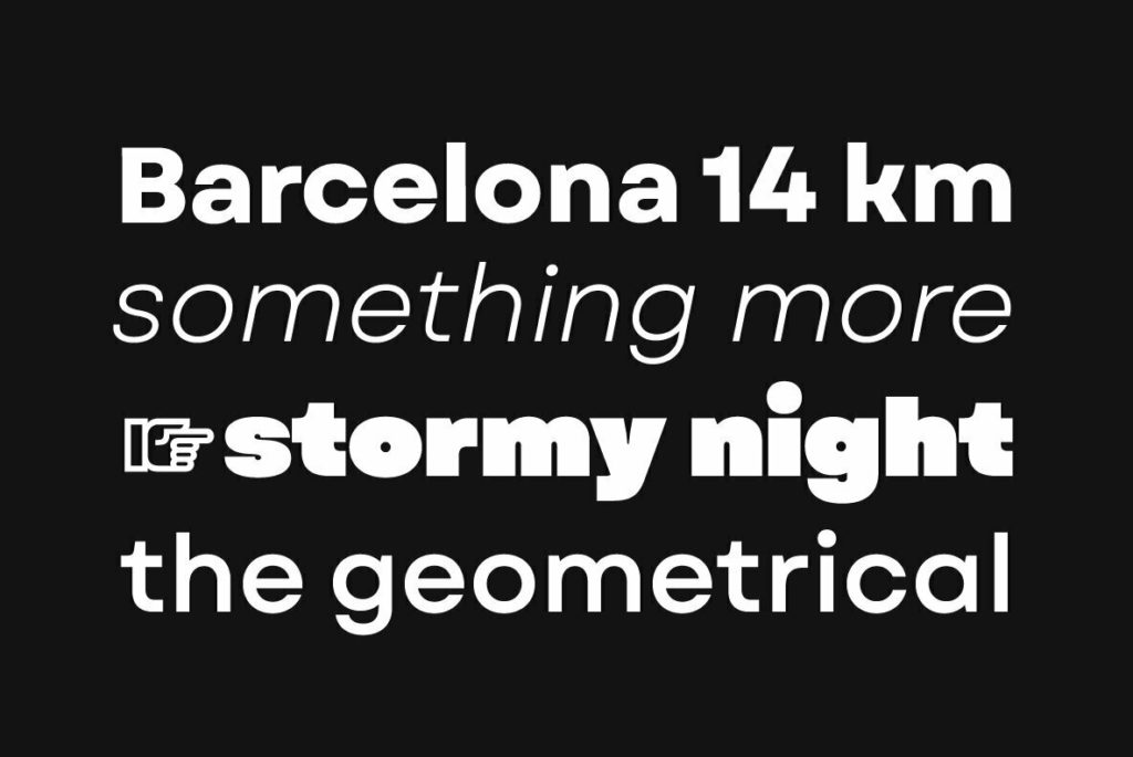
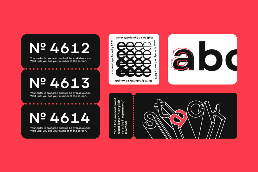
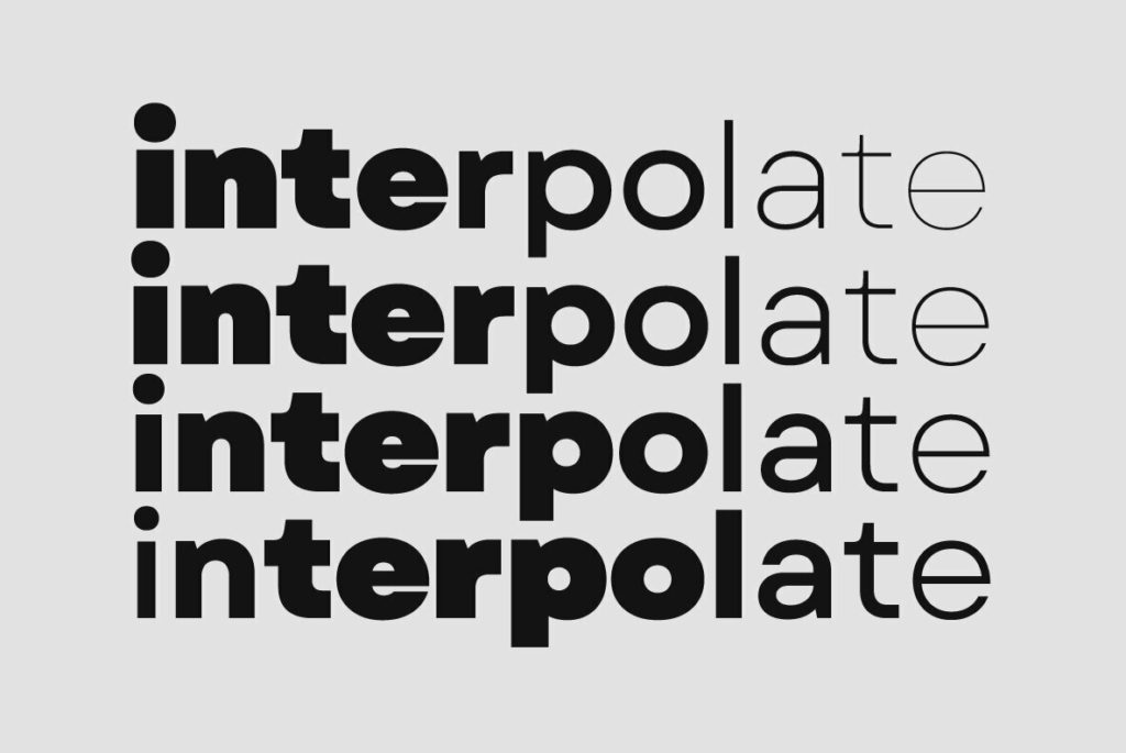
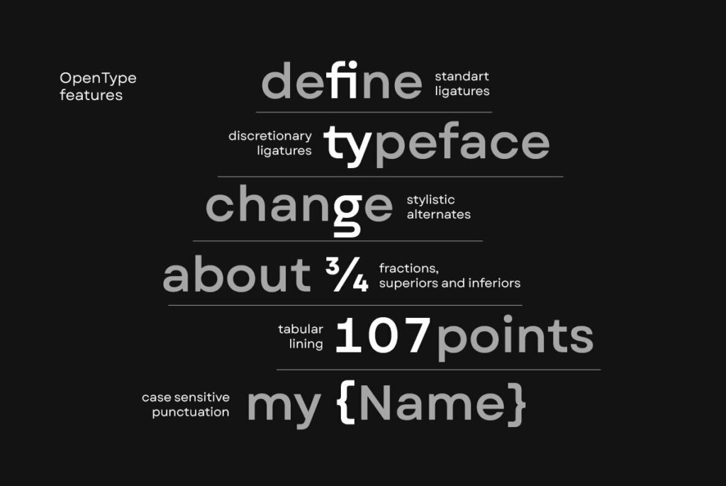
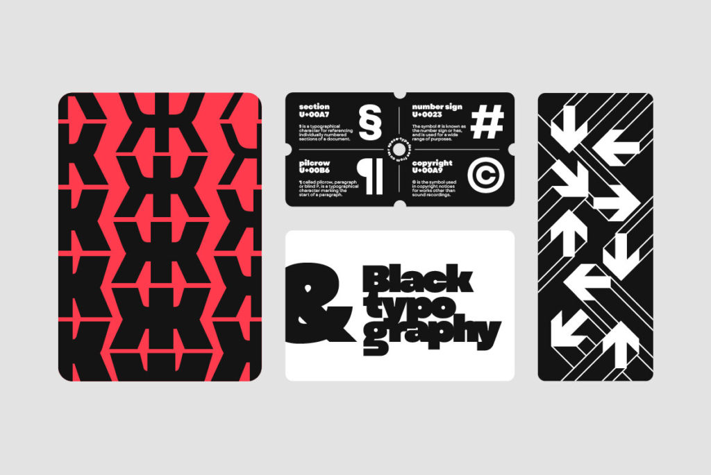
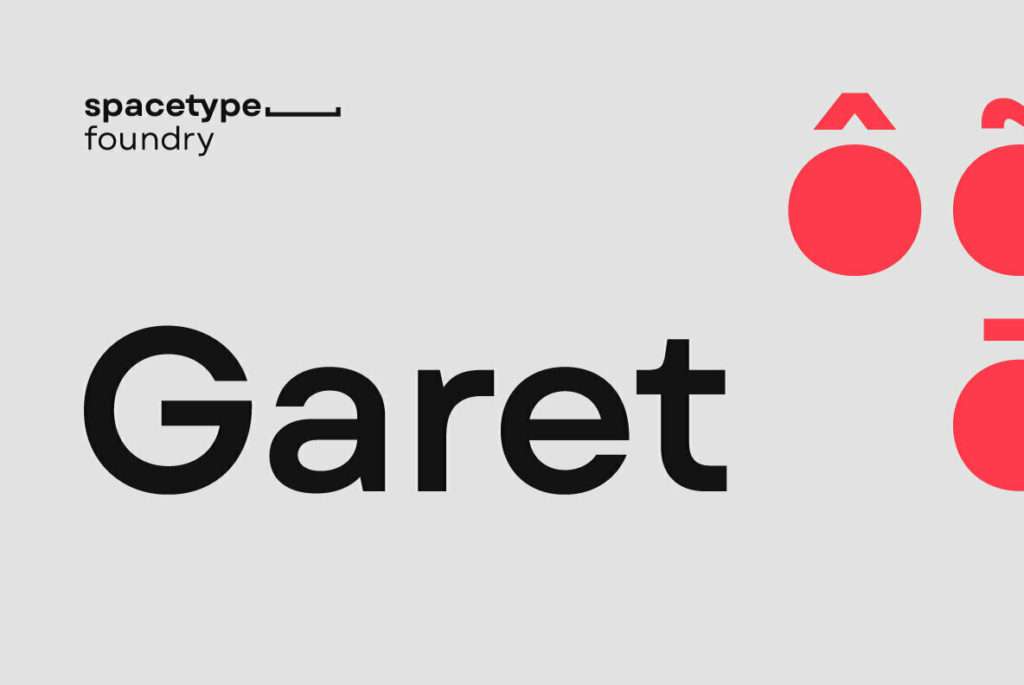
When scouring the Internet for noteworthy typefaces, it’s easy to gravitate toward gutsy display faces and flamboyant serifs. Garet does justice to the often-overlooked workhorse sans and deserves a moment in the sun. Featuring a wide range of weights (culminating in pleasantly plump characters), support for more than 200 languages, standard and discretionary ligatures, and stylistic alternates for granular control, Garet is the typographic equivalent of a chef’s knife—it can do it all.
But where many function-first typefaces fall flat on character, Garet’s subtle attention to detail and memorable touches turn its otherwise cold geometry into a timeless statement of taste. I picture Garet being a great choice for signage and wayfinding, user interfaces, web typography, and any modern brand that emphasizes clarity and modernity.
