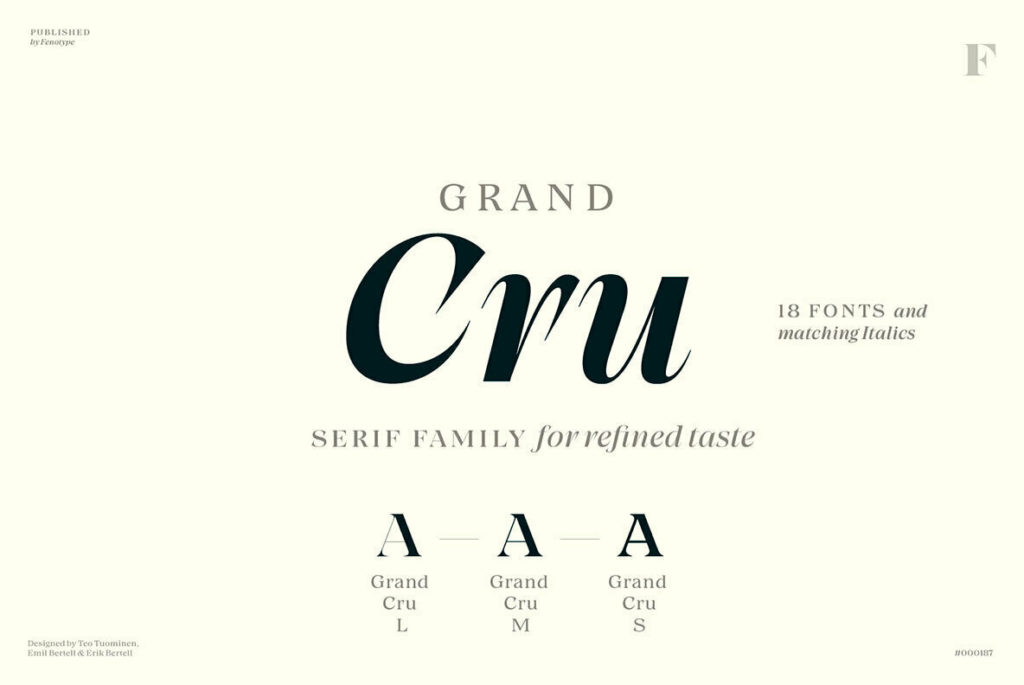
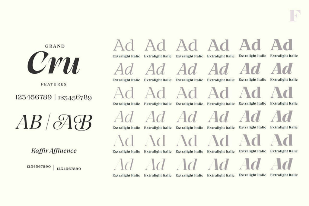
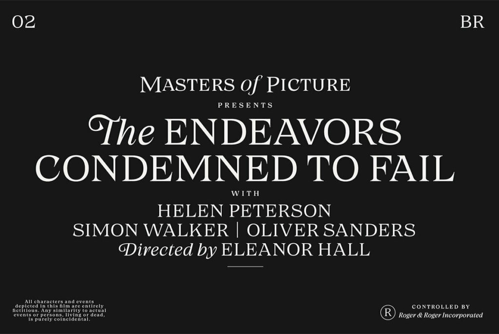
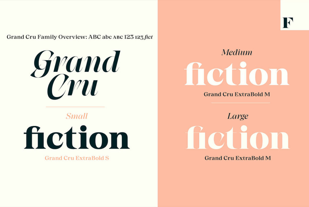
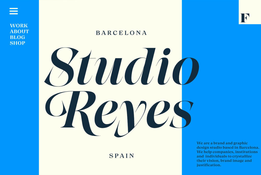
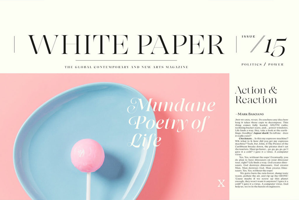
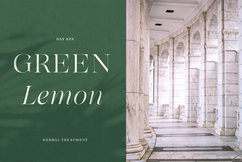
Grand Cru is a display and text serif by Fenotype founder Emil Bertell. As the name suggests, it’s the sort of top-tier, ultra-refined typeface that ought not to be a type designer’s first project. Aesthetically, it’s a romp through all the juicy details and visual rhythms offered by a humanist typeface. Compared to earlier styles of humanist typefaces, Grand Cru is slightly modernized with streamlined serifs and terminals that make it a more digital-friendly rendering of otherwise old-world letterforms.
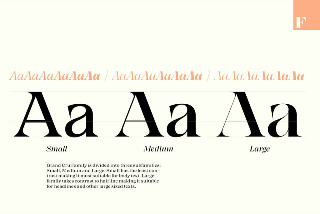
Functionally, Grand Gru offers the clever feature of not only traditional “weights” but also groups called “Small,” “Medium,” and “Large” depending on the intended display size. Put simply, the small group is for text and the Large group is for display, with hairline-thin features. Medium, as you might have guessed, is somewhere in the middle.
This is a type family worth shelling out for, yet is reasonably affordable—unlike the wines for which it is named.