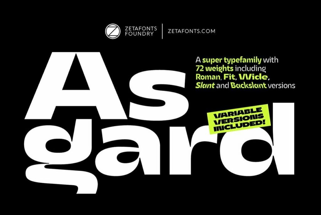
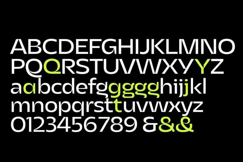
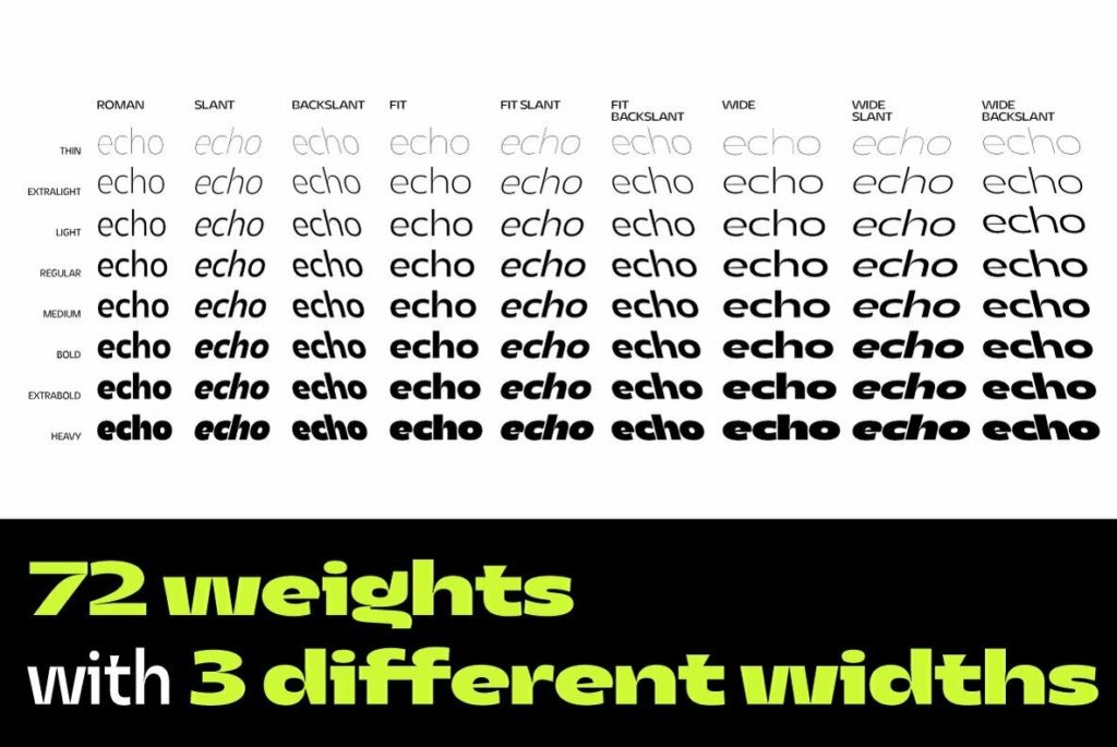
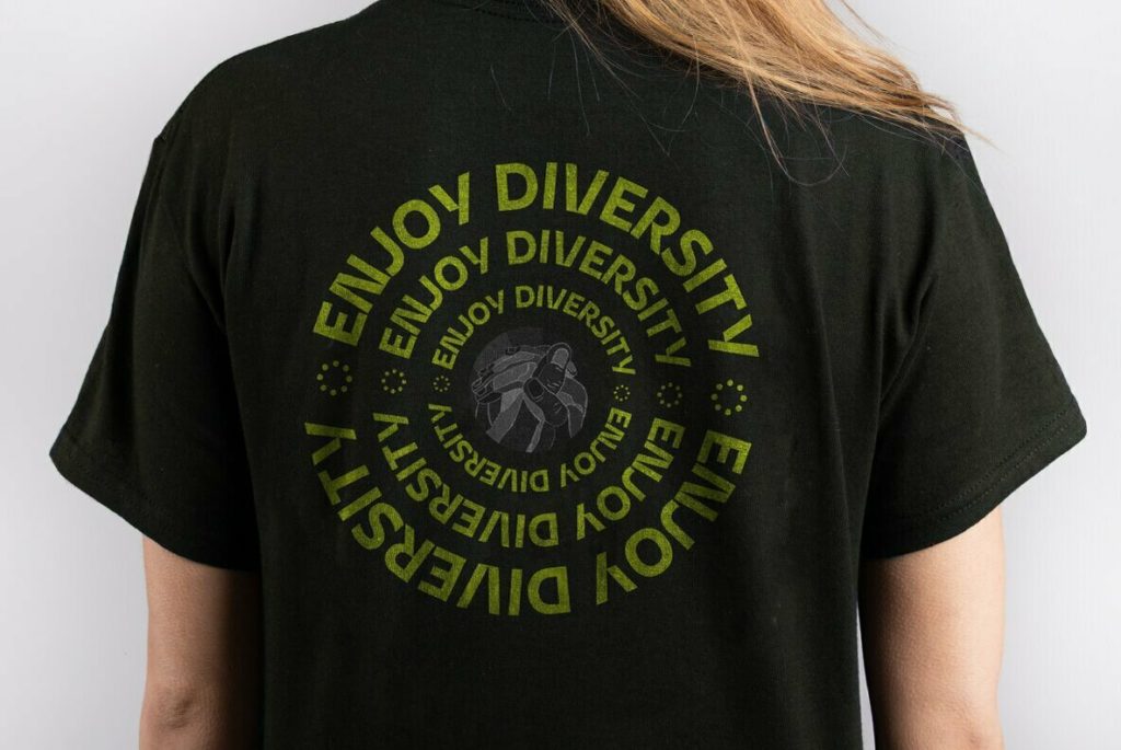
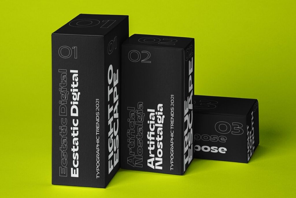
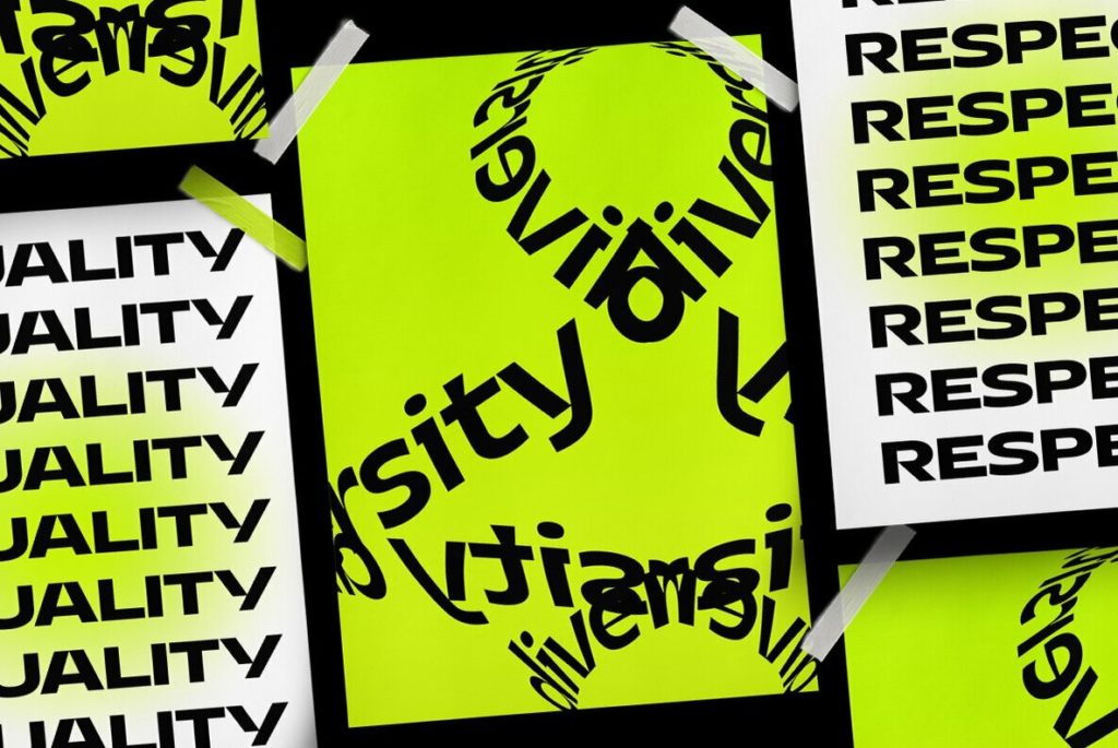
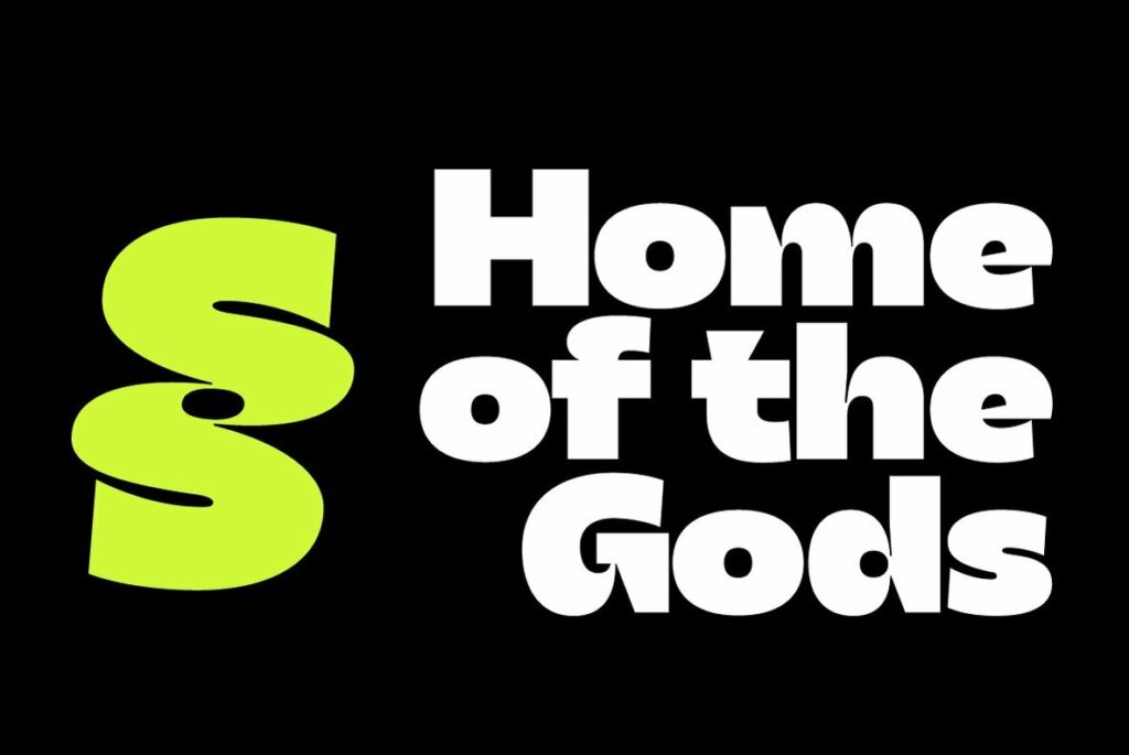
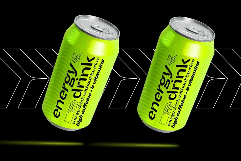
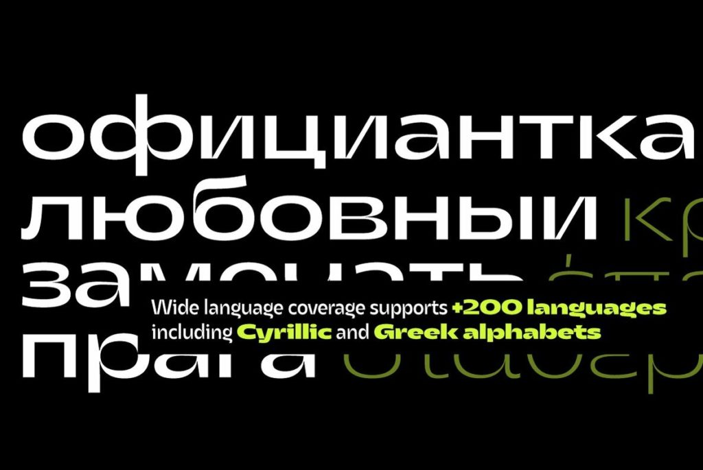
Arguably more than any other graphic art, typography is governed by established precedents and rules that inform every last detail of a type family. If you want to see what happens when those rules are disregarded (or simply not understood), just browse through a free font site. It ain’t pretty. Still, there’s a time and place for intentional boundary-pushing in typography, and Asgard is a great example of that. This funk-filled sans may not be everyone’s cup of tea, but it’s clear that designer Francesco Canovaro was calculated—even obsessively so—in the aesthetic intent and execution of Asgard. The truncated letterforms, sharp incisions, and occasional full-blown reinvention of glyphs (see the Q) give a sense of futuristic chaos. It’s visually noisy, yet finely crafted, like an avant-garde runway performance that toes the line between high art and lowbrow naivete. The biggest surprise is that rather than being offered as a small set of display faces, Asgard offers an enormous family of weights, glyphs, and alternates, making it a strong candidate as a visual cornerstone in a brand identity system.