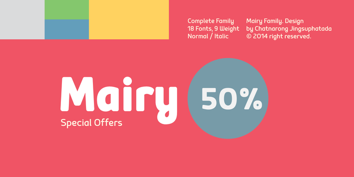
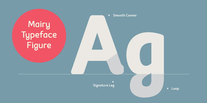
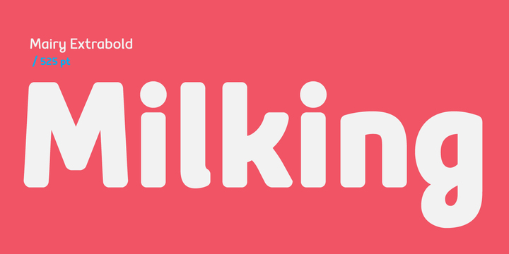
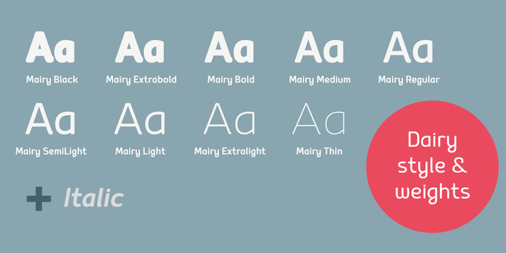
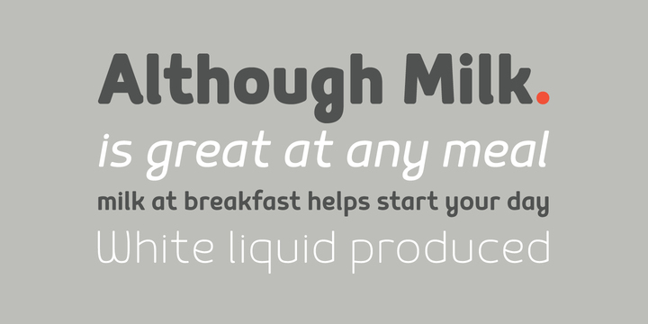
Sometimes you need a specific tool for a specific job. And while the majority of typefaces are designed to be broadly applicable, a brave few pick a focus and commit to it. This is the case with Mairy, an “organic” sans with rounded corners. Unlike many round sans serifs which can appear indistinct or even like cheap knockoffs of established typefaces, Mairy does an admirable job of maintaining detailed features. The use of minimalist letterforms like a looped “g” and single-story “a” give space for character elements like a slight curve in the leg of the uppercase R. The result feels soft, friendly, and a little eclectic. The lighter weights provide more refined and legible options, while the bolder weights are pleasantly plump and doughy.
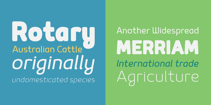
Mairy, paired with a second workhorse typeface, would be a strong choice for a visual identity system that is heavily type-driven. We could see it playing nicely in the food, kids, education, or apparel categories.