Type nerds like myself derive plenty of satisfaction in learning about the functional characteristics of a given typeface. X-height, contrast, serif versus sans, and the tiny execution details of a character can feel more like engineering for legibility than fine art.
And that has its place.
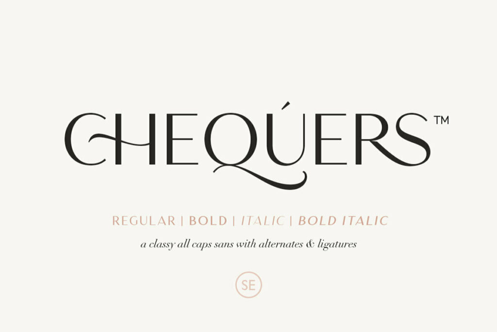
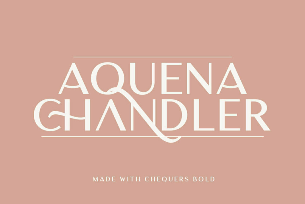
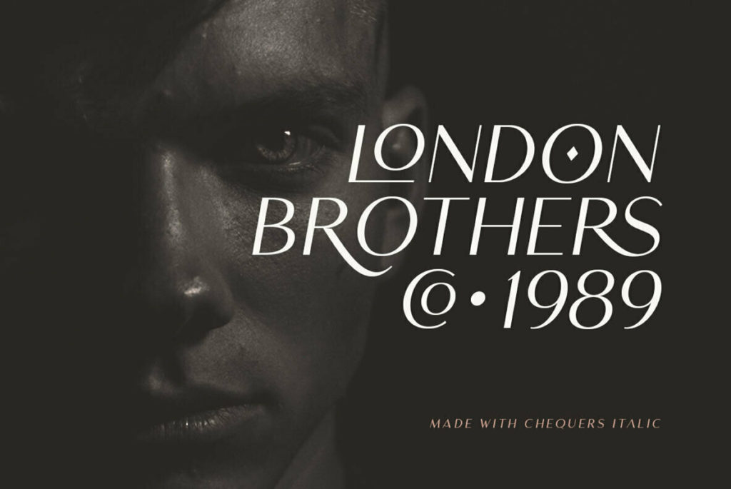
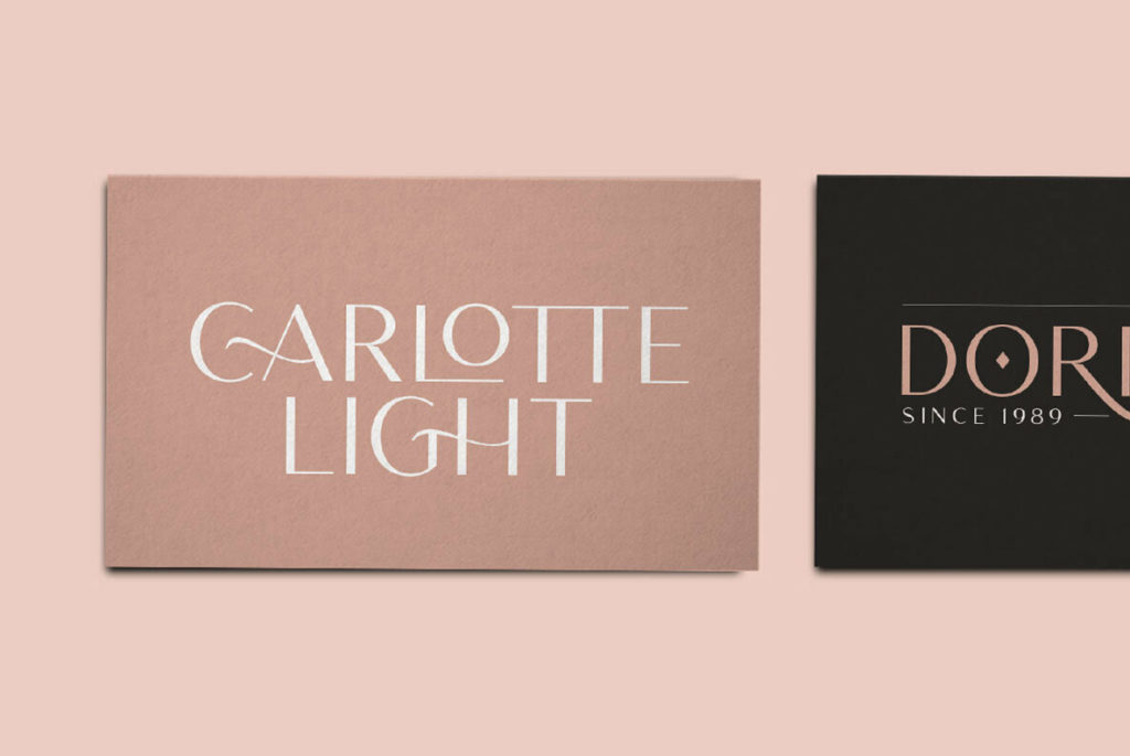
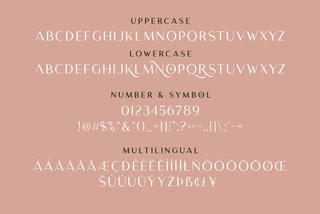
But it’s refreshing to come back to type as image, which is to say, to enjoy pure unadulterated beauty in type. Chequers by Sarid Ezra is a drool-worthy display face that is luxuriously appointed with silky-smooth swashes and sharp incisions reminiscent cut crystal. Sure, it’s functional enough for its intended application, in the same way that fine champagne may help quench your thirst. The sans-serif characters feature subtle contrast on a vertical axis, providing an elegant backdrop for the fluid swashes and ligatures. Multi-lingual support, bold and regular weights, and roman and italic sets provide just enough room for manual control and visual variety. Chequers would make an excellent basis for a logotype, or play well in a restrained usage within a larger visual identity system.