Geometric sans serif typefaces can be a mixed bag. On the one hand, they often excel at being flexible and practical. On the other, they can feel interchangeable and bland.
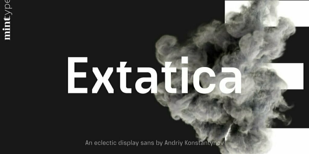
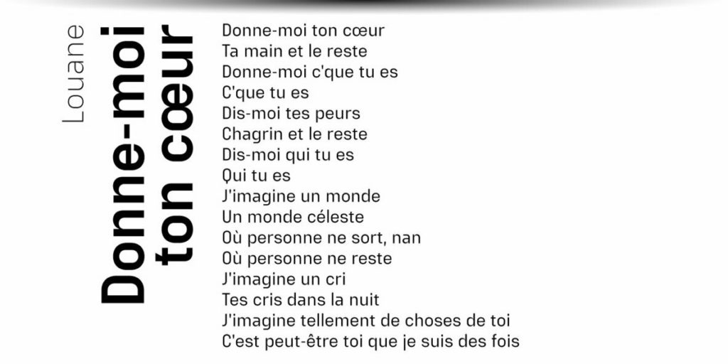
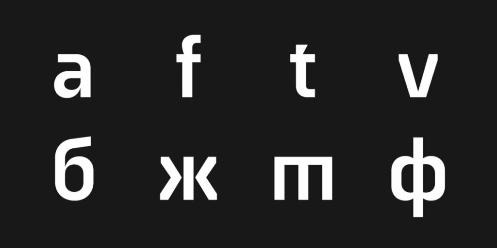
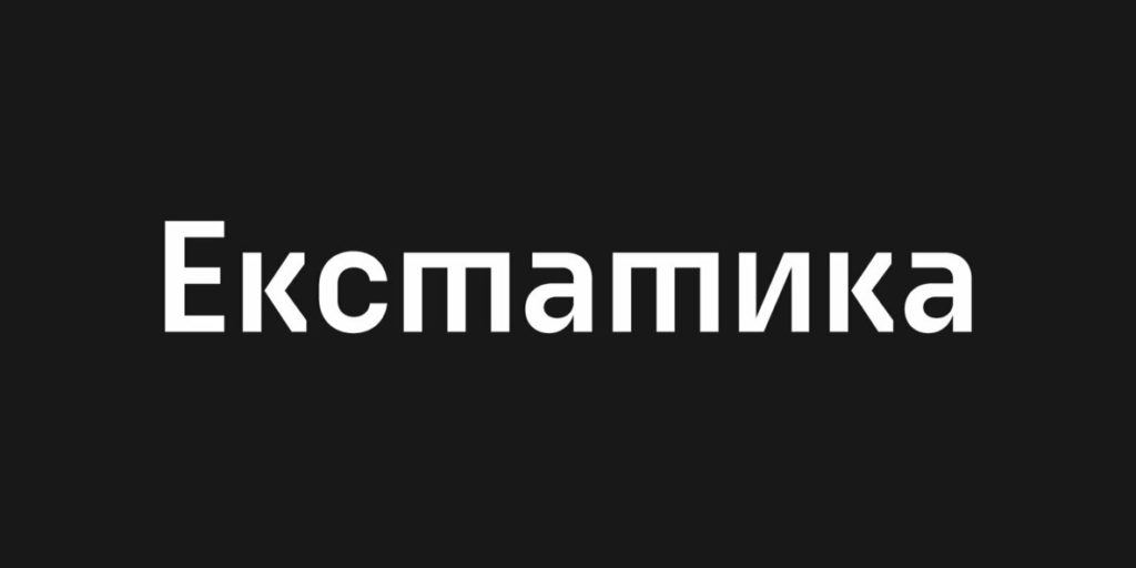
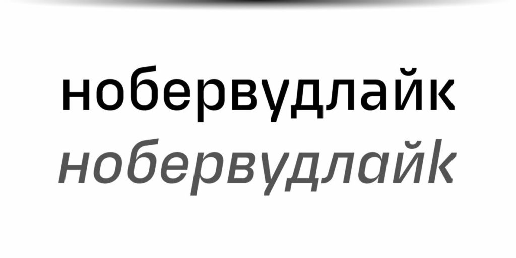
Extatica is, strictly speaking, a geometric sans. But its unique combinations of sharp cutaways juxtaposed with humanist strokes give it a futuristic character that allows it to play both for text and display applications. Aesthetically, Extatica isn’t shy about making bold statements, and one could argue that it feels too decorated. But, the same argument could be made about a Lamborghini. In the right application (for example, a tech-forward brand), it brings style and personality that are hard to forget. The narrow capitals give Extatica a monospaced vibe, evoking lines of code without actually compromising legibility or space efficiency.