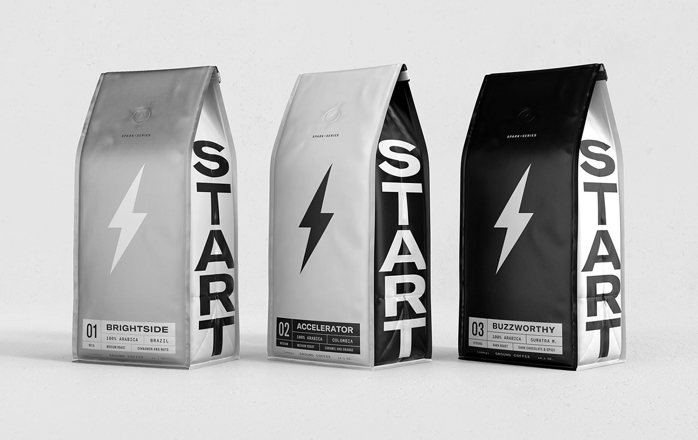
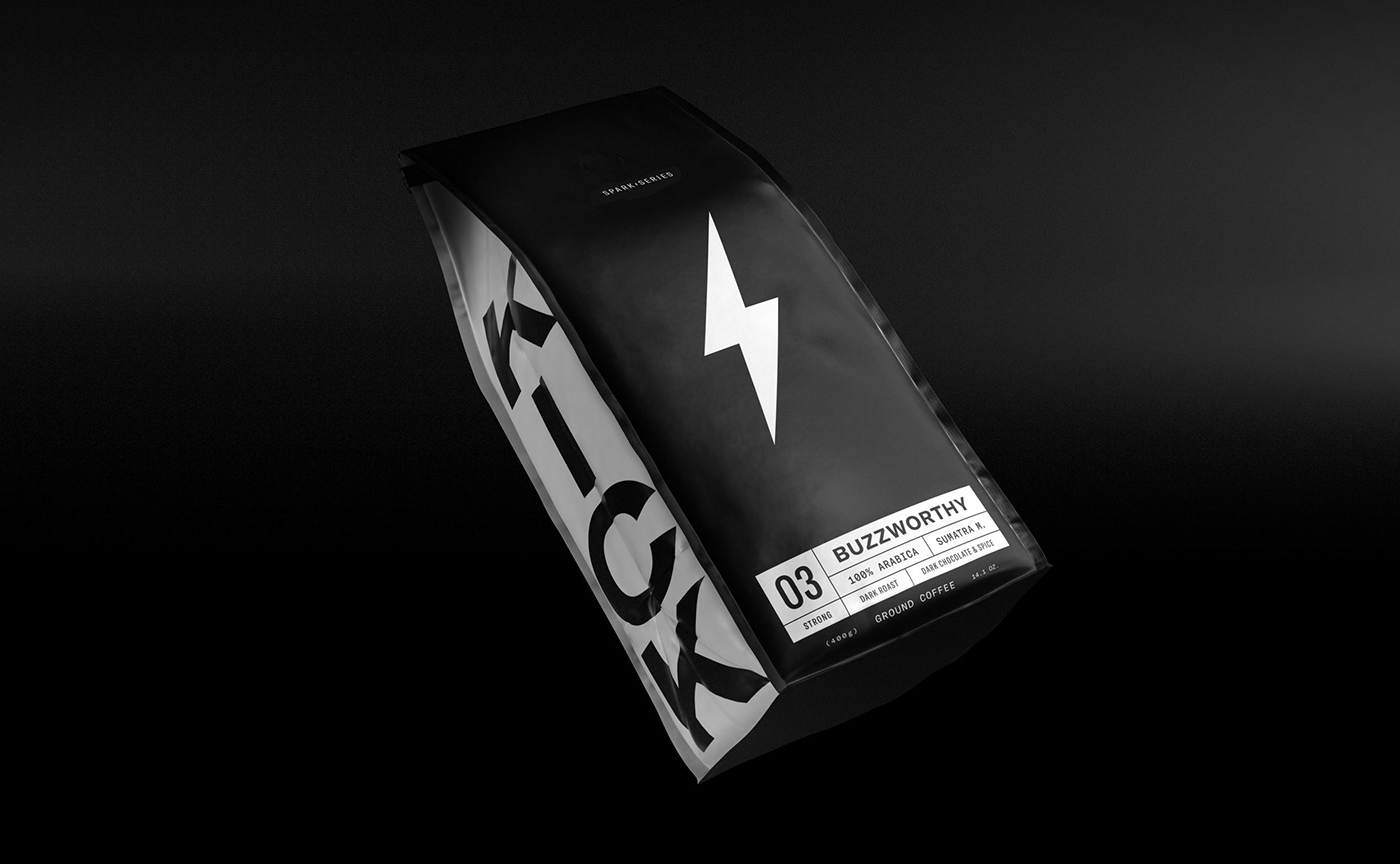
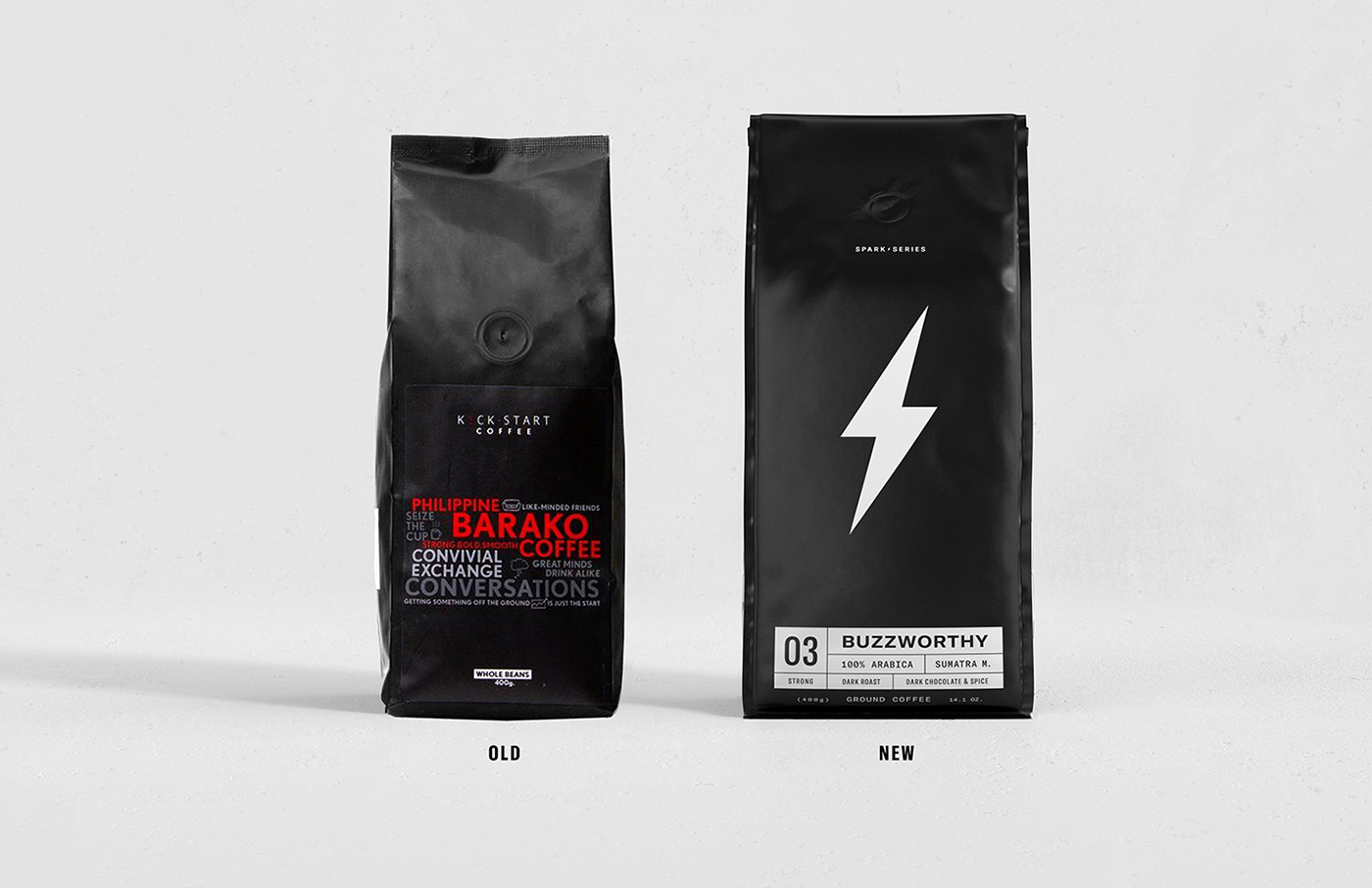
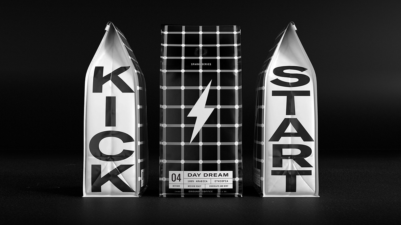
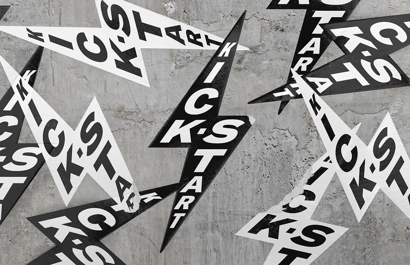
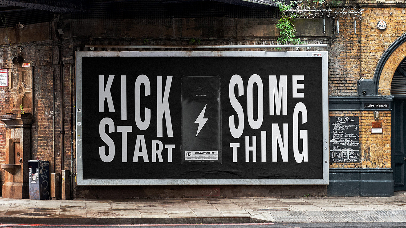
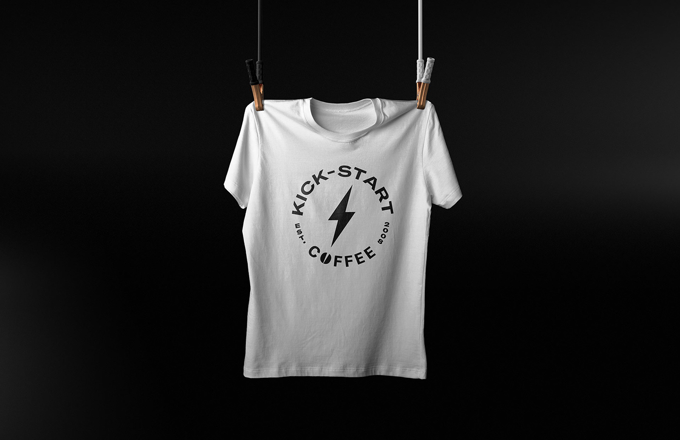
This coffee packaging has “jolt of energy” written all over it. For me, the lighting bolt seemed a bit obvious to include and even reminded me of Gatorade. Slate agency balanced that reaction out by pairing a classic and contrasted black and white color palette with bold modern typography. The jolt bolt is the focal point in the packaging which creates a visual hierarchy. This evokes the energetic satisfaction a consumer anticipates with coffee products. This overall style falls in line with the bold minimalist trend we are seeing the past couple of years which has caught the attention of Millennials and Gen Z consumers. Because of this forward symbolism, this packaging would stand out in a line of competitors by simply being, well, simple. 

Designed by: Slate Agency

Discuss this Project

Leave a Reply

This site uses Akismet to reduce spam. Learn how your comment data is processed.

The Forktales Podcast™: Interviews with restaurant industry leaders and visionaries

Restaurant and advertising industry headlines and thinking

Reviews of restaurant experiences from around the globe 

Reviews of our favorite design, business, & restaurant books

Our favorite typography and fonts

Inspiration in your inbox

Get the latest inspiration in your inbox every Monday morning, for FREE!

"*" indicates required fields

This field is for validation purposes and should be left unchanged.

Delicious Bits in your Inbox!

Get the latest and greatest content delivered to your inbox for free!

"*" indicates required fields

This field is for validation purposes and should be left unchanged.