
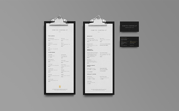
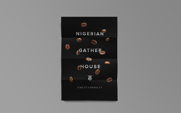
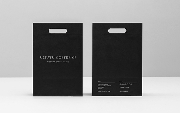
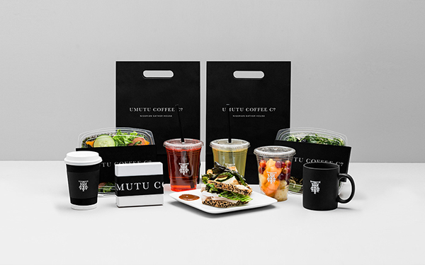
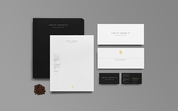
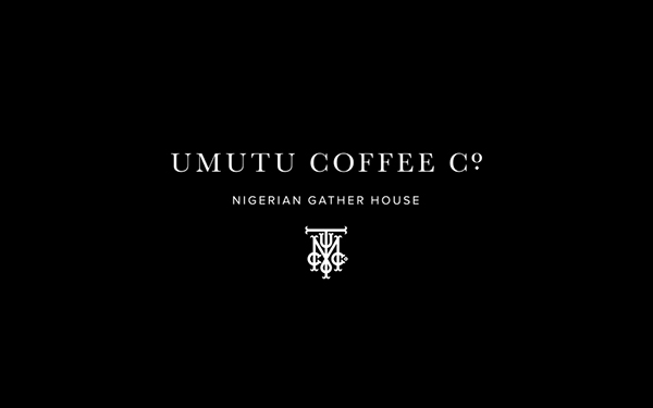
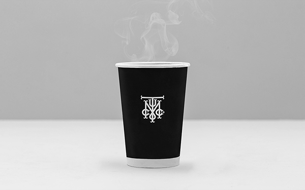
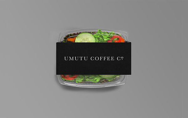
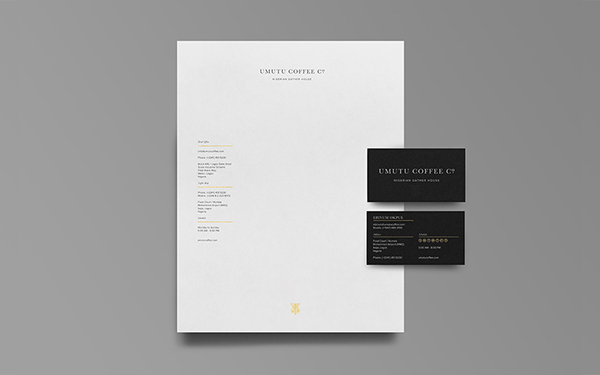
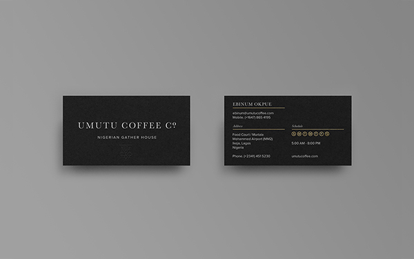
The brand identity for Umutu Coffee Co is marked by a classic, luxurious refinement. The black and white, high contrast design direction creates a confident air about the brand that’s intriguing and slightly mysterious. It’s certainly a welcomed shift from the go-to looks used by most coffee shops/brands.
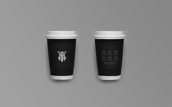
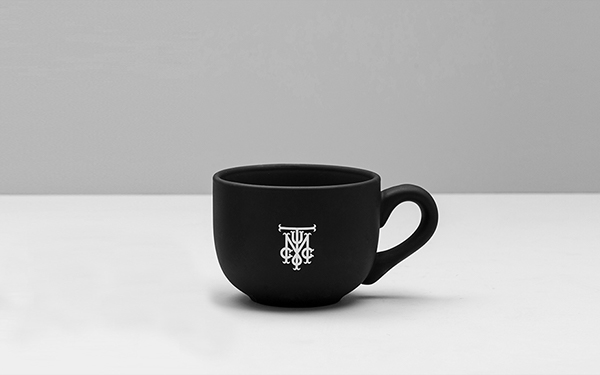
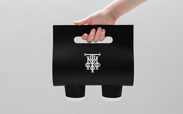
The monogram is especially intriguing to me. The way the letters interact adds so much character to this element of the brand. It simultaneously lifts the full identity to levels of luxury akin to fashion leaders.
Where the team could have added more, they used restraint to let the beauty of the typography shine in this high contrast scenario. Very impressive work by the team at Anagrama.
Designed by Anagrama


