
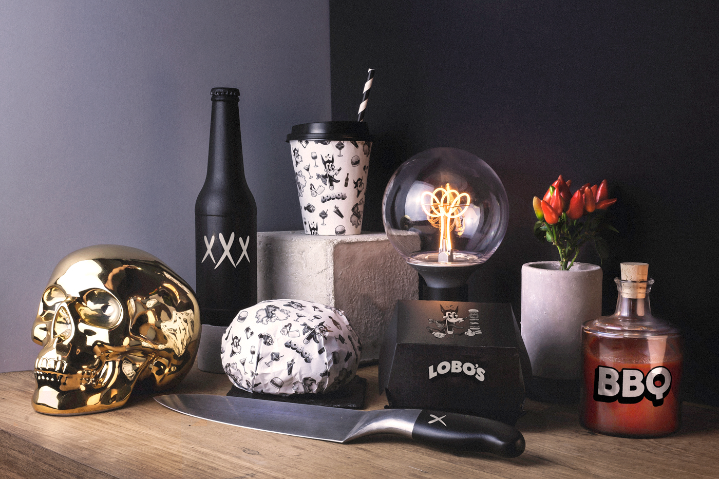
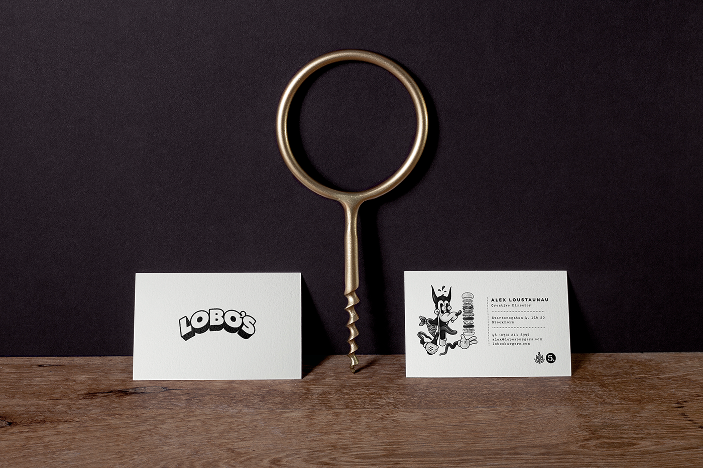
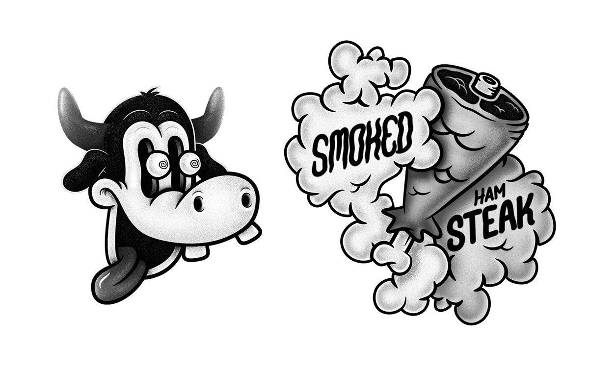
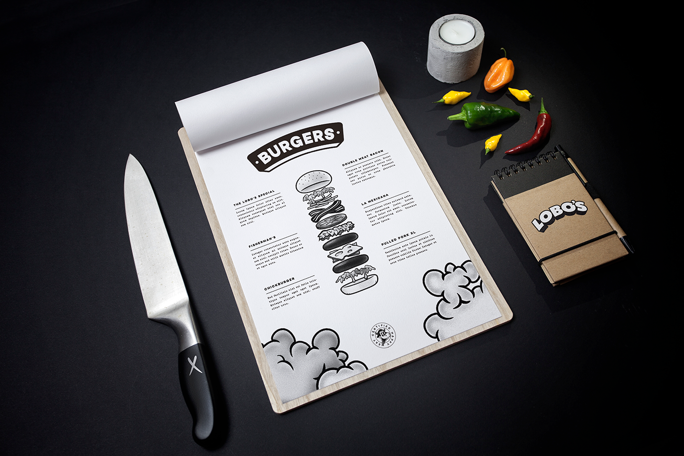
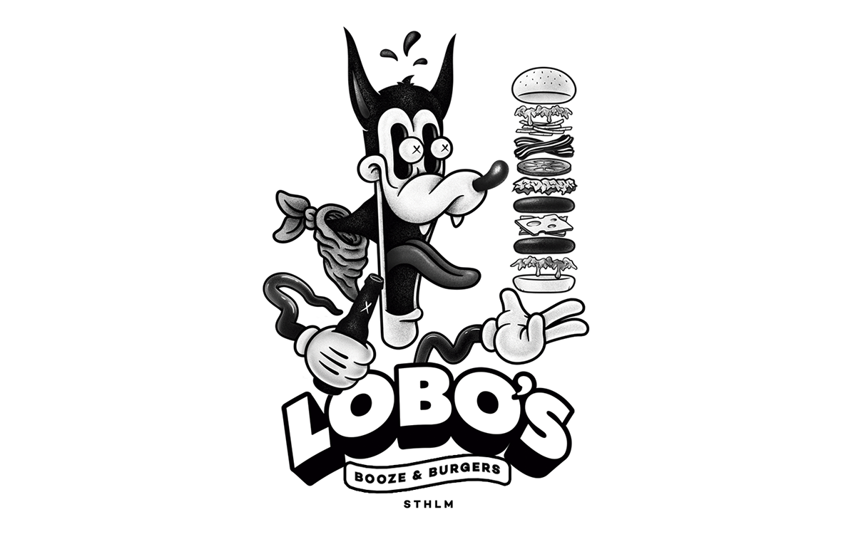
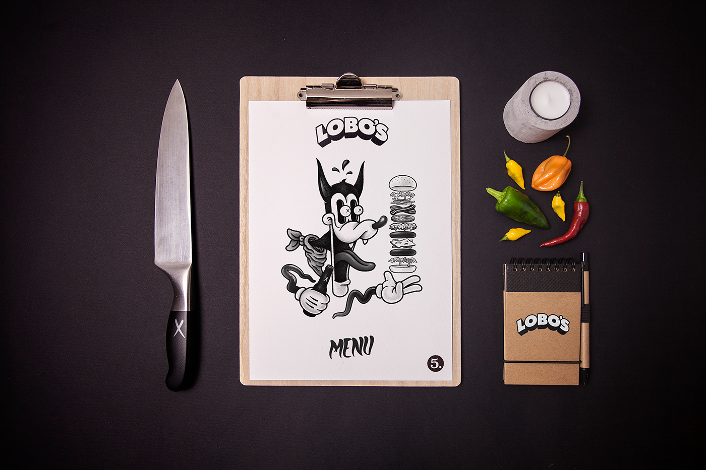
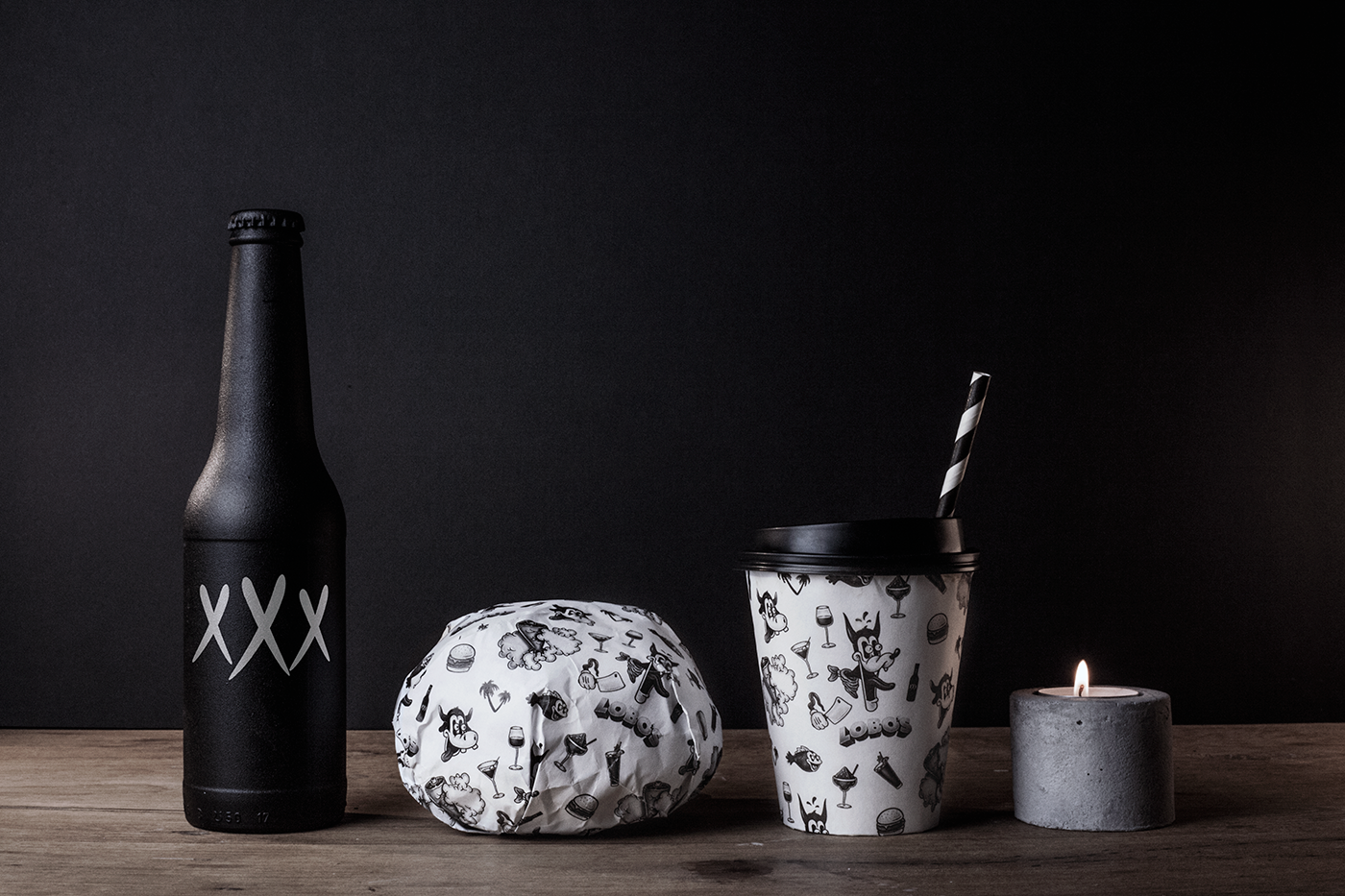
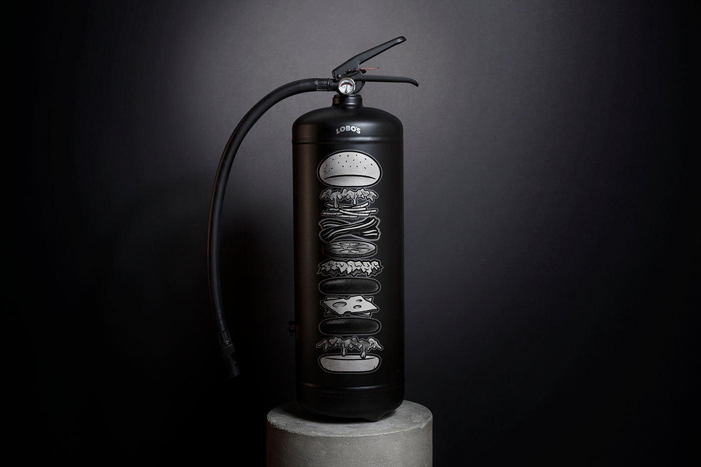
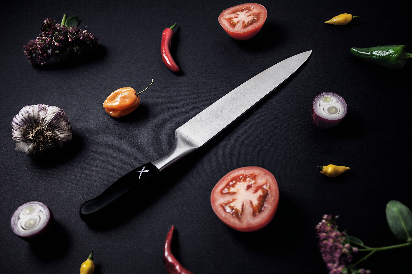
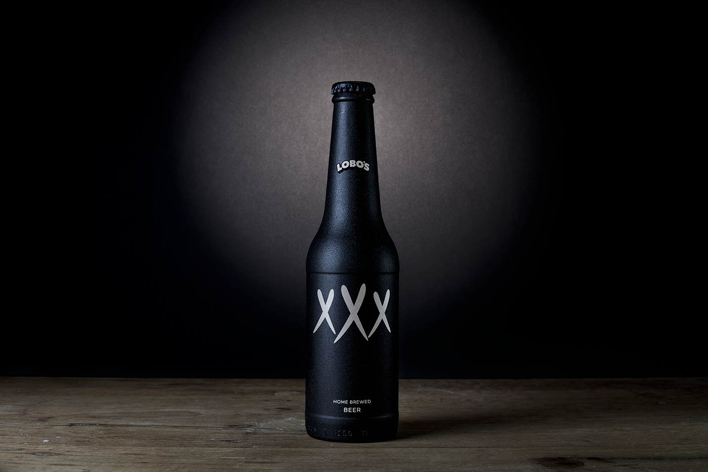
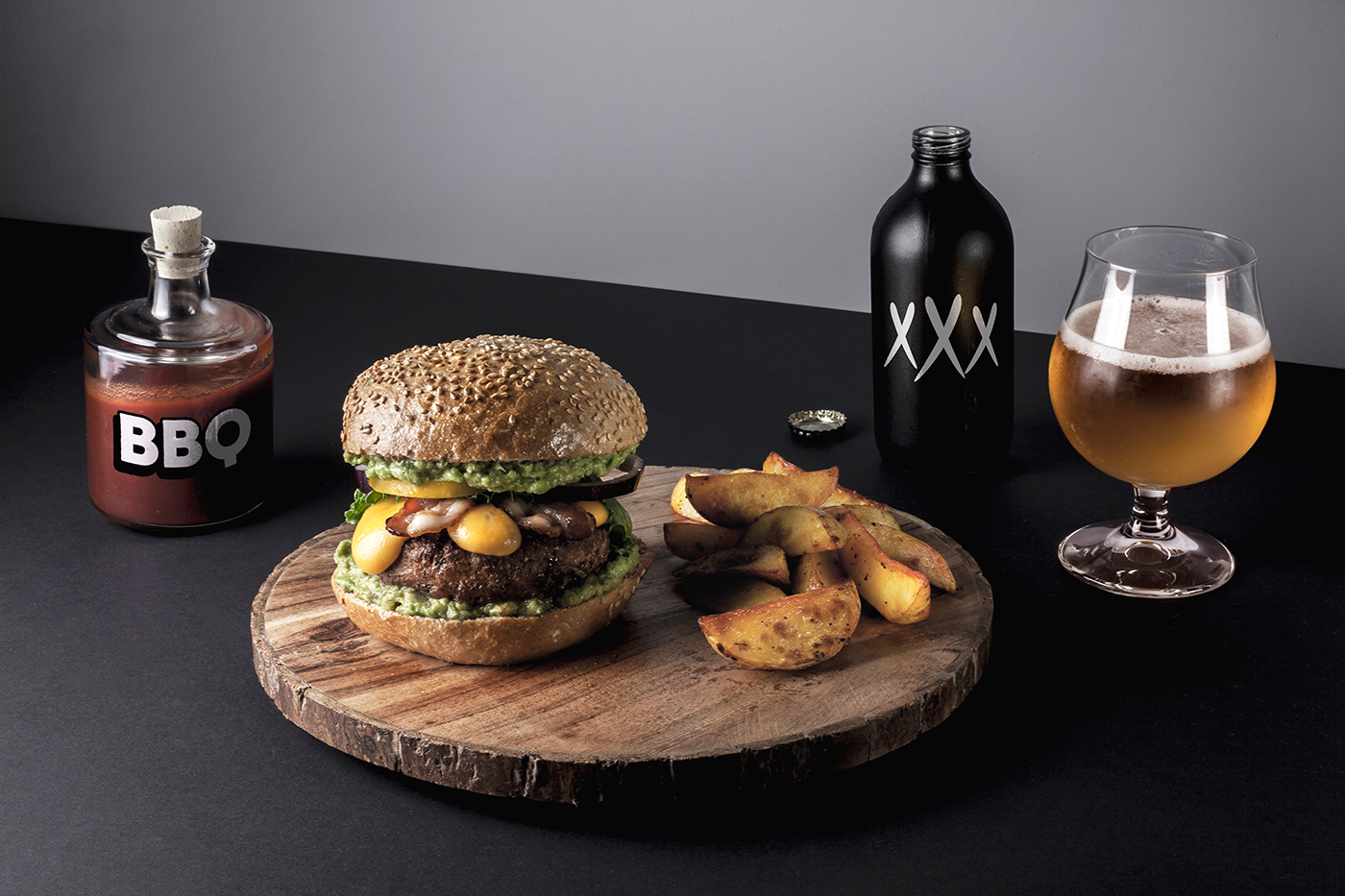
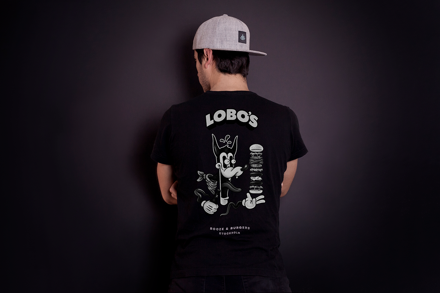
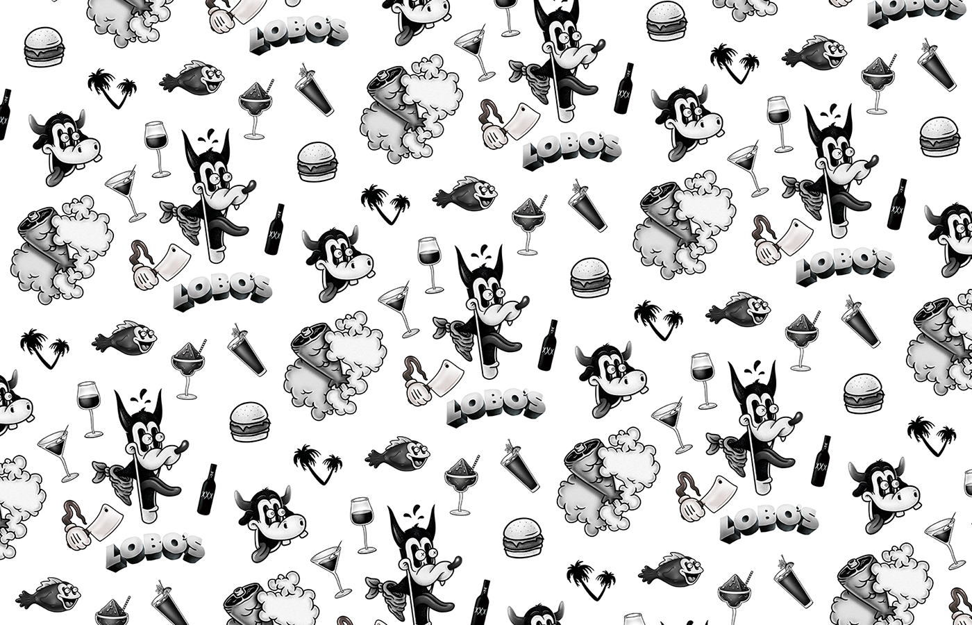
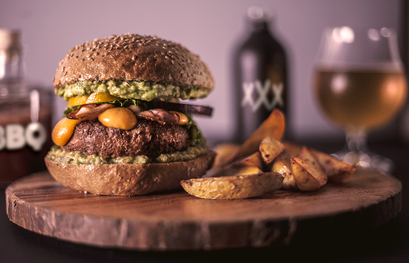
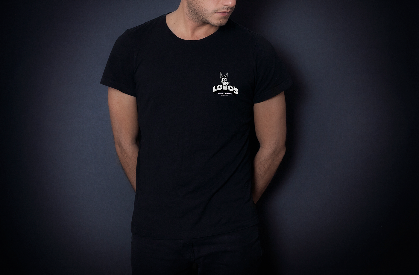
Nostalgia can be a wonderful thing especially when it’s unexpected. That’s the core driver of the Lobo’s brand identity created by Amber. The Amber team taps into classic Looney Tunes® art styles reminiscent of the early years of animation.
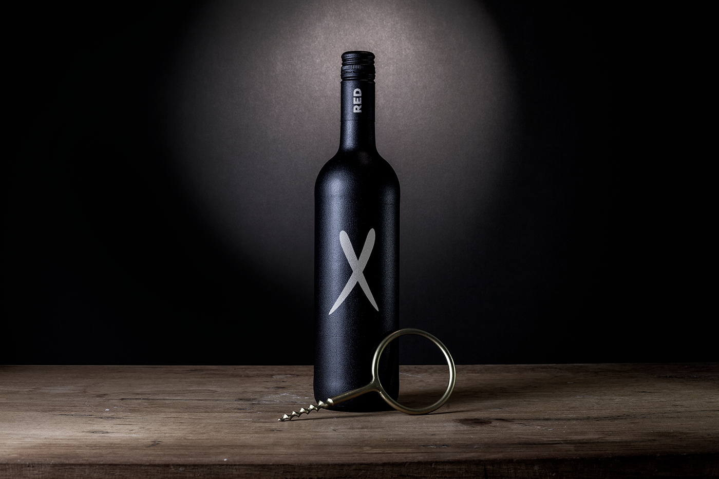
“Lobo” is Spanish for “wolf.” The design team took this name and ran with it by personifying it in that classic cartoon style. From that basis, they built out a fully realized brand experience that nods to the nostalgia-driven aesthetic with popular elements of that cartoon era. Elements like the eyes popping out of the head, XXX on alcohol bottles, and other bits all drawn with a grainy, thick line style.
The look is one we don’t see often with restaurants but having seen this I have to wonder why. It’s so charming, fun, and a bit edgy. Job well done by the team at Amber.
Designed by Amber


