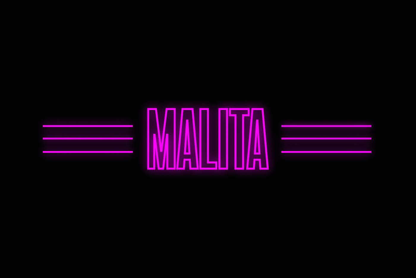
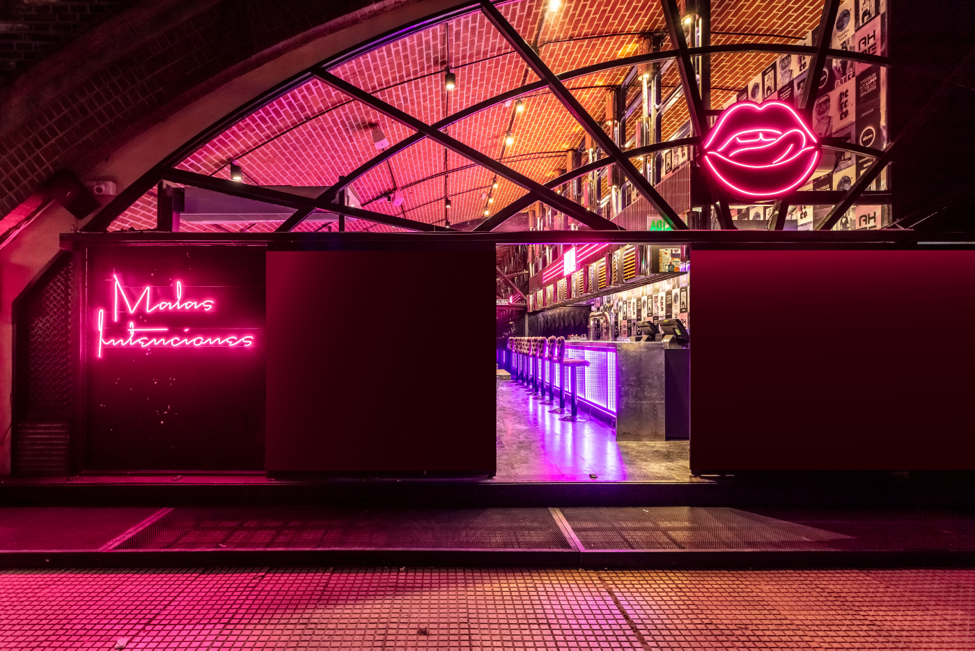
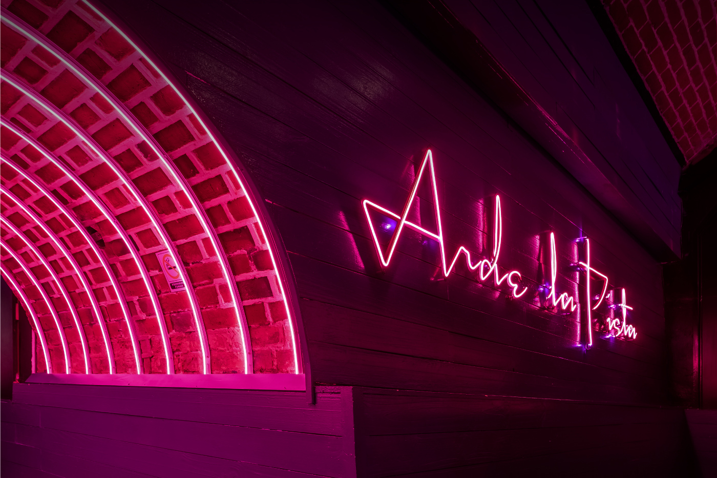
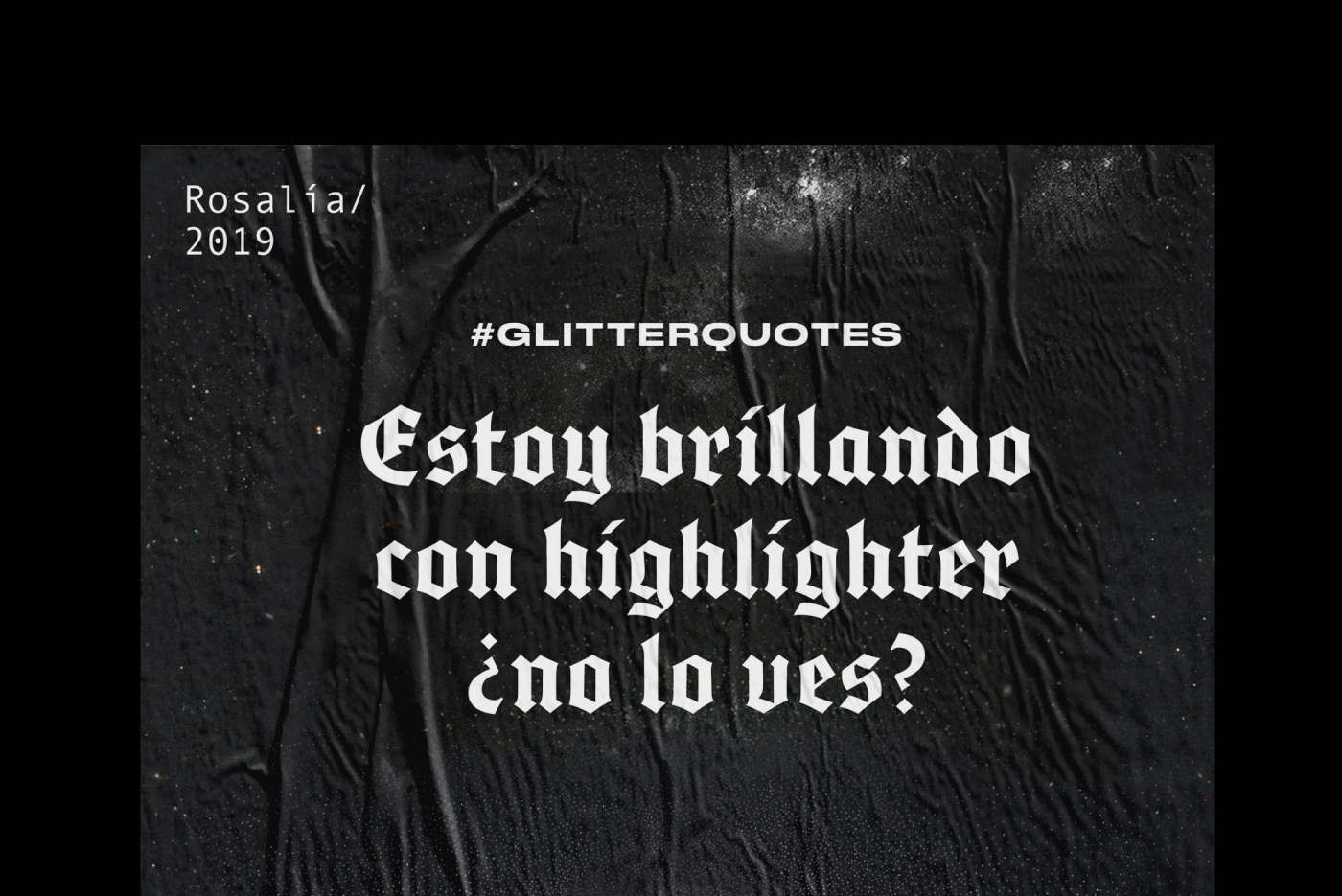
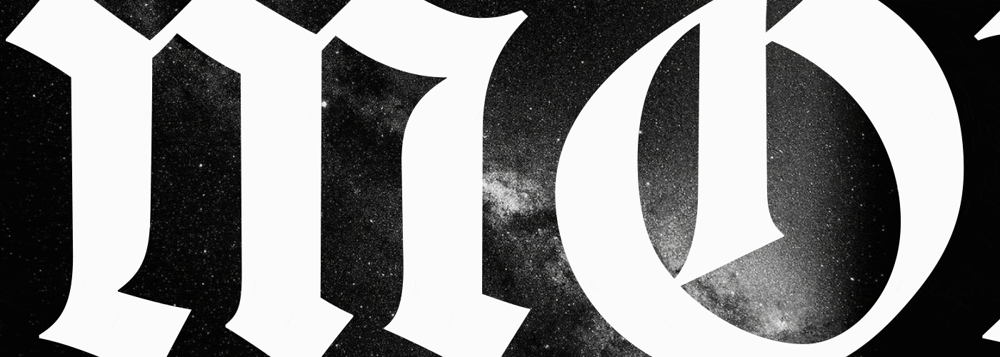
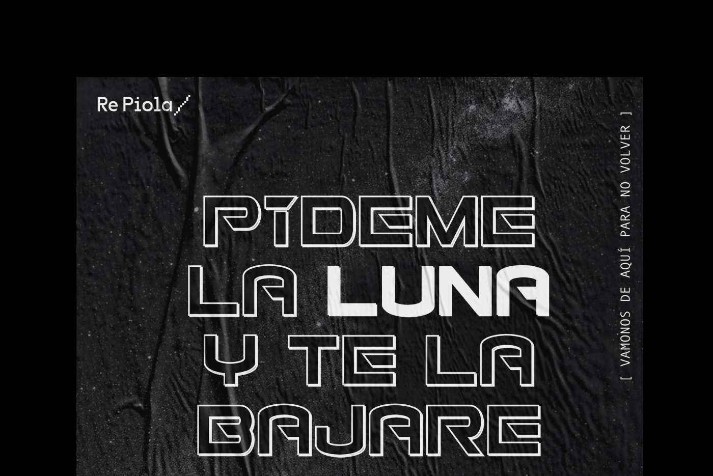
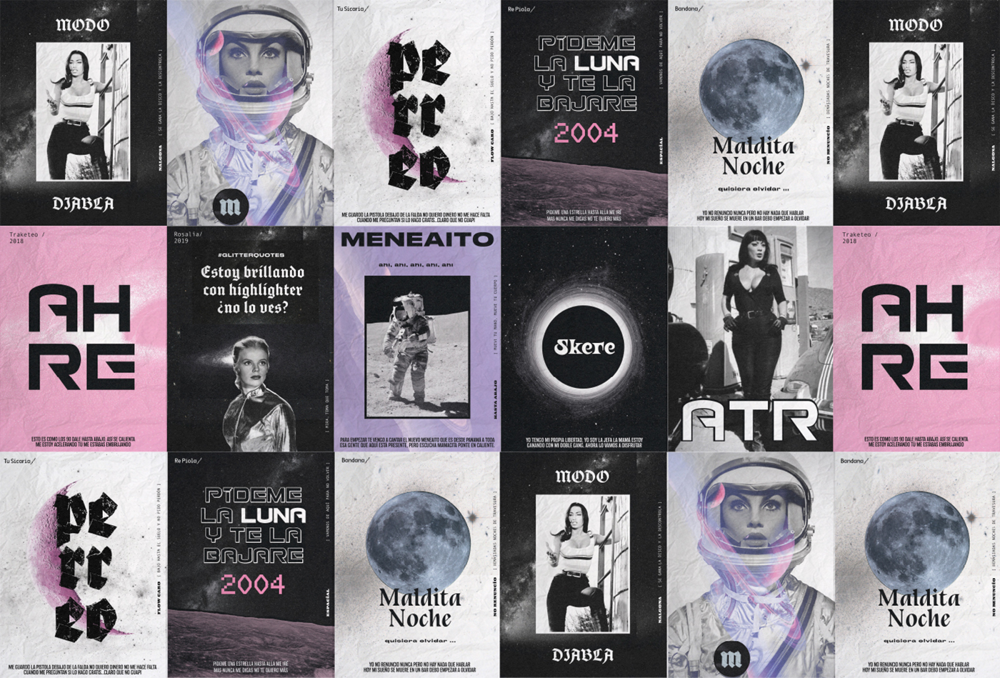
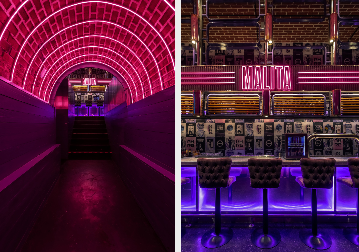
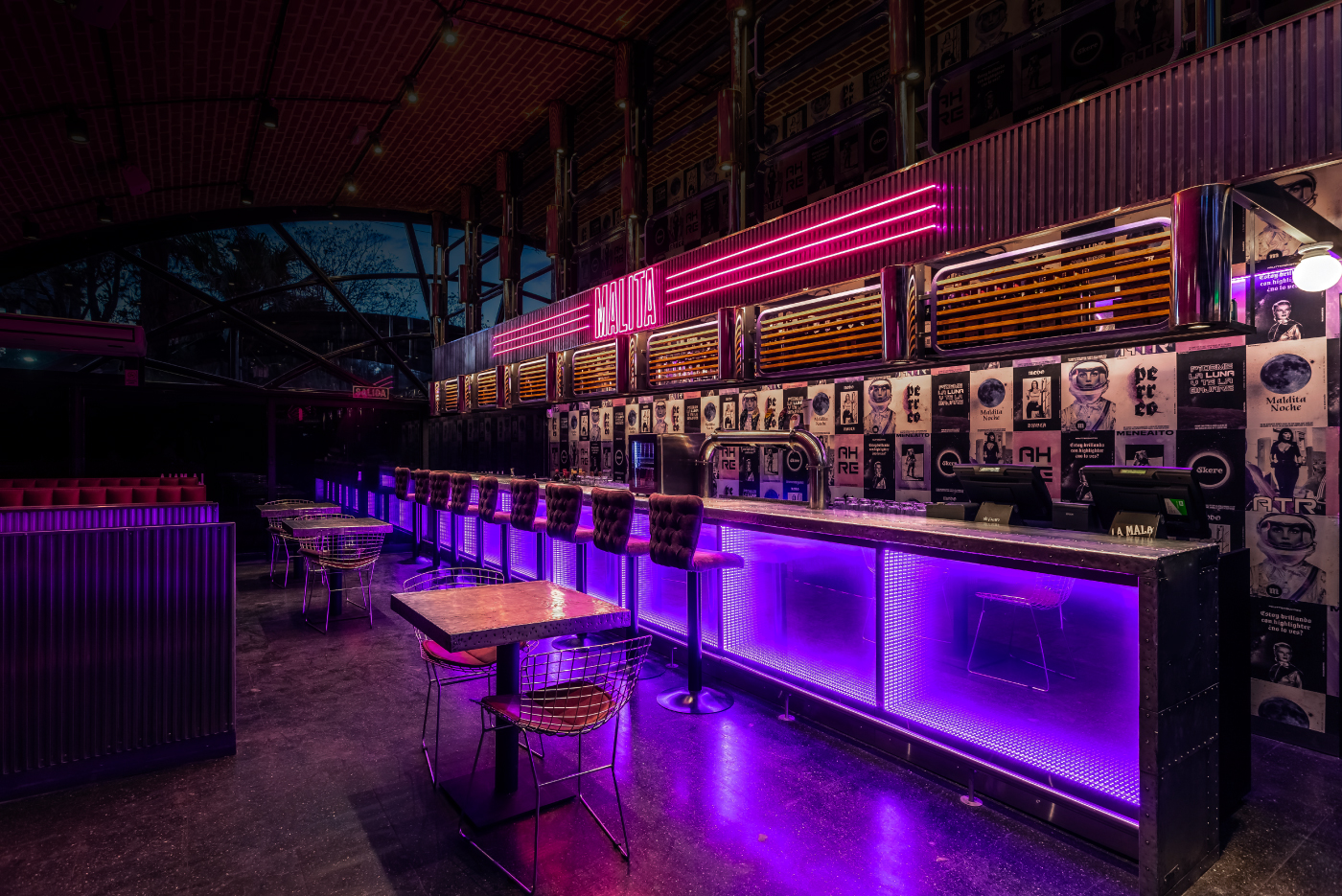
Mala, a bar in Buenos Aires has a fantastic brand identity thanks to the folks at Estudio Nuar. It’s a dark and moody brand that’s highlighted by 90’s style fluorescent elements then mixed with some chaotic typographic shifts throughout the system.
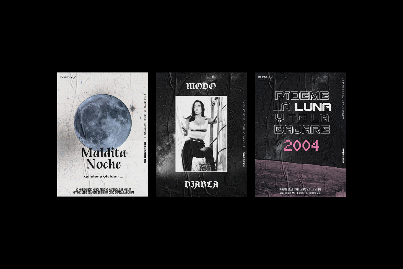
The bright pinks and purples delivered via lighting selections create many gradient tones across the surfaces of the interior. Outside of the space, the brand makes use of wheat-paste poster elements to develop a visual language that seems set on exploring typography to deliver a vibe above the average for most bars.
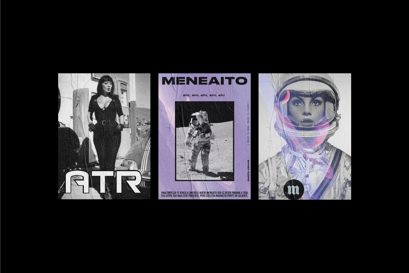
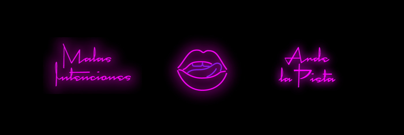
The iconography, namely the licking lips and Saturn planet, are fun, notable elements that keep this place rooted in a fun vibe despite the dark tones used across the identity system.
Agency: Estudio Nuar Dirección Creativa: Manuela Ventura y Melisa Rivas. Arquitectura: Hitzig Militello Arquitectos. Arquigrafía y Producción: Crista Bernasconi. Equipamiento y Detalles: Krapa. Diseño: Manuela Ventura, Melisa Rivas, Crista Bernasconi y Natasha Furst. Fotografía: Federico Kulekdjian. Animaciones y Montajes: Malena Sueiro.