For larger brands that use complex visual identity systems across multiple media and regions, only the most robust typefaces will do. The last thing a responsible designer wants to do is select a typeface that lacks the legibility, flexibility, or features needed to solve real-world problems out in the wild.
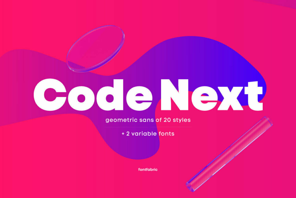
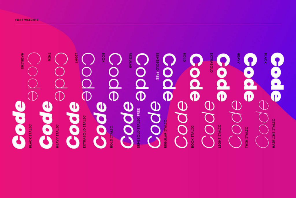
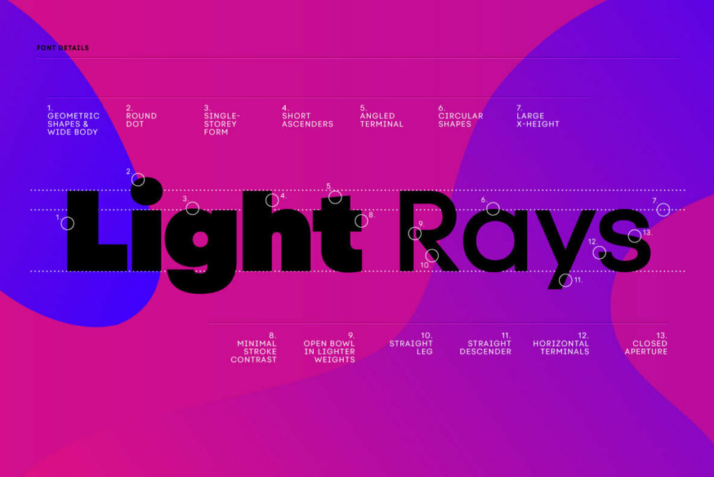
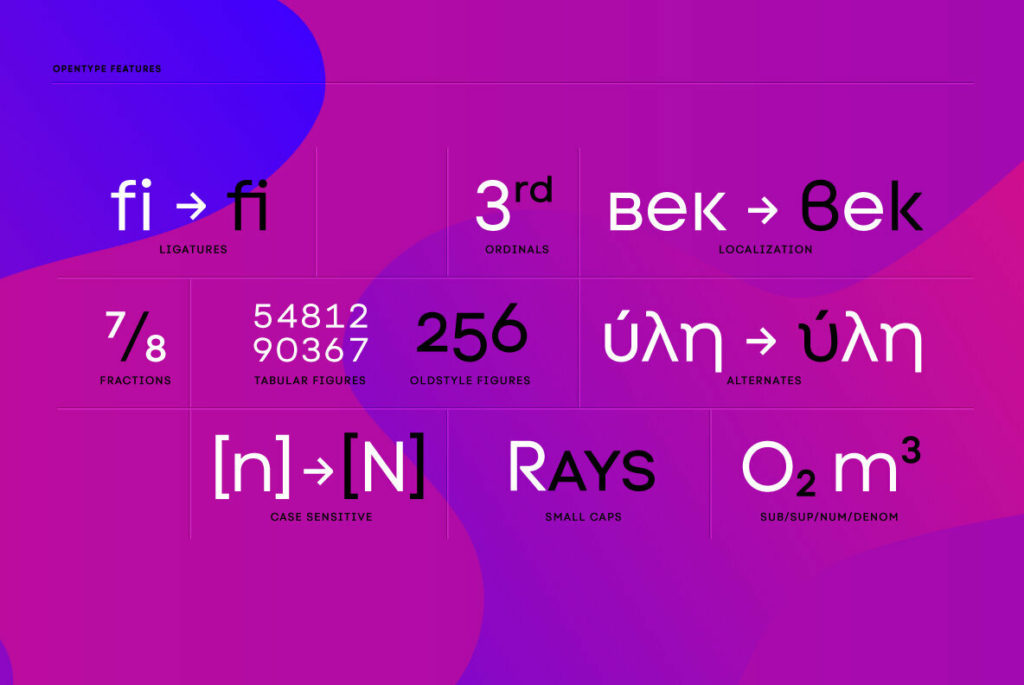
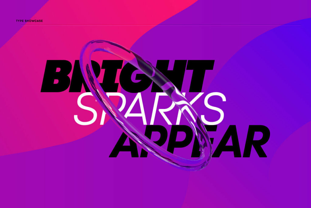
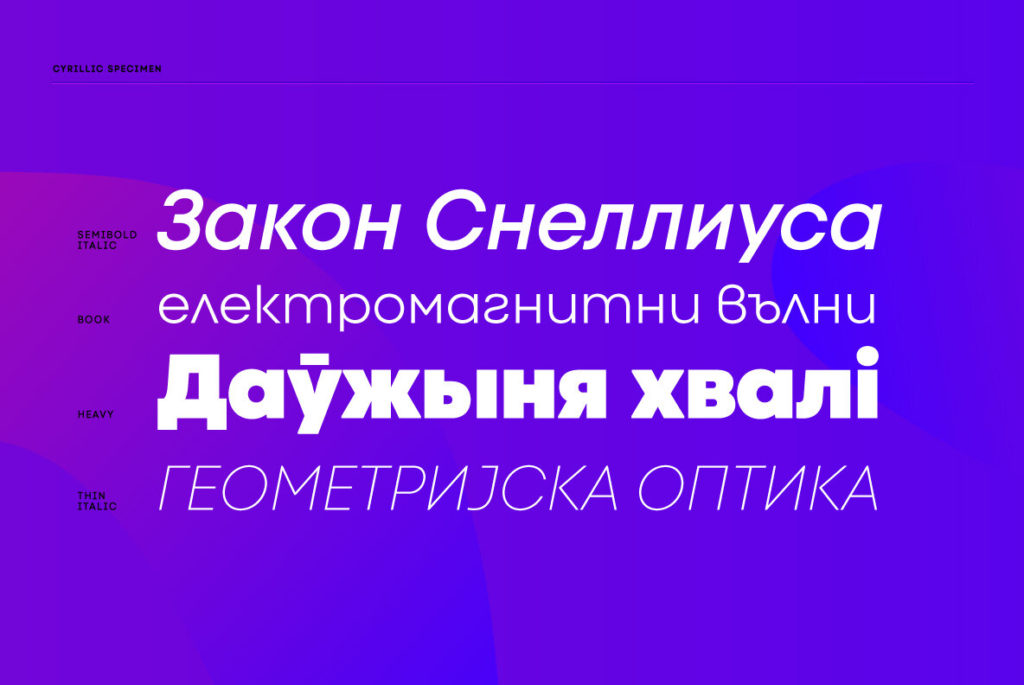
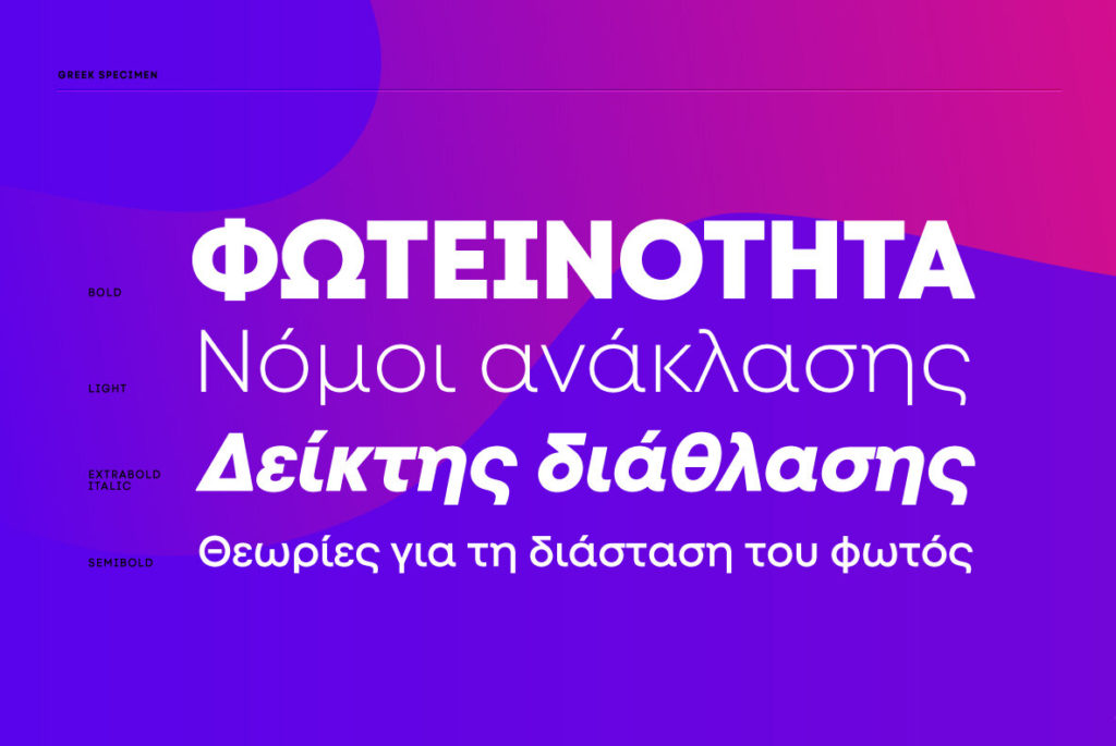
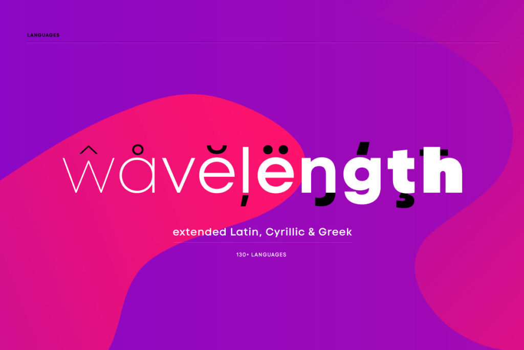
Code Next—a new “evolution” of Code Pro, is a prime example of a workhorse typeface that can shape-shift into nearly any application. The family contains 22 fonts in 10 weights, multi-language support, and a slew of OpenType features which grant designers control in both print and digital applications. Fortunately, Code Next isn’t short on character or attention to detail. Each weight’s glyphs are considered and customized for that weight. The extremely short ascenders and tall X-height give it an uber-contemporary feel. And the combination of very low stroke contrast, closed apertures, and judiciously softened corners give the typeface a surprisingly warm feel.
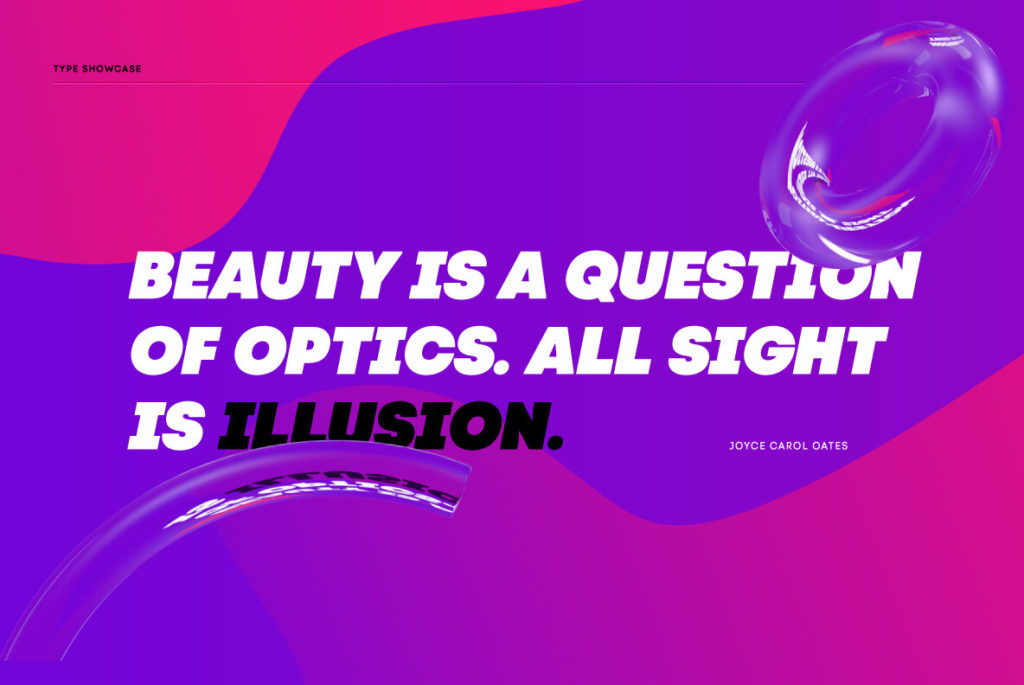
This typeface would serve well as part of an international visual identity system that is tech-forward and emphasizes approachability over austerity.