In the world of design, highly stylized display faces (like scripts, blackletter, typewriter, or anything labeled “futuristic”) tend to fall short on quality. Often they can be kitsch, derivative, or hastily constructed typefaces that substitute decoration for taste.
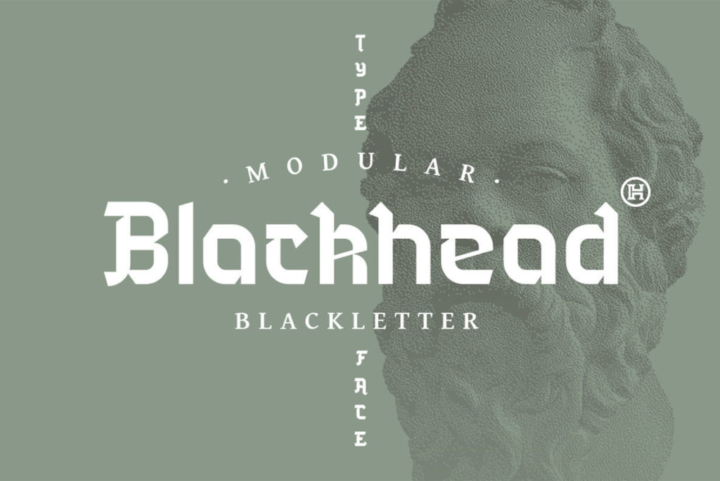
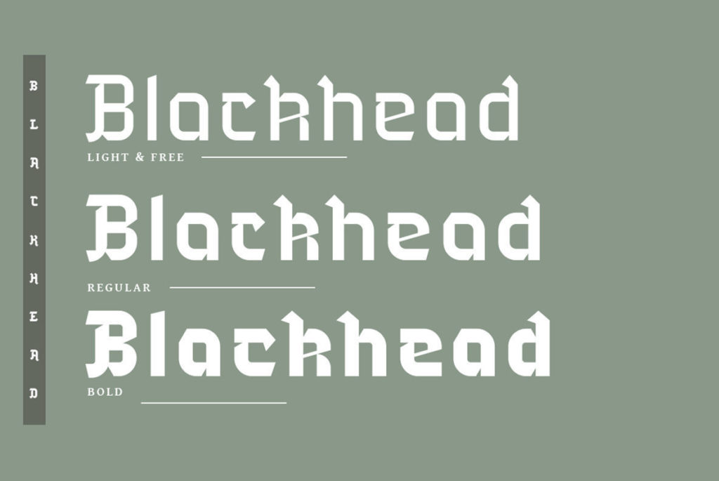
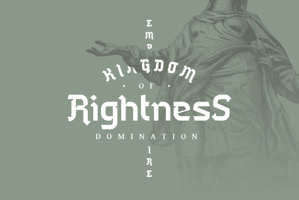
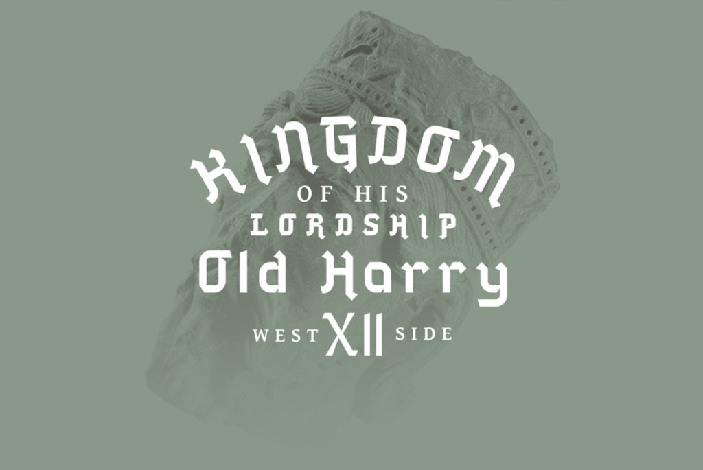
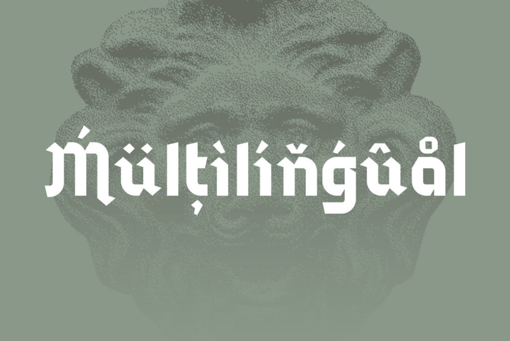
Blackhead is a blacketter-inspired typeface that, though highly stylized, raises the bar for the category. First, it’s original. Though the strokes are evocative of blackletter, the actual letterforms are simplified and modernized. This means it’s also surprisingly legible, even at smaller sizes. While the mixing of old and new ideas does result in a bit of a visual identity crisis, the opportunity to blow the dust off blackletter and bring it into new contexts is well worth the trade.
We could see blackhead as a starting point for brand type or even as part of a larger visual identity system for brands that evoke Western European influence.