
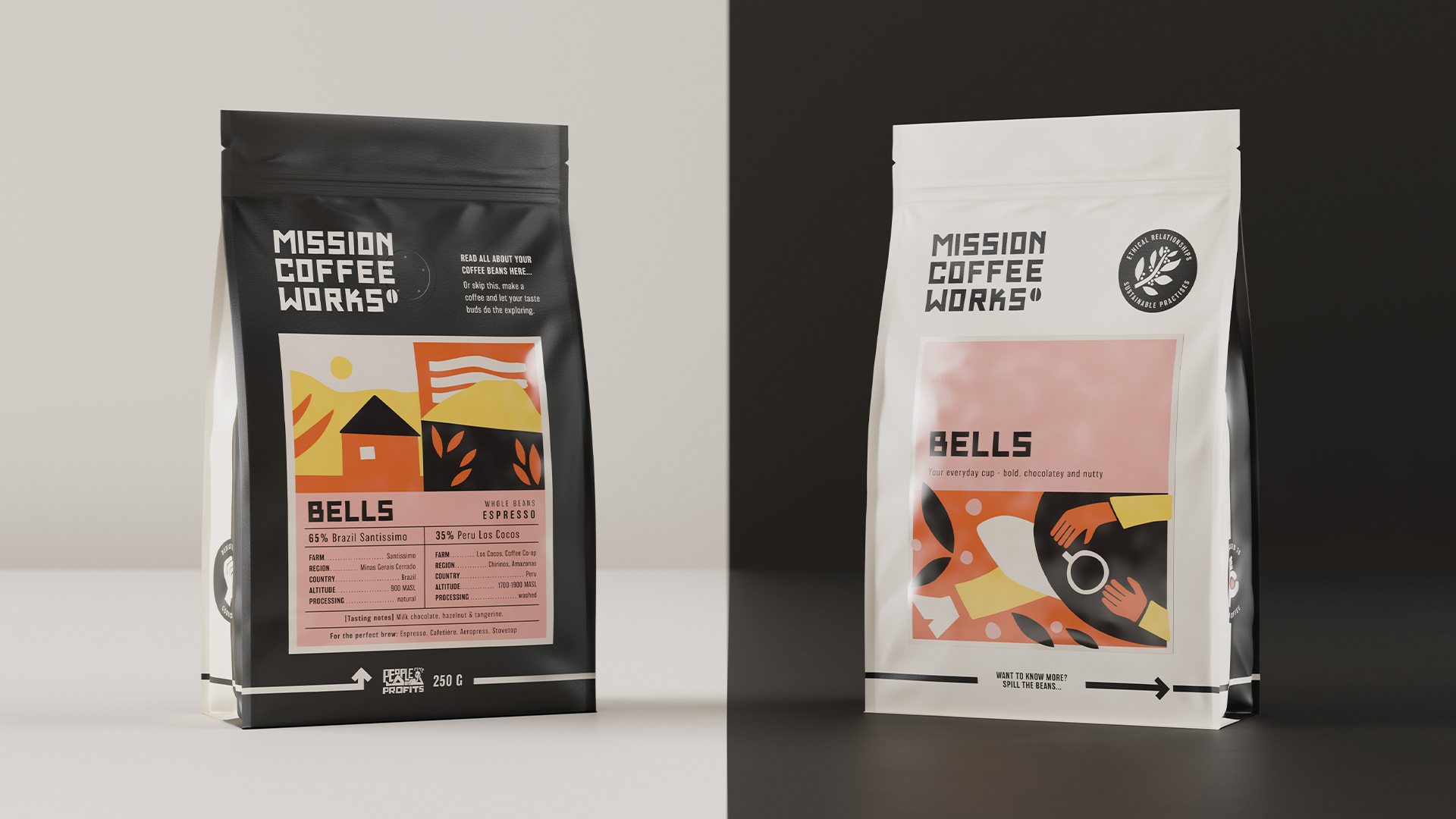
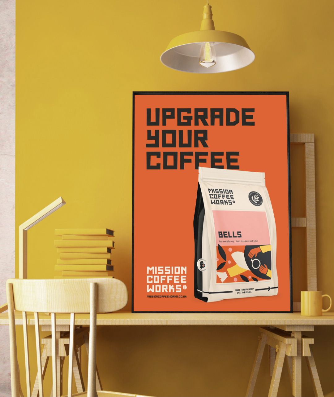
What strikes me about the brand identity design for Mission Coffee Works is the nonchalance and approachability of the visuals. Rather than taking a high-brow, snooty, “I’m so into coffee and know so much you can only hope to be as cool as me”, the team at Kingdom & Sparrow pull things back to be more casual without losing the artful touch that lovers of coffee desire.
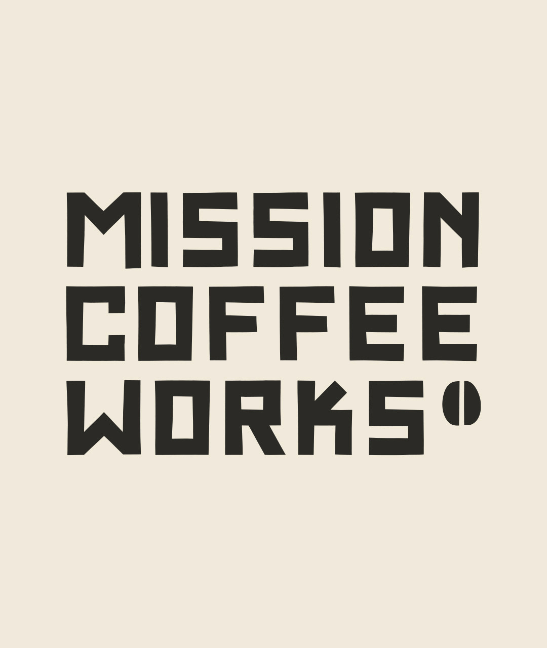
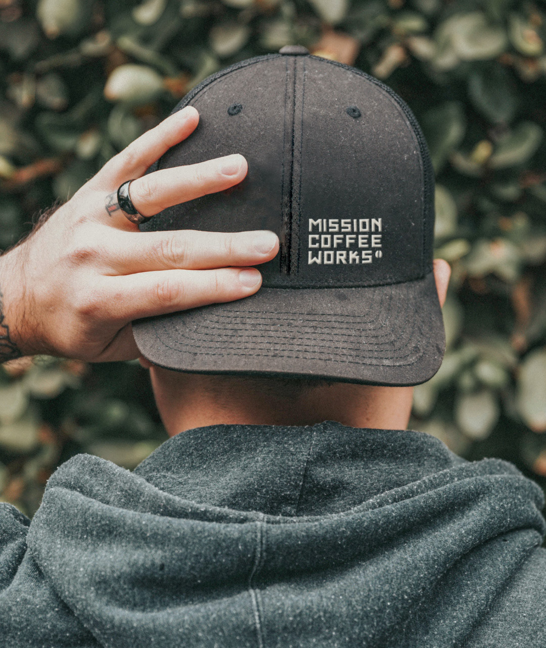
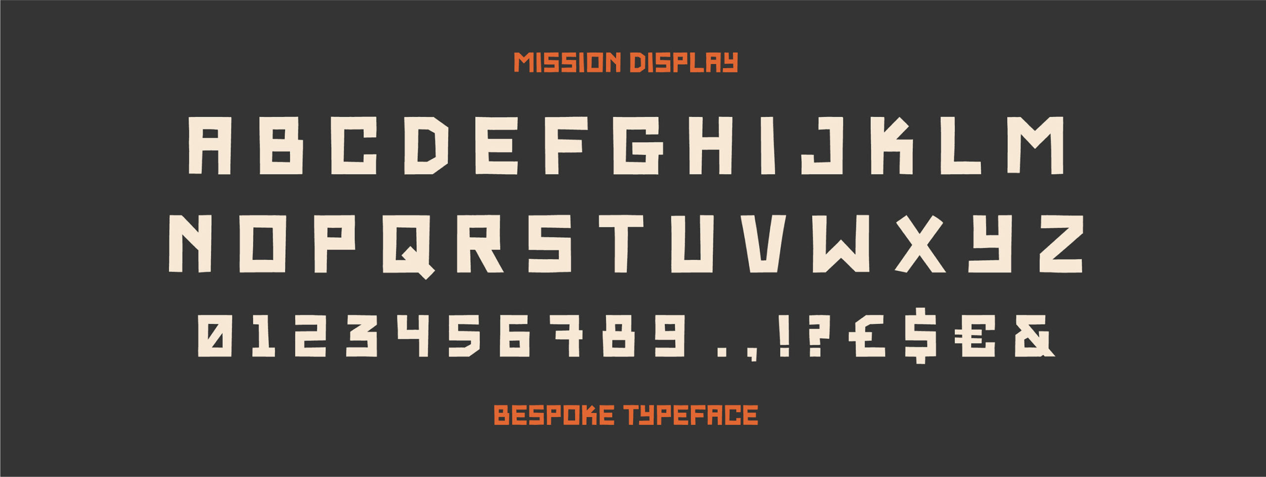
The identity is spearheaded by custom typography created by the studio. It has the feel of paper cutouts to create the letterforms. In many cases this would feel elementary and childish (not in a bad way), but the team elevates the look with a beautiful color palette and supporting elements that keep it from feeling like a kid’s brand.
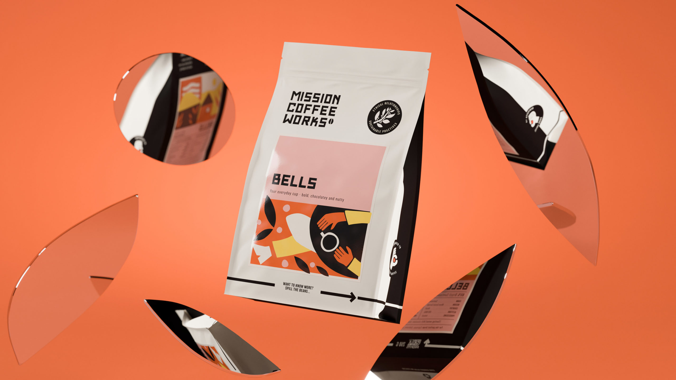
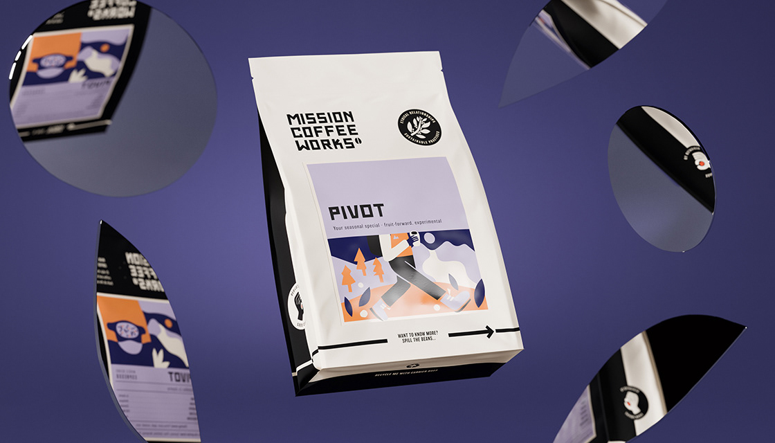
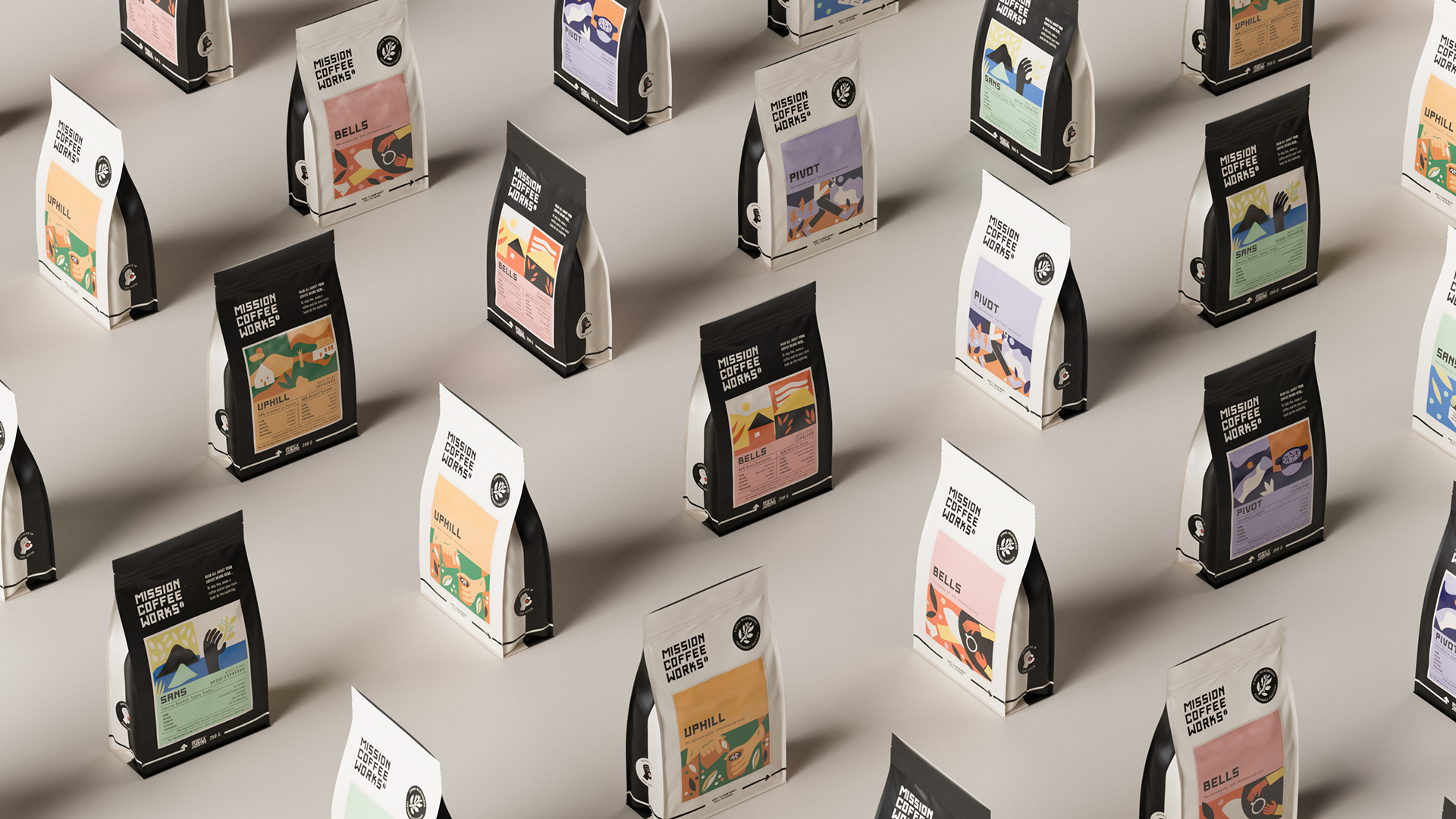
The illustrations style builds from the typography to add personality to the packaging, interiors, and photography. This successfully creates a unique look for social posts and other areas where photography would be employed as a communication device.
I simply cannot get enough of this brand identity work. Big high fives to the team at Kingdom + Sparrow.
Designed by Kingdom + Sparrow


