
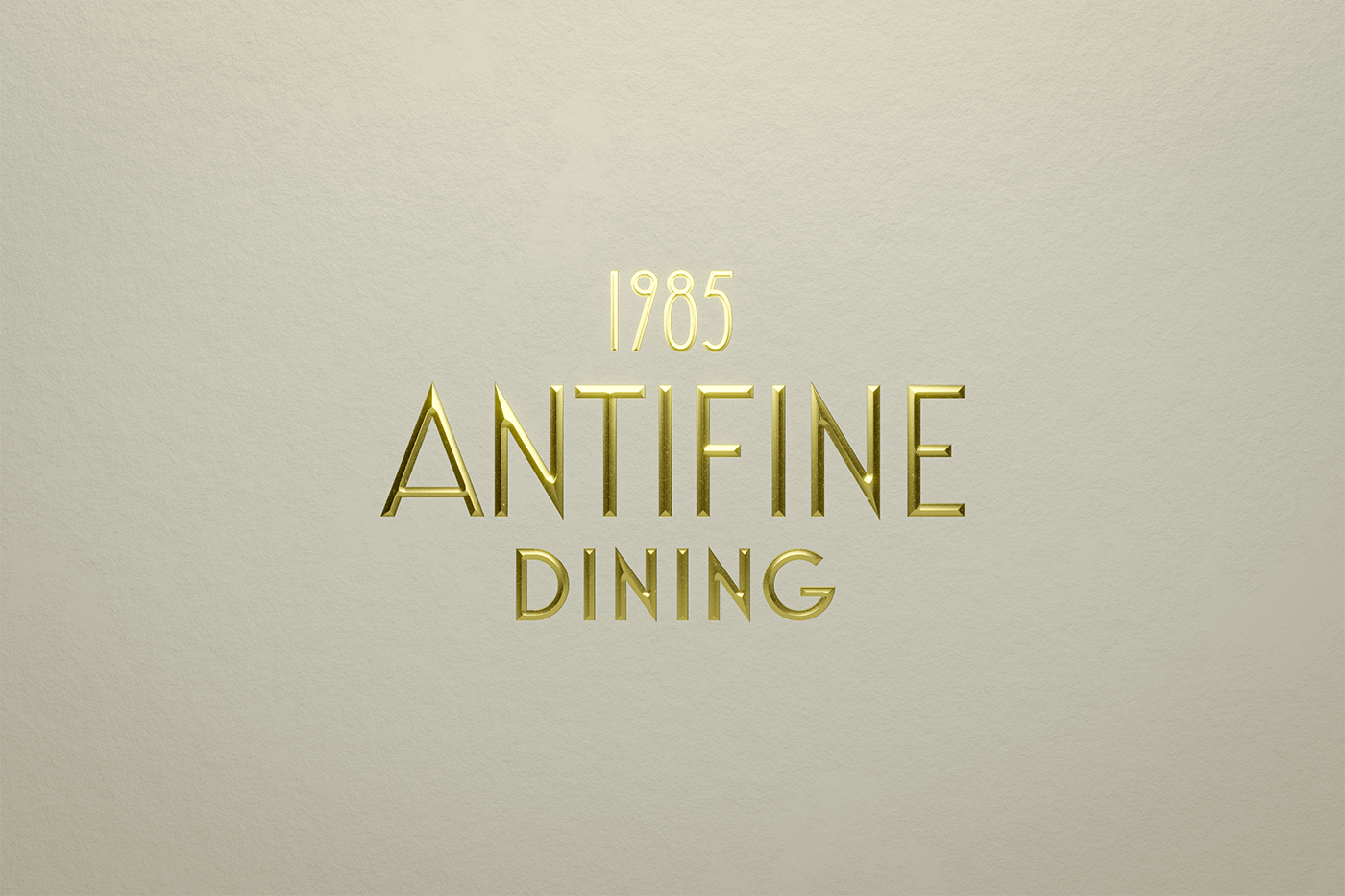
Fine dining can be quite a stuffy experience. White table cloths, white-glove, high faluting language, all for the sake of an upscale moment in time. And while this is sometimes desired, there is something to be said about breaking that mold, and that’s exactly what the Anti Fine Dining experience is all about.
The team at Anagrama approached the identity design with the idea of “fine dining with a chaotic and real touch.” And they’ve aced it.
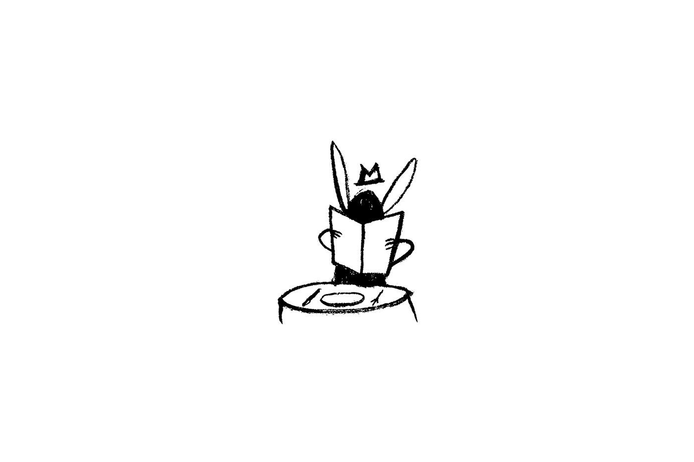
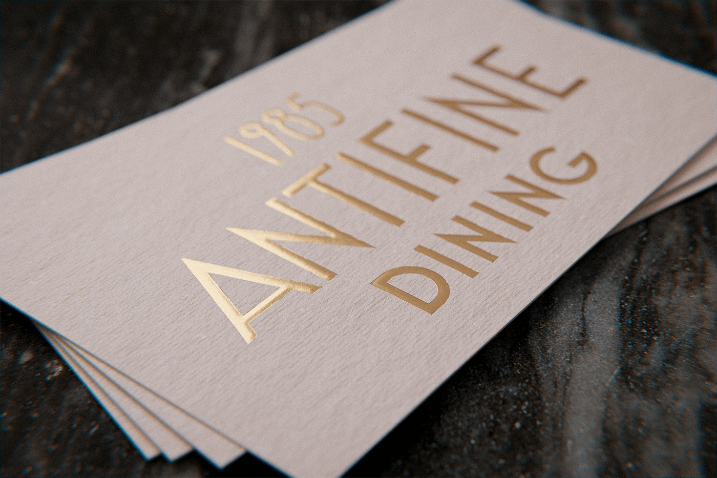
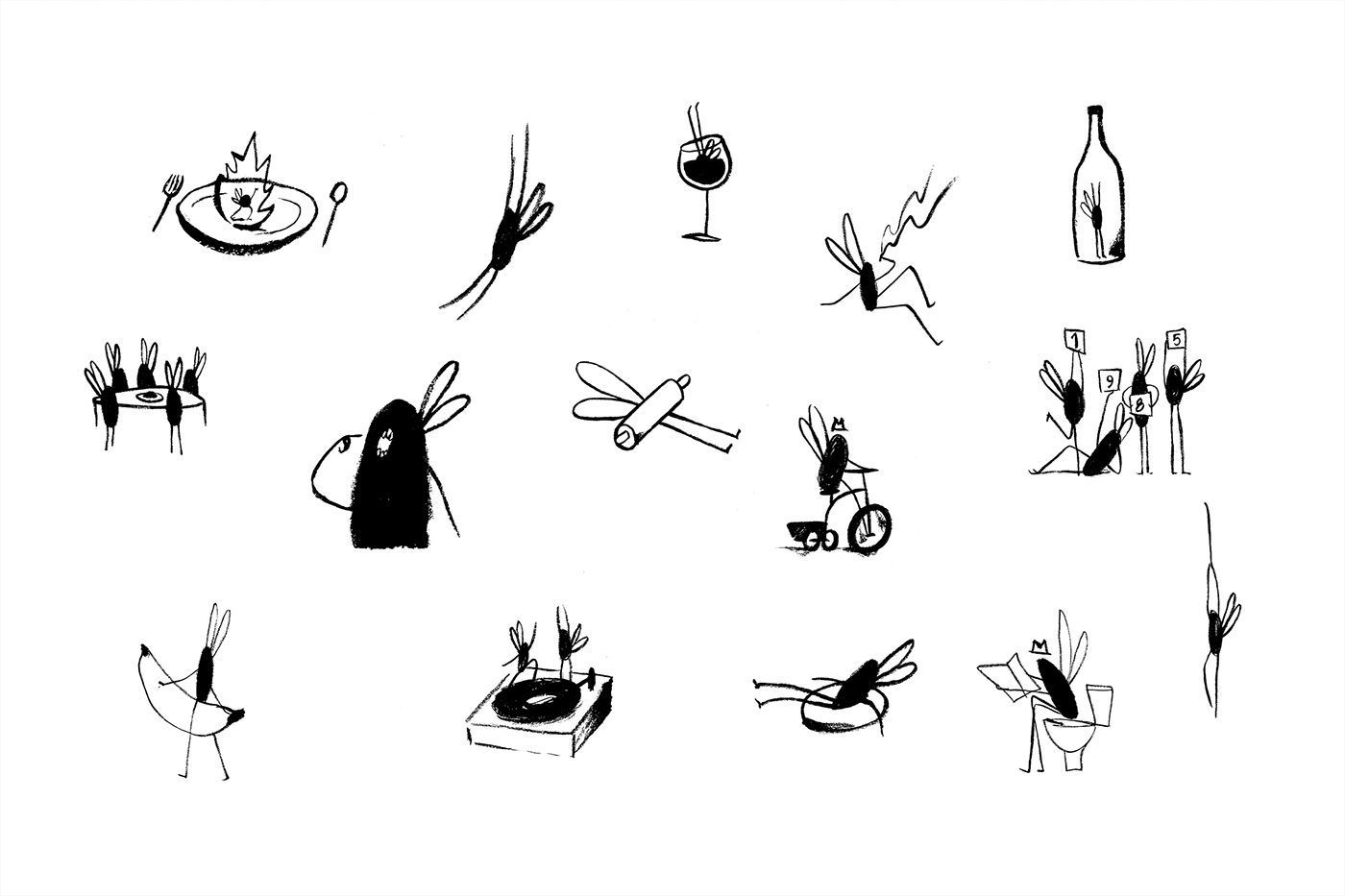
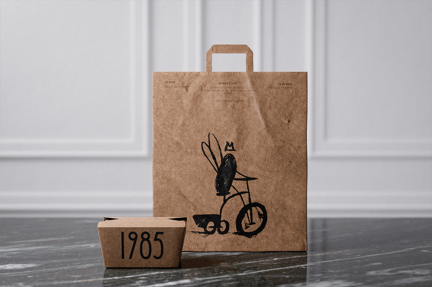
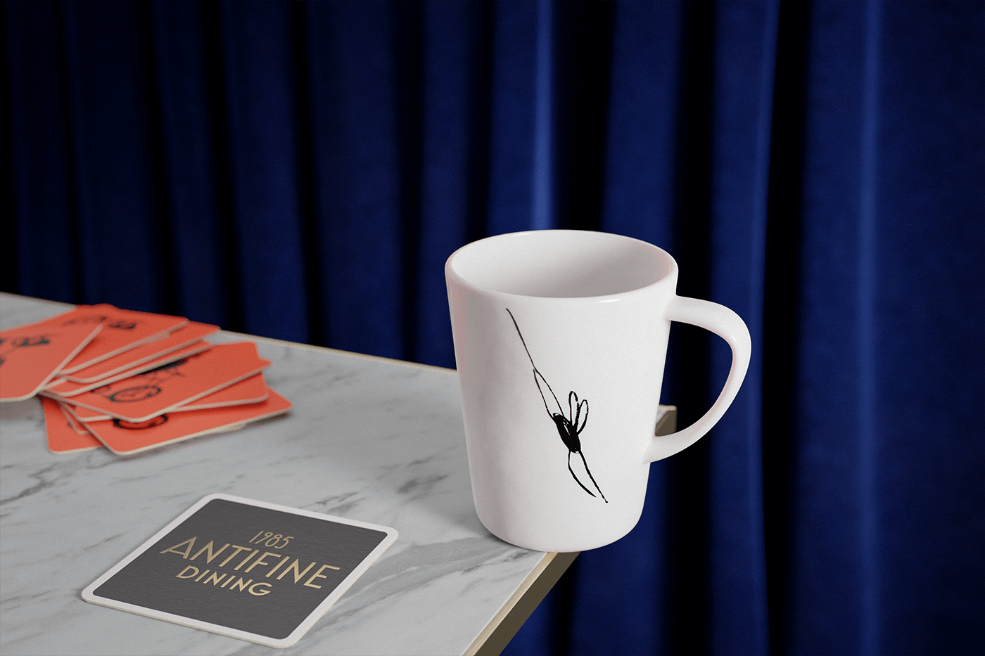
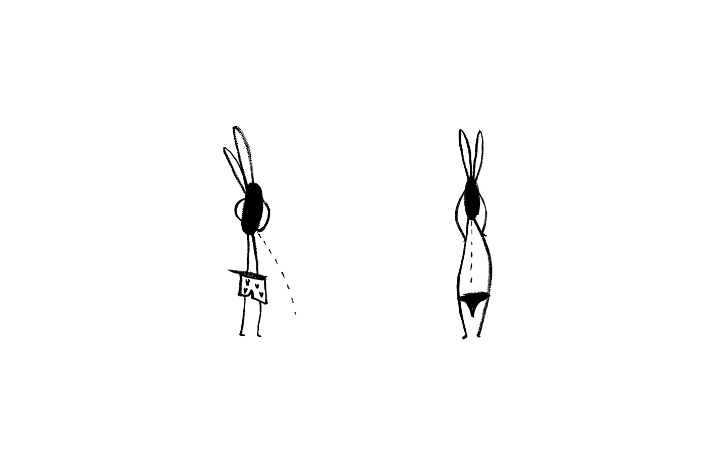
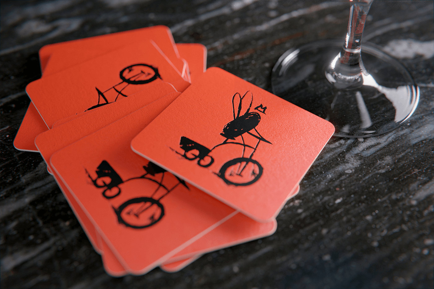
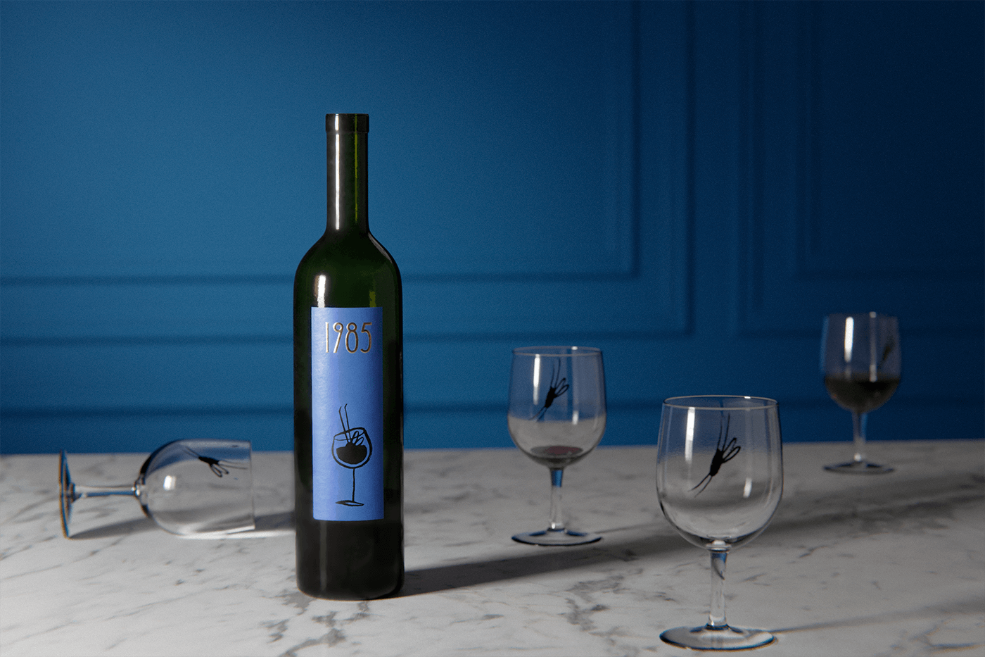
The restaurant’s brand is spearheaded by a beautifully elegant, yet typical, Art Deco typeface. But that elegance is completely disrupted by a chaotic illustration of a housefly. Yes, a housefly. The last thing you want to associate with a restaurant. Yet, it’s perfect.
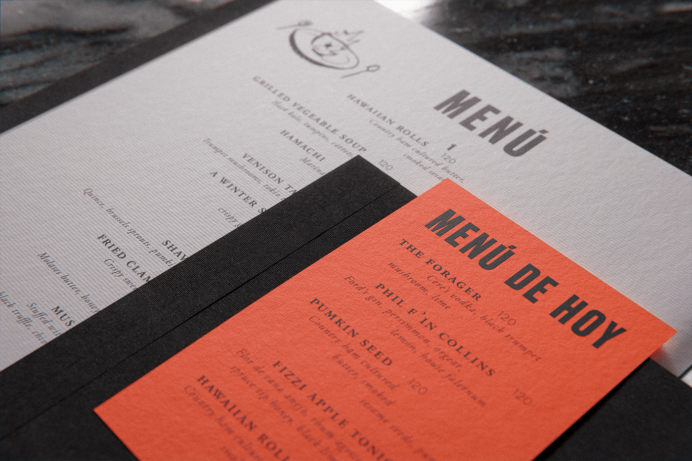
This fly takes on a full personality across the brand’s touchpoints adding some whimsical, tongue-in-cheek humor to an otherwise upscale experience.
Designed by Anagrama


