
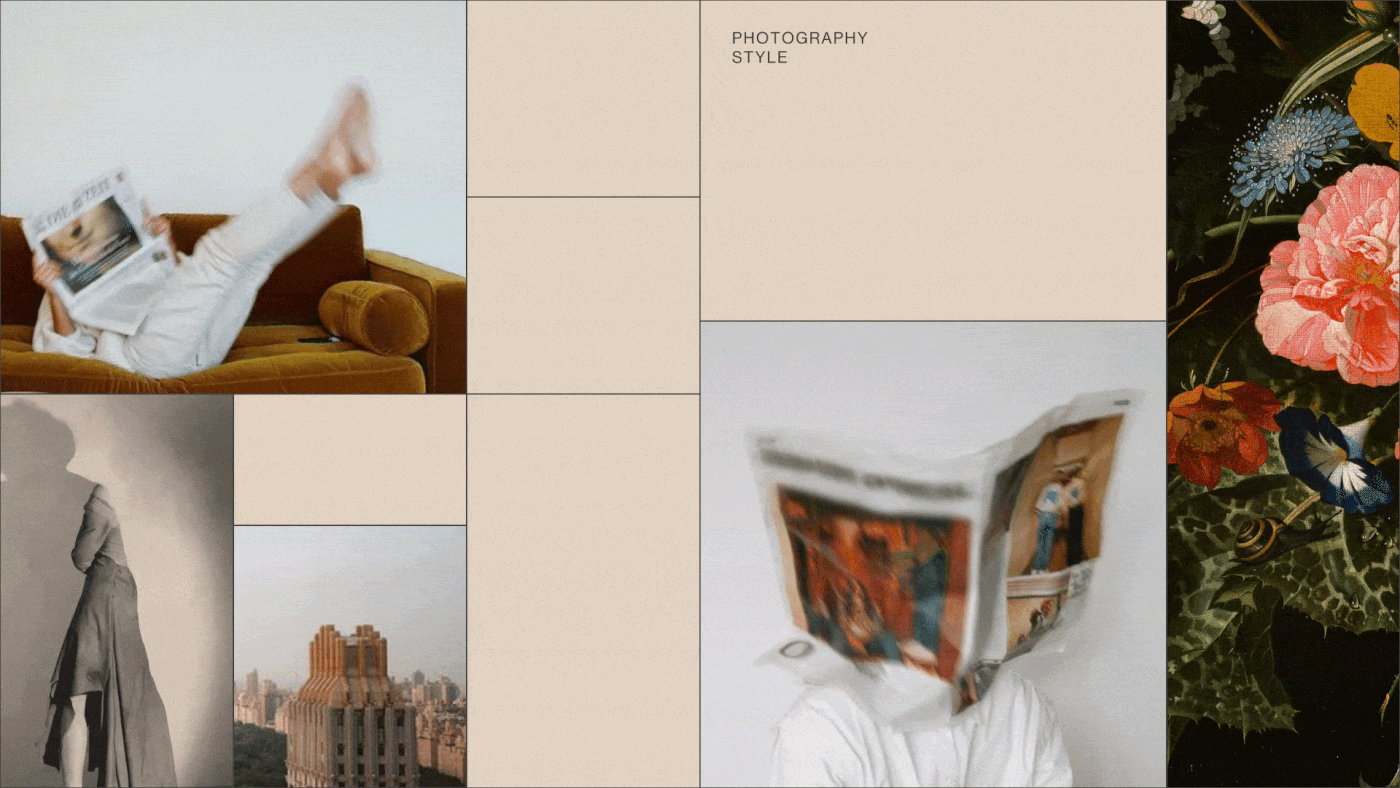
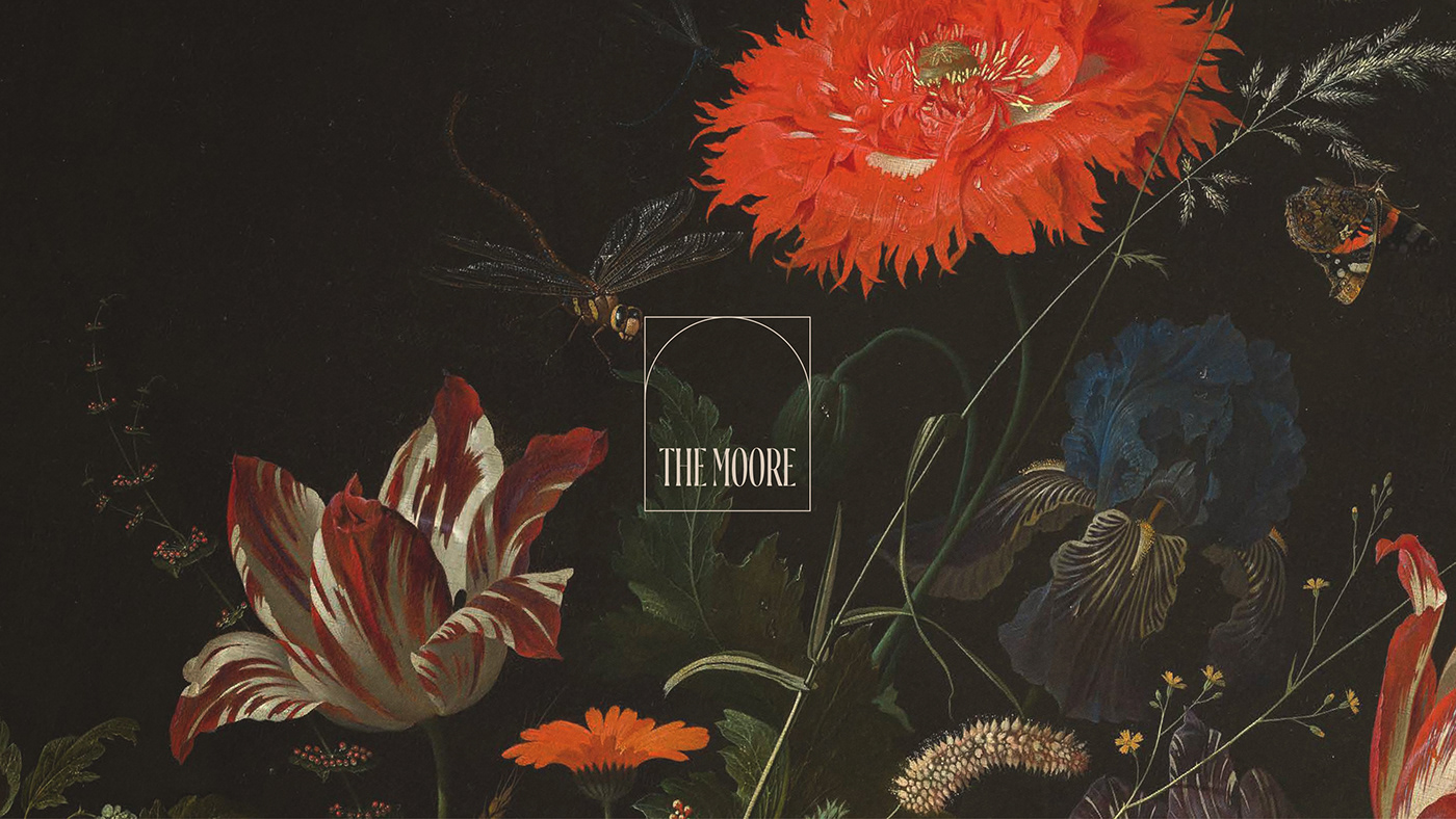
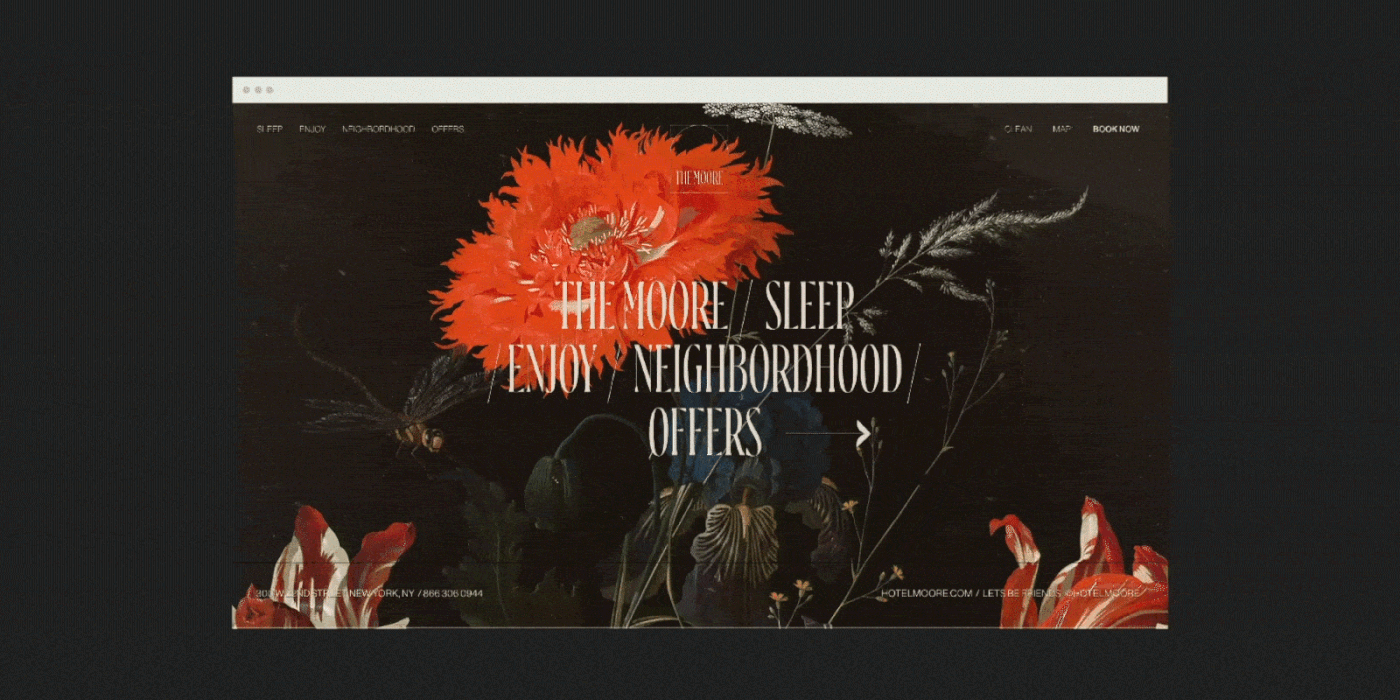
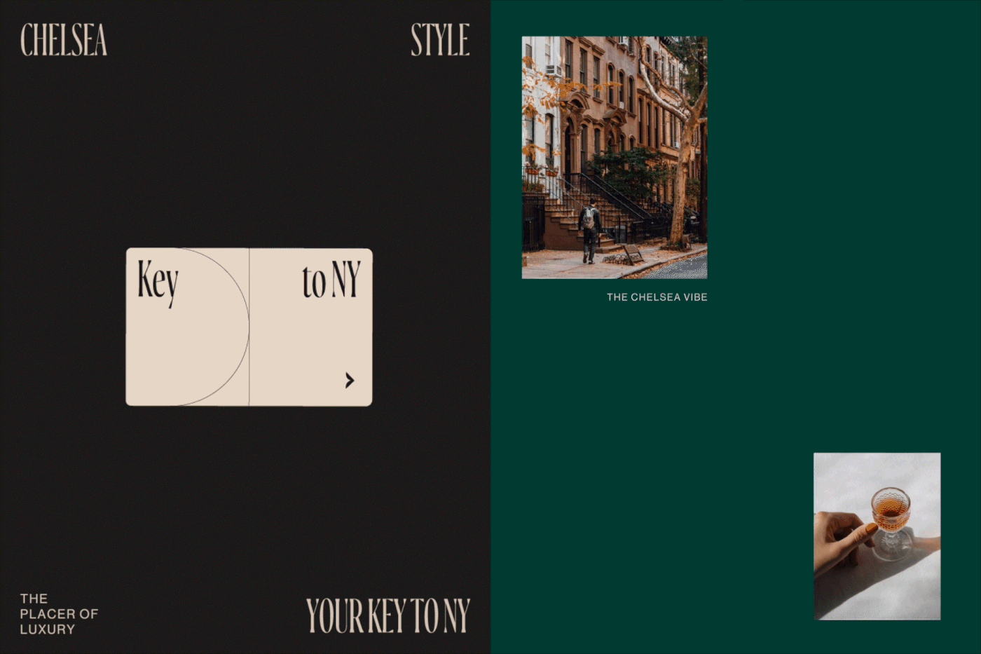
Apparently I’m in a fancy mood this week considering both posts are highly illustrative and showcase a classic, maximalist design aesthetic. This post covers the work by Bunker 3022 for The Moore Hotel in New York City’s Chelsea neighborhood.
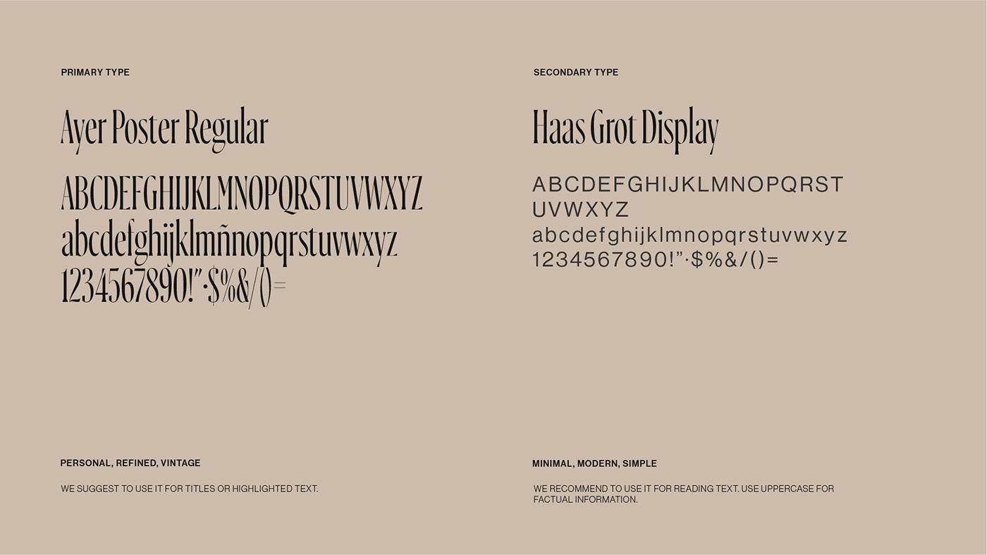
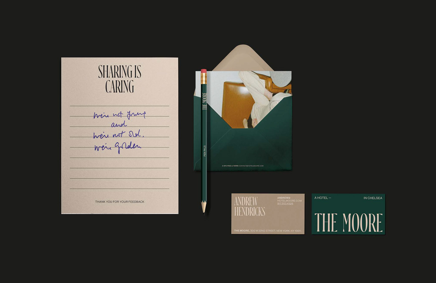
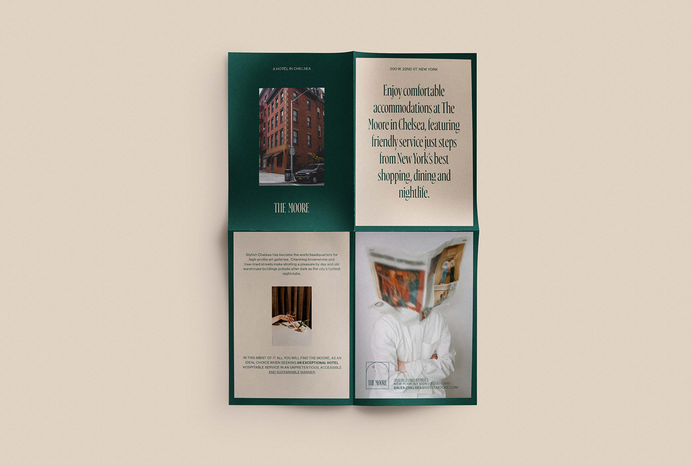
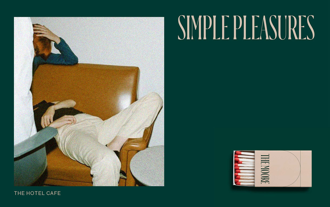
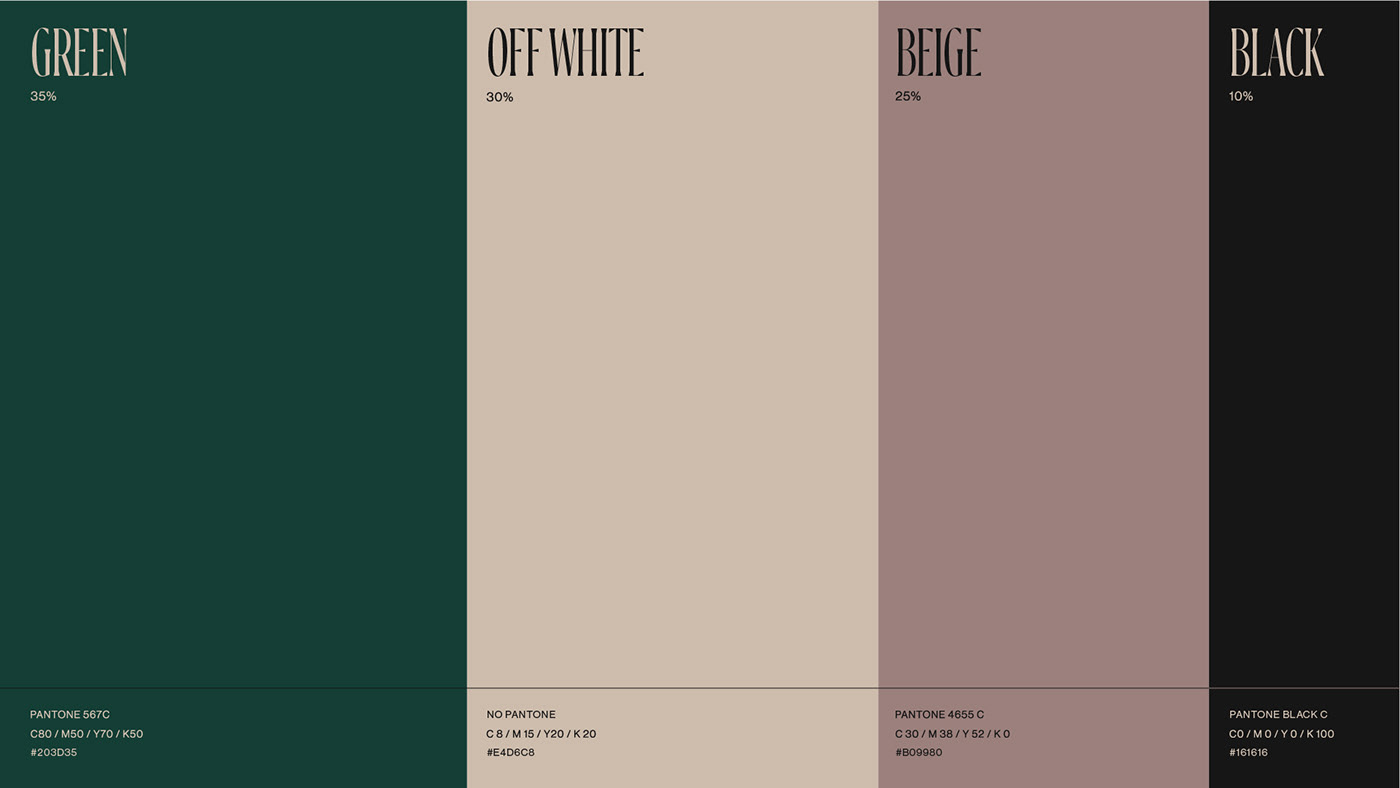
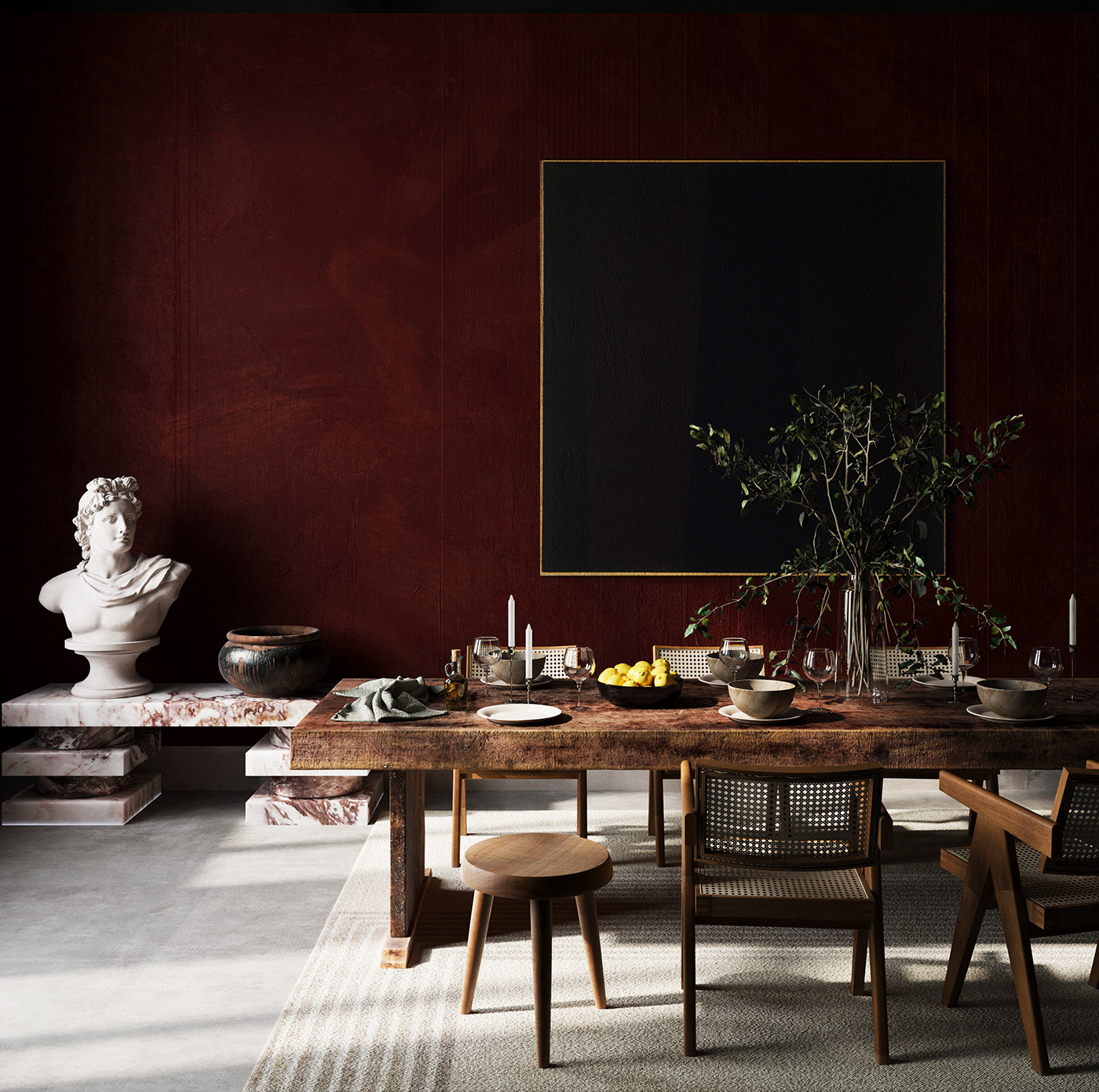
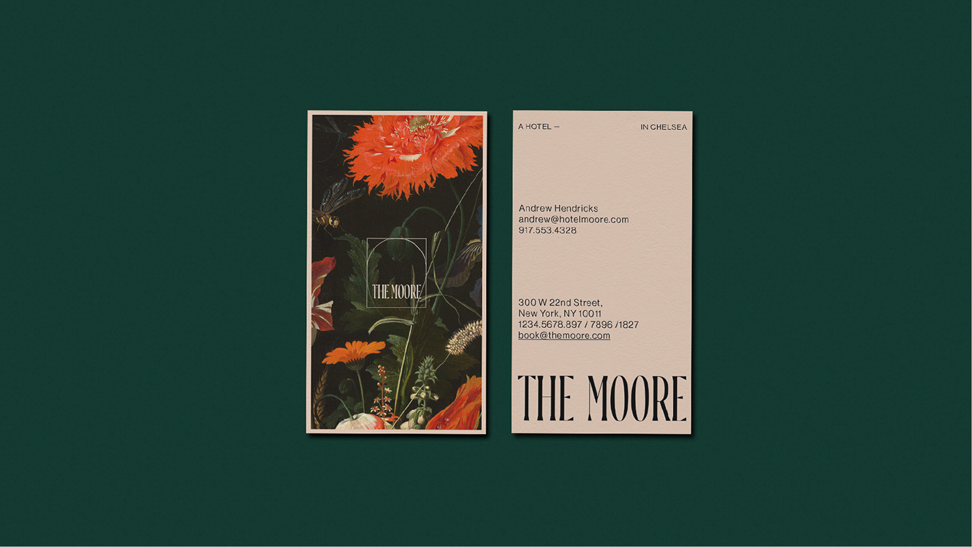
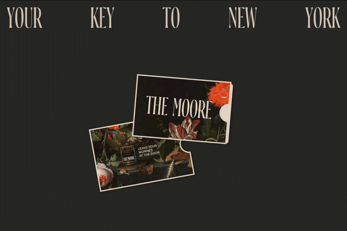
The hotel’s brand identity melds classic, rich artistry with controlled, confident typography. The result is a powerful dichotomy that enriches the eye with strong visuals supported by principled typographic application. Truly an unforgettable visual experience.
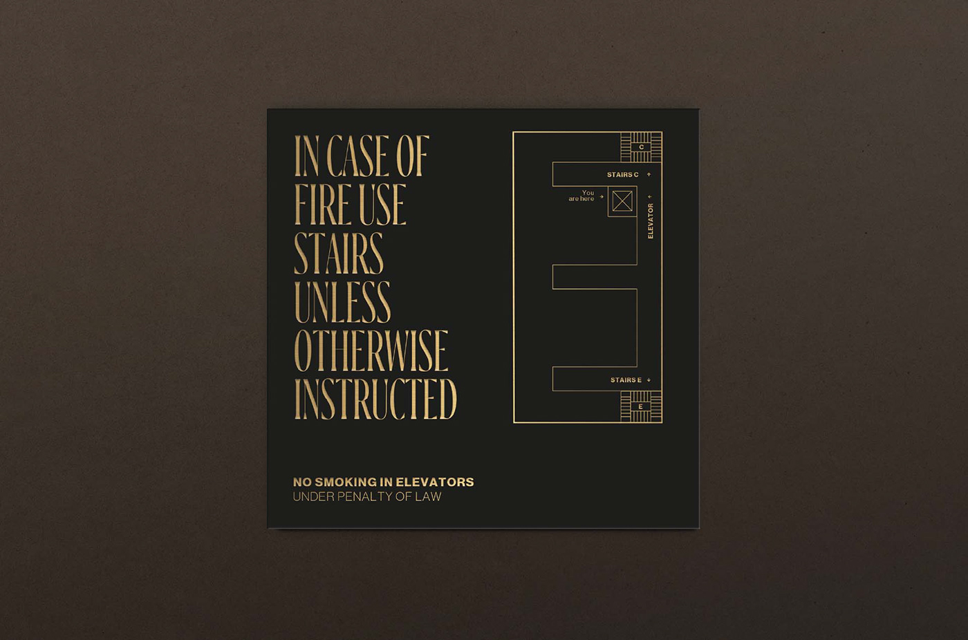
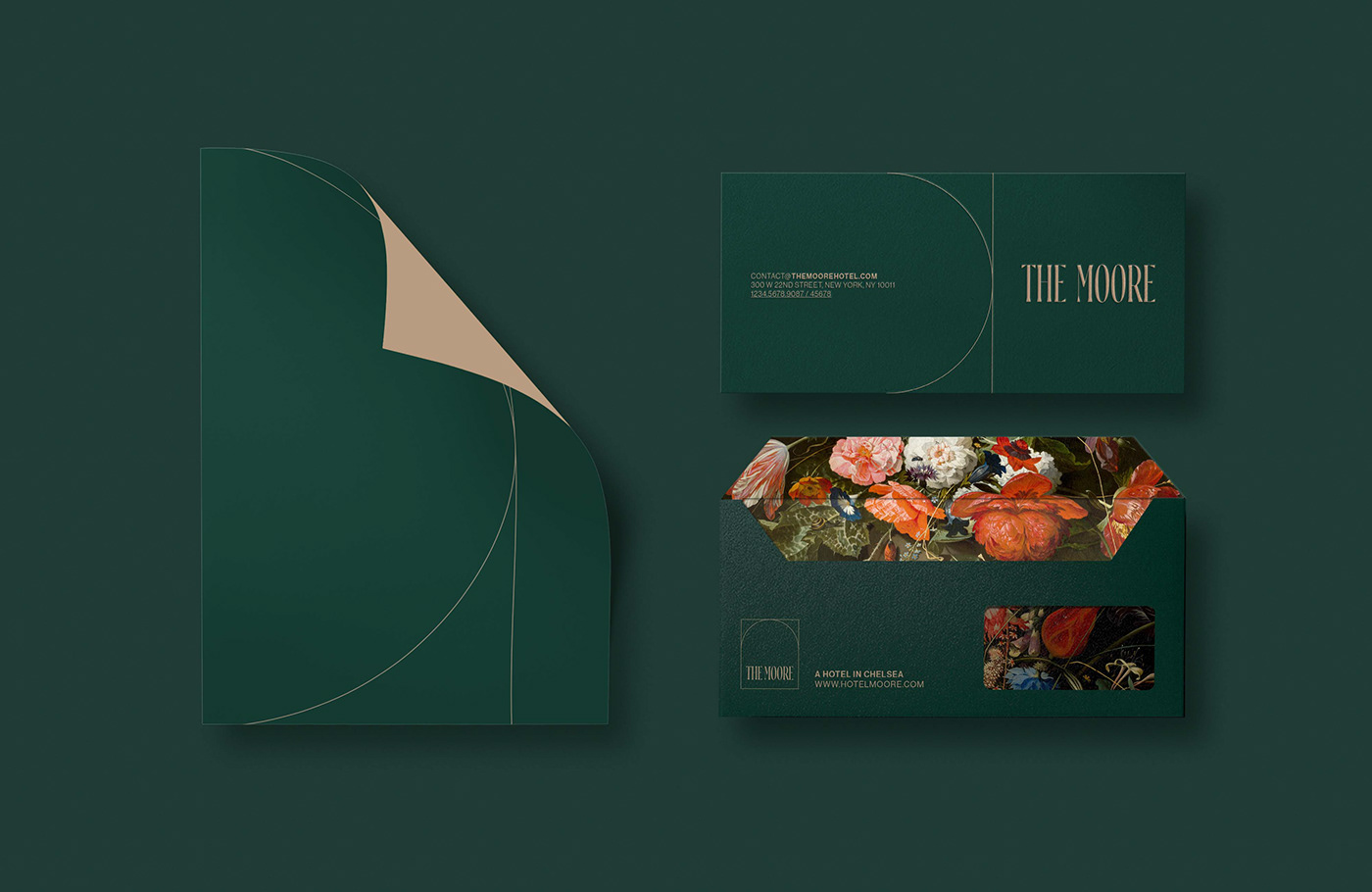
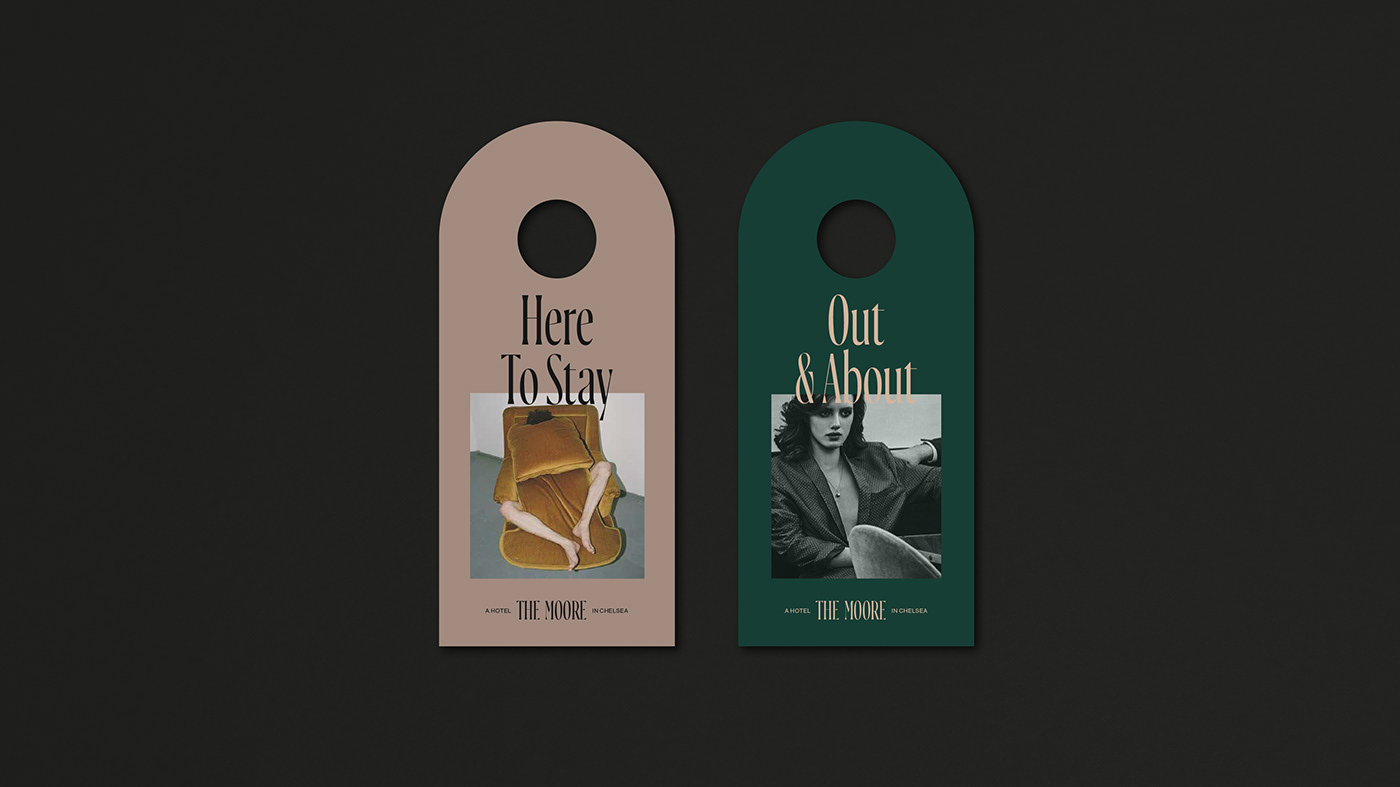
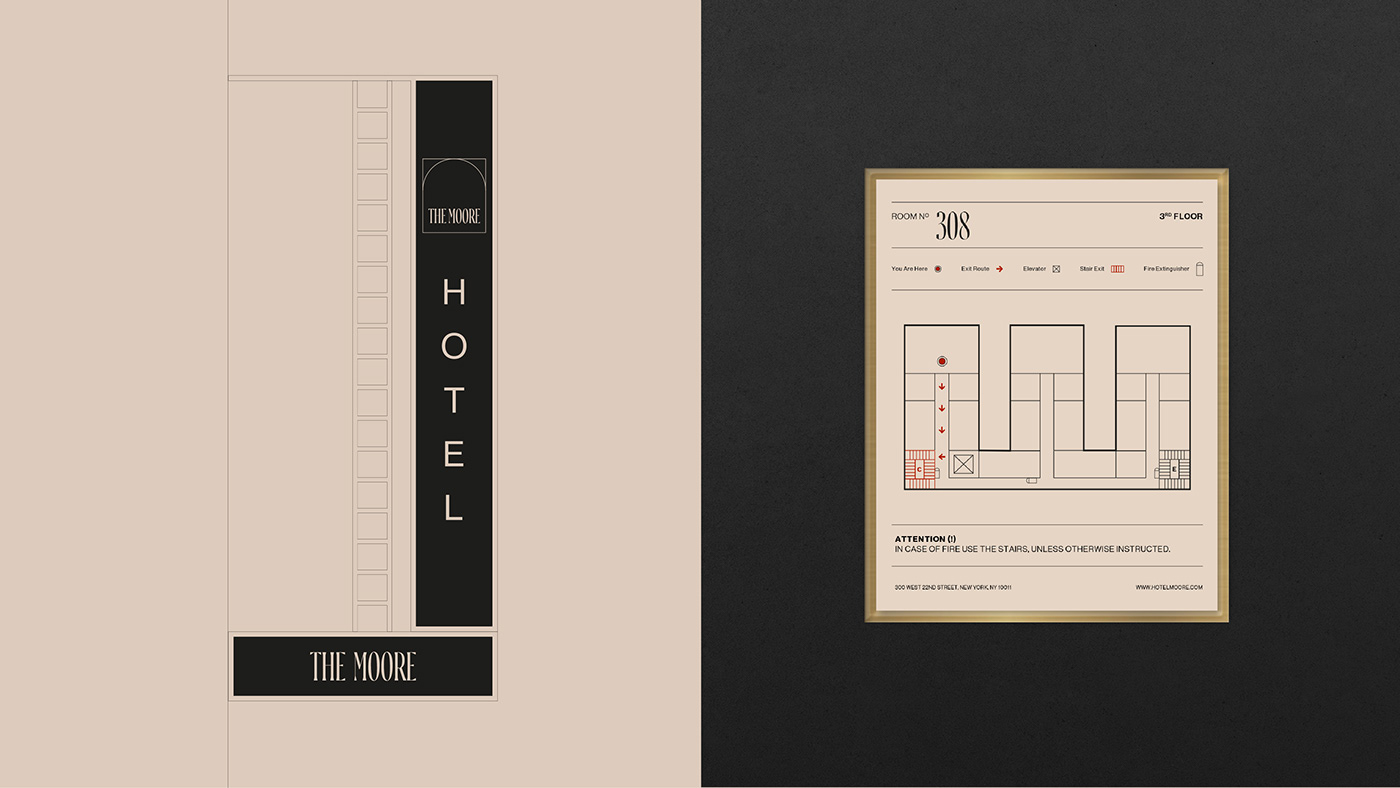
The brand experience covers the bases from wayfinding and signage design through ephemeral elements like matchbooks. Each piece is considered and expertly crafted to build believability in the brand’s tenets.
Designed by Bunker 3022


