
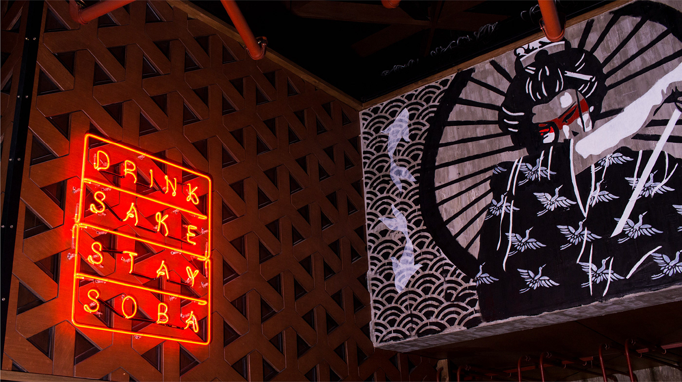
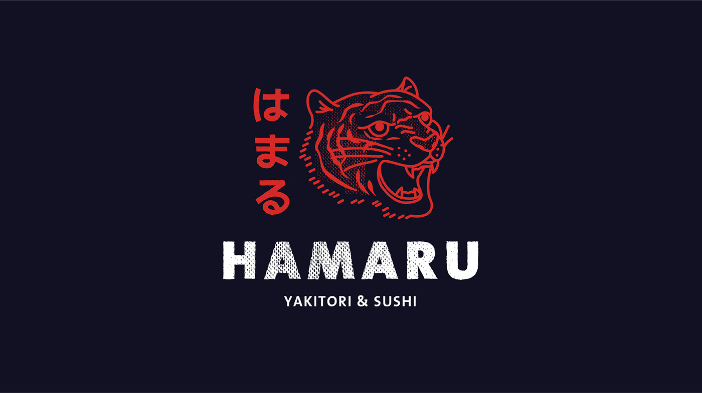
They had me at “drink sake. stay soba.” The team at Cocomilk Studio obviously had a lot of fun crafting this identity for Hamaru Sushi.
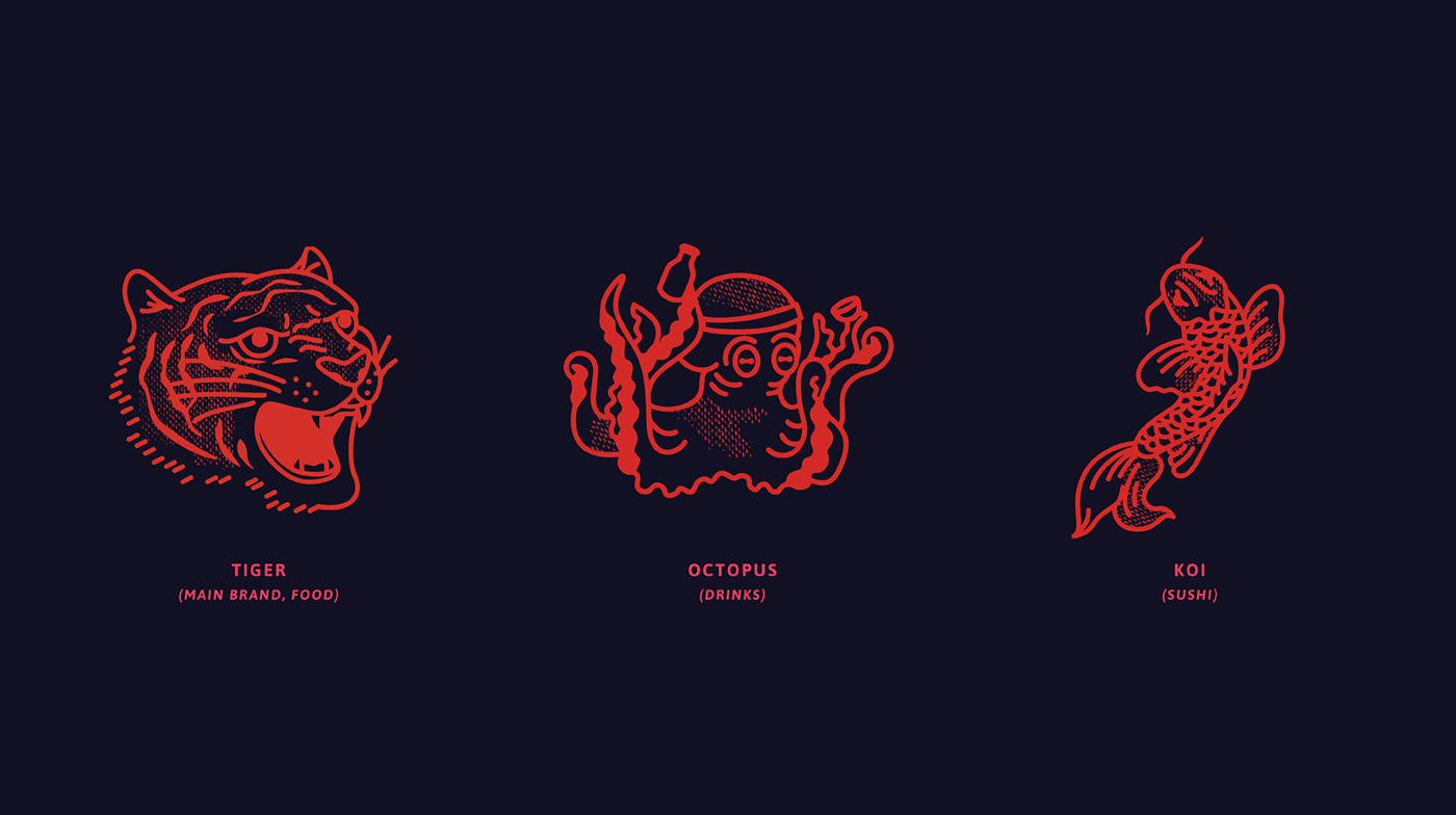
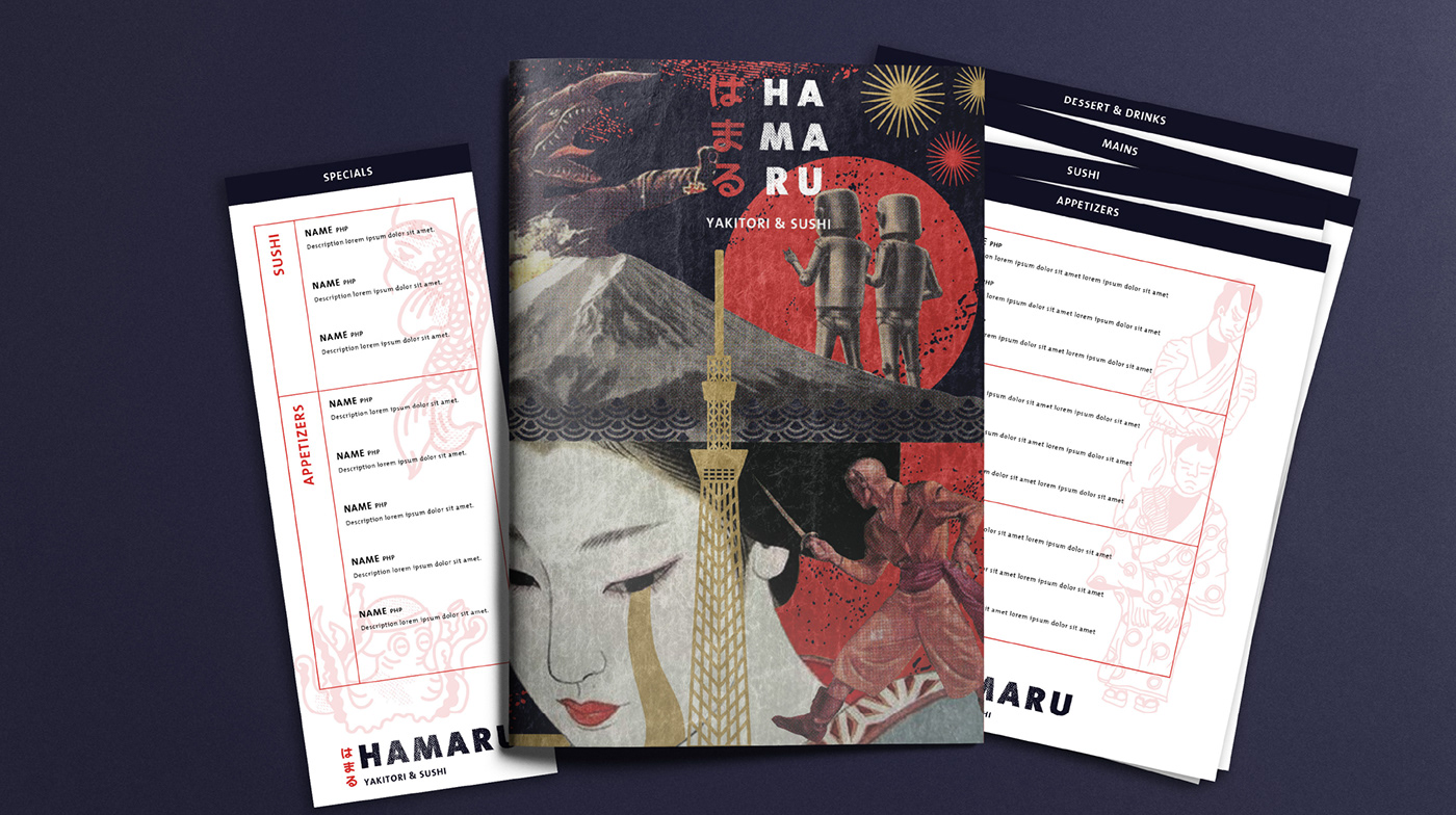
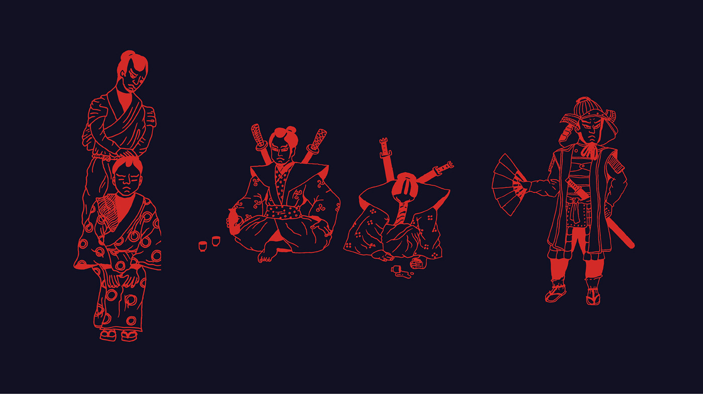
From the retro-style line art animals to the gritty, collage-drivne art fro the menus, the identity explores the melding of today’s cultures in Japan.
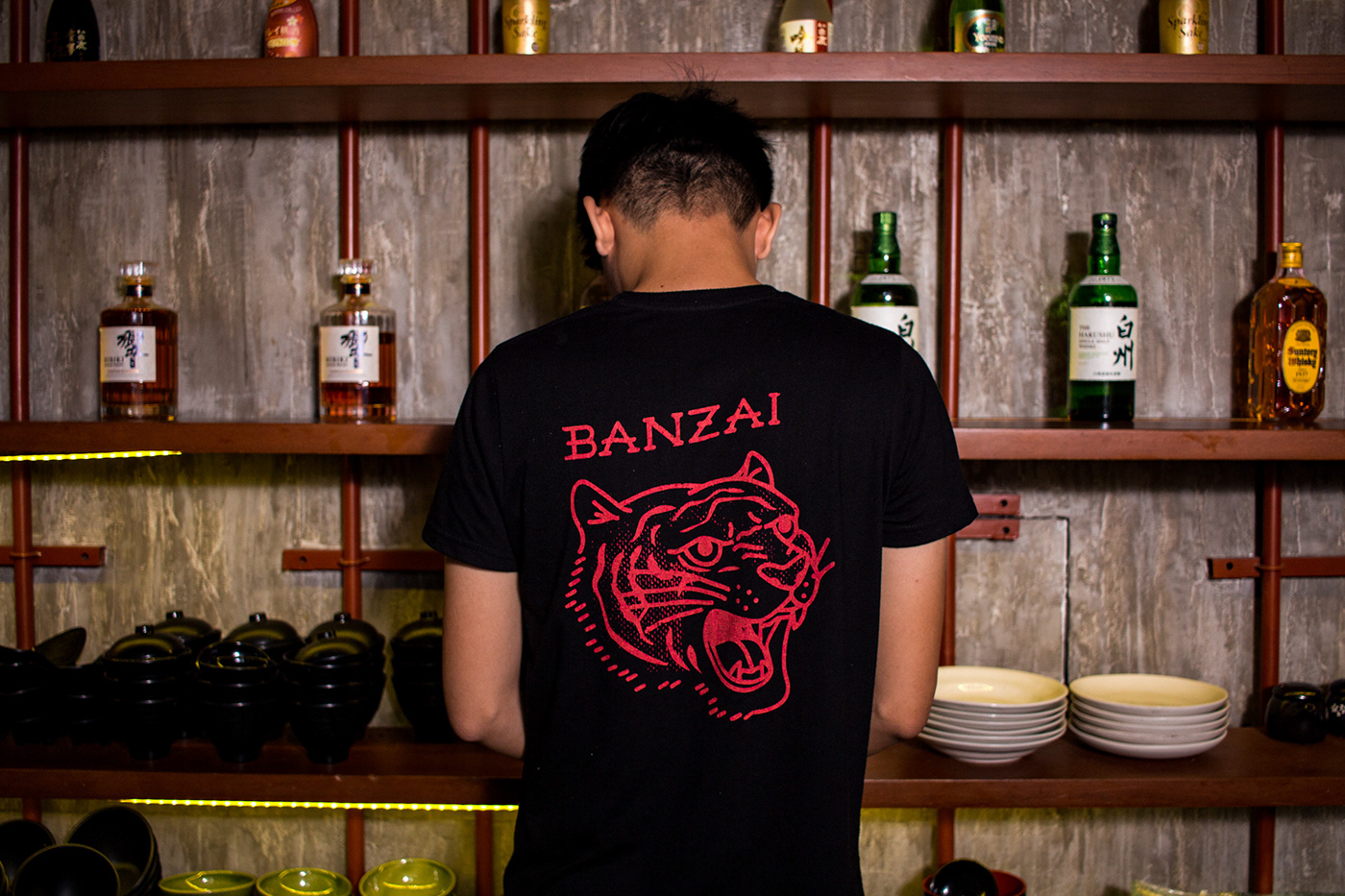
The color palette is moody and bold supported with a deep violet and popping with a vibrant red. Textures give a gritty, raw vibe to the brand while the illustrations are left to add personality.
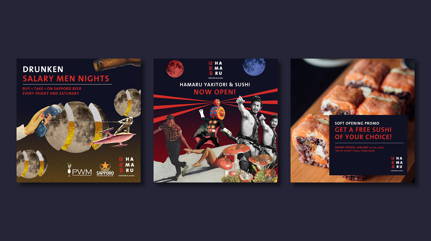
My only gripe is the marketing posters. The typography falls short of the core brand’s personality and could use a bit more thought. The collages are spot on though.
Designed by Cocomilk Studio


