
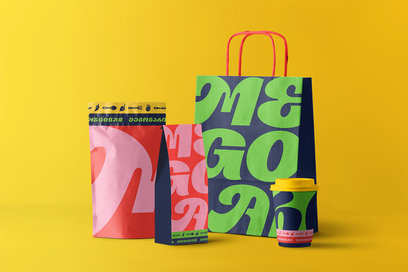
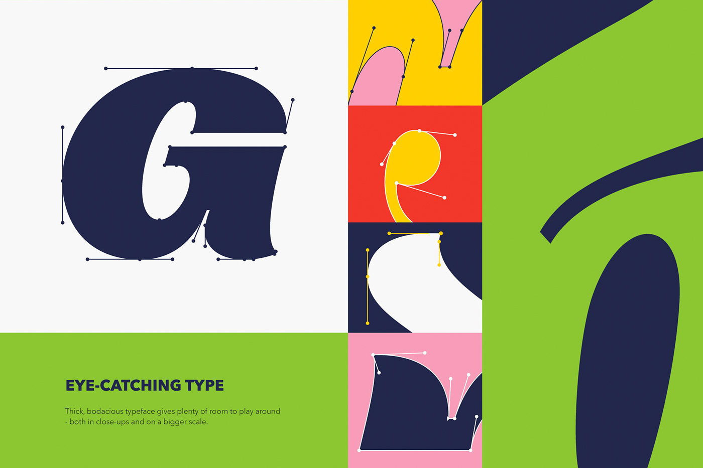
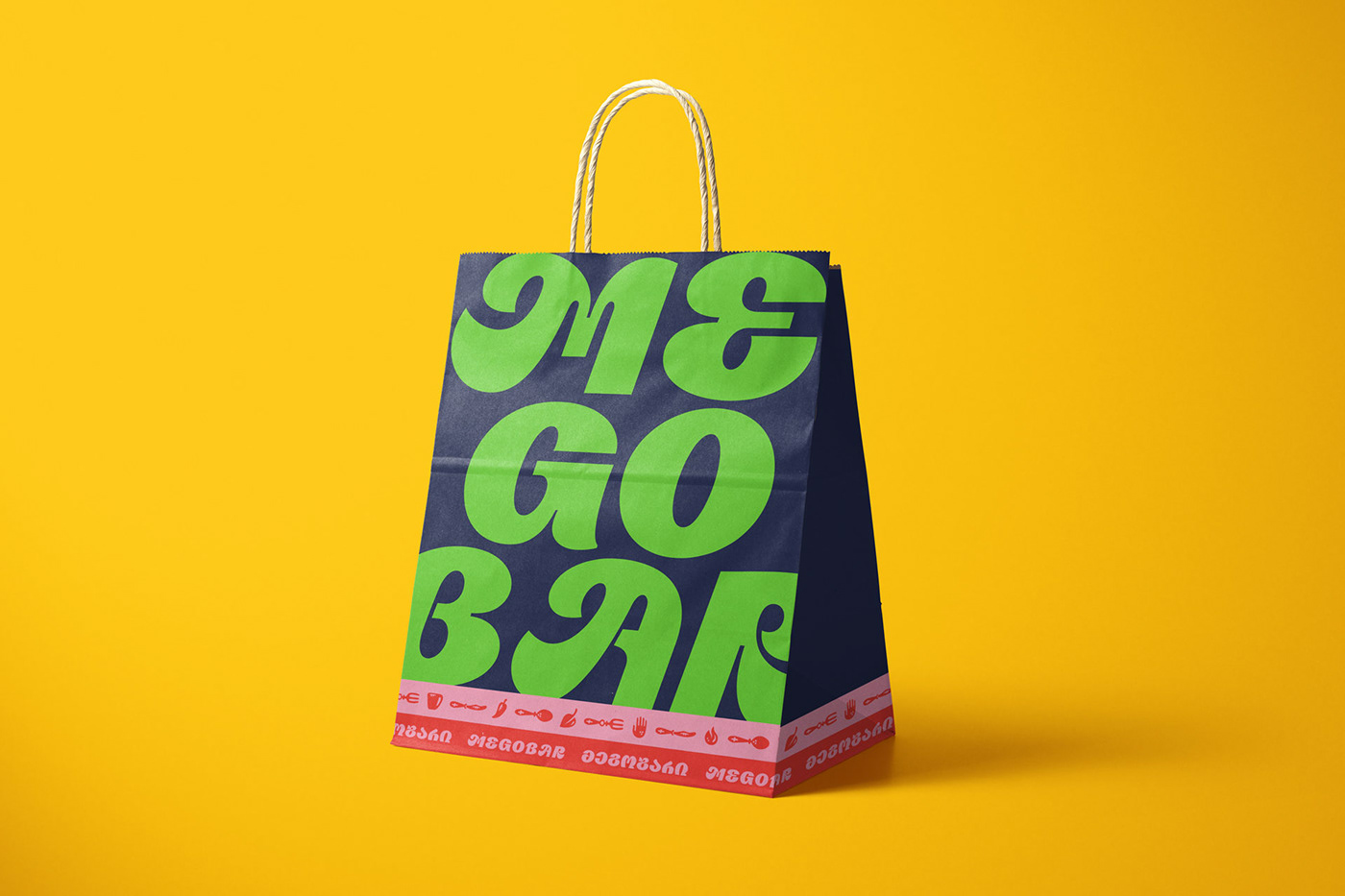
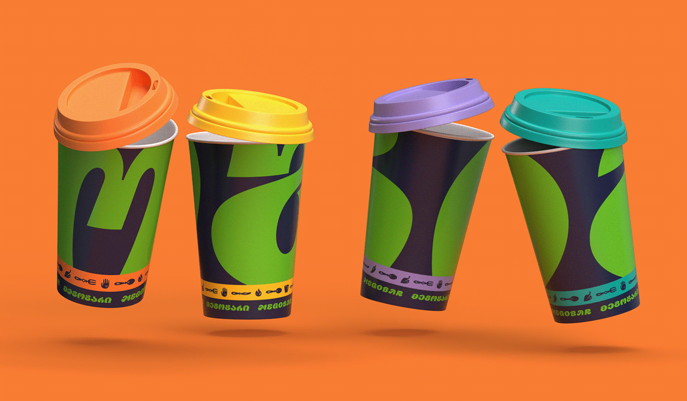
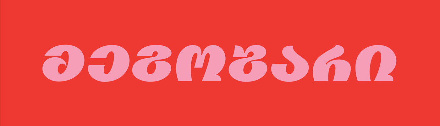
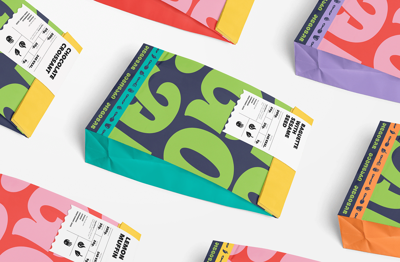
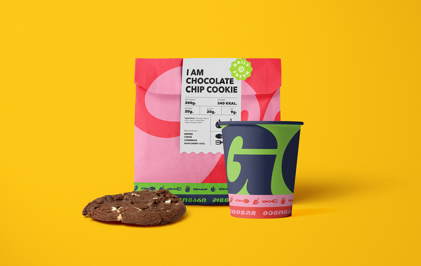
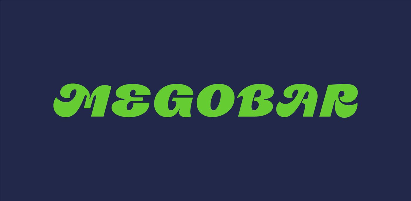
I’m drooling over the chunky typography for this restaurant’s brand identity. It’s thick and flowing with an upbeat vibe about it. No wonder it takes the center stage for the full suite of brand touchpoints!
Megobar is a chain of restaurants focused on bringing Georgian cuisine to the world. The word itself means “a friend” and seeks to evoke the sentiment felt while sharing food with friends and family.
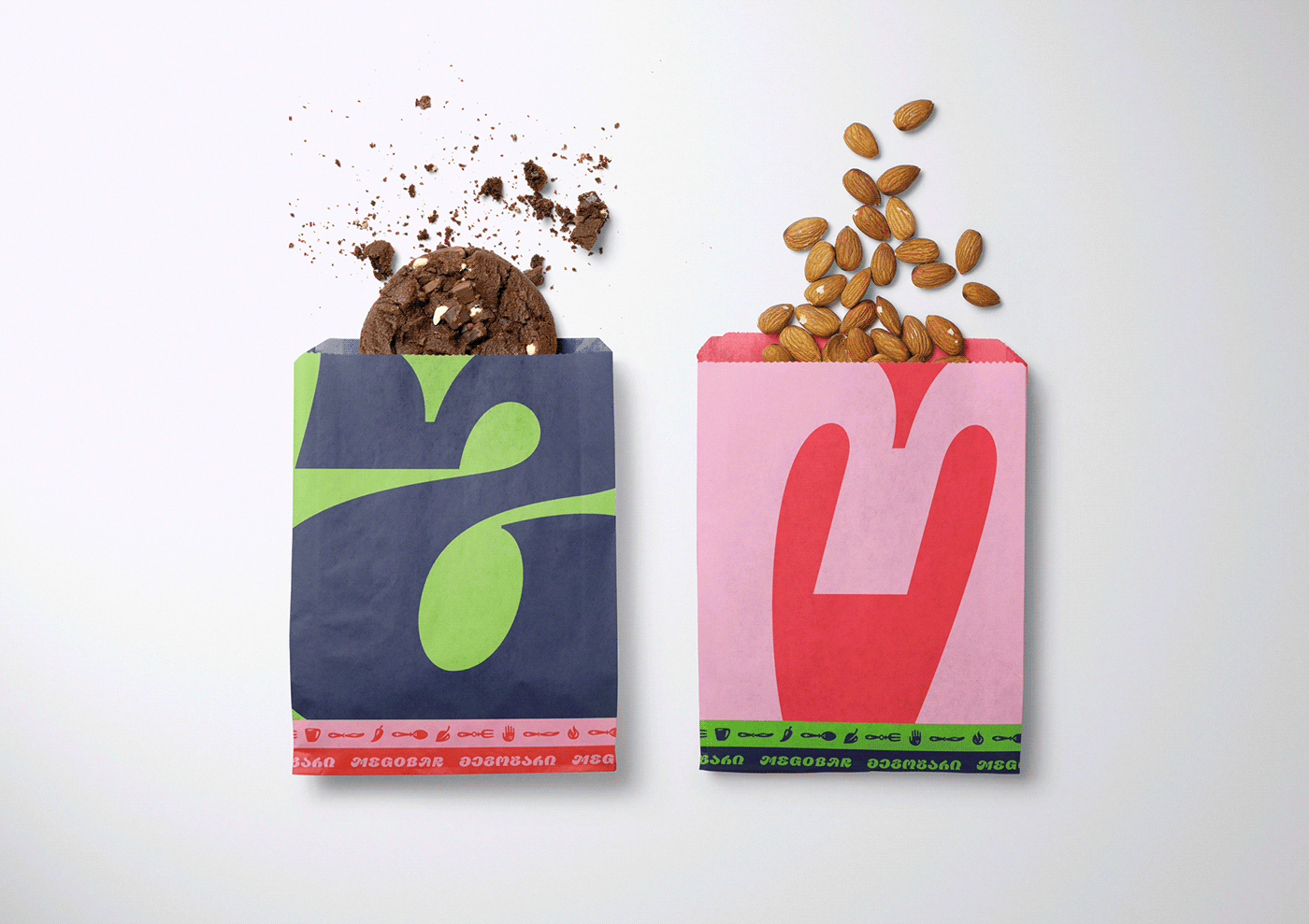
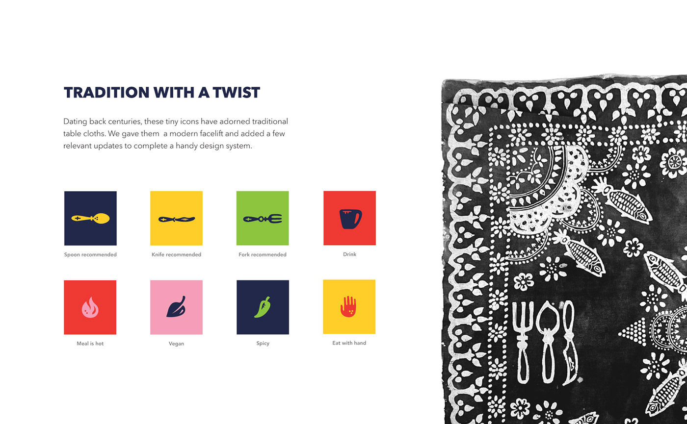
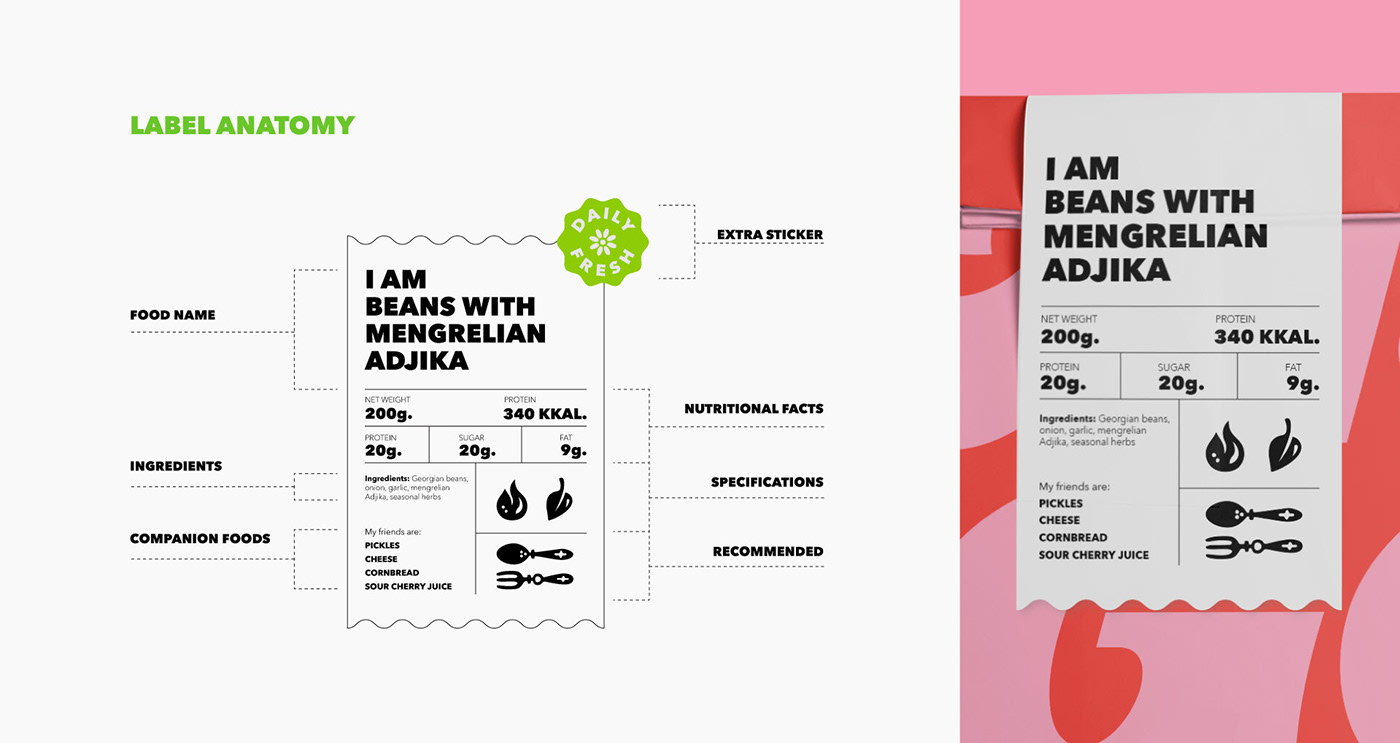
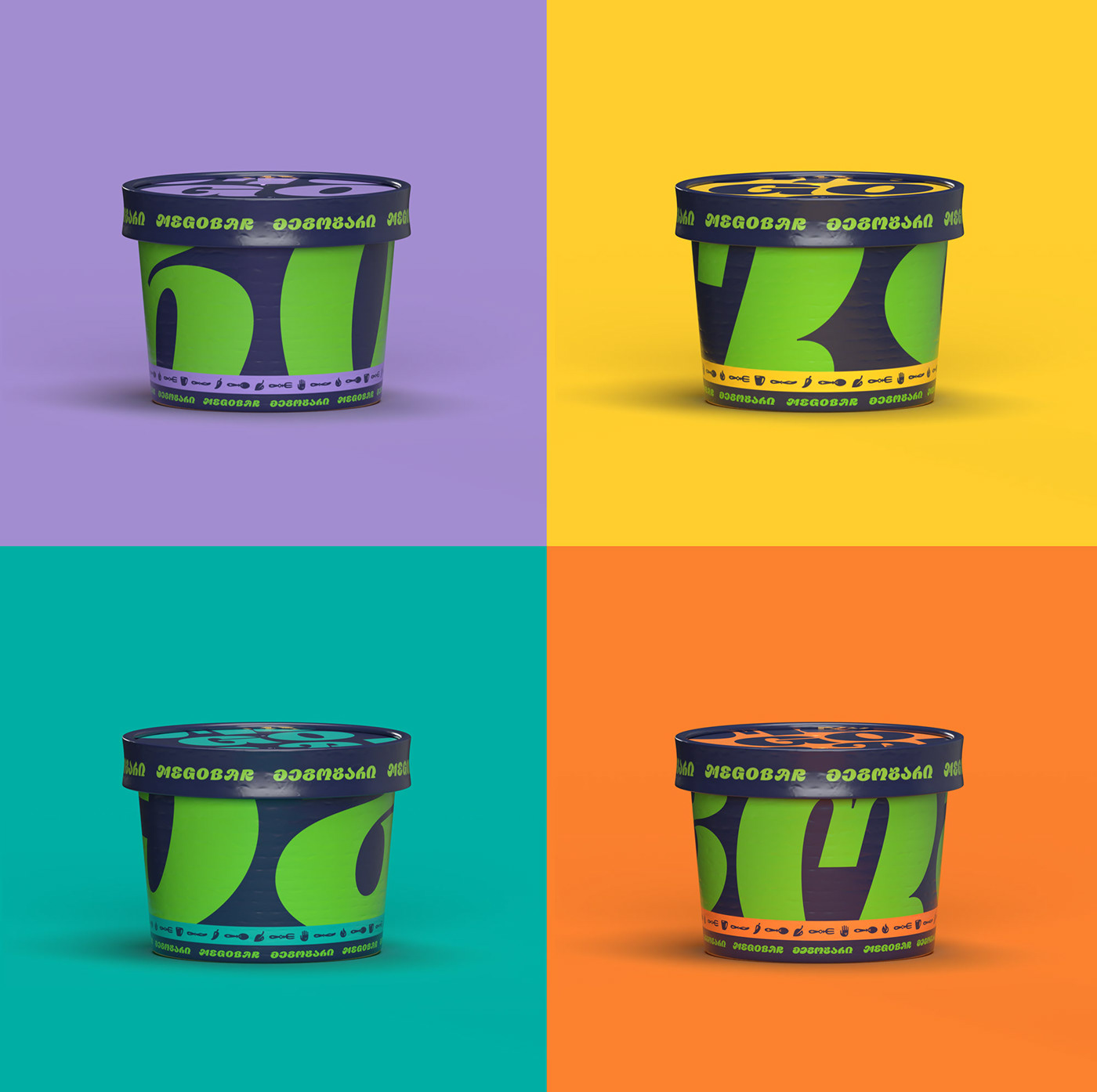
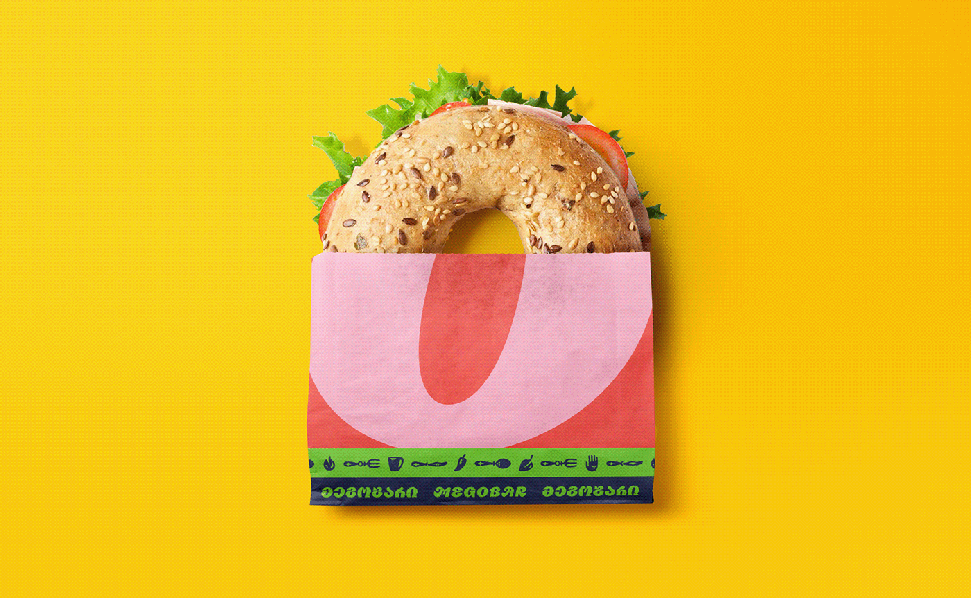
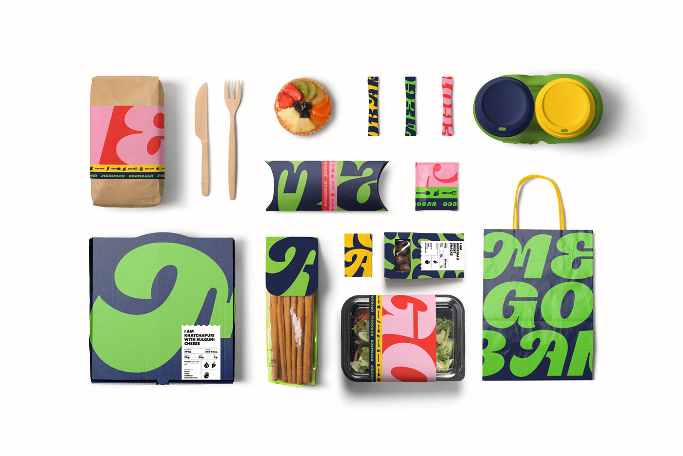
Bright, vibrant colors help push this identity into a more electric and eye-catching status. Mixed with the type, it creates a beautiful composition. The design team springs from this basis to add in amazingly witty compositions like the bagel/cookie sleeves.
Overall, a truly remarkable brand identity design by the team from Tbilisi, Georgia!
Designed by Holy Motors


