
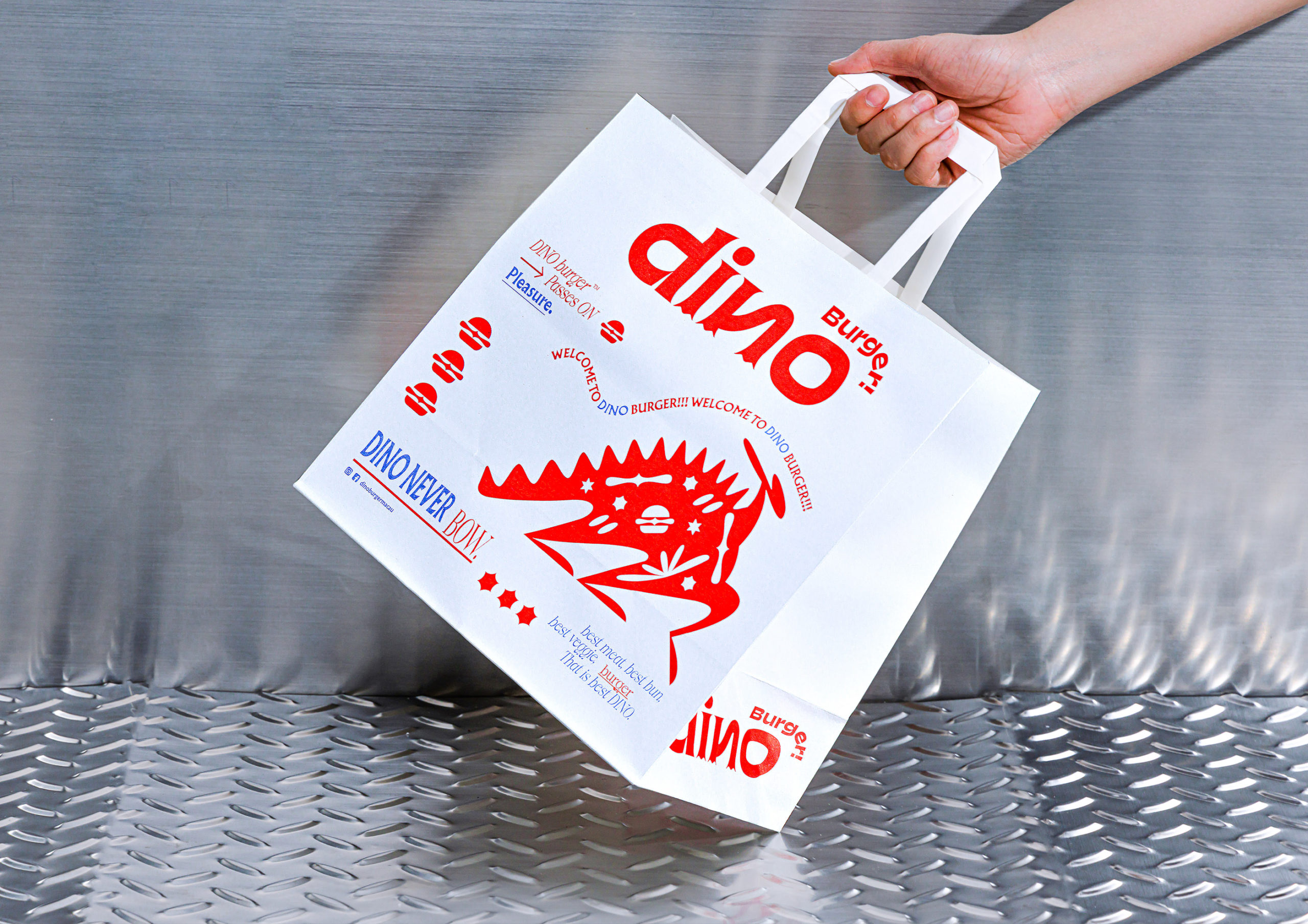
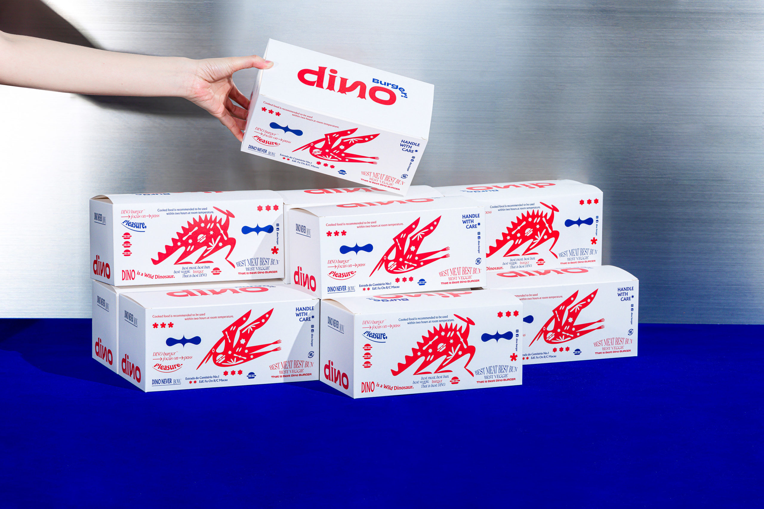
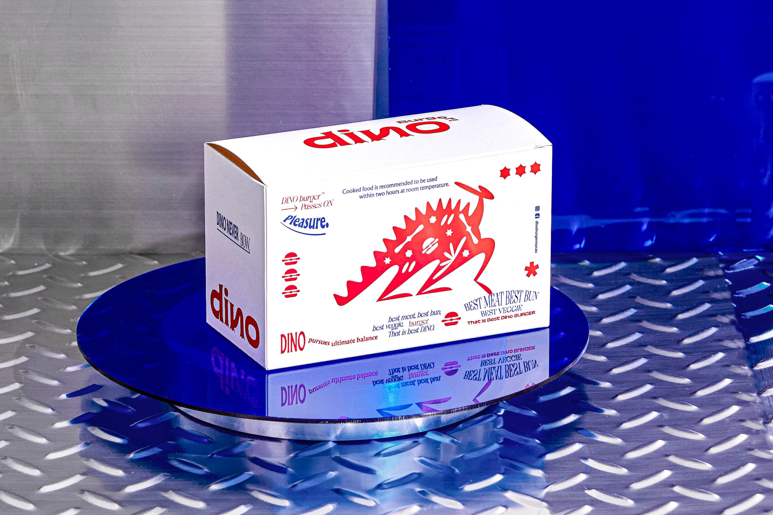
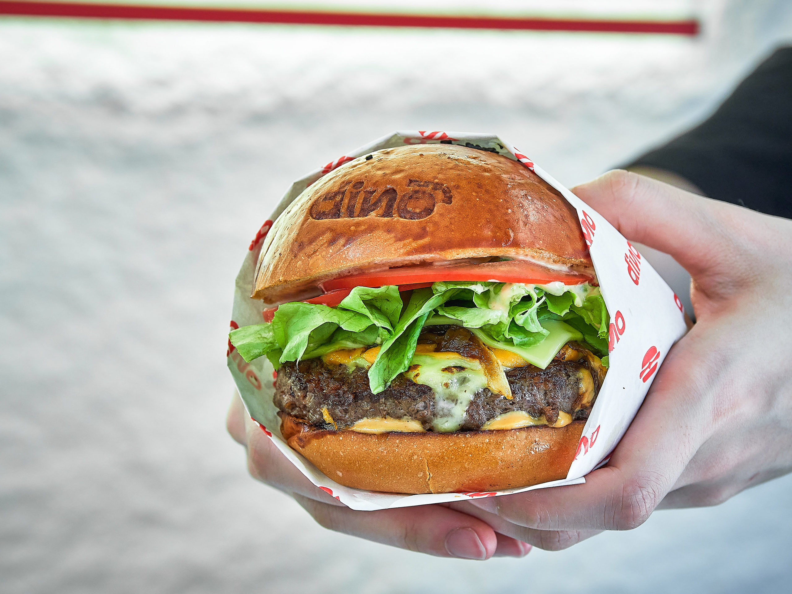
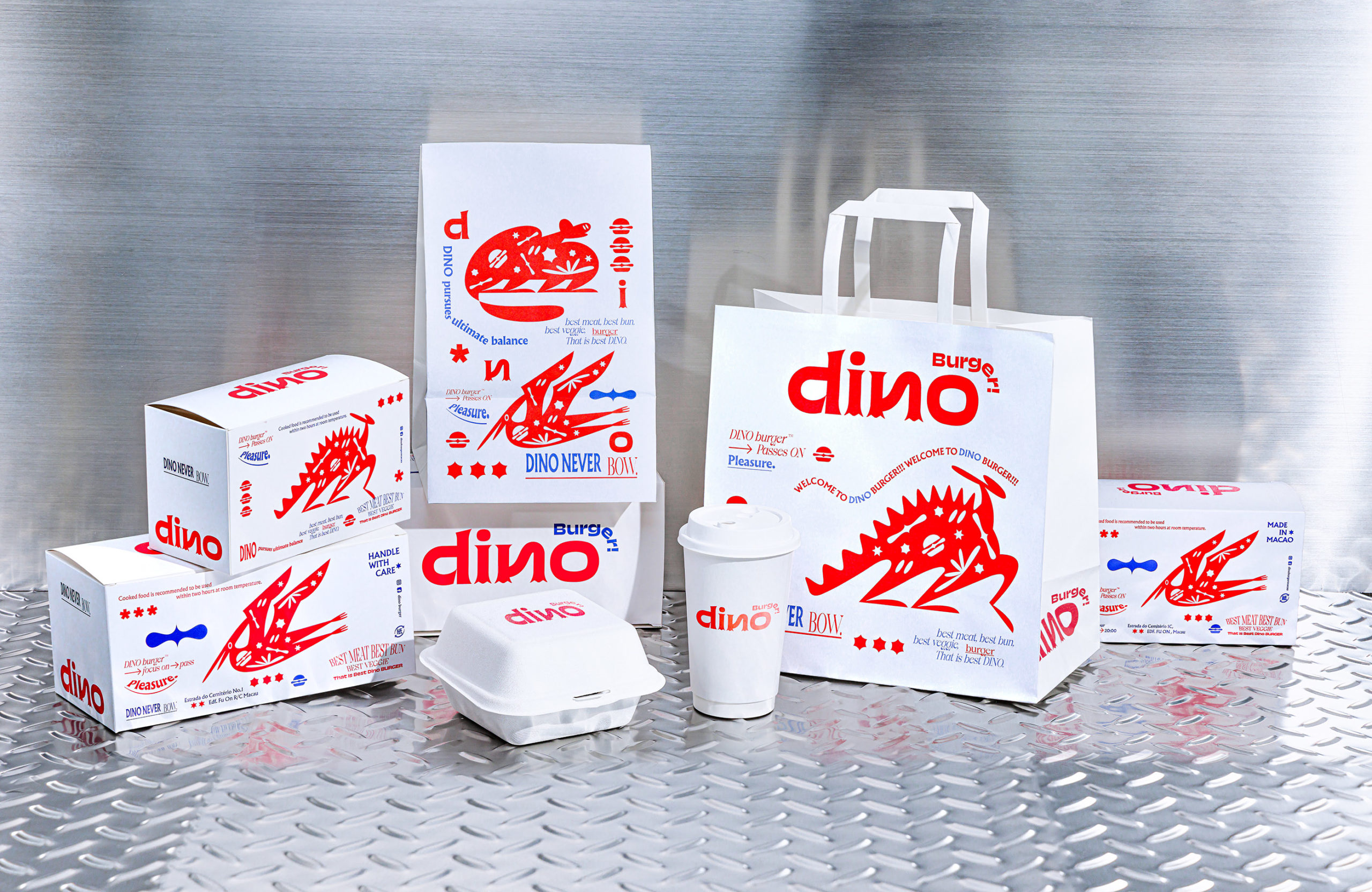
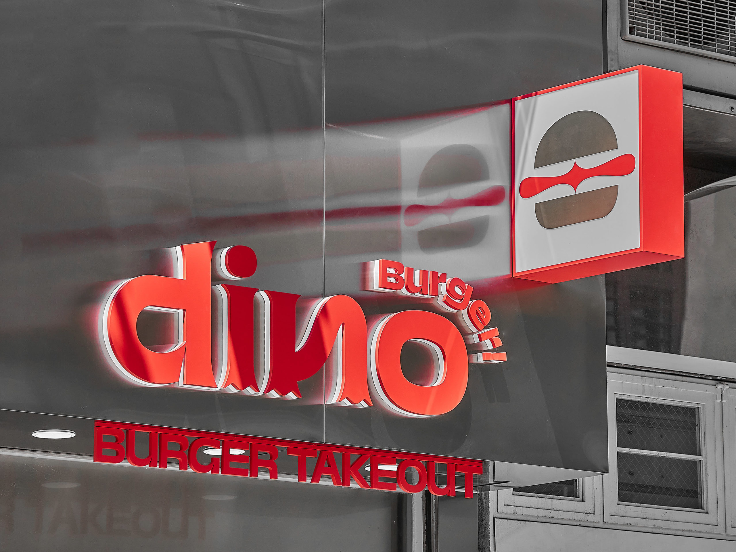
Burger brands were on fire a few years ago and for good reason. Who doesn’t love a delicious, juicy burger? Well, to go with the love of the burger, there is love for this visual identity system created for Dino Burger in Macau.
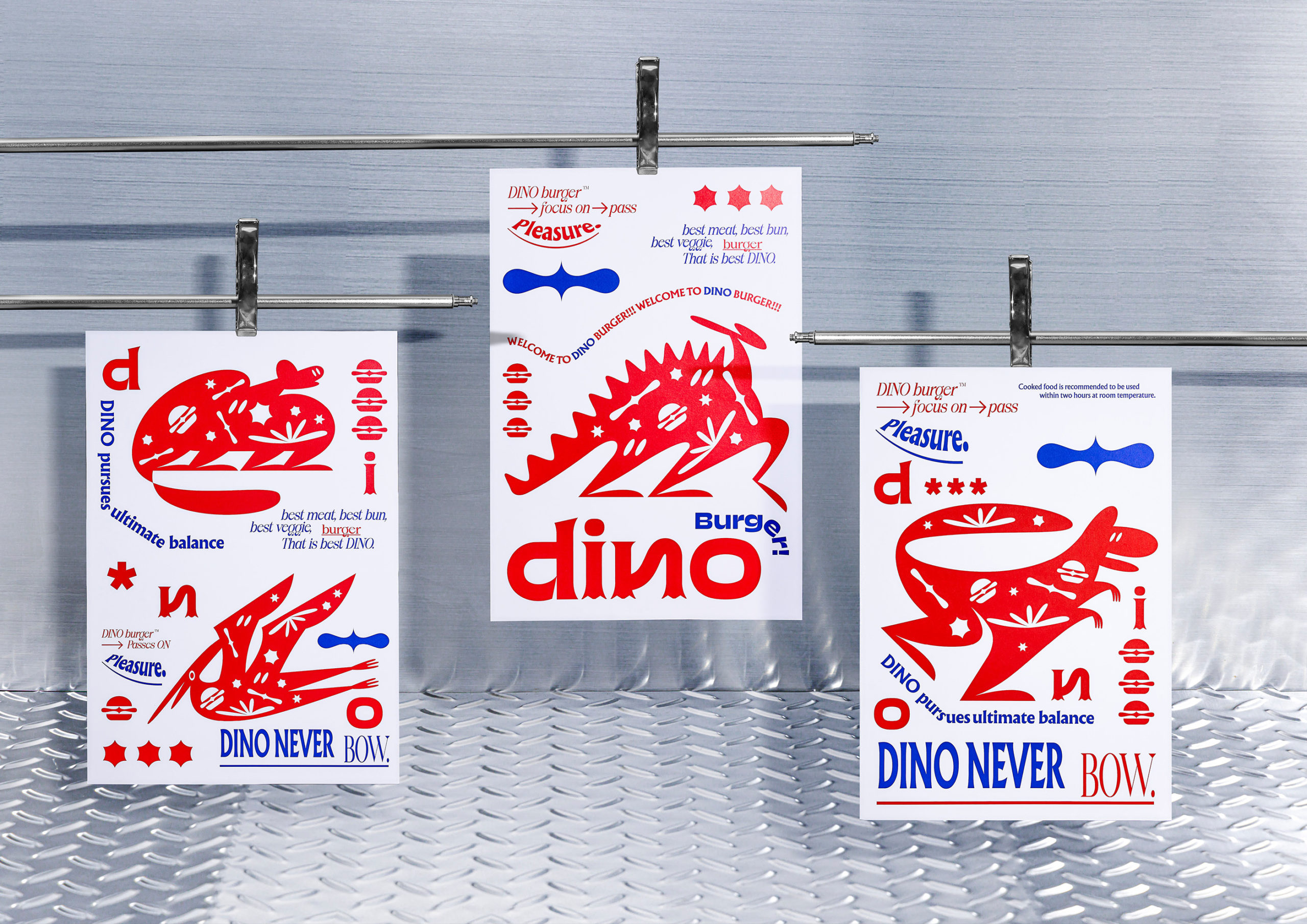
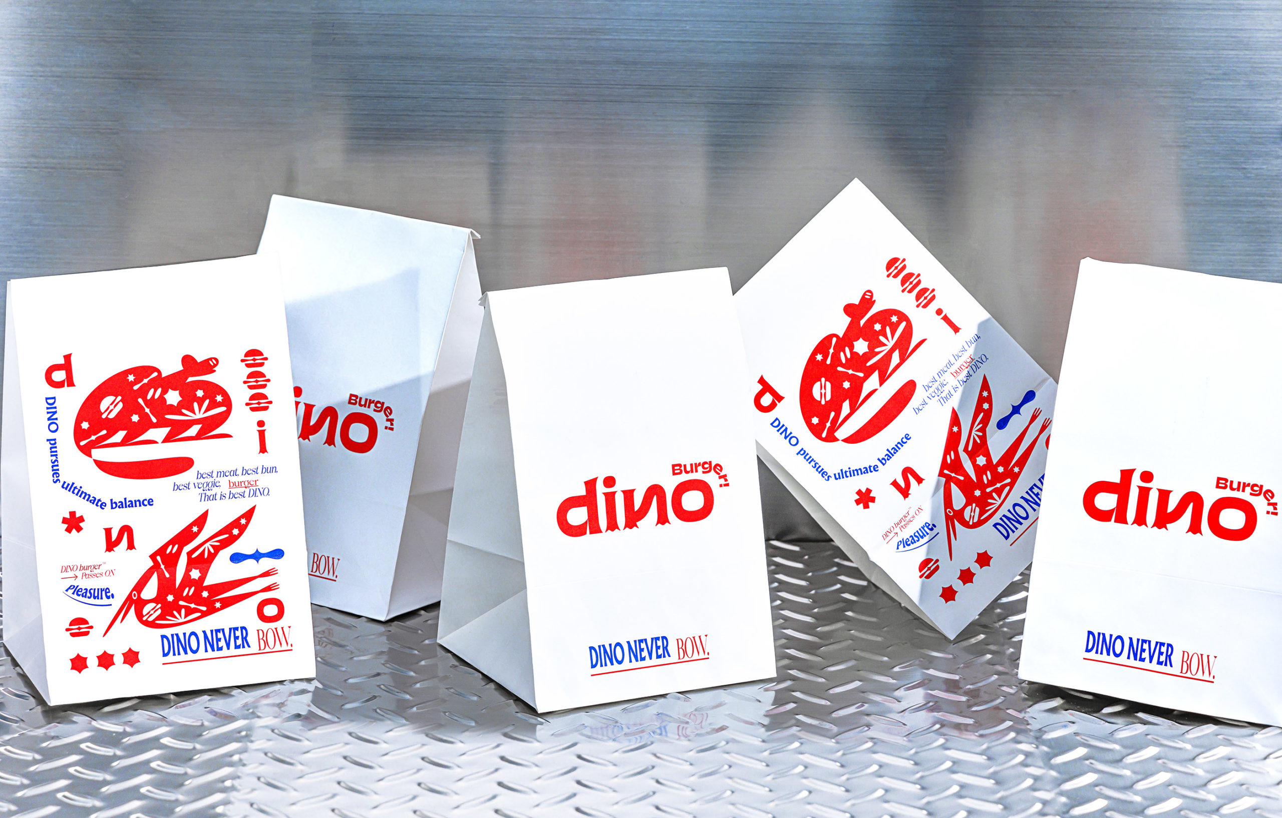
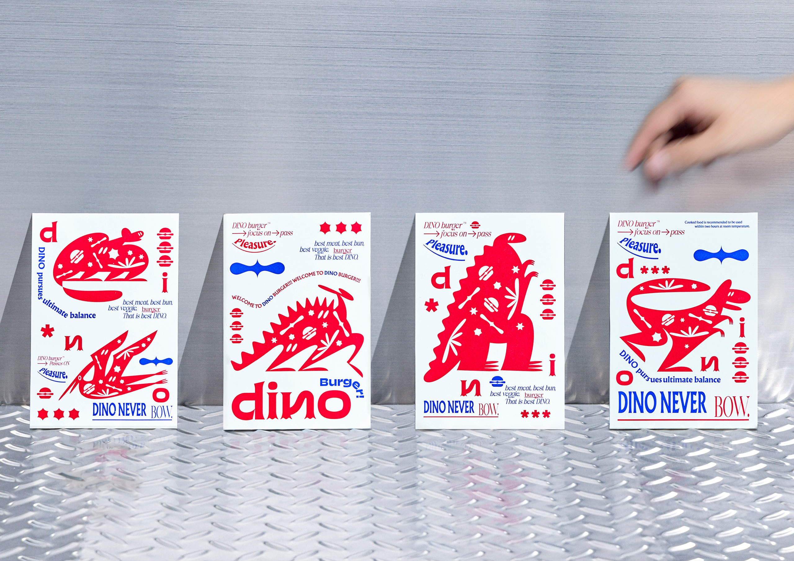
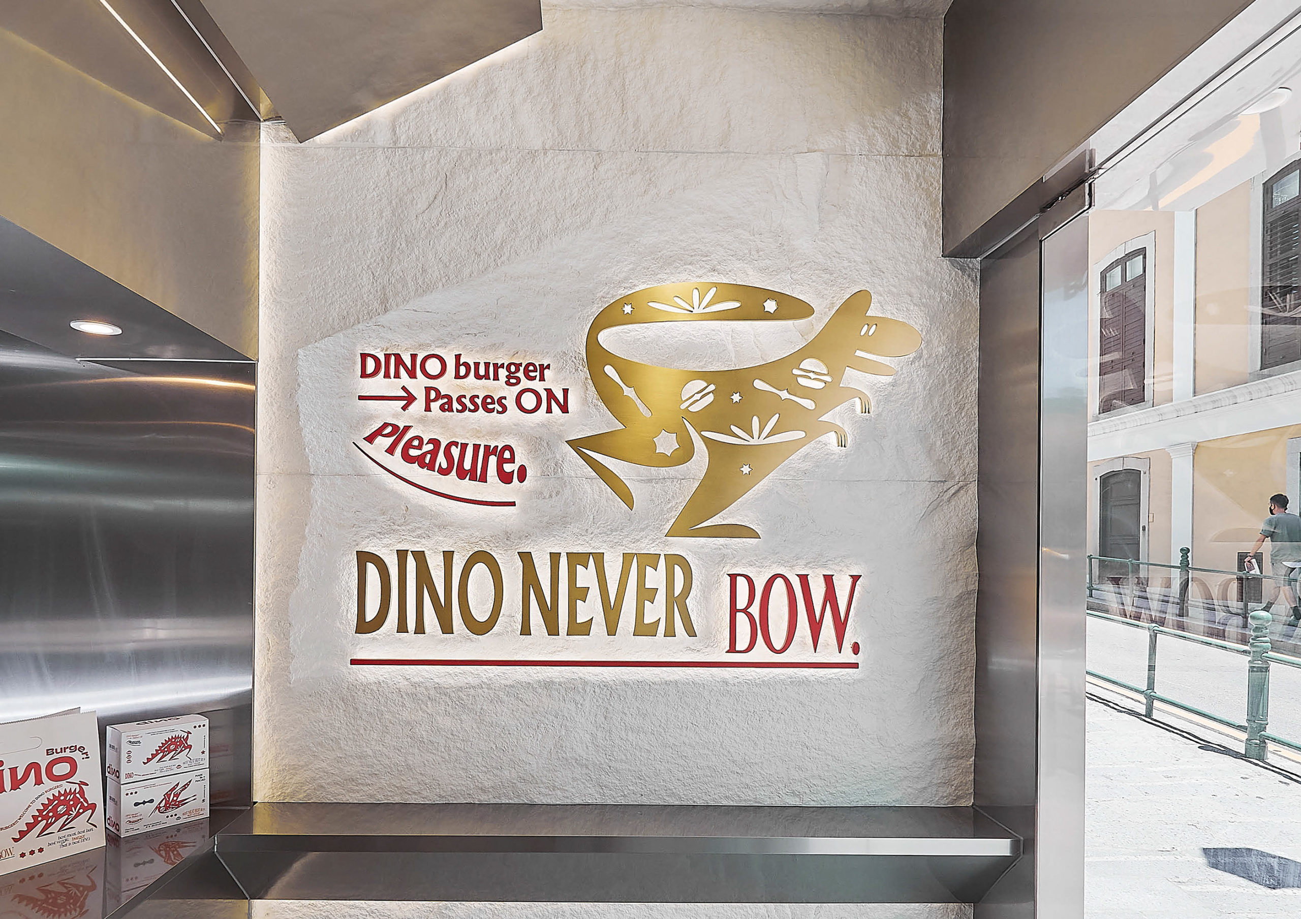
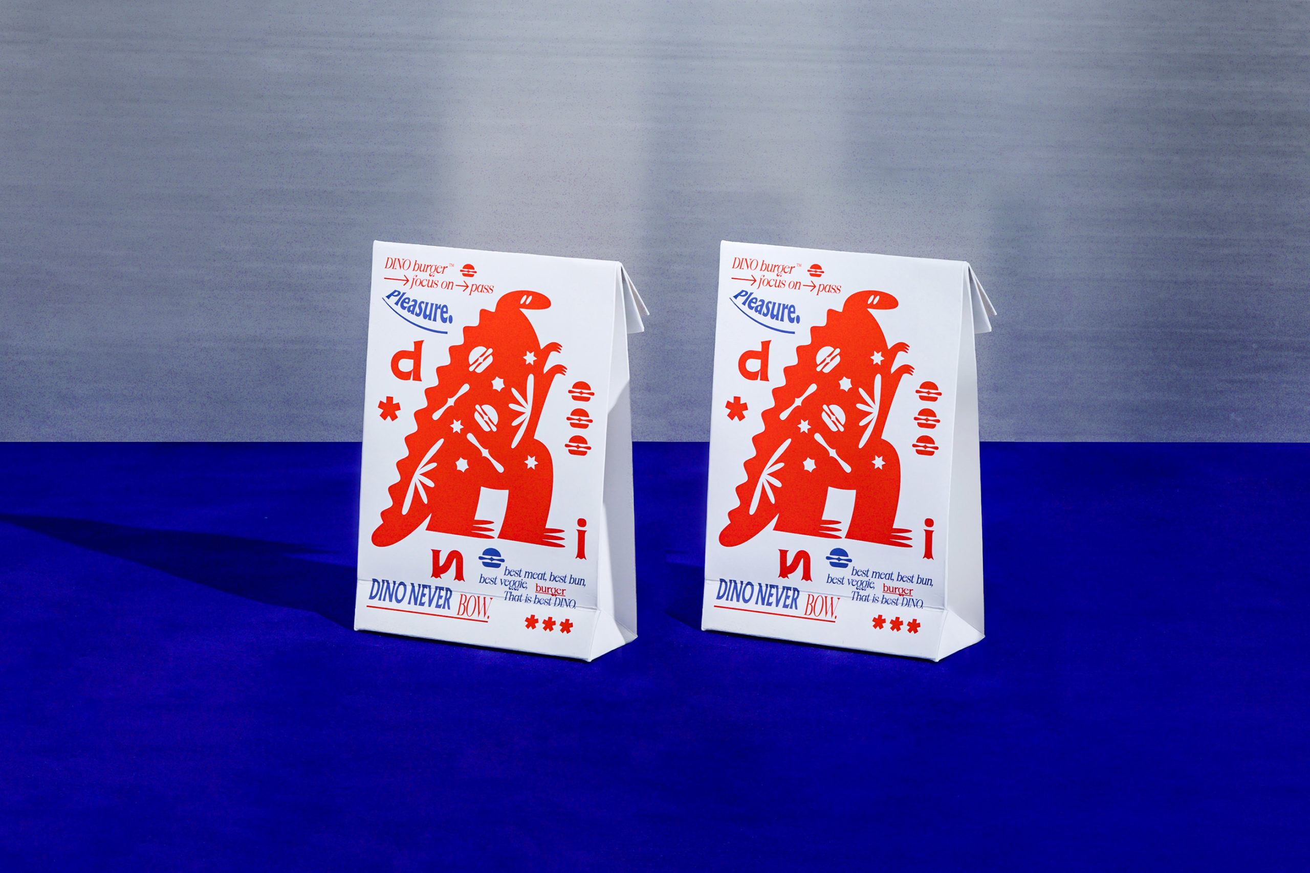
What struck me about this identity is the unique style employed to represent dinosaurs. It’s remarkably different and creates a whimsical vibe for the brand without having to go over the top with full color illustrations.
The designer explores many different dinosaurs to give the visual identity more life beyond a singular illustration. This creates a wonderfully remarkable visual language that gives the brand more teeth across touchpoints. Put simply, it’s never dull.
Some of the typography on the postcards isn’t very well done. Notable negative areas are the overuse of warping effects and the odd use of a thin serif font for “BOW.” These miscues mar an otherwise great identity.
Designed by Au Chon Hin


