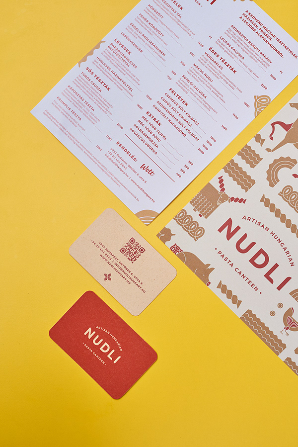
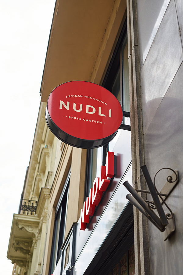
As an American, when I think of pasta noodles I first think of Italy or Southeast Asia. Of course, pasta has made its way around the world, and Nudli is a lovely expression of elevated traditional pastas of Budapest, Hungary. In fact, the name is derived from mákos nudli, a traditional dish of noodles with sweet poppyseeds.
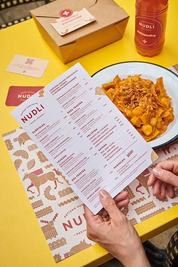
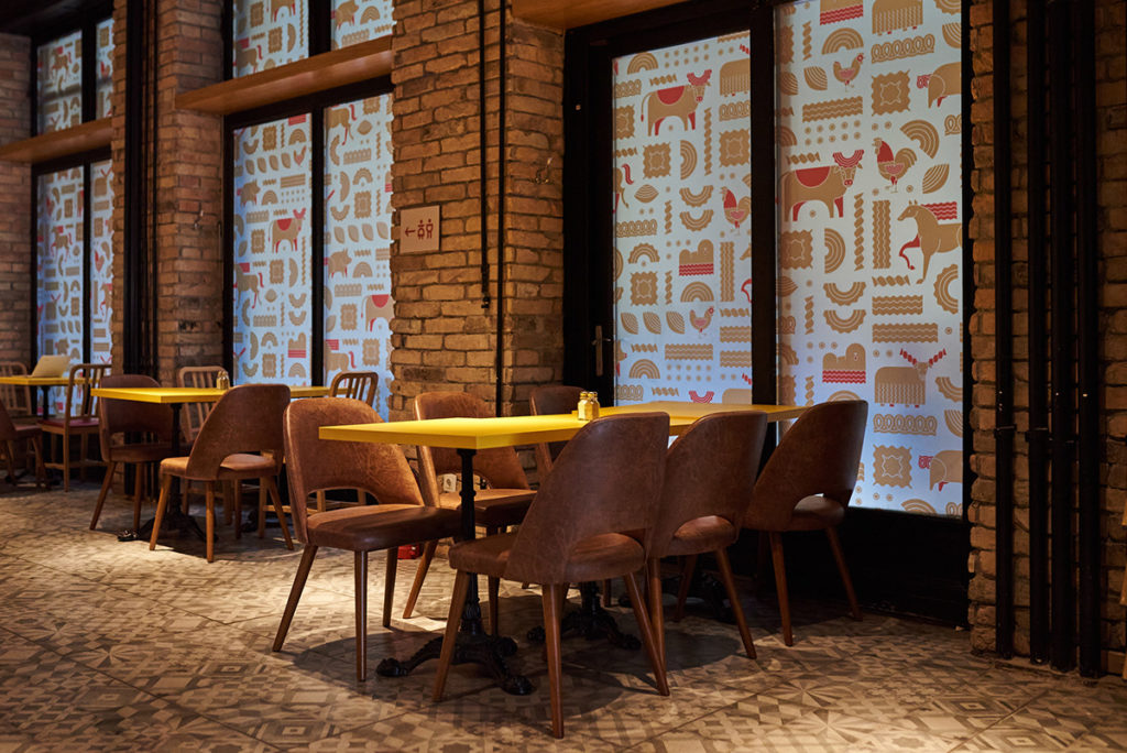
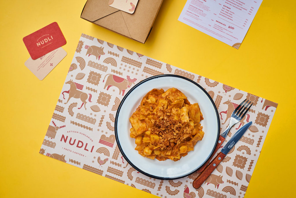
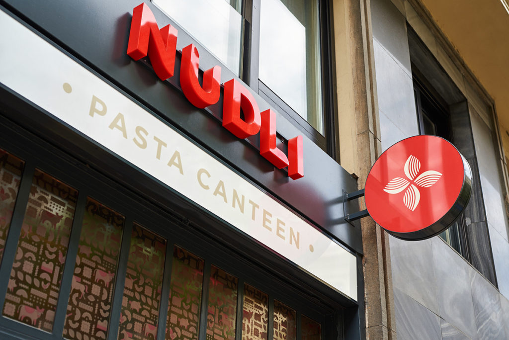
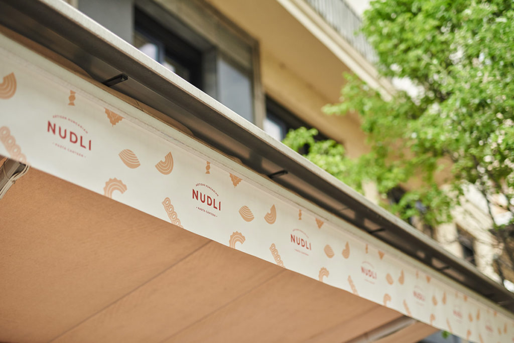
Designers Eszter Laki and Réka Imre of Studio Nur approached the project starting with a simple logotype featuring subtle curves that begin to evoke the product. The logomark, which “lives” independently from the logotype, begins to build visual complexity with four pasta shapes that form an iconic flower. This move from simplicity to complexity is brought to full expression with a suite of whimsical geometric illustrations which highlight not only the product, but engaging cultural symbolism that adds a storytelling component to the brand.
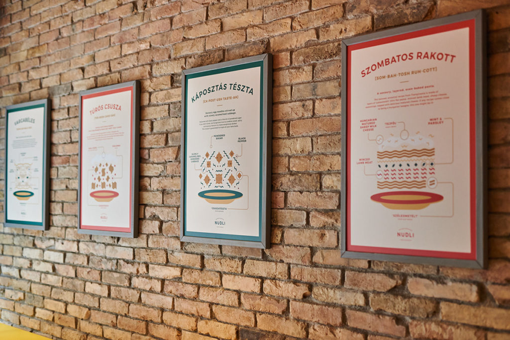
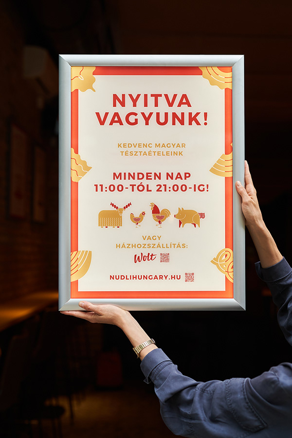
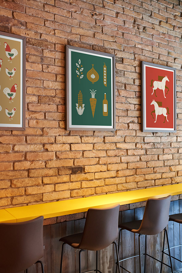
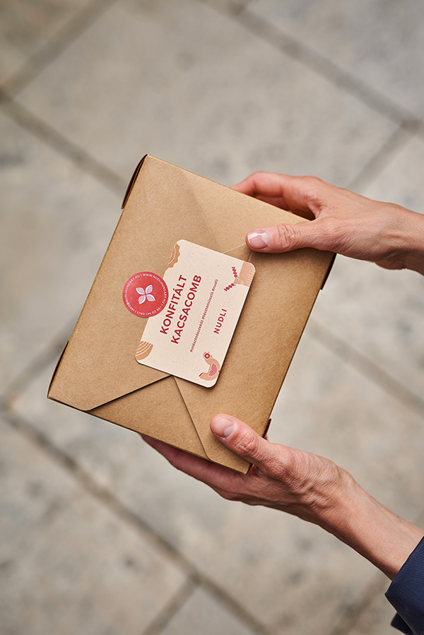
In a unique decision, Studio Nur also turned build charts (visual references cooks use to assemble a dish) into artful posters that illuminate the key elements of each dish, giving special focus to educating customers (and myself) on their own cultural traditions. Finally, the brand’s increasingly important takeout packaging is given special attention with die-cut closure stickers that color coordinate with artfully chosen carryout containers. Deliciously done!
