
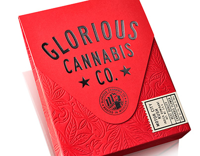
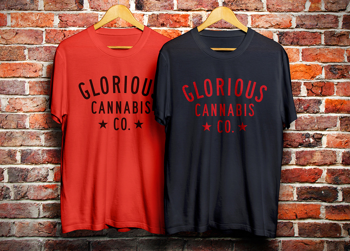
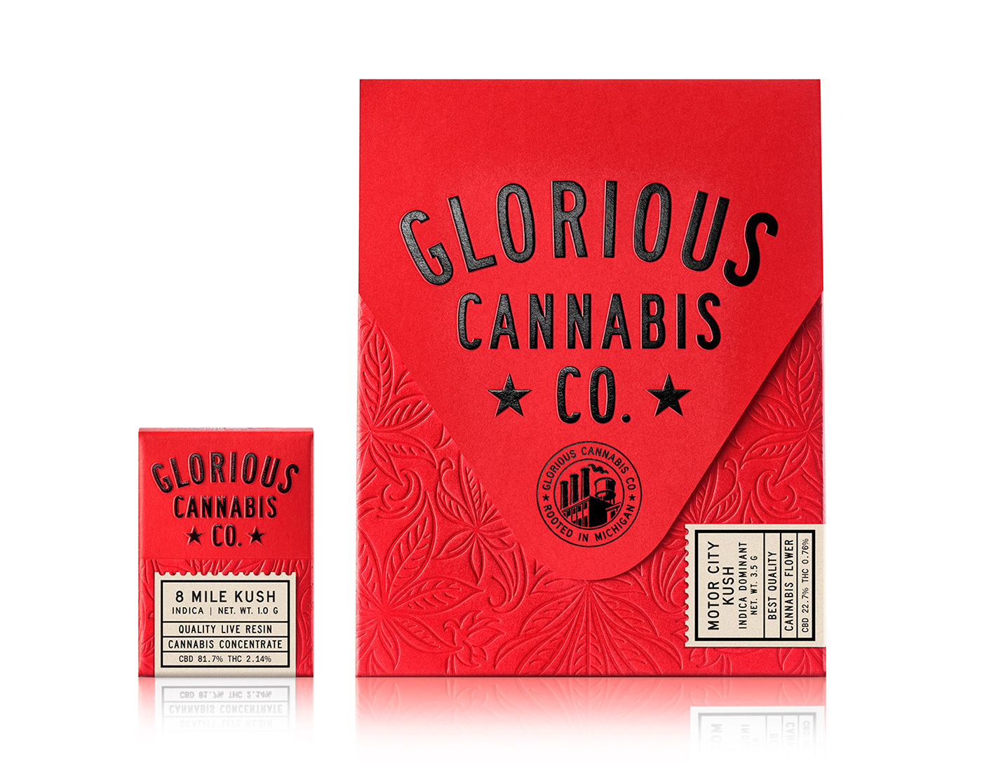
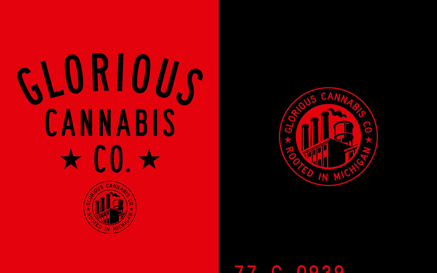
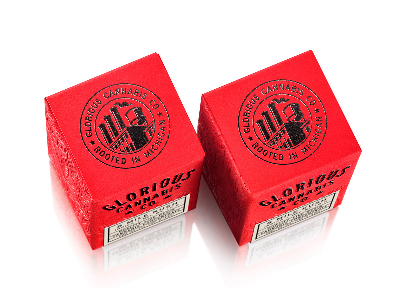
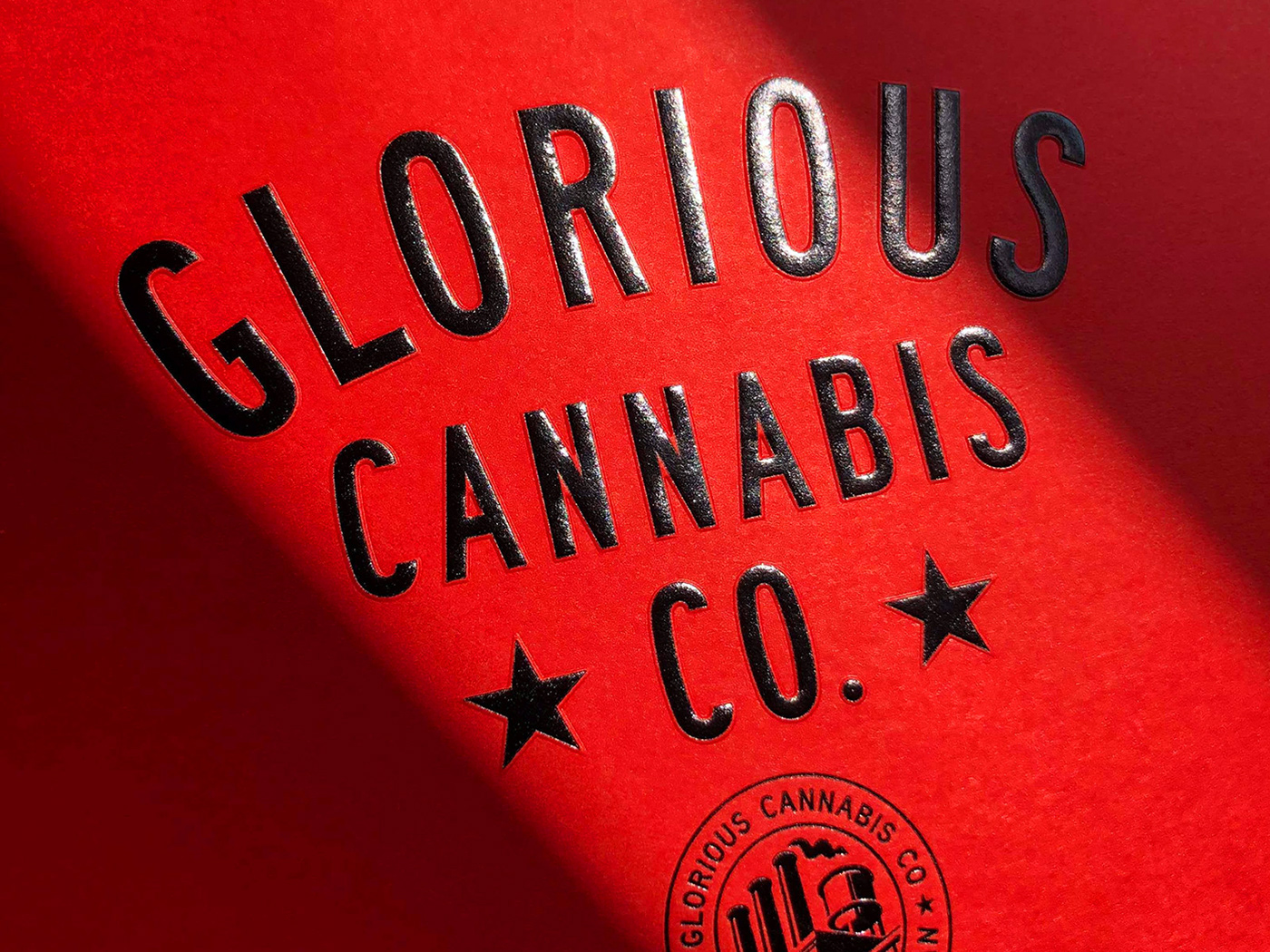
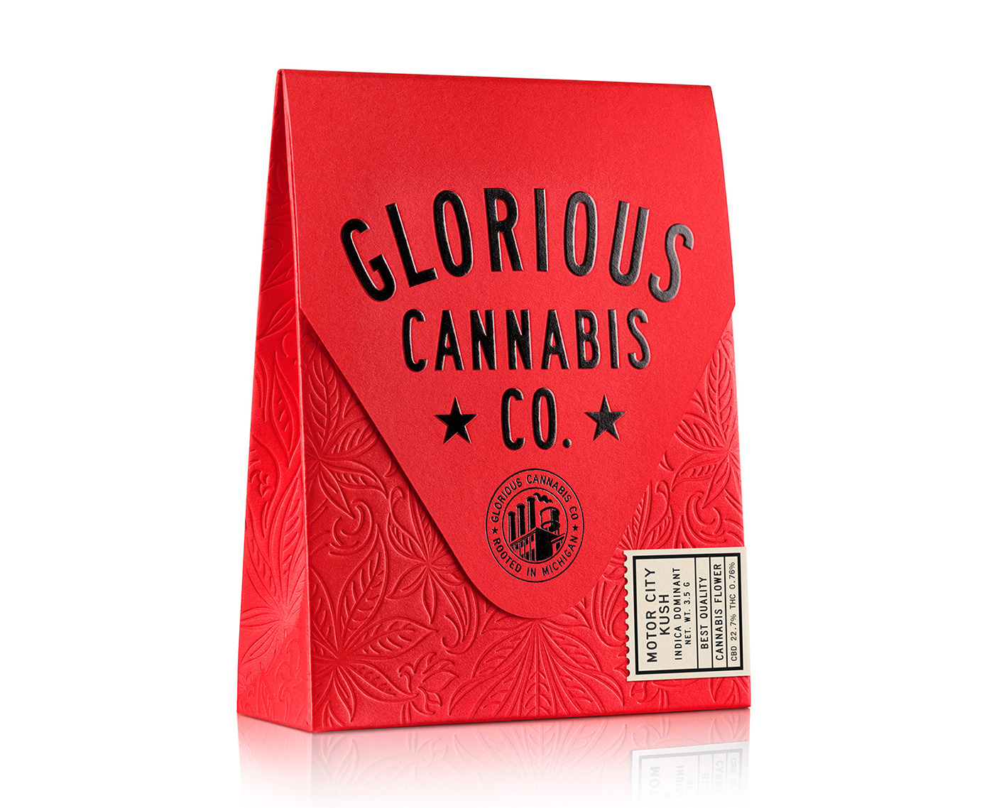
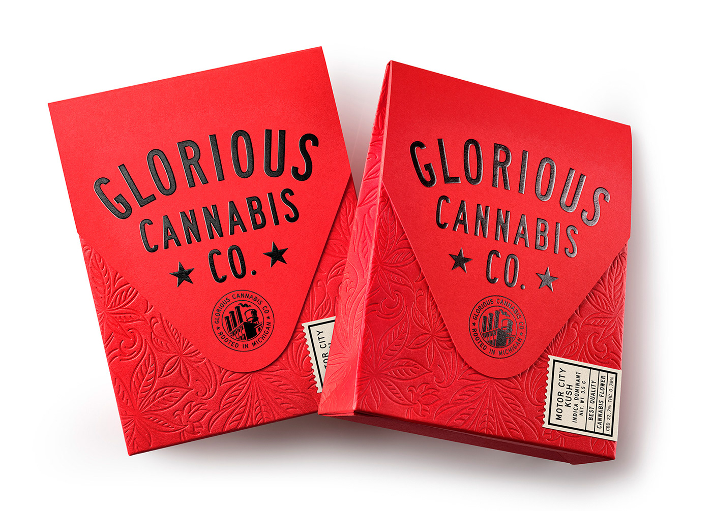
In celebration of the renowned grit of Detroit, the team at Pavement design created this beautiful cannabis brand. The identity is marked by industrial era sans-serif, compressed typography set in a classic composition. The goal was to pay homage to Detroit’s persona as a city who’s comeback is well underway.
Bold reds offset deep black colors to create a high contrast, aggressive vibe. The packaging pushes the design style further with gorgeous organic embossing that conveys the natural aspects of the product. Finalized with a tip-on tag, the packaging screams industrial era and hardnosed grit. Perfect for Detroit.
Designed by Pavement


