
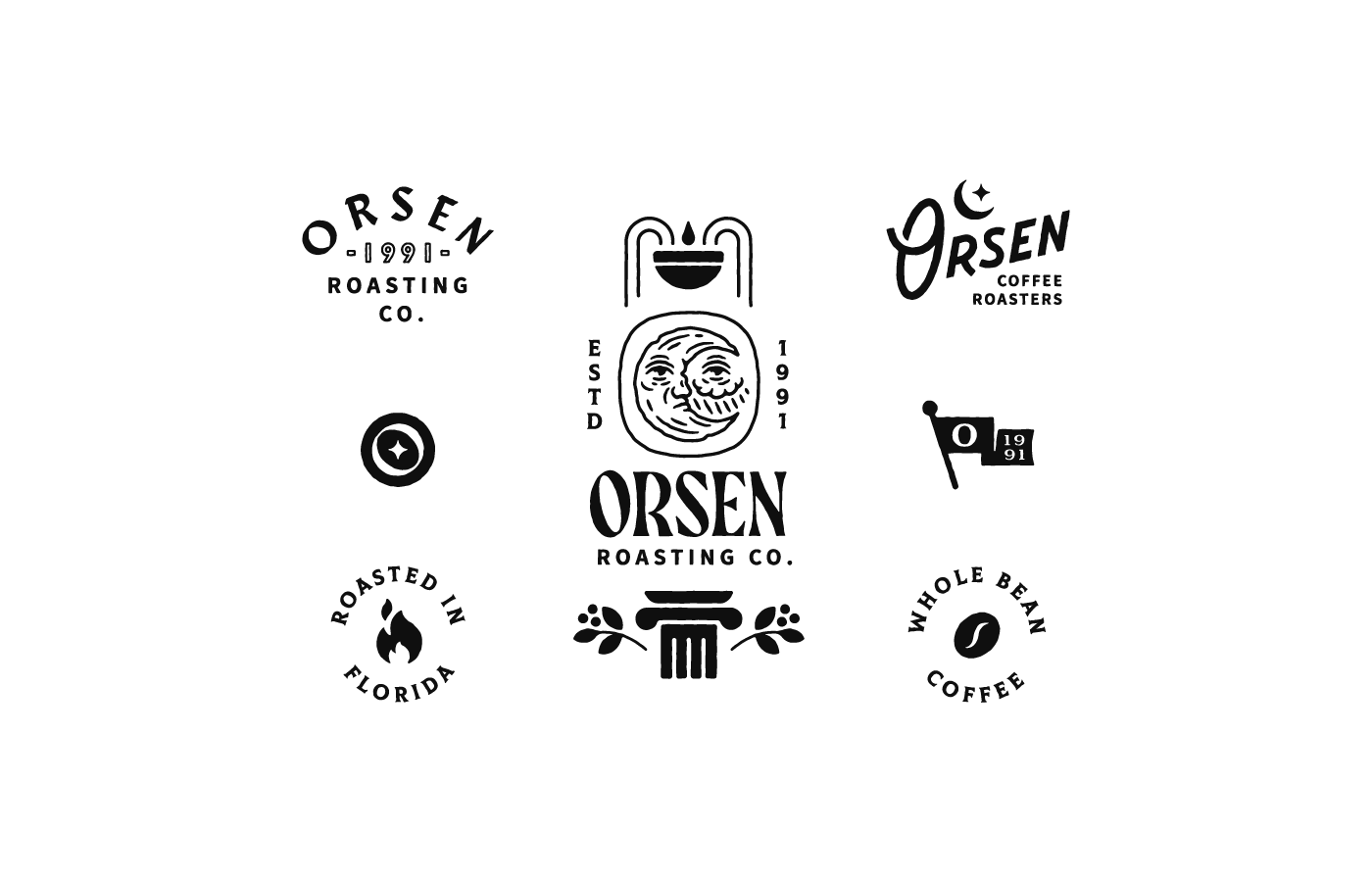
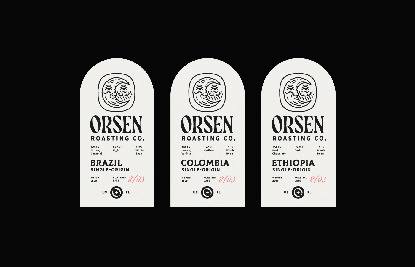
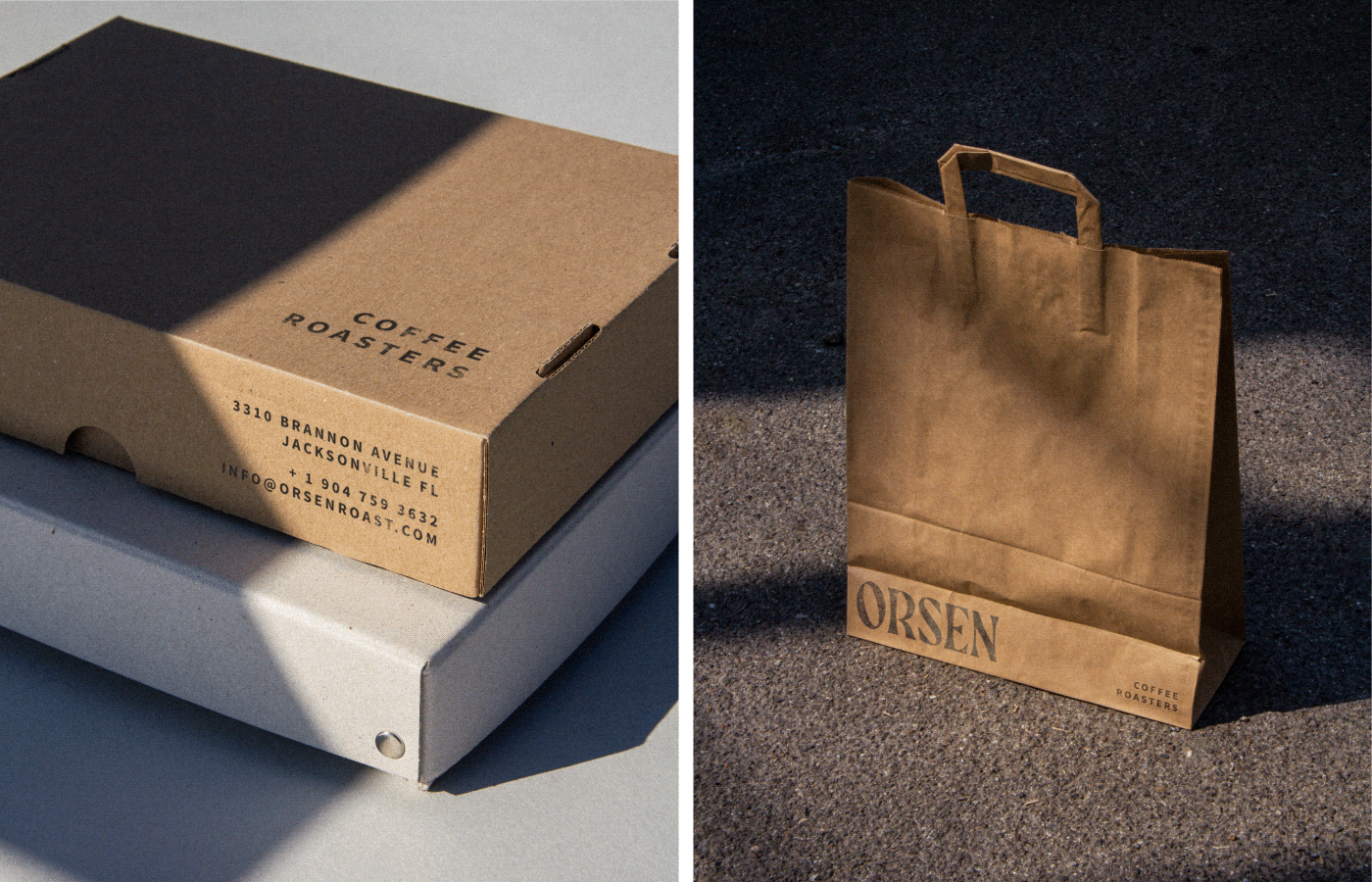
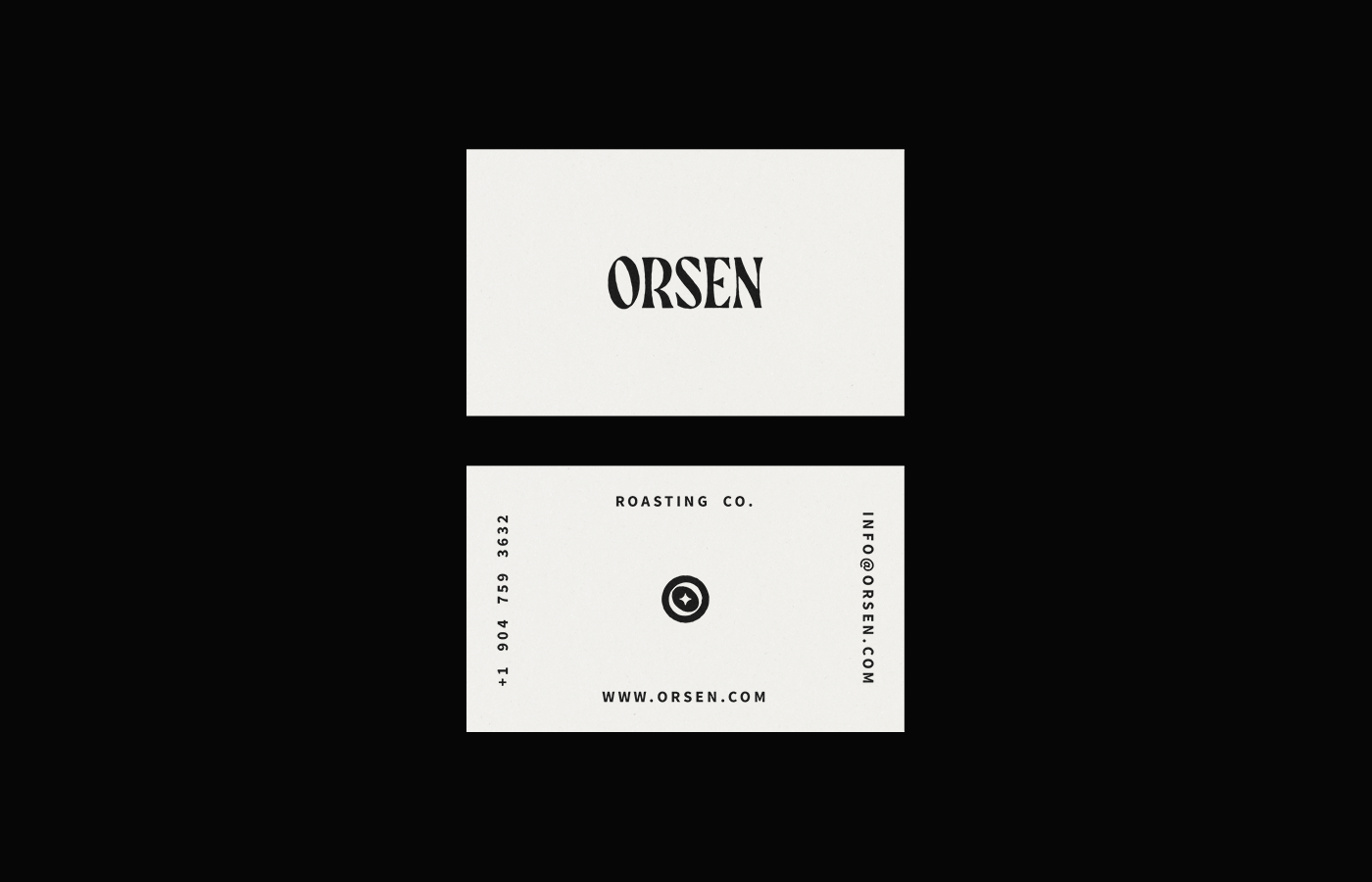
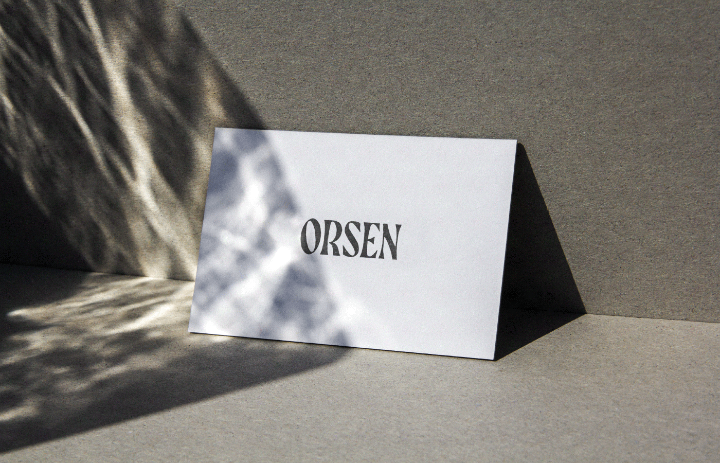
Orsen Coffee Roasters showcases a beautiful design style that’s been gaining traction in the last few years. The style is marked by a low-fidelity effect applied to classic typography and typographical compositions. The classic nature of the compositions is most notably demonstrated in the image of multiple identity “artifacts” where typography is arching over centered words, and the pennant style flag design.
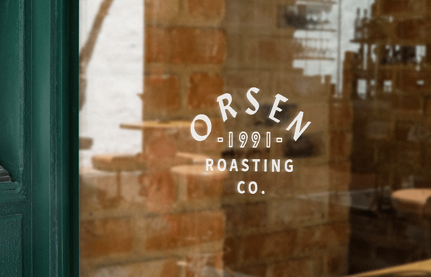
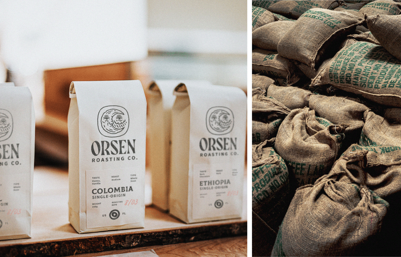
Designer Nikita Maslov leverages the power of a high contrast black and white palette which serves as a foundation for full-color imagery to pop. The imagery has a lower contrast look with warm, washed-out colors to add to the vintage style of the brand.
Finally, the designer introduces a few illustration styles. One is a simplified graphic approach and the other is pen and ink line art. These sort of conflict and create a gap considering there is only one line art example, but the simplified graphic is employed often. My only critique would be to kill the line art and reapproach it in the same style as the others to create unity and strength in the visual language.
Designed by Nikita Maslov


