
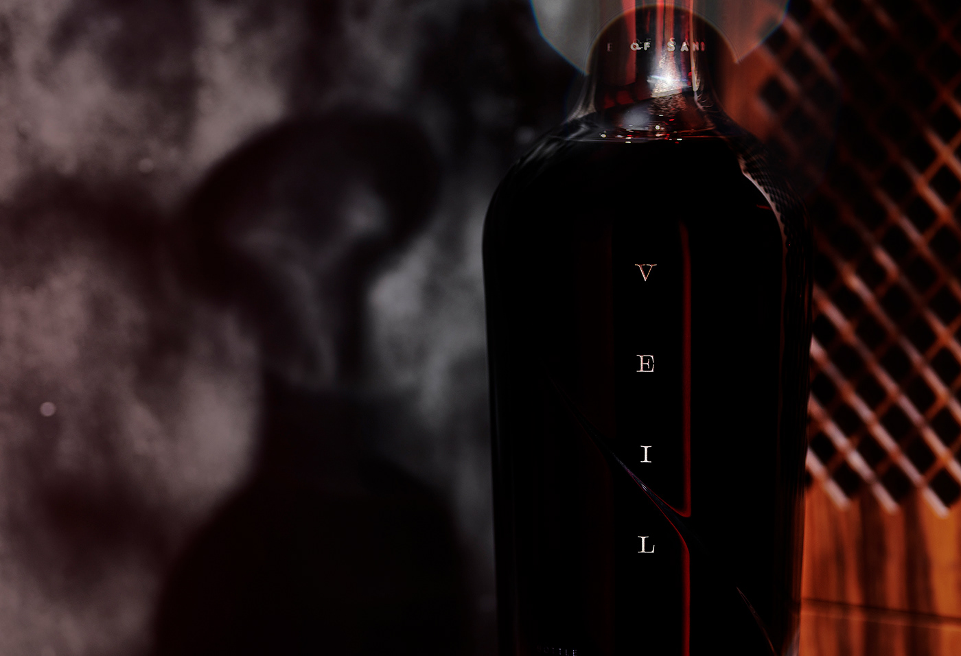
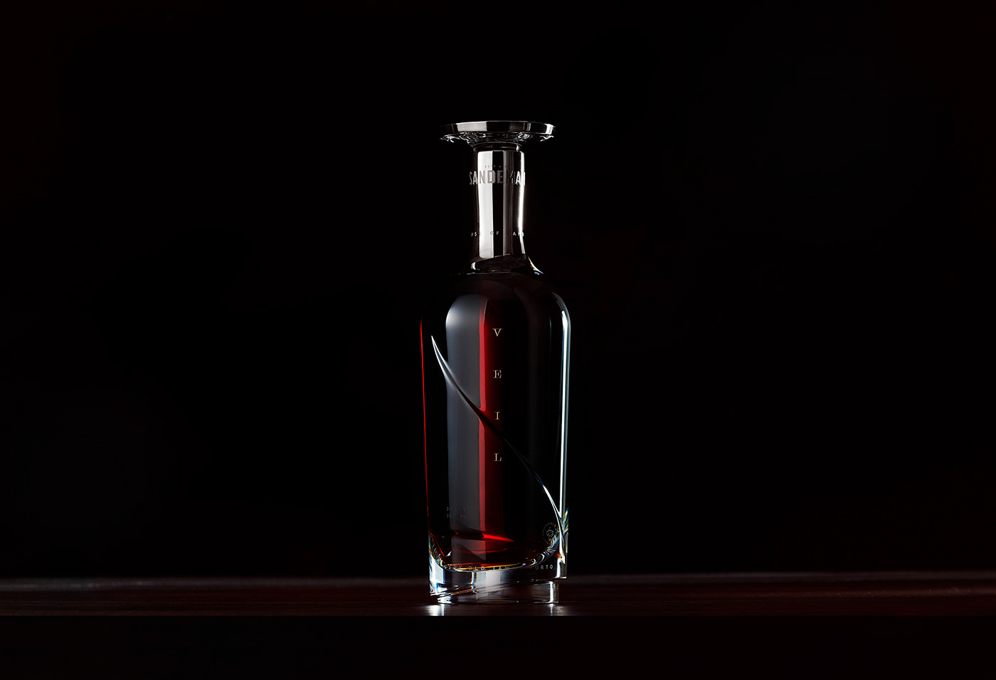
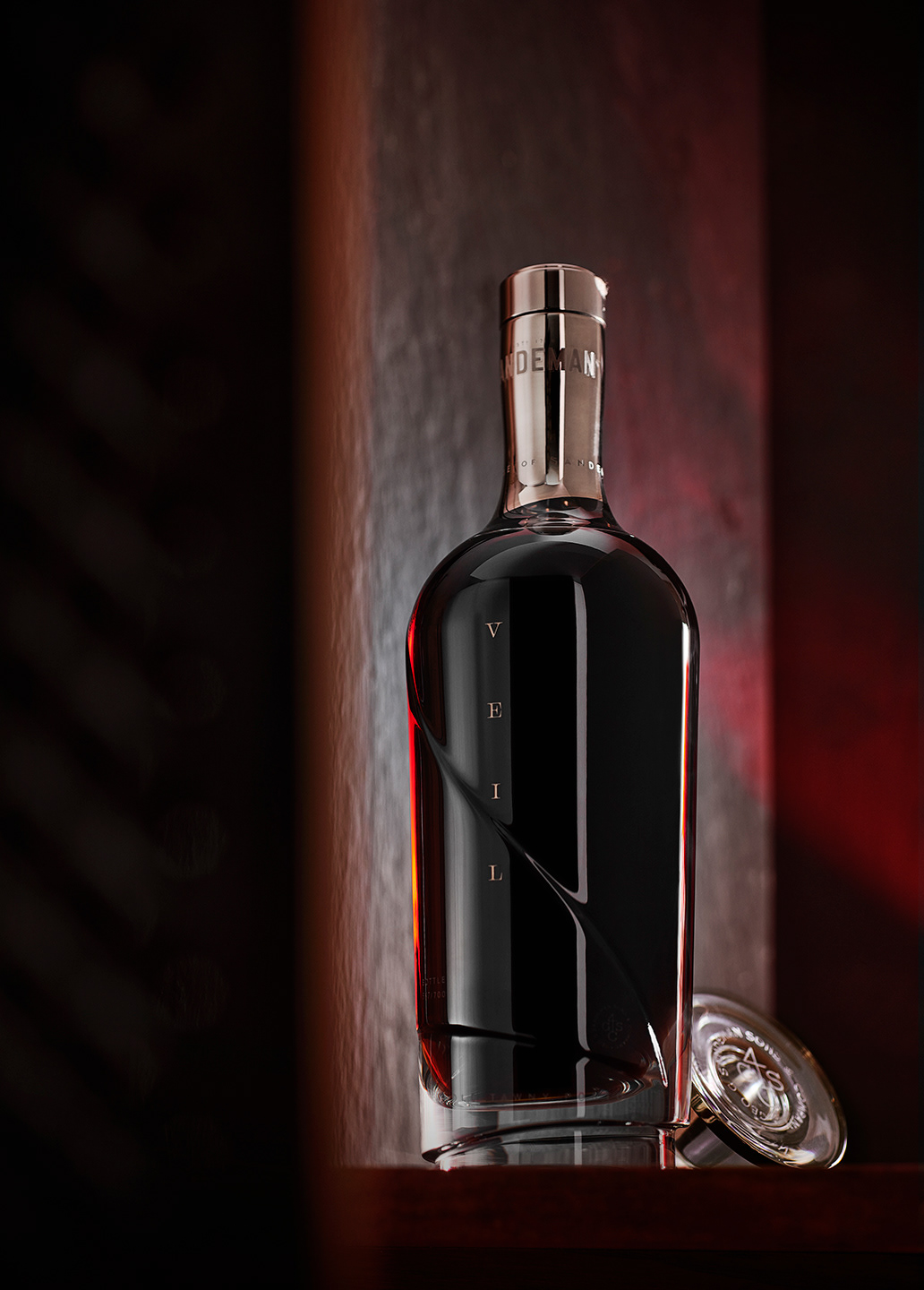
Sandeman & Sons is one of the most renowned names in the port wine industry. To celebrate the celebrate the brand’s generations of master blender’s tenacity, dedication, inspiration and talent, they created Veil, a Very Old Tawny Porto.
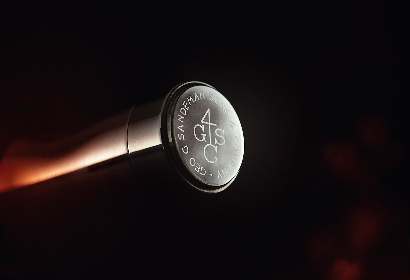
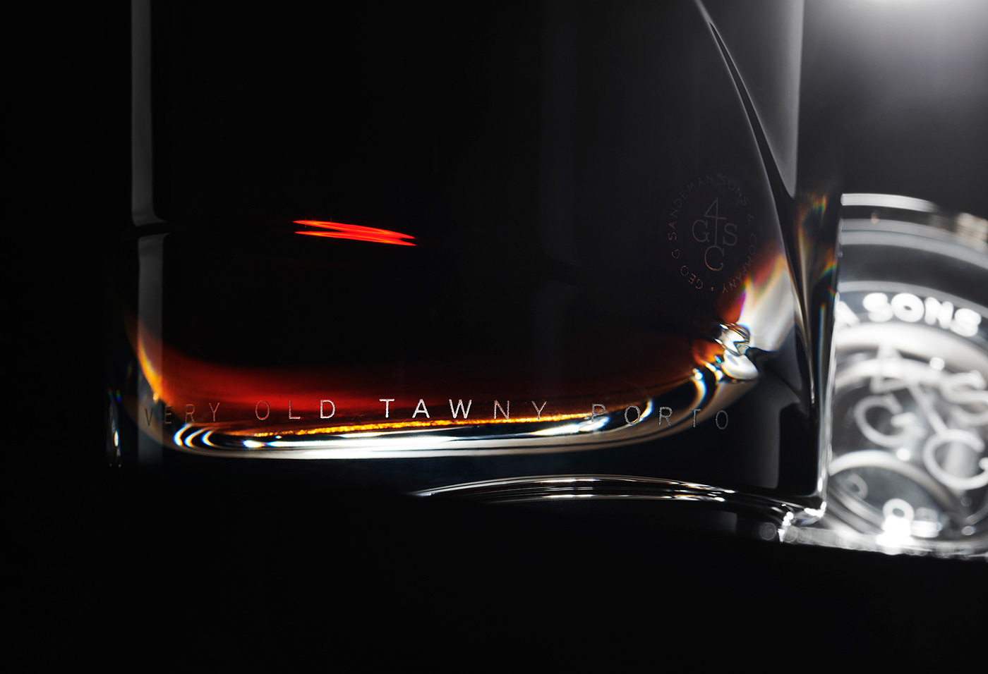
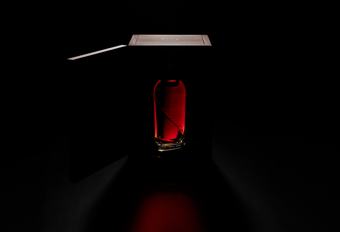
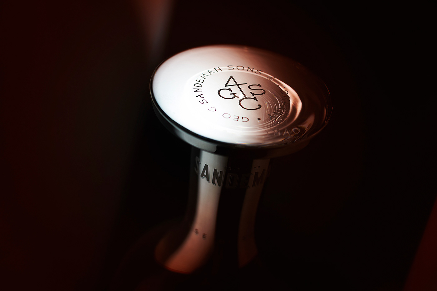
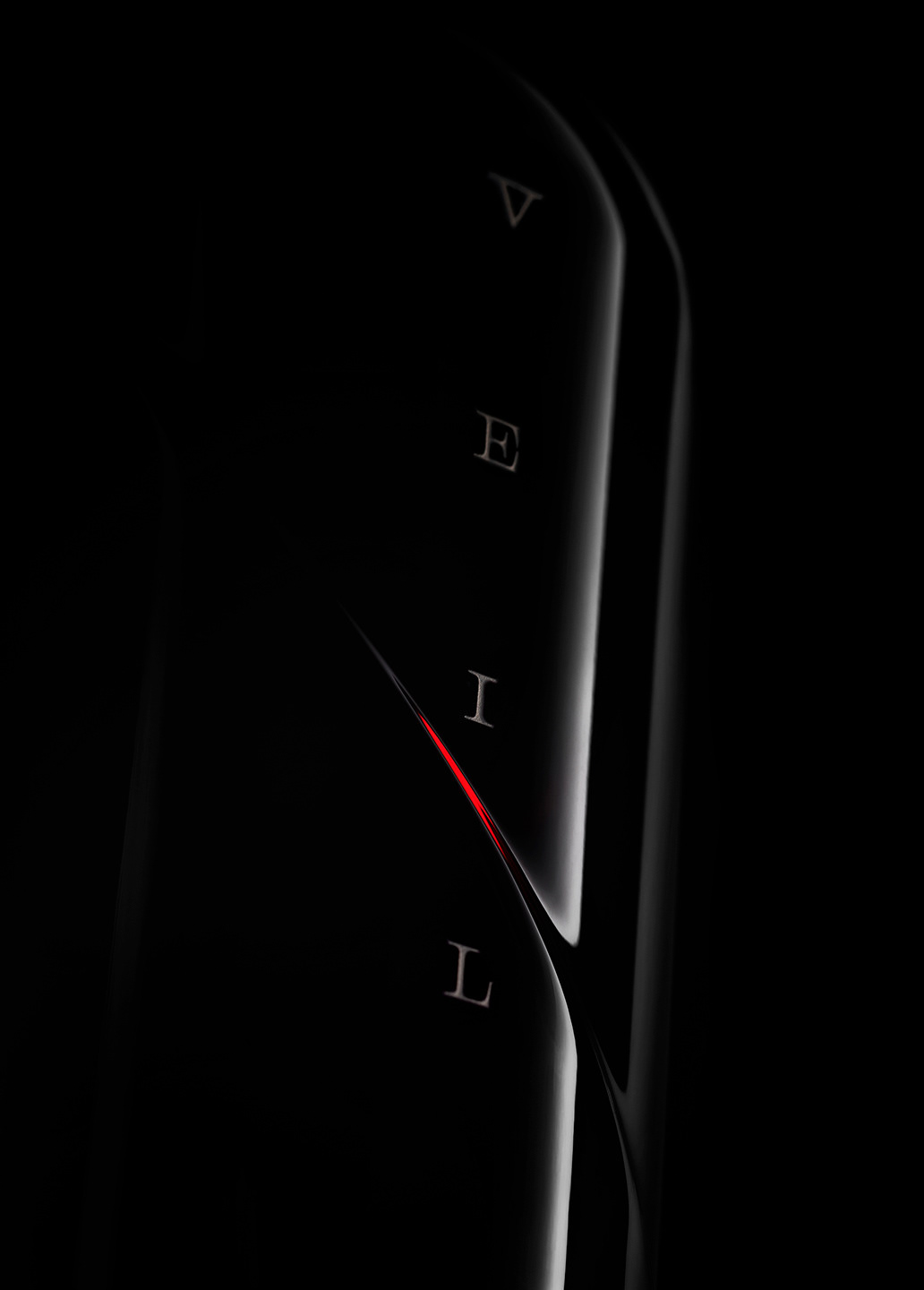
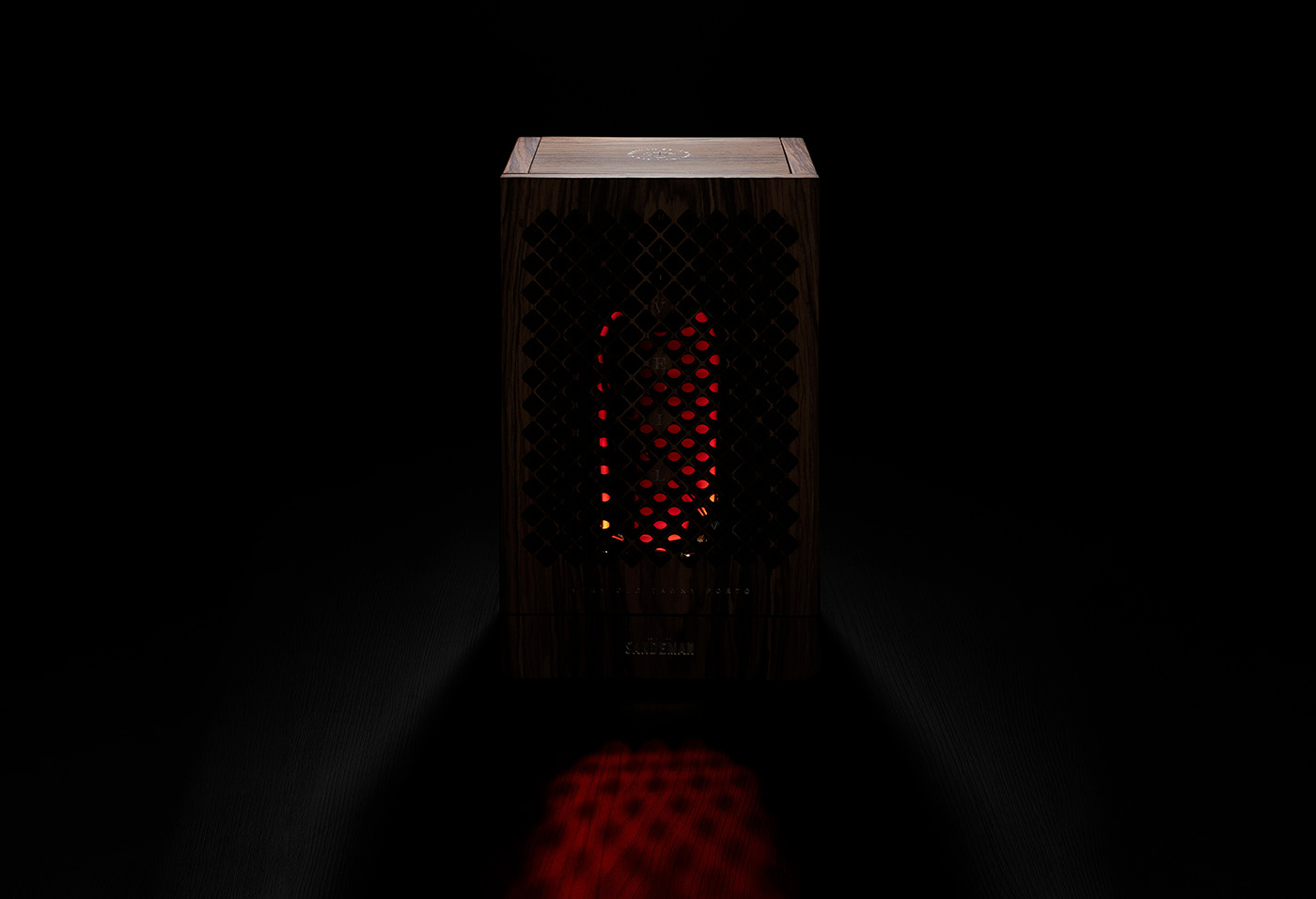
The design team was inspired by the notion of “anticipation” and used it to unfold a mysterious and alluring experience from beginning to end. It starts with packaging that allows light to shine through a rosewood grate. Upon opening the bottle hints at Sandeman’s logo, The Don, with flowing cape silhouette complete with an elegant bottle stopper that doubles as its signature hat.
This work is absolutely stunning and I truly cannot wait to actually try the product.
Designed by VOLTA
Bottle: Vista Alegre
Box: Aéme
Video & Copy: Estúdio Imigrante
Photography: Nuno Moreira Copy: Pedro “Stray” Tavares


