
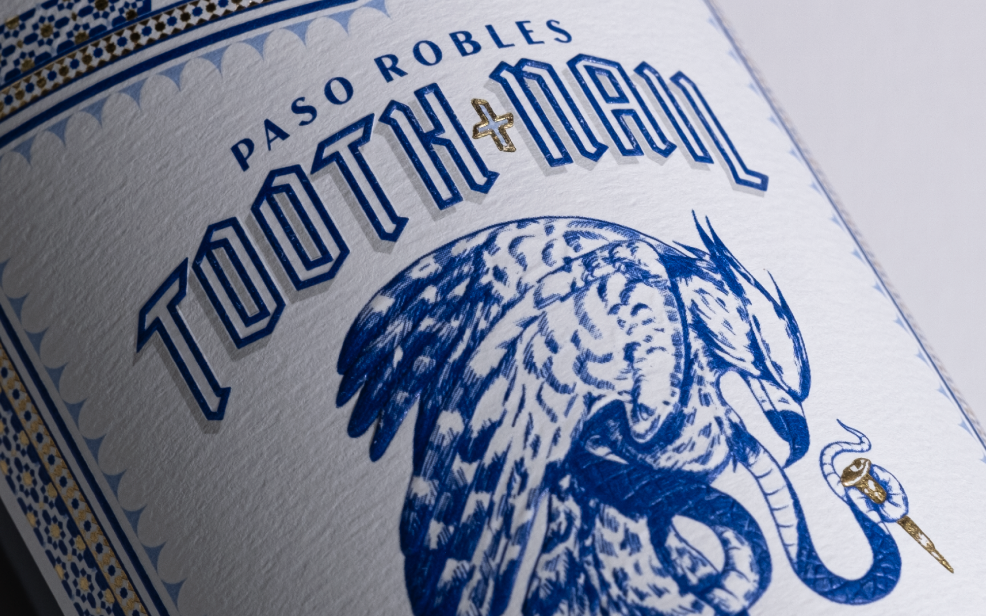
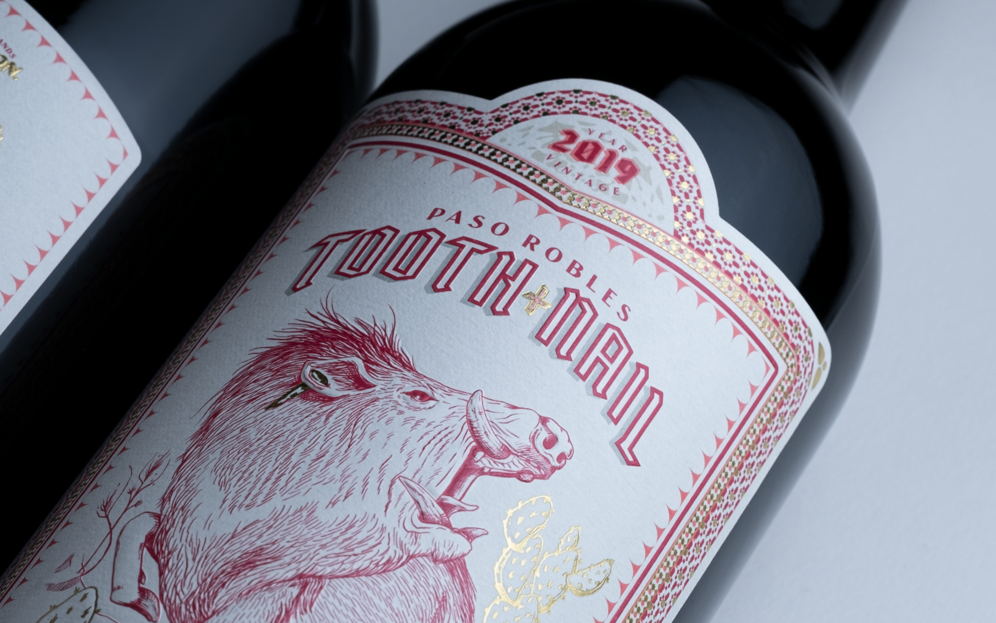
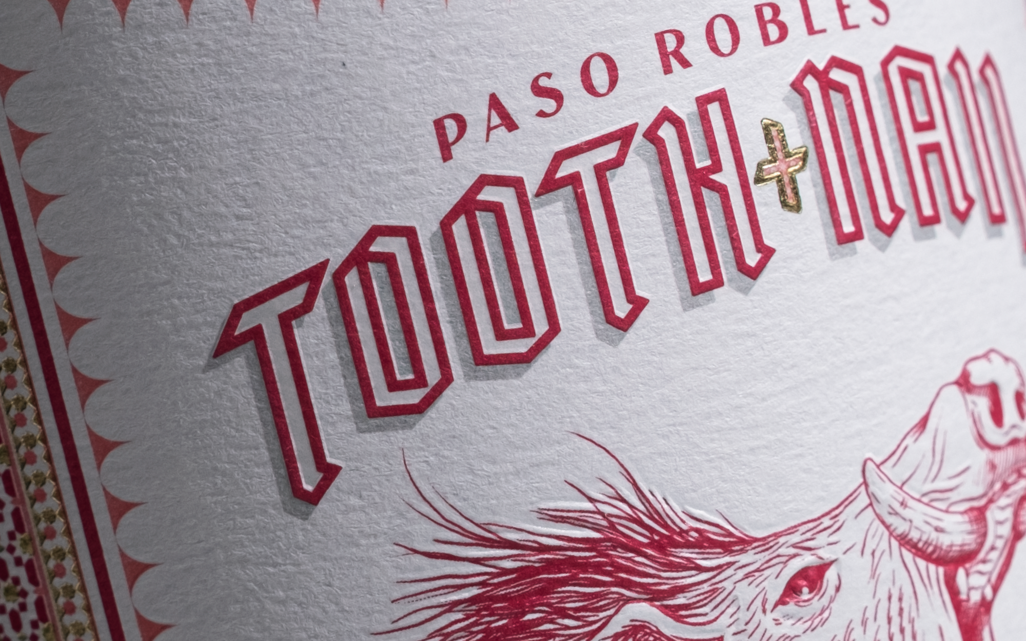
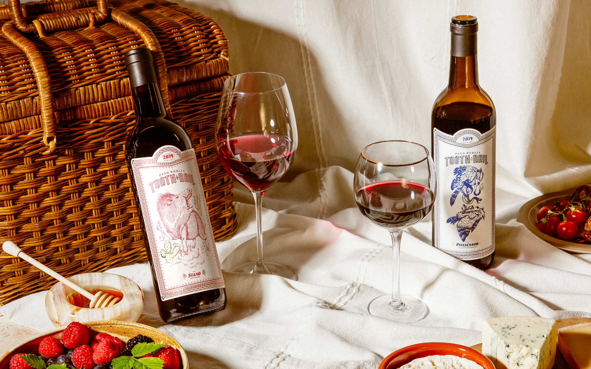
When the folks at Paso Robles created a series of bold, dark, and decadent red and white wine blends the move demanded an equally daring approach to the packaging. Studio Ethur Ethur approached the challenge by exploring the idea of survival of the fittest, and the beautiful, and often times violent, aspects of nature.
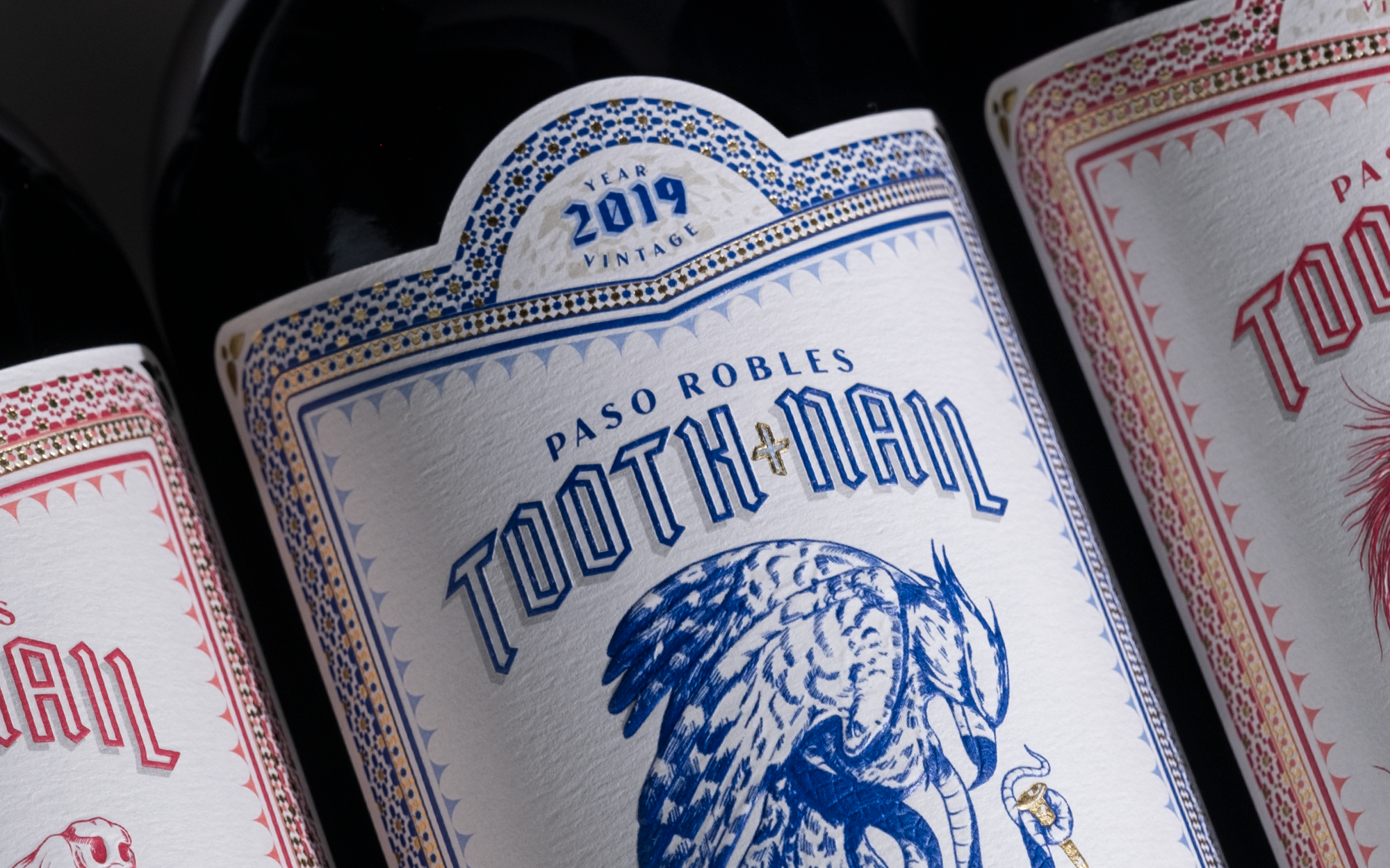
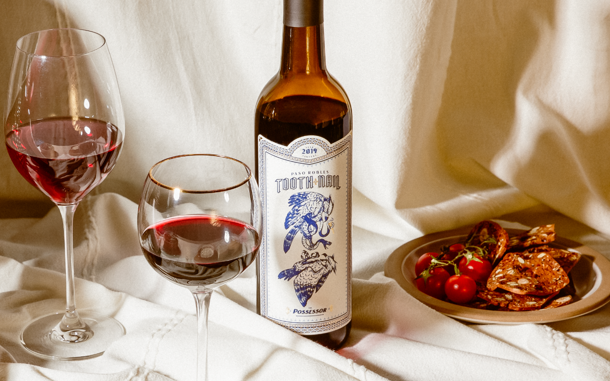
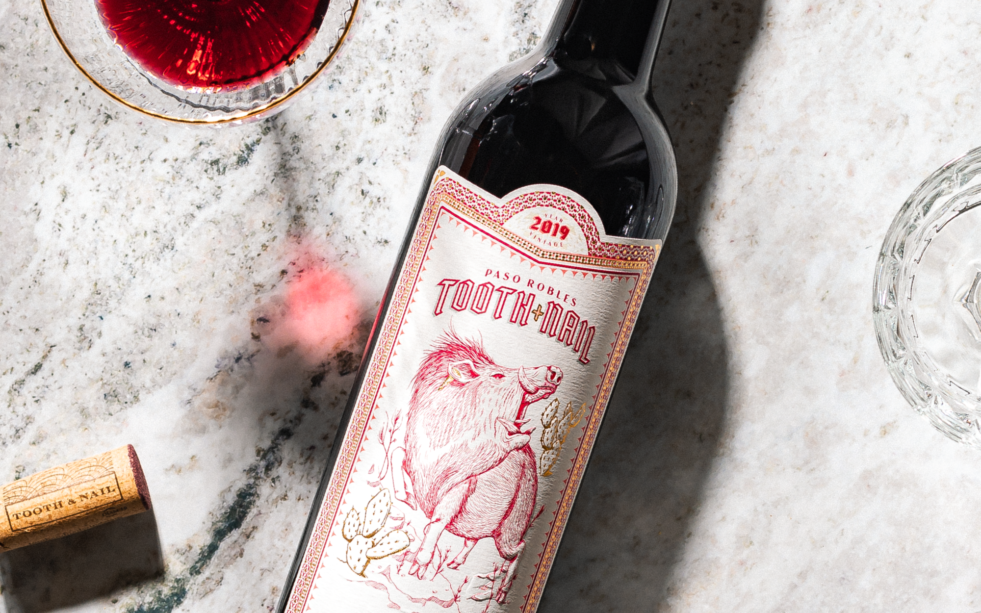
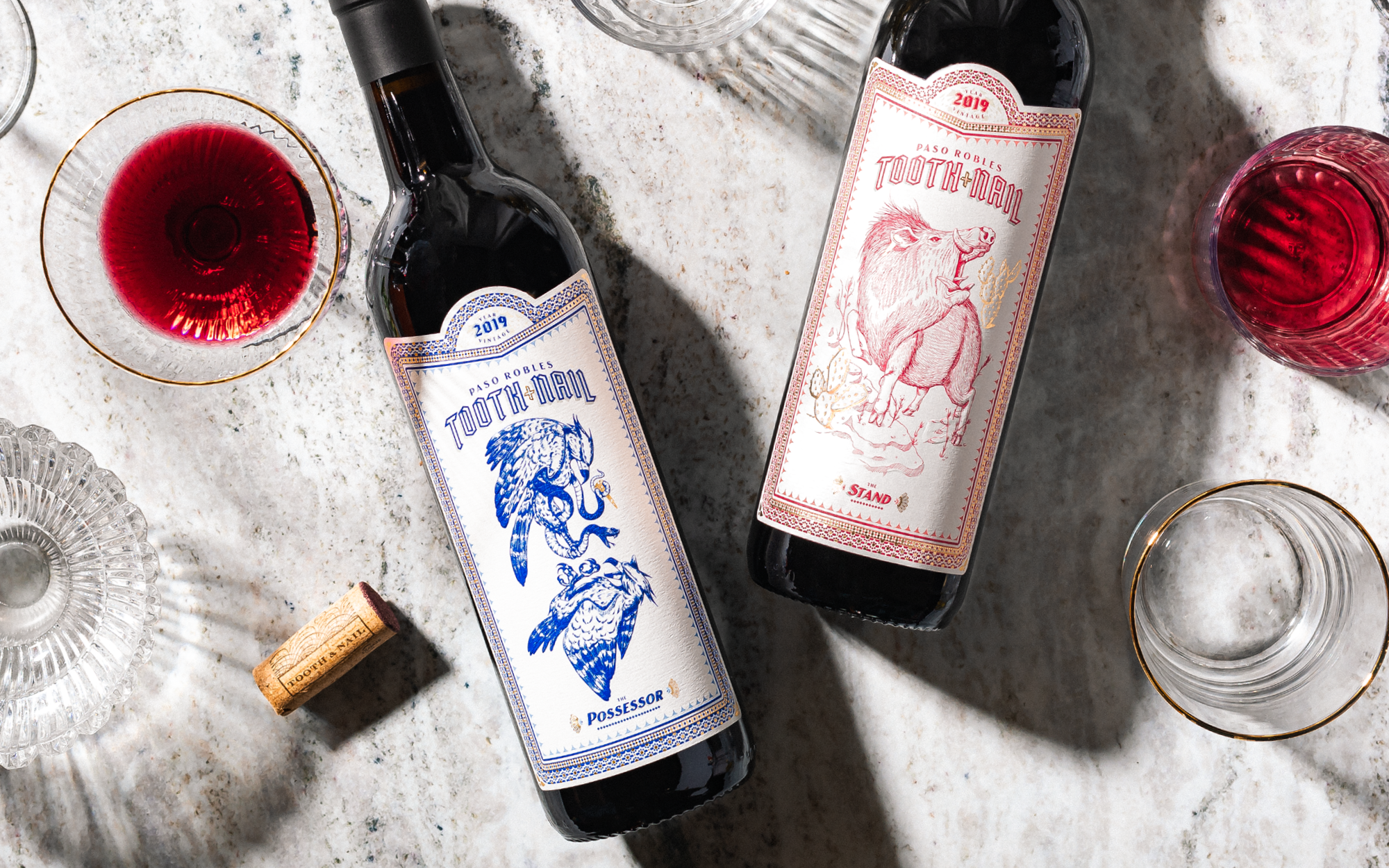
The design for Tooth & Nail approaches the great J.J. Audubon’s wildlife illustrations with new fervor and focus. Each of the varieties tells the story of an individual animal’s fight for survival with an opponent.
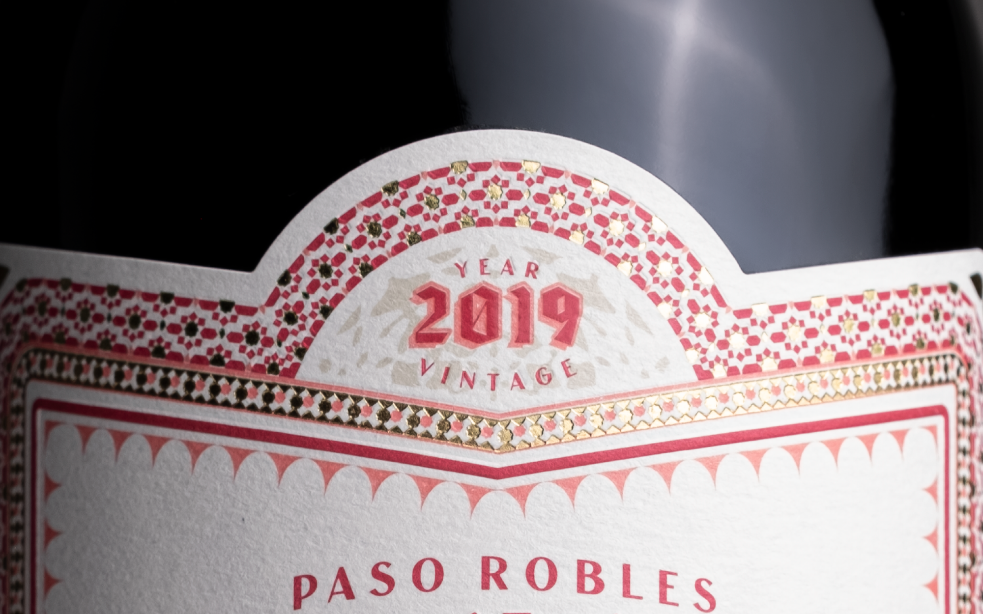
These illustrations are supported with a modernized black letter style typographic treatment that reinforces the strength and masculinity of the overall brand.
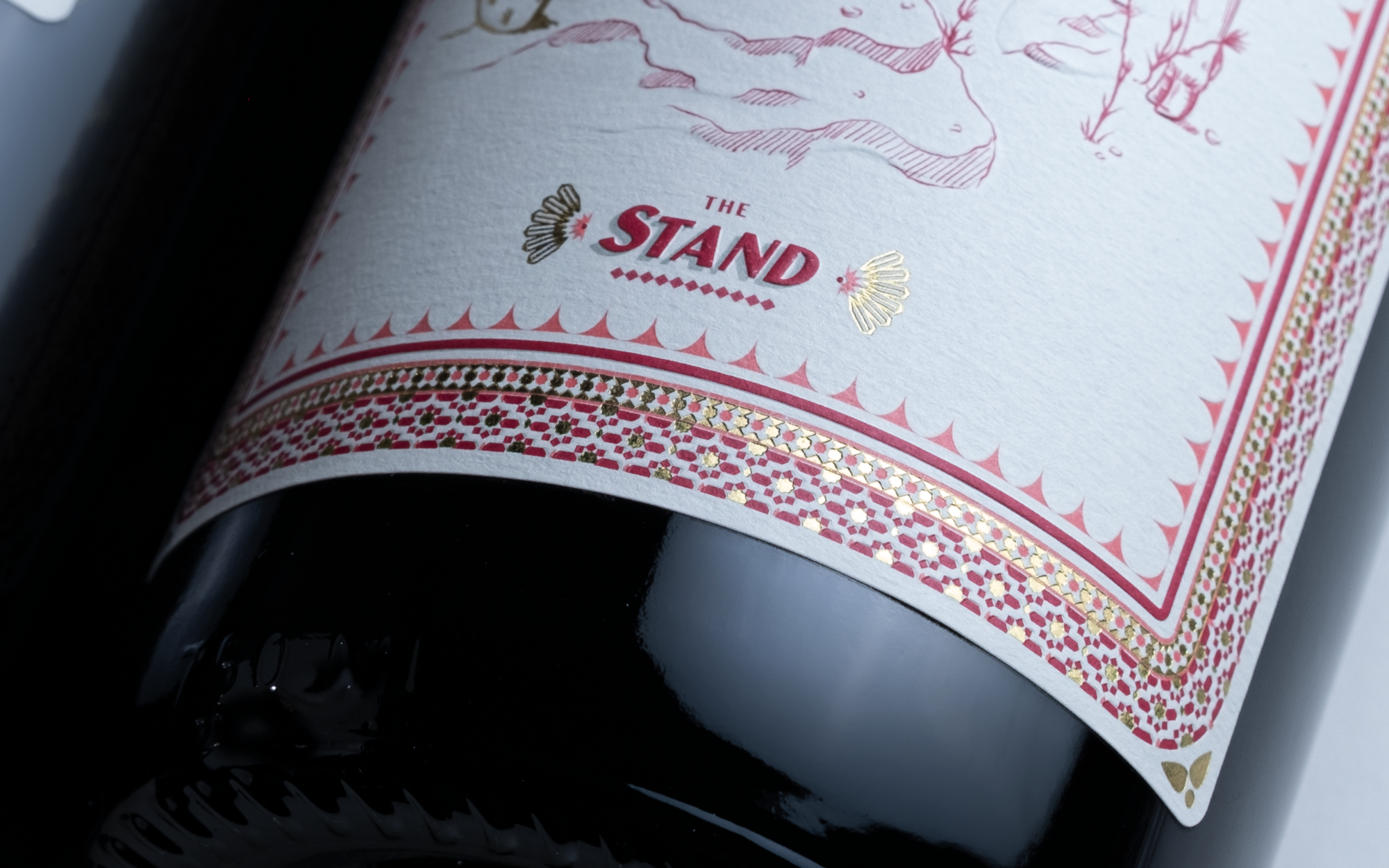
Circumnavigated by classic, vintage-style border work, the overall packaging creates a transitional feel simultaneously harkening to the past while creating something for today.
Designed by Studio Ethur Ethur
Photographer by Mary Lagier


