
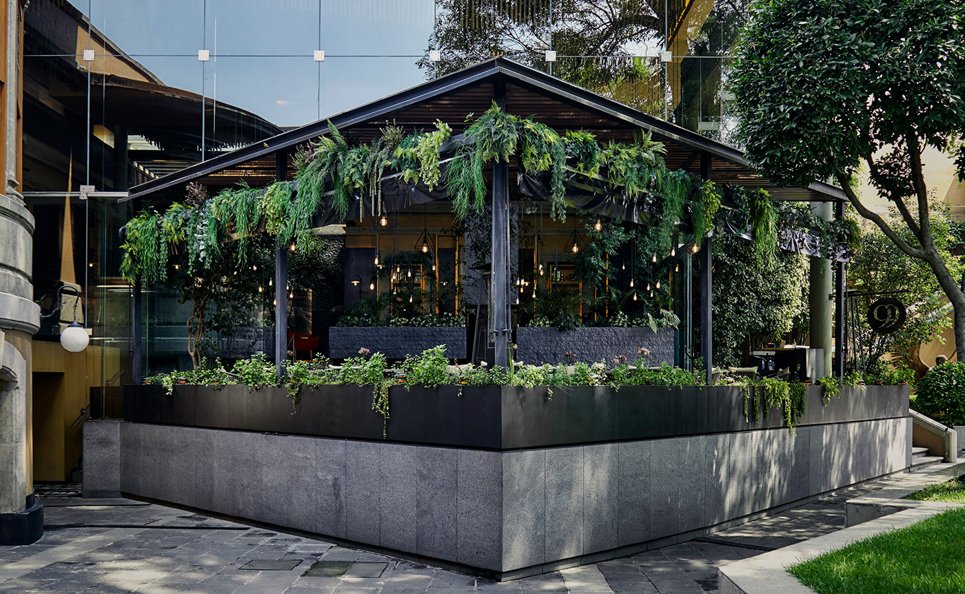
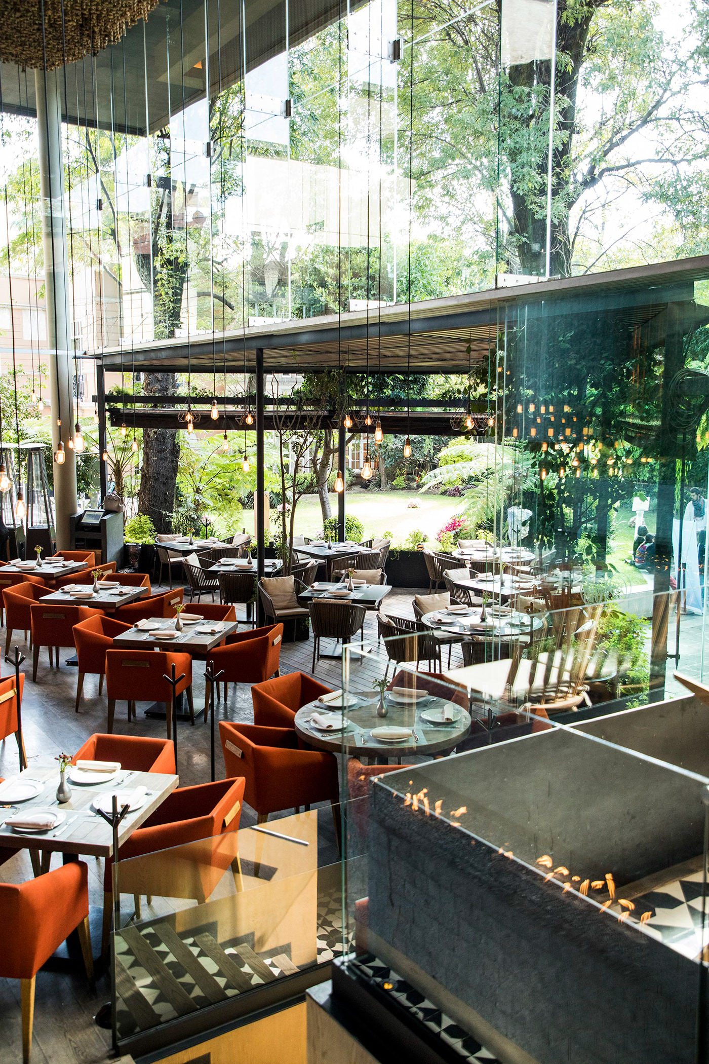
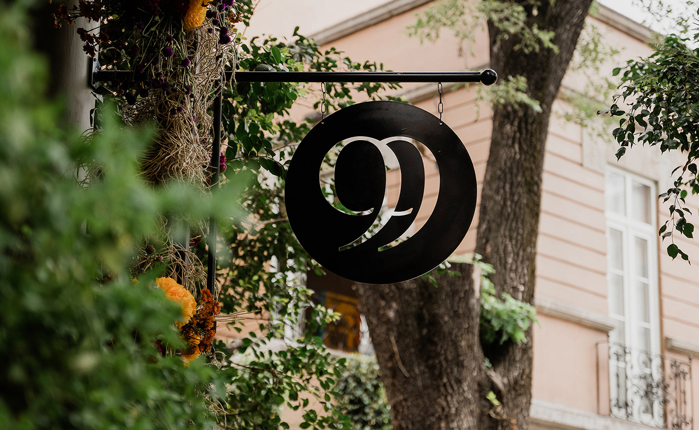
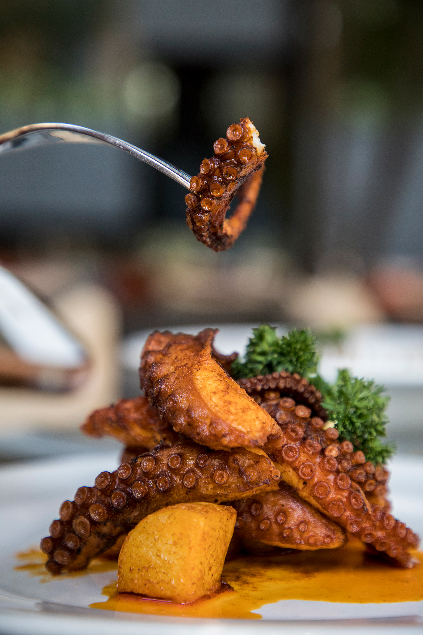
In one of the most beautiful neighborhoods of Mexico City, La Colonia Roma, exists a fantastic little bistro called Nueve Nueve. Crafted inside of one of the most important and cultural colonial houses, Casa Lamm, the bistro exudes a highly floral, open and airy atmosphere.
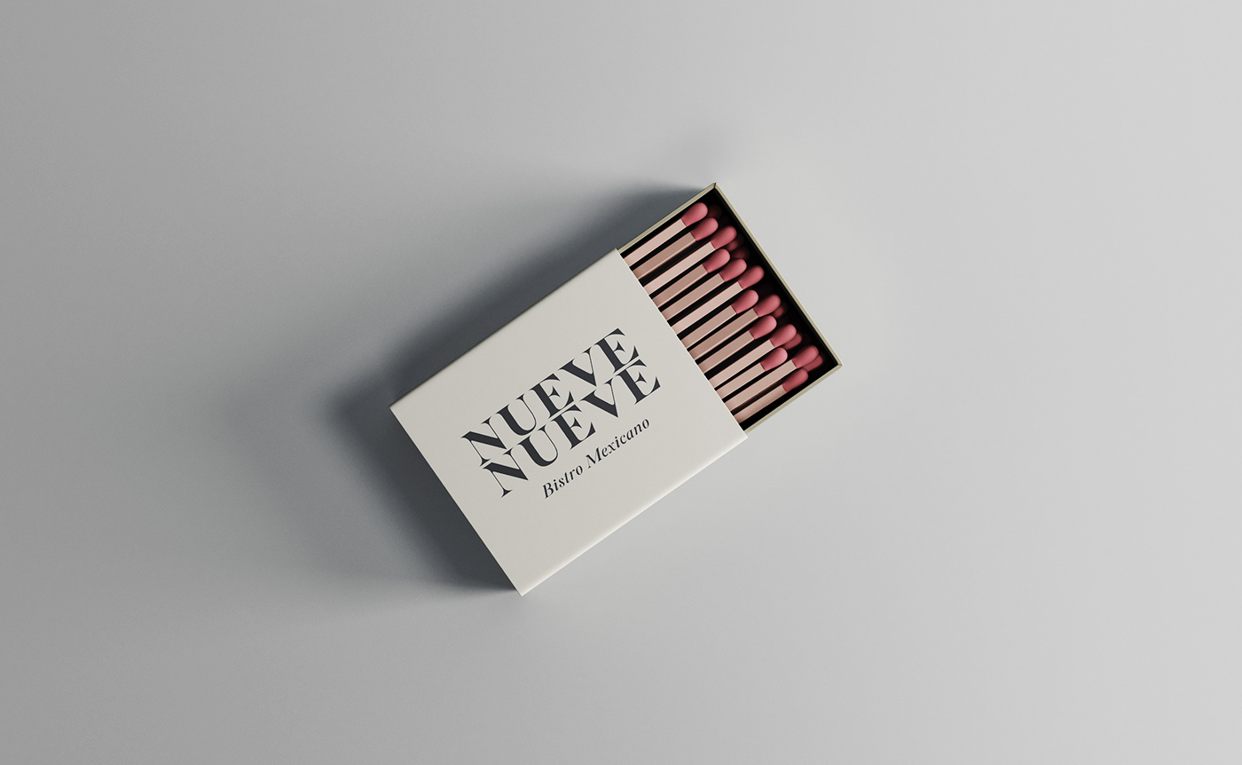
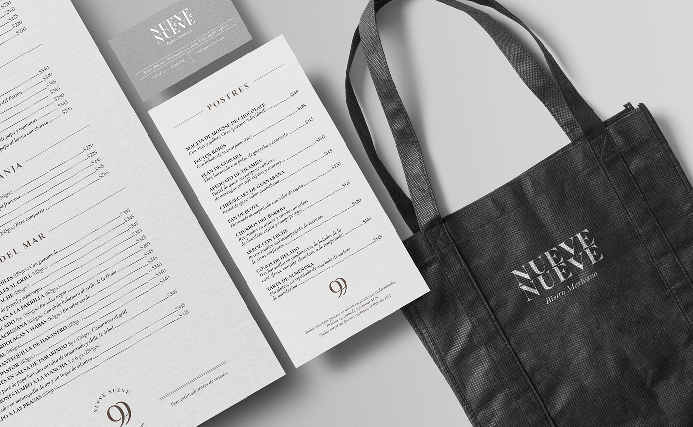
Nueve Nueve’s brand identity is lead by a simple, typographic mark consisting of interlocking “9” letterforms. This simple, yet striking, mark creates an instant connection with the restaurant’s brand. Secondarily is the stacked “Nueve” words in the same type as the 99.
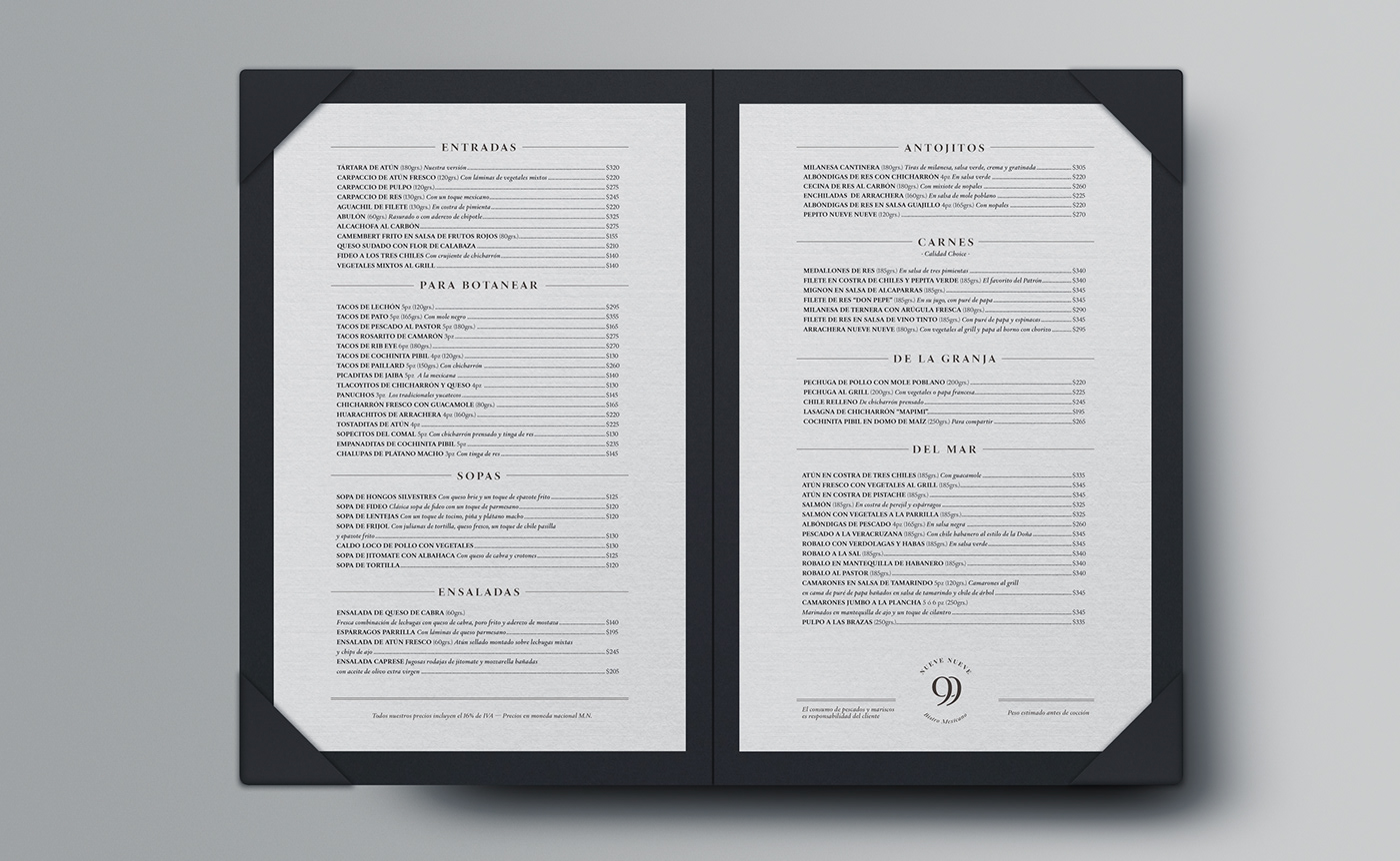
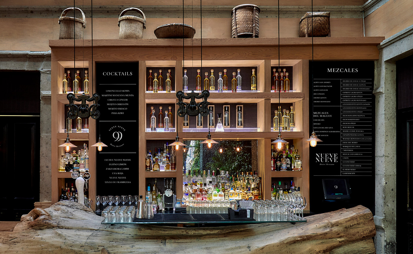
From this basis, the brand is built predominantly with the same typography used for the logos. Employing strong, sturdy grid systems and a monochromatic color palette, the various touchpoints create a sense of order and modernism. As a result, the bistro has an upscale, orderly feel despite being surrounded by so much organic greenery. The dichotomy is notably powerful.
My only criticism is that this brand is begging for more of a visual language outside of the 99 mark.
Design: Leolab
Architecture: Javier Sordo De Haro


