
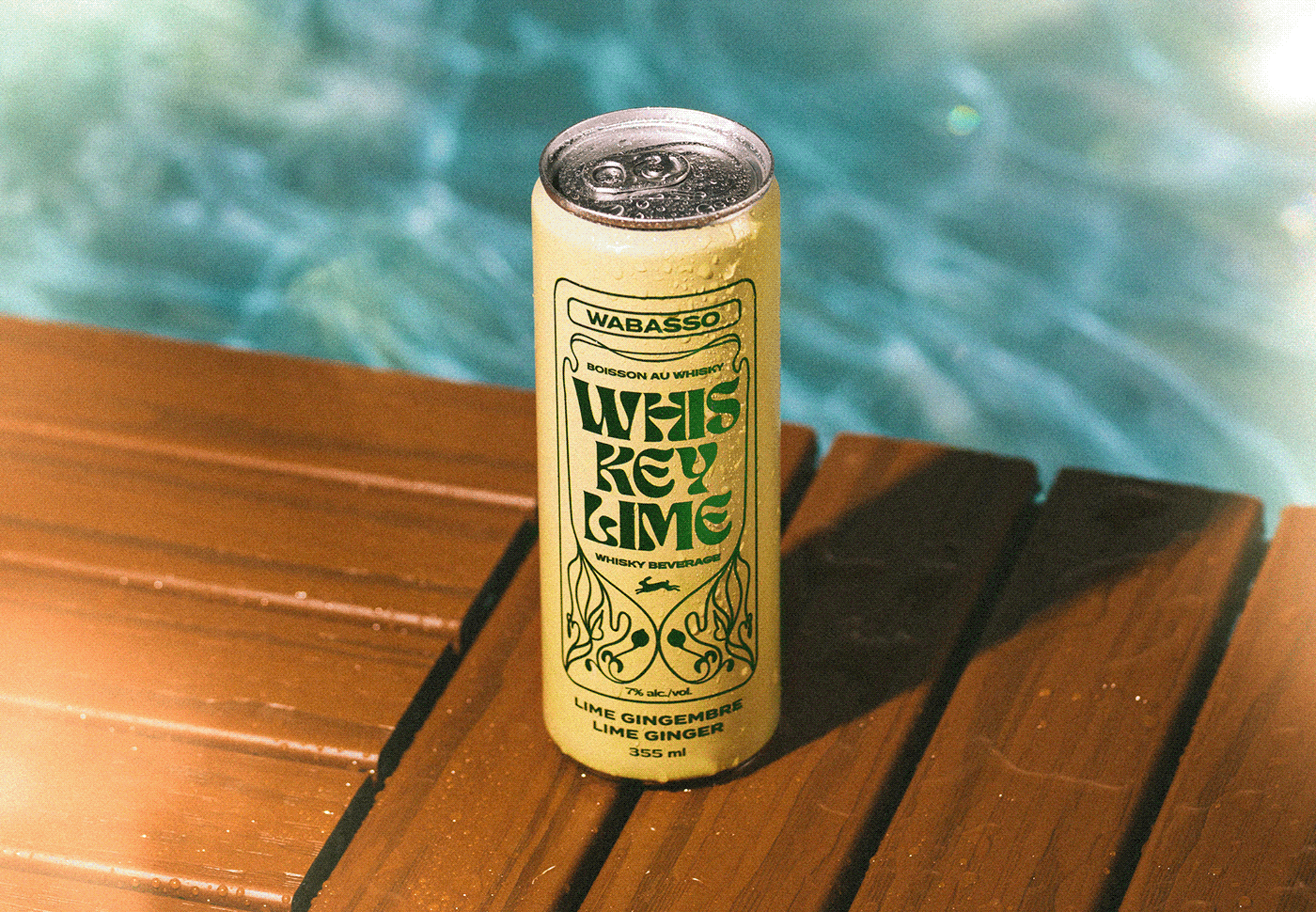
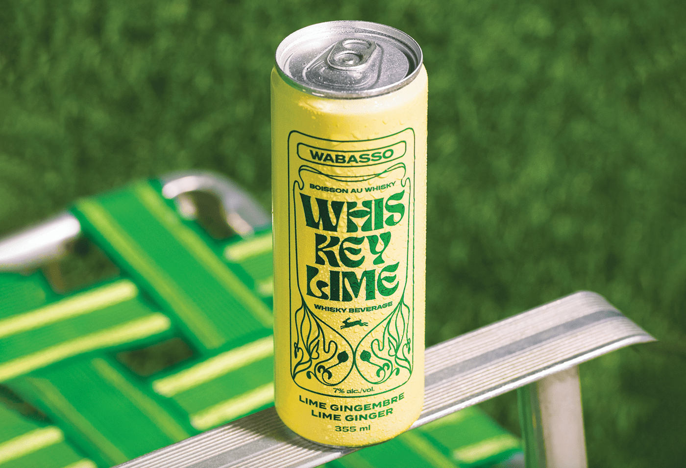
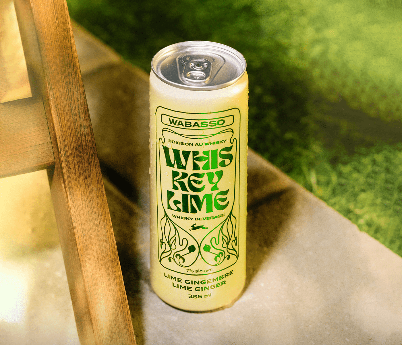
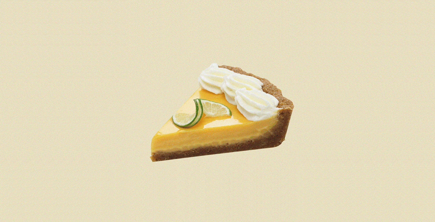
First and foremost, it’s “Whisky” and not “Whiskey.” However, in this case, we give it a pass because the spelling is a play on words to communicate the flavor: Key Lime.
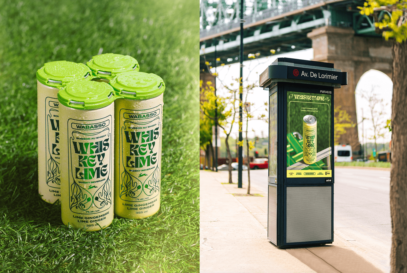
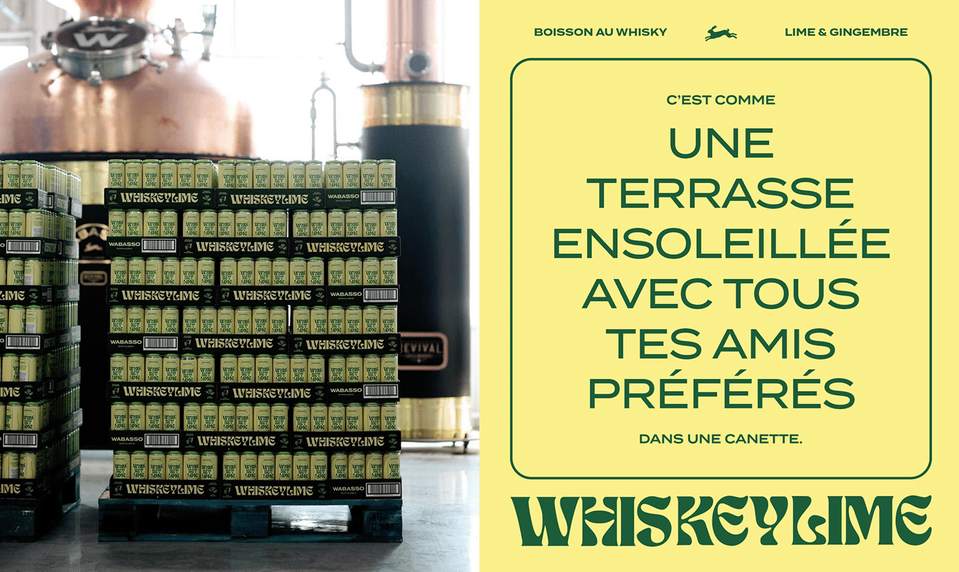
The ready-t0-drink beverage rage is in full effect, and this brand and packaging design is sure to grab the eyes of enthusiasts. Using a powerfully simple color palette, Wabasso Distillerie’s newest release, immediately sparks intrigue.
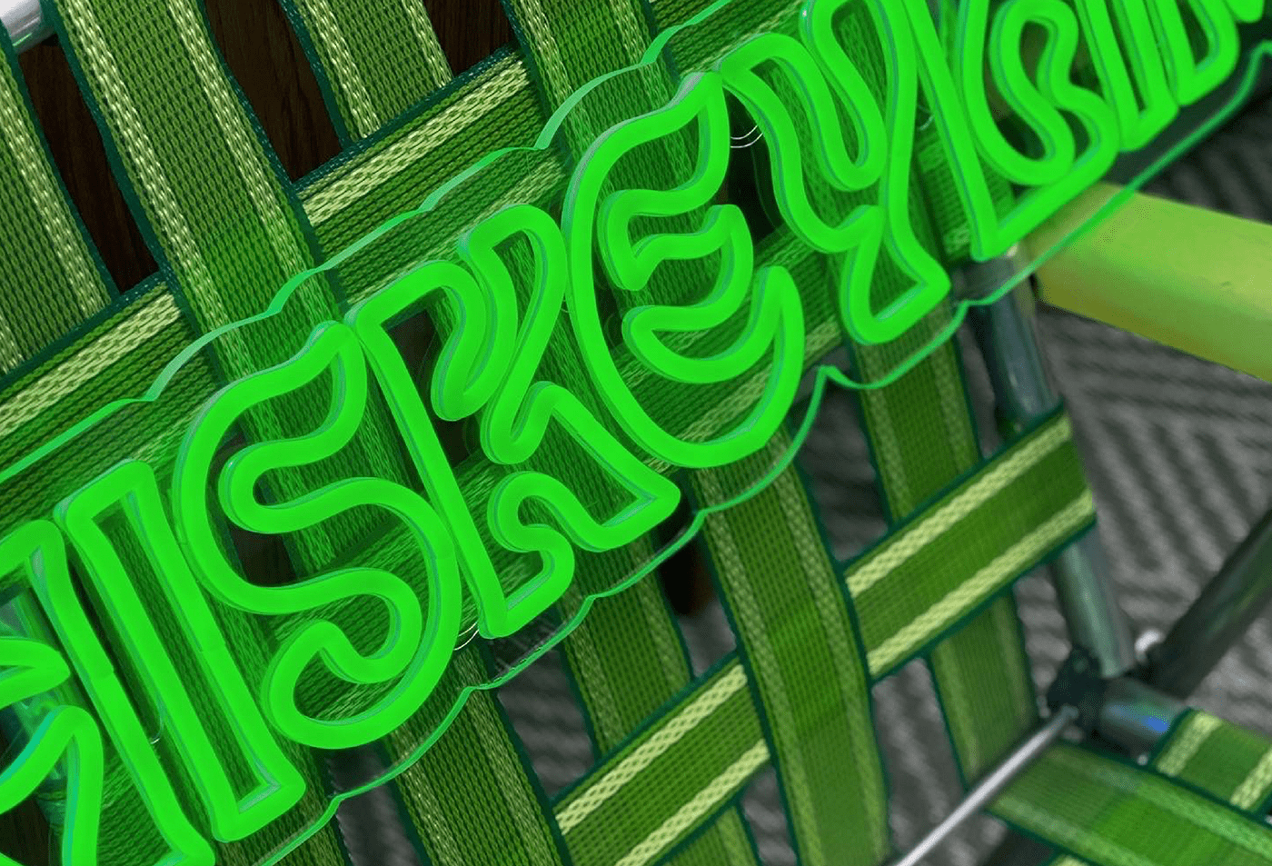
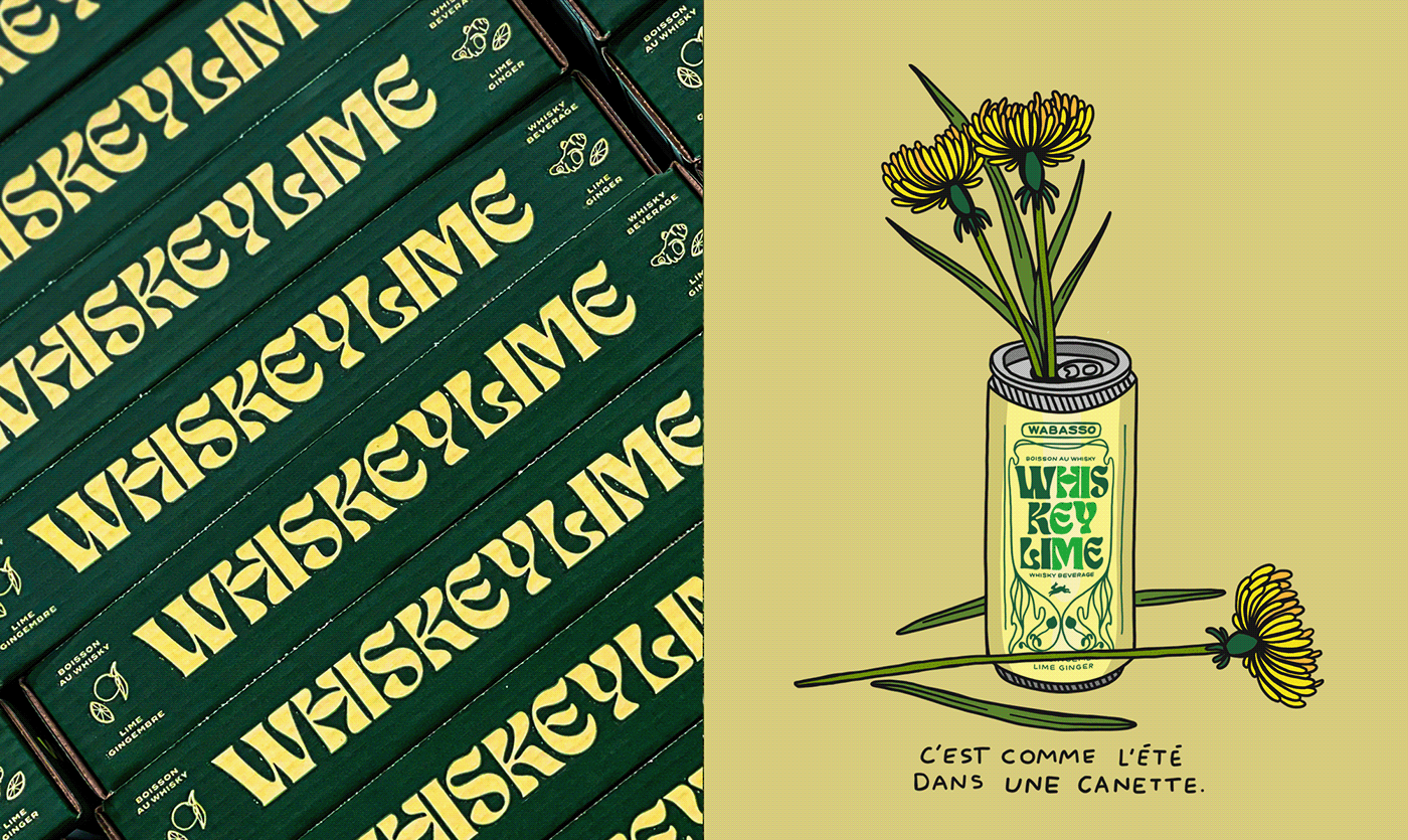
Inspired by the famous flavor of Florida’s Key Lime Pie, this whisky drink not only tastes like Key Lime Pie, it also sort of looks like it. At least in the sense of colors. Pulling the pale greenish yellow color from the pie, and the rich green from actual key limes, the design team found a notably strong combination. Mixed with an Art Nouveau design aesthetic, the packaging design communicates a natural vibe with a bright flavor experience.
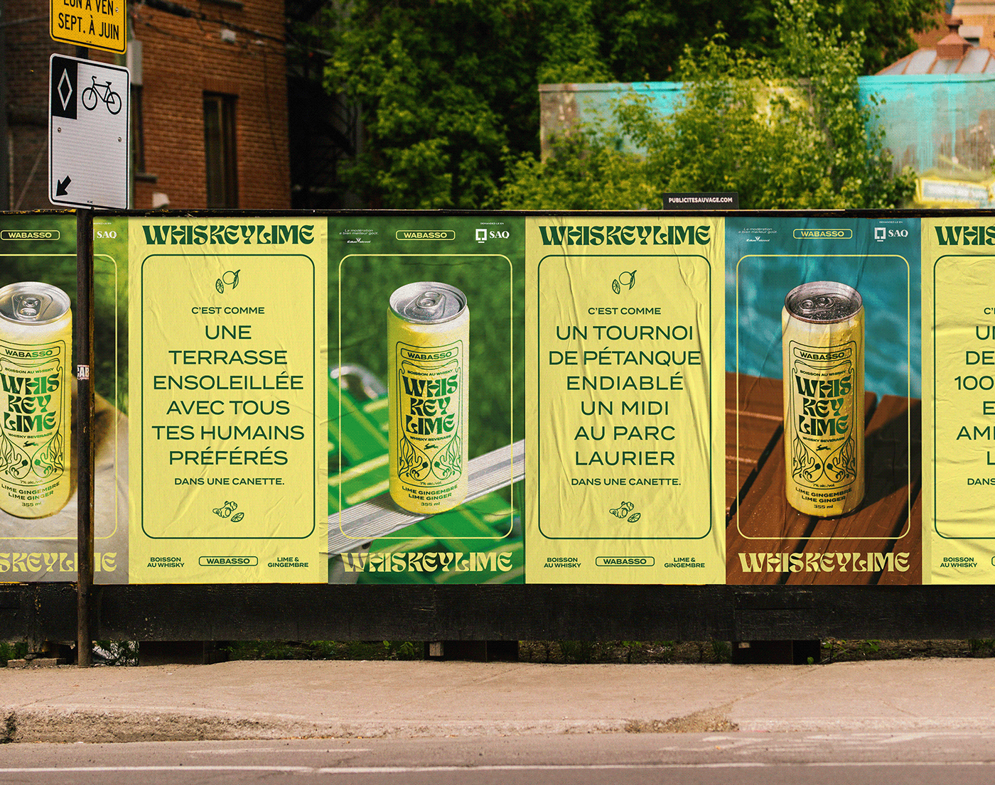
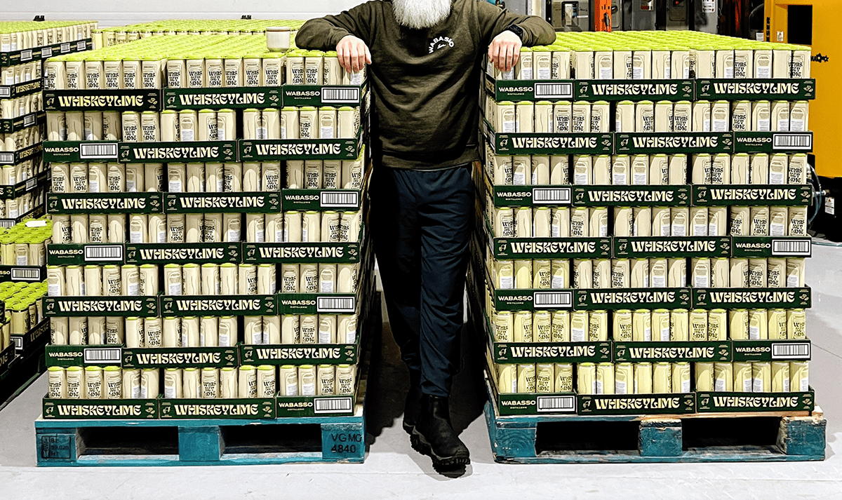
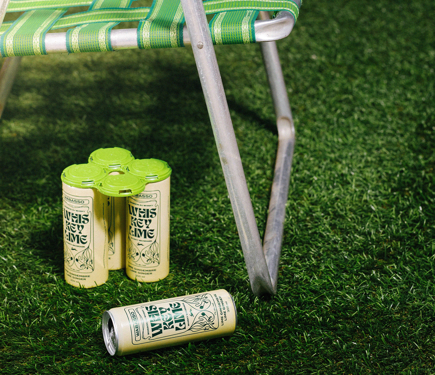
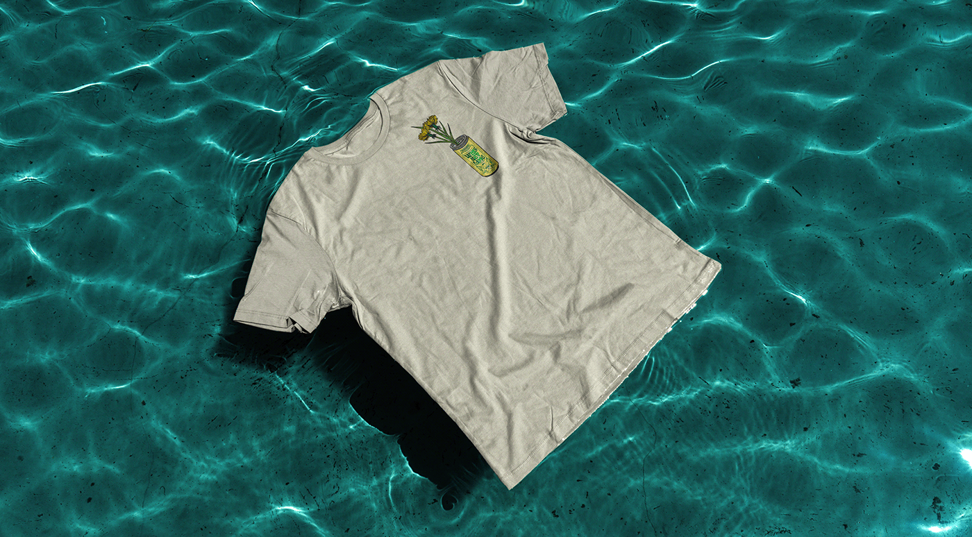
From this basis, the design team expanded into market and secondary packaging touchpoints that continue the visual language. The marketing creative creates a sense of place and lifestyle with Summer barbecues by the pool.
Designed by Acolyte


