
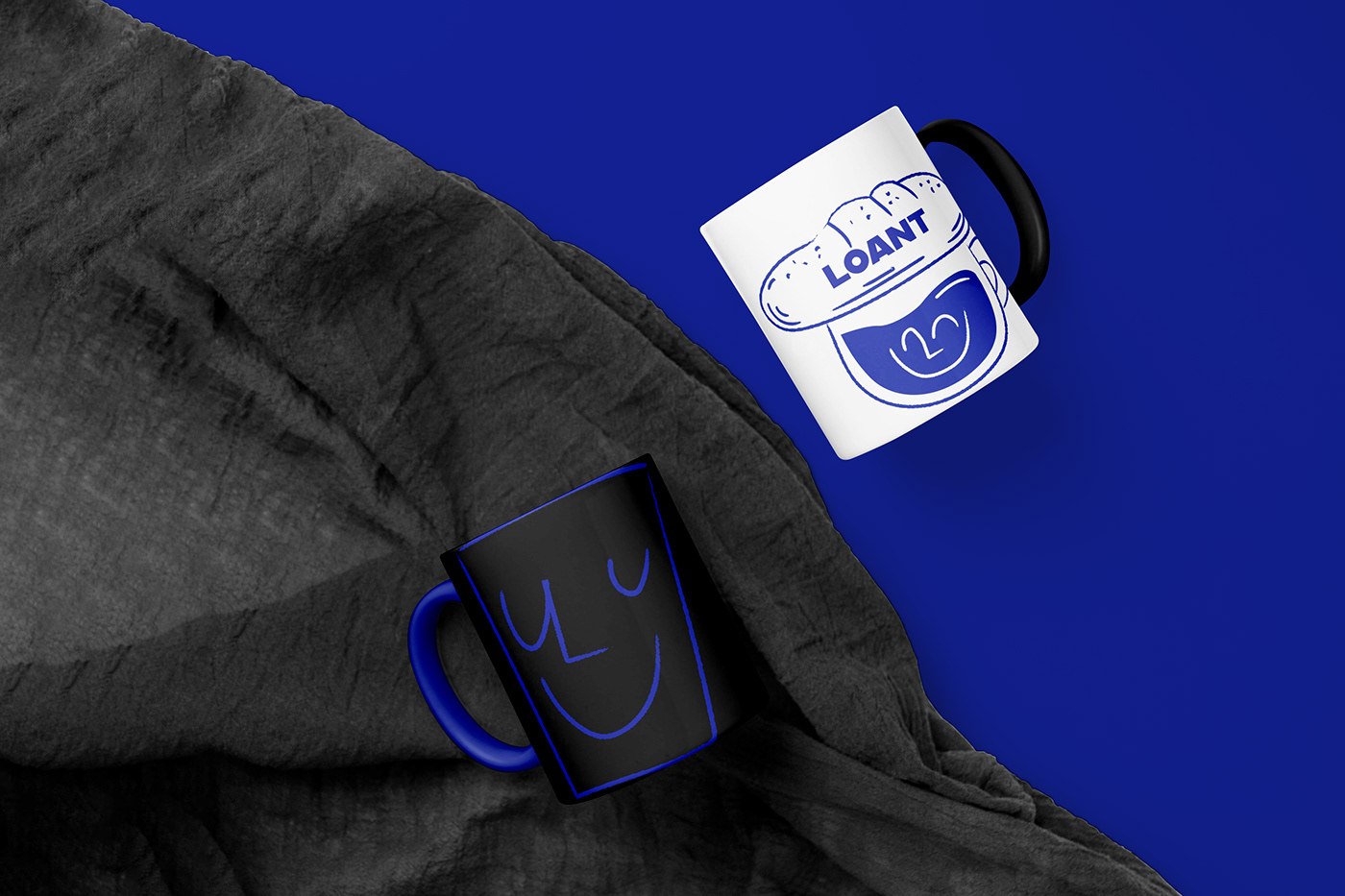
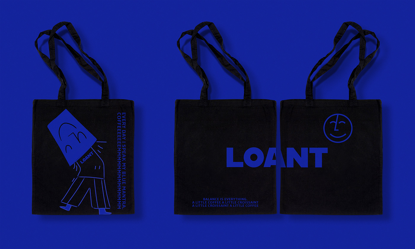
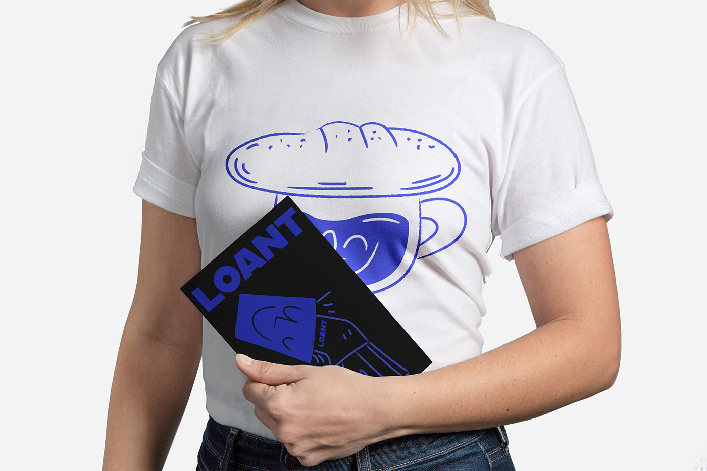
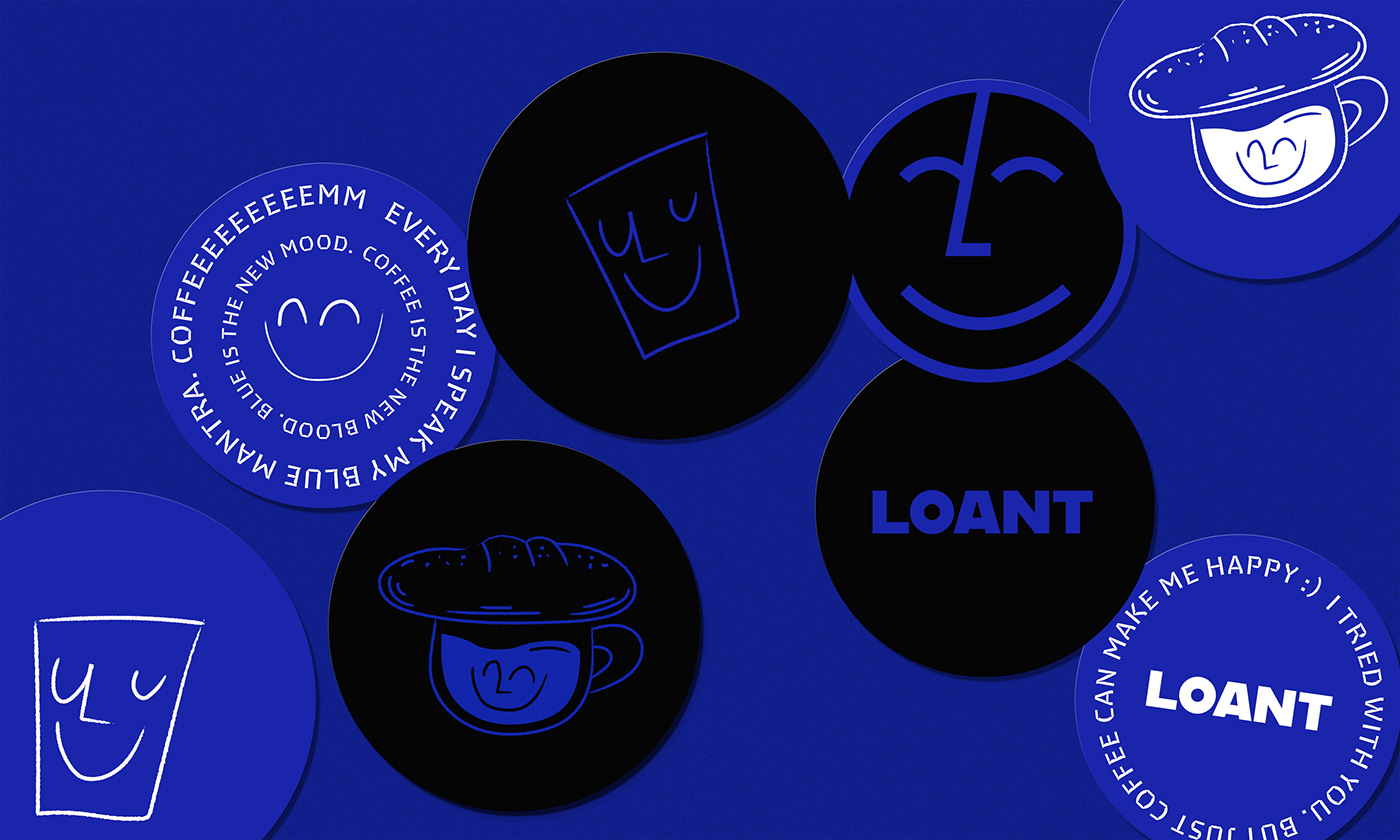
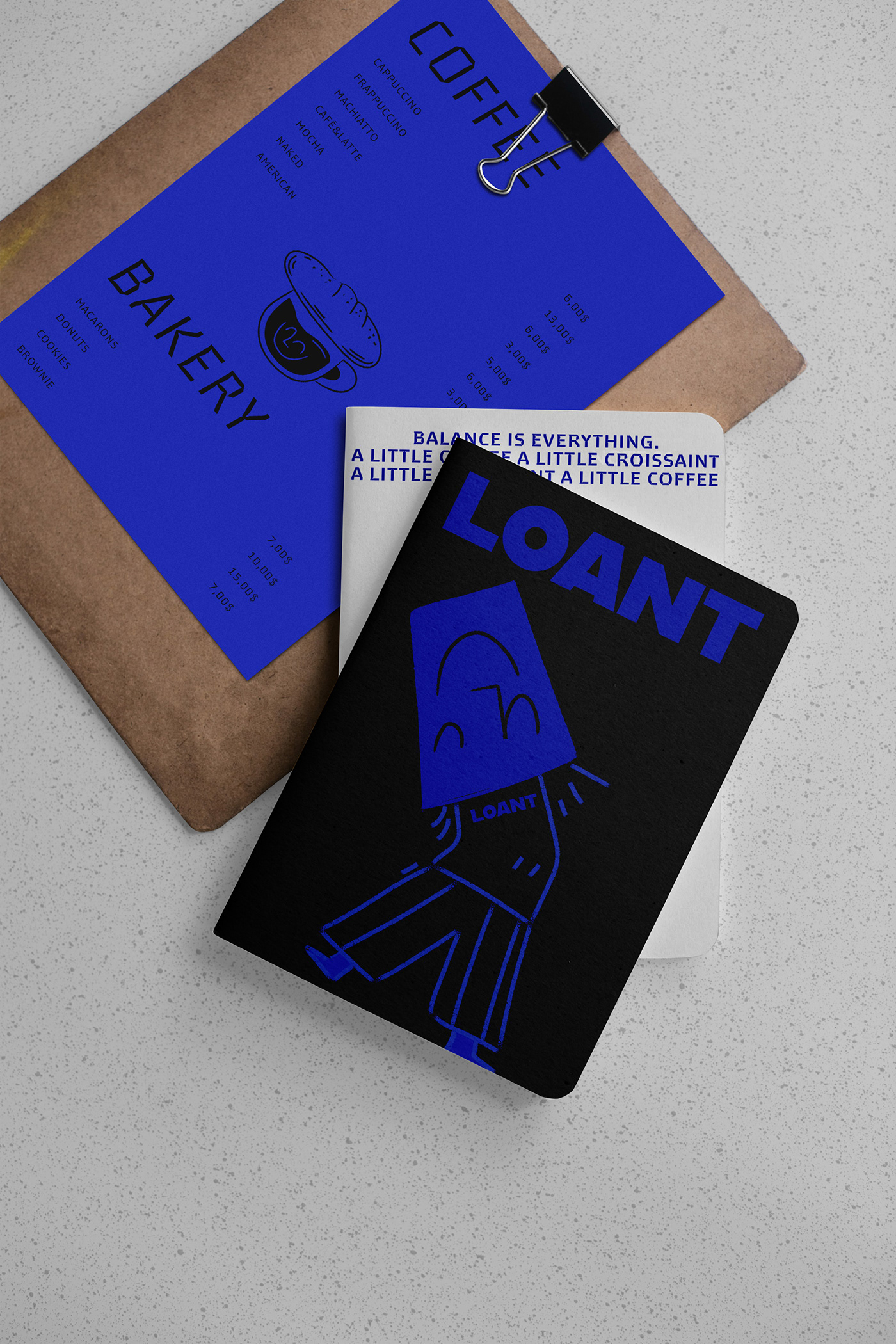
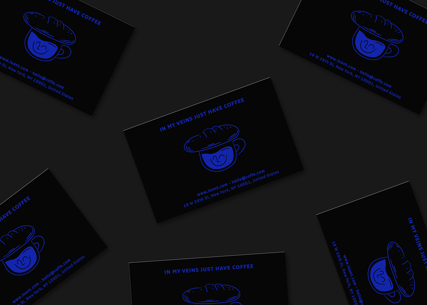
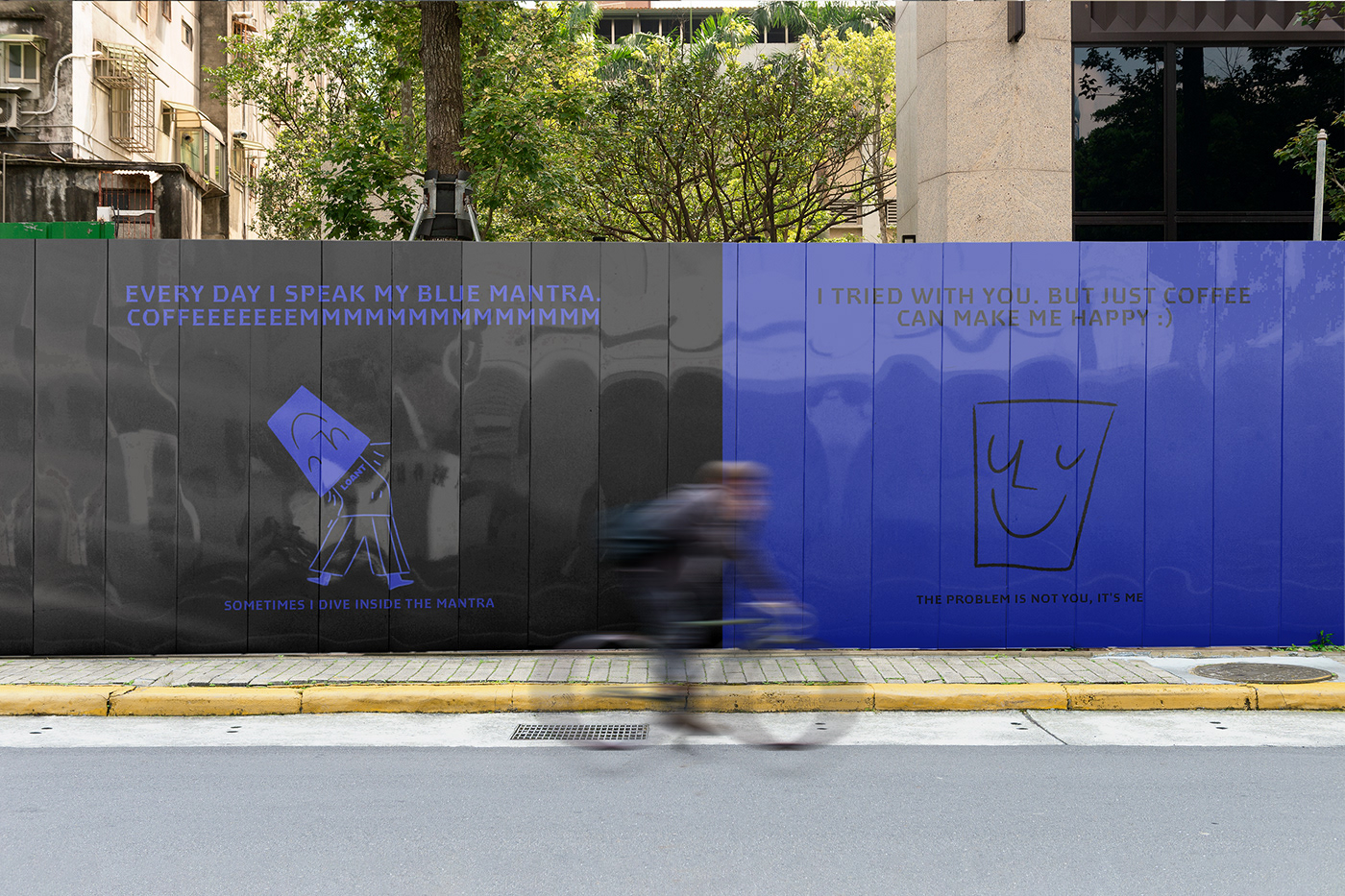
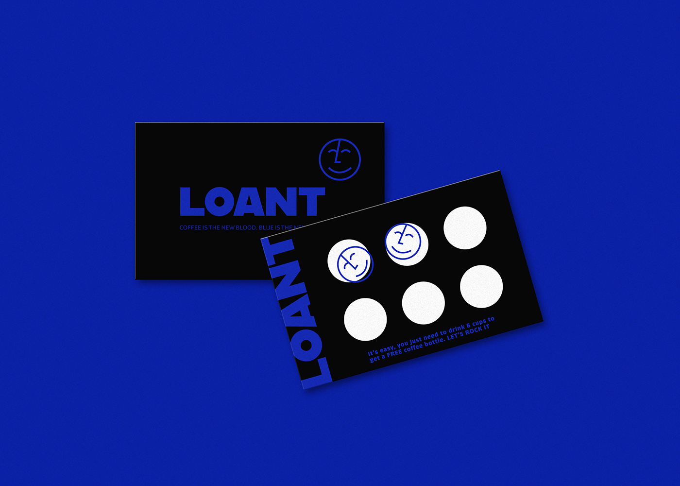
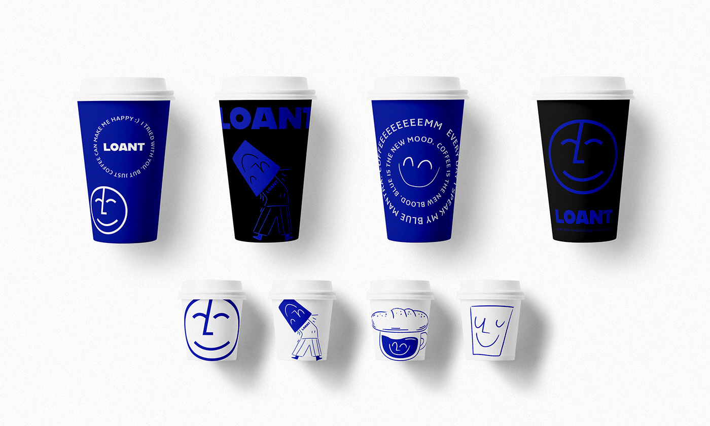
Created by good-humored, happy friends, Loant is a small coffee brand dedicated to the beloved coffee culture. The brand is striking in its use of royal blue and deep blacks. Usually, these colors don’t work very well together at all, but designer Eduardo Dias seems to have aced it.
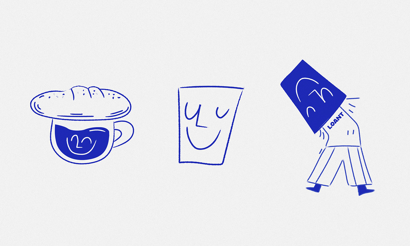
Dias creates a dichotomy between precise, stoic typography and freeform, hand-drawn illustrations. The result is an affable, yet strong, personality that’s memorable in the brandscape of coffee.
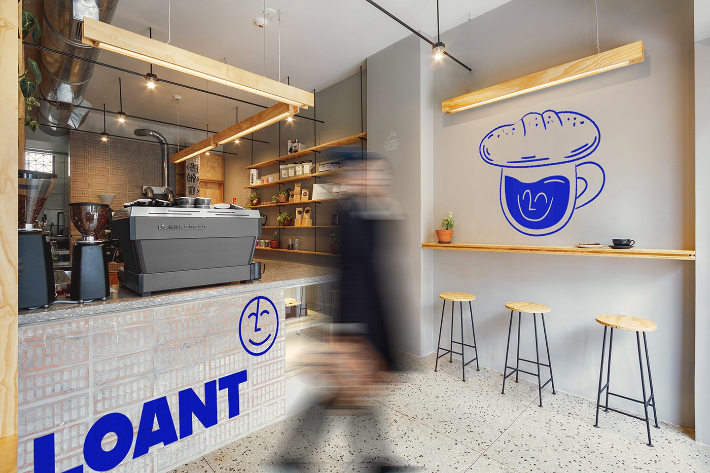
The interiors (attribution not available) are a beautiful expression of Scandinavian design aesthetic. It allows the rawness of slightly refined materials to shine from the cemented counter kick area that allows cinder blocks to push through to the beauty of sanded cement that allows each stone to show through. It’s beautiful and representative of coffee itself: raw materials refined to beautiful results.
Designed by Eduardo Dias


