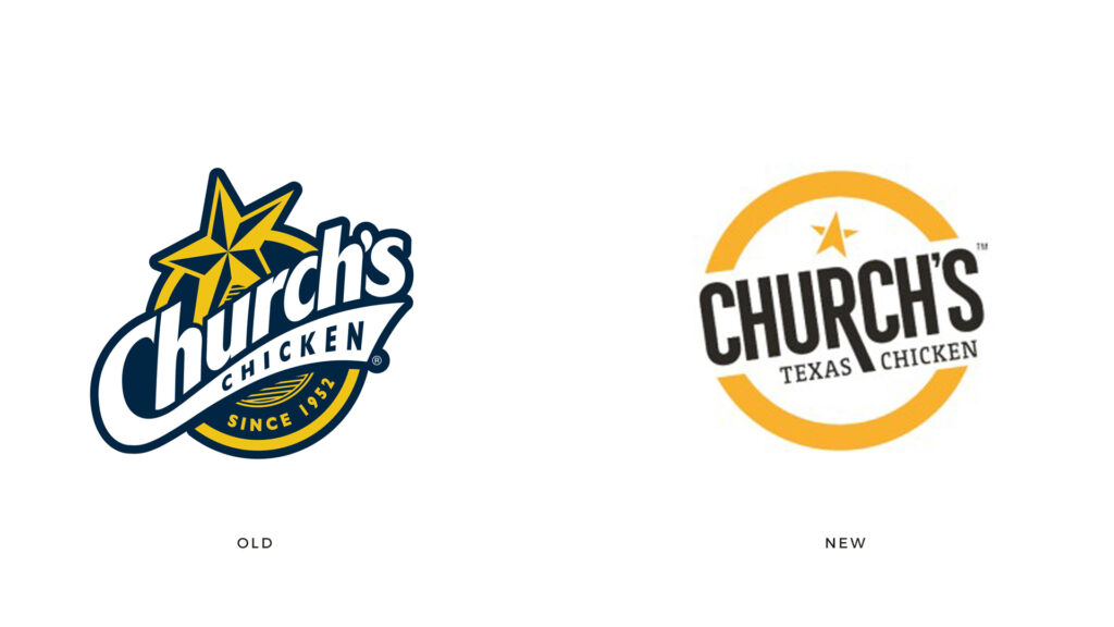
I wish there were more images to share on this, but it’s being slowly floated into the public view. The rebrand caught my eye on LinkedIn and when checking other social channels, I noticed the profile images were carrying the look, too.
The new look and feel is a clean up of the incumbent identity. it’s simplified almost to a fault in my opinion. The only visual elements that have seemed to survive are the circumnavigating yellow line and the star shape. Everything else has been shifted.
One notable positive shift is in the legibility of the new typography. A highly stylized, almost sports brand look typography shifts to a clean compressed sans-serif supposed by a slab-serif descriptor. The leg of the R letterform protrudes downward, but there’s no clear reason why.
The star mark has been shifted from an iconic Texas star to a basic version that seems to point north. Again, no clear reason why.
Colors are another shift. The new brand keeps yellow but makes it richer and more orange. The blue previously owned by the brand has been dropped in exchange for a warm gray.
I’m on the fence with the new identity. While there are positives, it seems to have shed any notable features and personality which seems to be a miss.
What are your thoughts?


