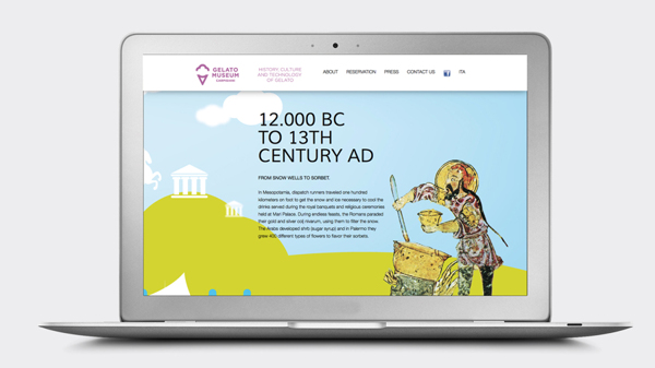
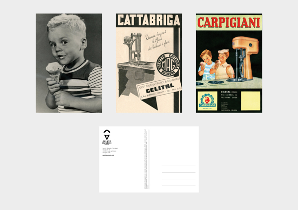
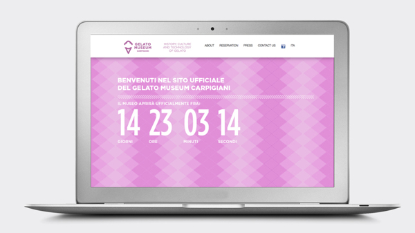
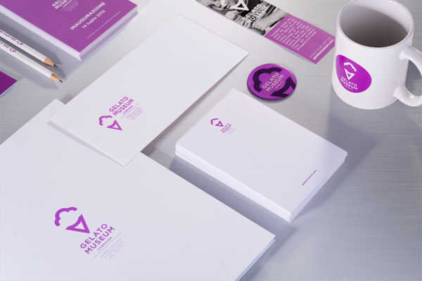
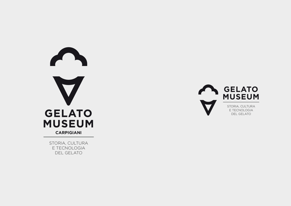
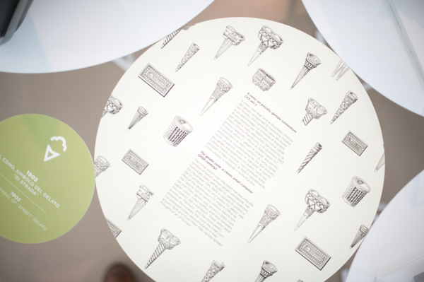
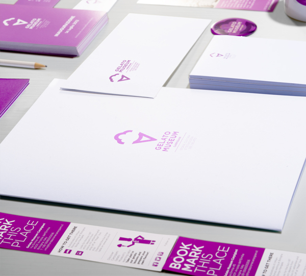
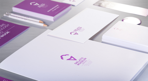
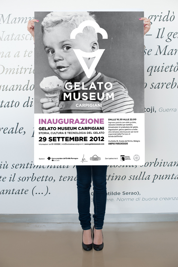
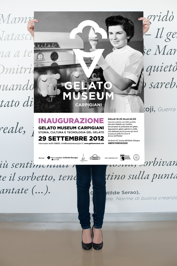
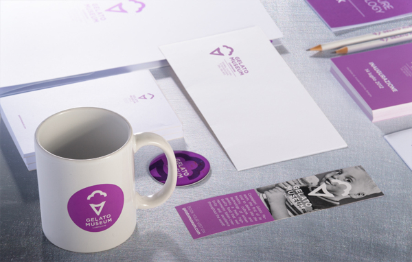
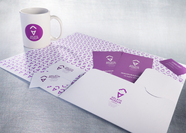
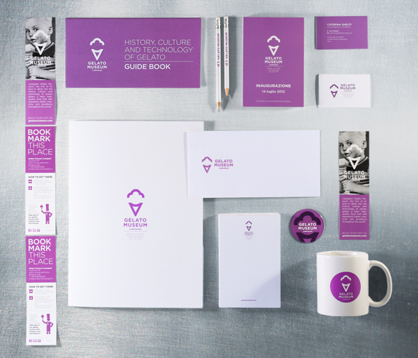
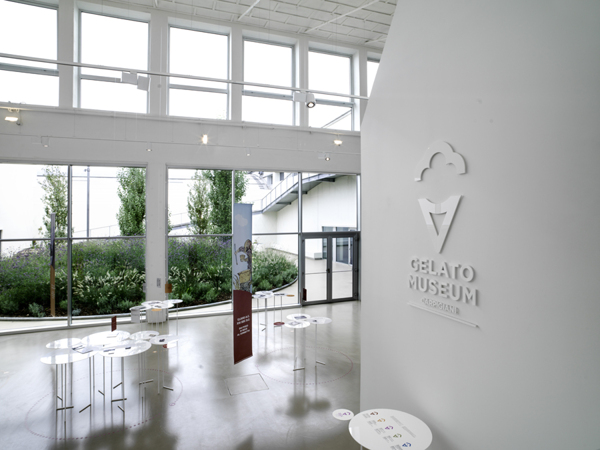
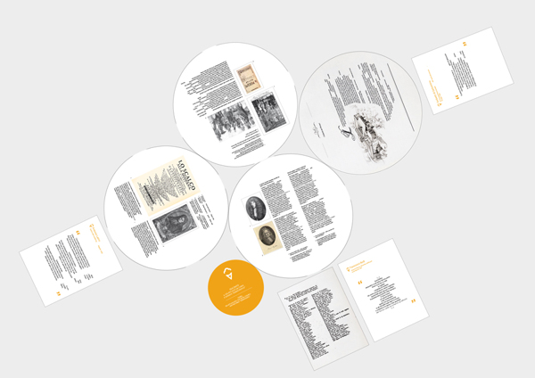
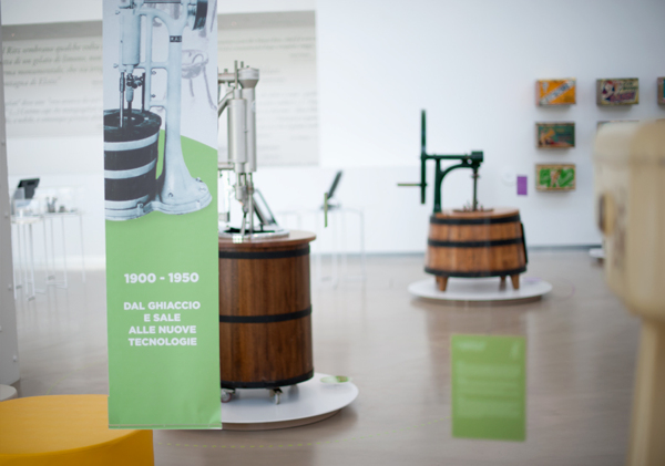
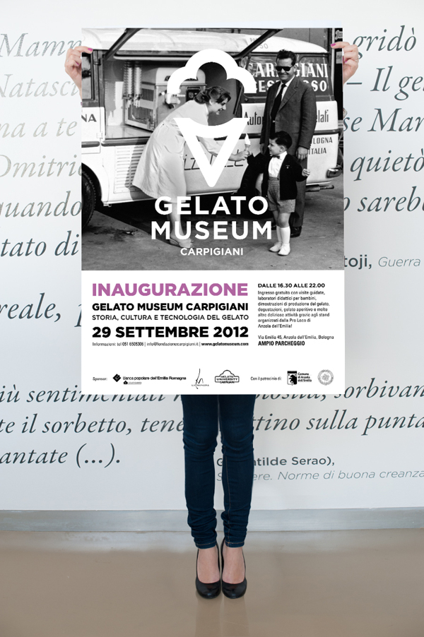
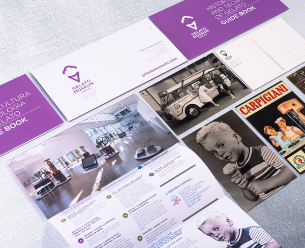
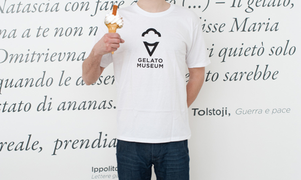
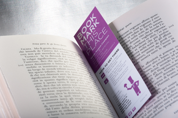
We’ve all been to museums. Some are fun, others a bit dry, but this is one with exhibits good enough to eat. And the brand is just as tasty. This is the brand identity design for the Gelato Museum. The creators the brand, Bipiuci, ran with a simplistic identity that let the typography, graphic and color speak for itself. The brand’s many touch points follow this approach making it easy to identify and stand out in any language. Here is what the agency had to say about it.
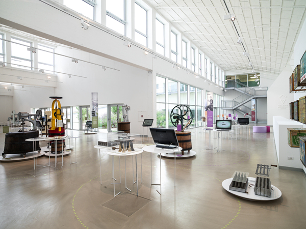
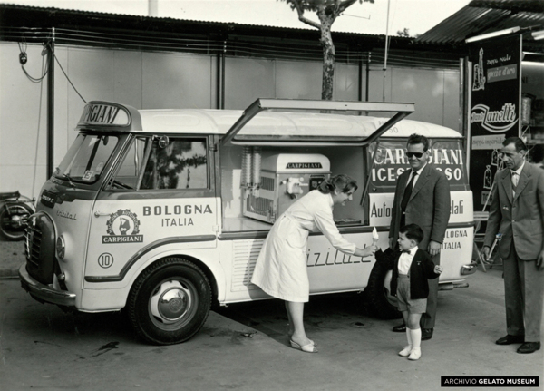
[Translated] The Carpigiani Gelato Museum is the first museum in the world dedicated to the history, culture and technology of ice cream. The international reference point of this famous culinary art everywhere.
When we were called to take care of its identity, the preparation and communication, we have thought of visual applications that were at the same time institutional simple but able to encompass also the essence of the museum.
From the history to the future, from technology to people, machines to taste. We are proud to have shared all phases of the project with the architects Clare and Matteo Gugliotta Caravatti, the creators of the museum and exhibition system.
