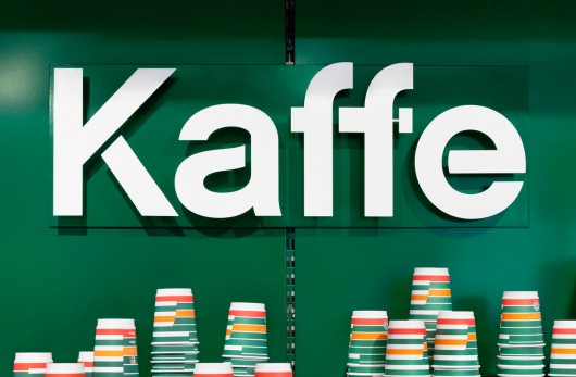
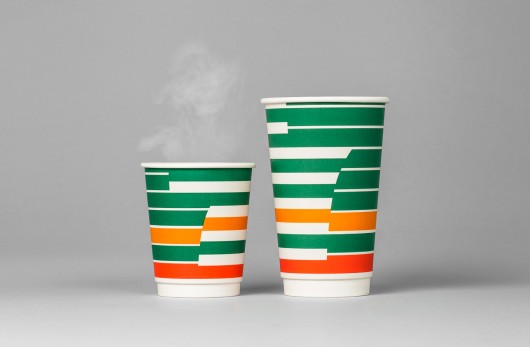
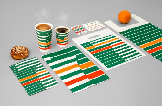
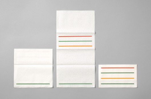
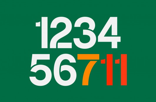
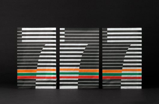
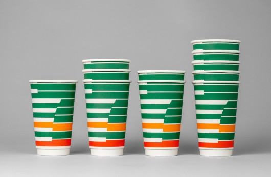
The updated branding for 7 Eleven’s coffee experience is an exercise in clean, simple design with easily recognizable elements. BVD, undertook the project with goal of streamlining the convenience store’s brand and updating it to be fresh and new.

To me it has more of a retro feel than a forward-thinking one. Here’s what the agency says:

7-Eleven decided to update their cof­fee con­cept for the Swedish mar­ket and empha­size a smart and con­ve­nient brand expe­ri­ence. The iconic stripes is the take-off point of our design. Mod­ern and clear branding.

7-eleven-rebranding-01-530x347

7-eleven-rebranding-02-530x347

7-eleven-rebranding-03-530x347

7-eleven-rebranding-04-530x347

7-eleven-rebranding-05-530x347

7-eleven-rebranding-06-530x347

7-eleven-rebranding-07-530x347

7-eleven-rebranding-08-530x347

Discuss this Project

Leave a Reply

This site uses Akismet to reduce spam. Learn how your comment data is processed.

The Forktales Podcast™: Interviews with restaurant industry leaders and visionaries

Restaurant and advertising industry headlines and thinking

Reviews of restaurant experiences from around the globe 

Reviews of our favorite design, business, & restaurant books

Our favorite typography and fonts

Inspiration in your inbox

Get the latest inspiration in your inbox every Monday morning, for FREE!

"*" indicates required fields

This field is for validation purposes and should be left unchanged.

Delicious Bits in your Inbox!

Get the latest and greatest content delivered to your inbox for free!

"*" indicates required fields

This field is for validation purposes and should be left unchanged.