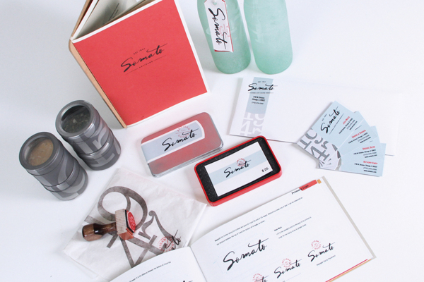
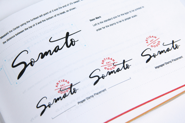
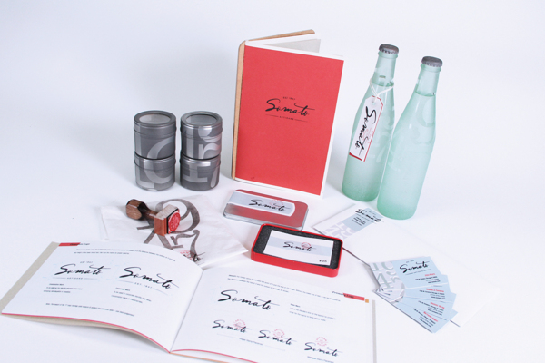
The brand for Somato Cafe is defined by a custom-made flagship typeface reminiscent of old style japanese inking. The packaging kit follows suit on the historical cafe’s brand with nostalgic style graphic treatments including stamping and woodtype printing techniques.
This is the full story:
Following World War II, Gregory Clark invested his service earnings into a modest storefront on Chicago’s Division Street. Influenced by post-war travels in Spain, he intended to bring an upscale bistro to the burgeoning neighborhood of Wicker Park.
In 1947, the displaced-persons population saw major rise, and a sympathetic Clark sought to help. He brought all goods production in-house: from bottling to packaging. Jobs were made, prices lowered and goods were gifted to those most in need.
Many of those changes made in 1947 still stand to this day, and with more than sixty years of history in Wicker Park, Somato – a word meaning “the body of” – happily lives up to the name.
Branding: Josh White
Packaging: Gabriela Saravia
Advertising: Brooke Blom
Corporate: Anthony Knipp


