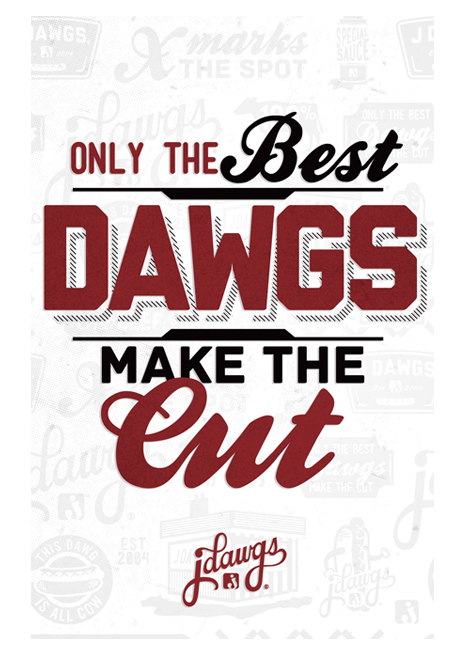
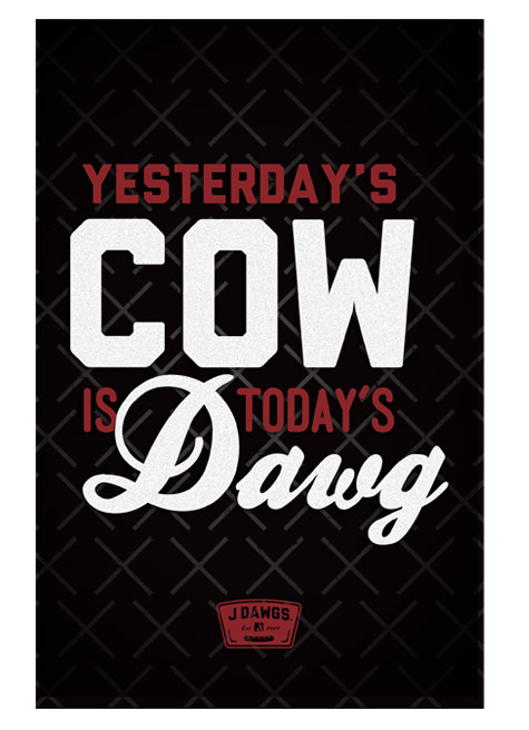
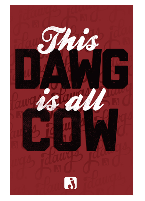
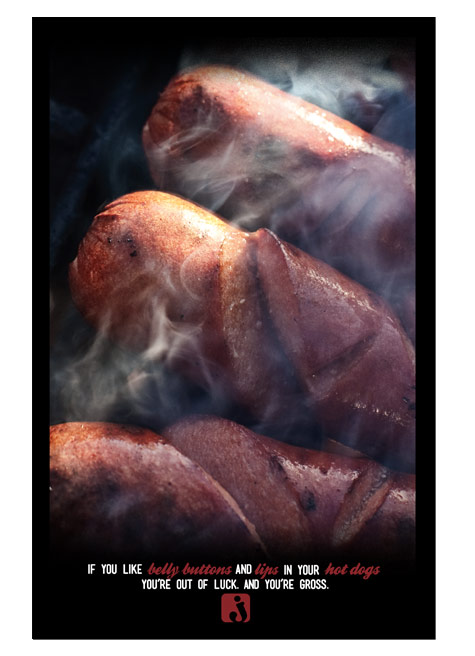
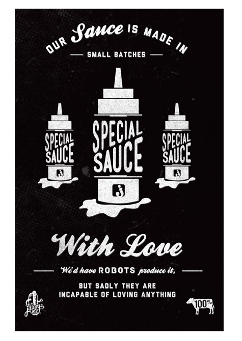
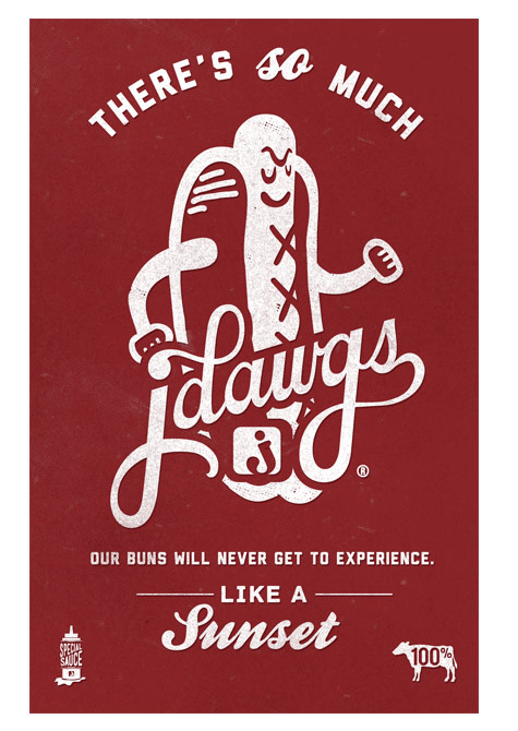
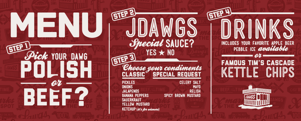
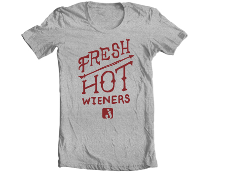
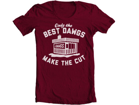
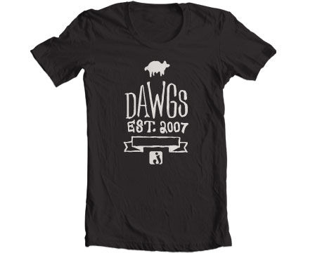
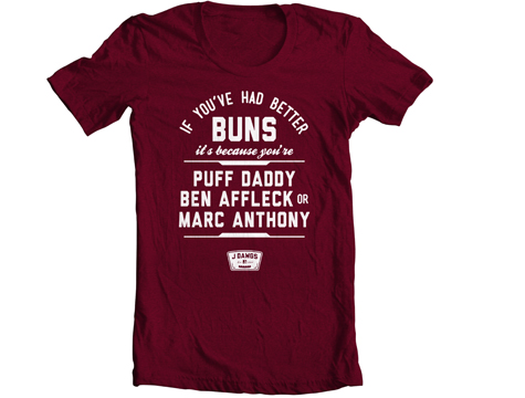
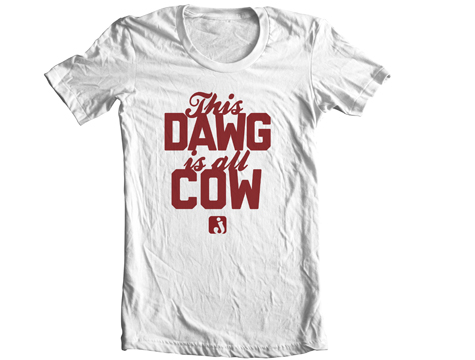
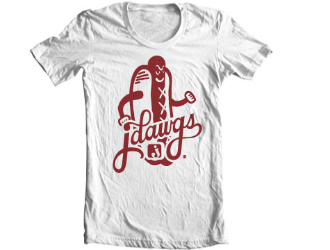
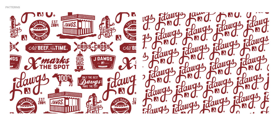
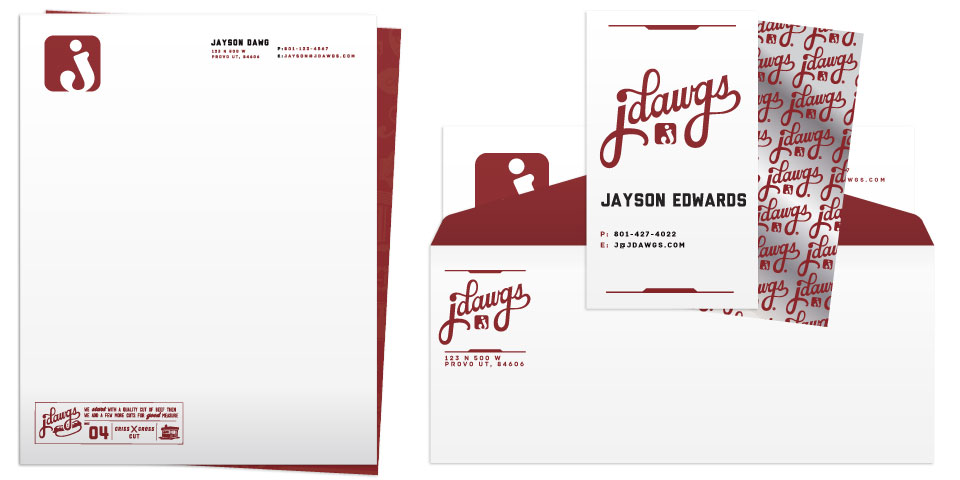
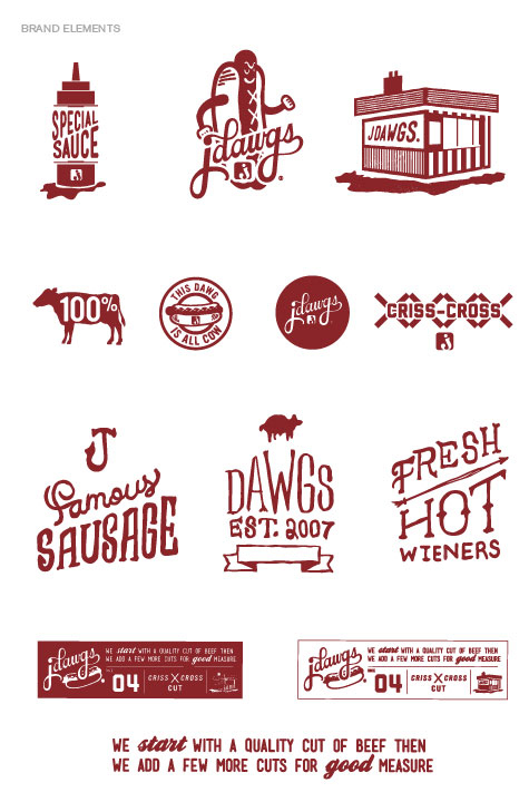
A bit ago I covered J Dawg’s new website, which is pretty rad, but couldn’t find out who did the complete rebranding… until today. Designed by Super Top Secret out of Salt Lake City, Utah, J Dawgs new brand is a sexed up, semi-nostalgic, hot dog brand with some ‘tude. Here’s their writeup and their work:
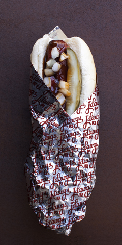
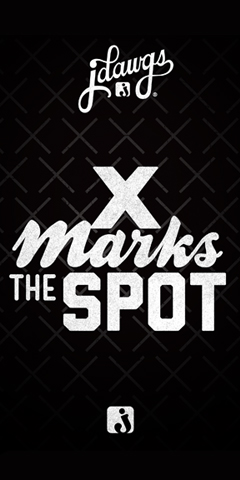
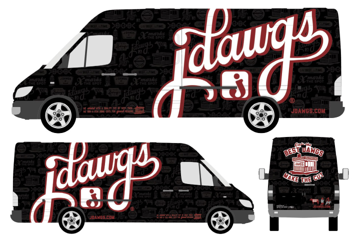
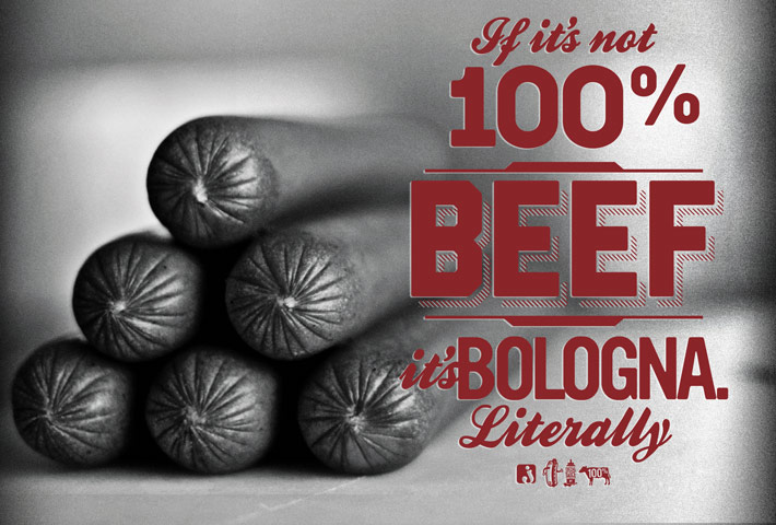
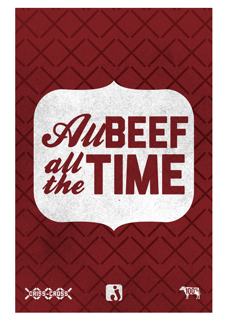
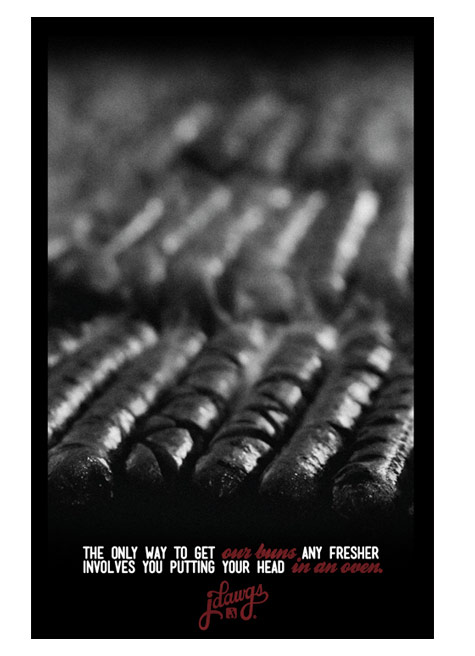
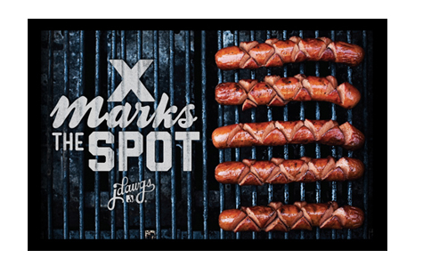
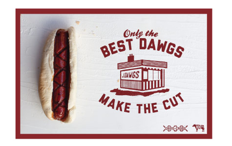
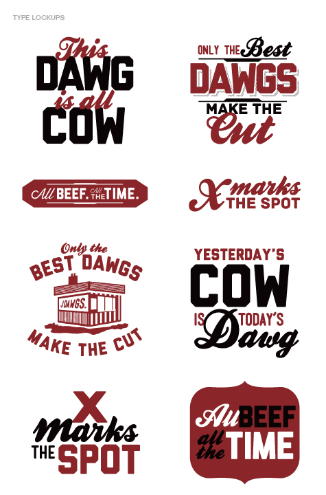
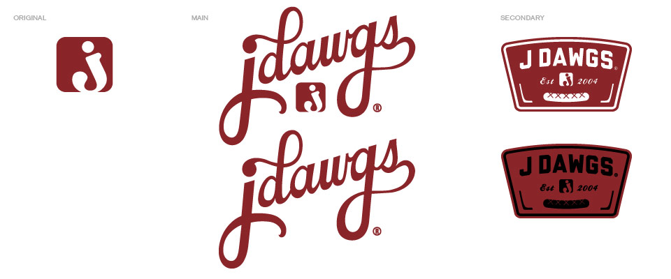
While J Dawgs has been serving up the tastiest meats in Utah since ‘04, their branding needed a little gussyin’ up, so when they came to us we vowed to cook them up a smorgasbord of STS branding hotness. We hit ‘em with the full hook-up. First we took their branding to the next level by cleaning up their logo and creating new brand elements featuring new iconography and type lockups. We then dropped said hot new elements into menus, napkins, cups, wrappers, environmental design, posters and vehicle wraps. We’re really pumped how everything turned out—admittedly, we’re probably more stoked on the lifetime supply of dawgs. We just earned ourselves a one-way ticket on a bullet train to meatsweatsville. All aboard.


2 Responses
Looks WAY too much like Matt Stevens work on JJ’s Red Hots:
http://largetype.squarespace.com/blog/2012/6/27/process-jjs-red-hots-pt02-extending-the-brand.html
C’mon!
Interesting. I see the similarities for sure. It seems the patterned, multi-logo identities are trending right now.