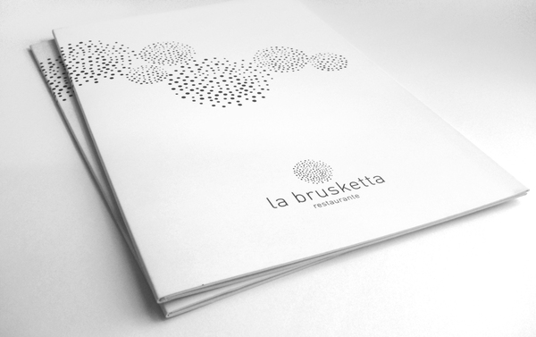
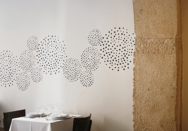
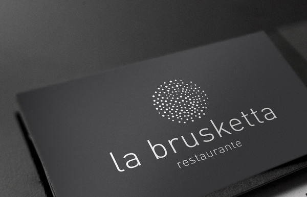
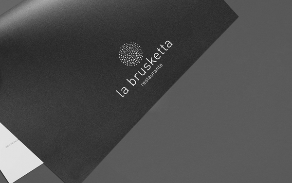
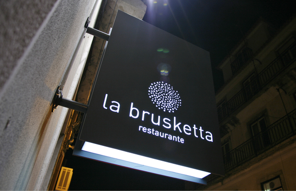
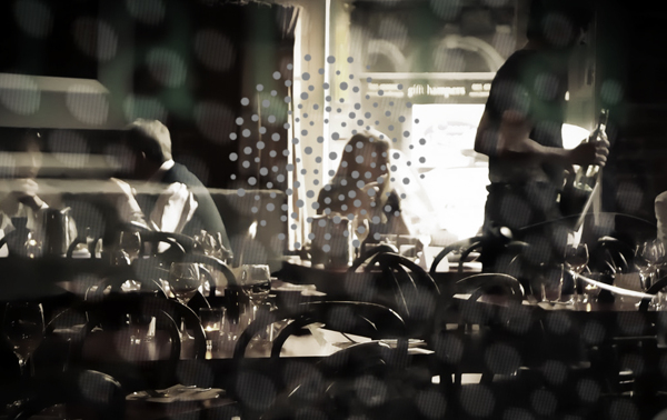
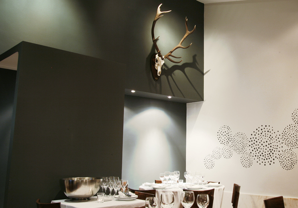
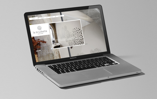
This sexy, chic restaurant brand is confident in its use of design and color. Muted colors mix with vast, stark planes of color where lighting is allowed to create texture throughout the space. The logo’s key graphic is used quite intelligently as an interior accoutrement. Designed by Tux & Gill.
464c01215c0bb254cb9df055bf5811b6

f6b20bef660ff32c4a76f727ca2fd1bb

33e8c80ec85306487548af288ce2f860

3a29d39e88b285872bd8d3b470fac4e2

97596a3a99269eaadf0c49ee080484ca

0937c3e4770311b05583c084c73f4fca

36a08ee5802973c7062e6a36770aee80


36f411745f8a189bd656d352df4f59f8

3782472d0475cc95eb899baa110a9018

Discuss this Project

Leave a Reply

This site uses Akismet to reduce spam. Learn how your comment data is processed.

The Forktales Podcast™: Interviews with restaurant industry leaders and visionaries

Restaurant and advertising industry headlines and thinking

Reviews of restaurant experiences from around the globe 

Reviews of our favorite design, business, & restaurant books

Our favorite typography and fonts

Inspiration in your inbox

Get the latest inspiration in your inbox every Monday morning, for FREE!

"*" indicates required fields

This field is for validation purposes and should be left unchanged.

Delicious Bits in your Inbox!

Get the latest and greatest content delivered to your inbox for free!

"*" indicates required fields

This field is for validation purposes and should be left unchanged.