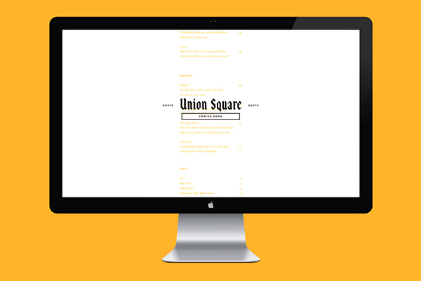
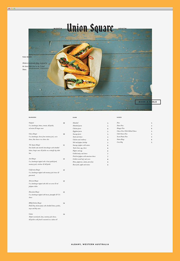
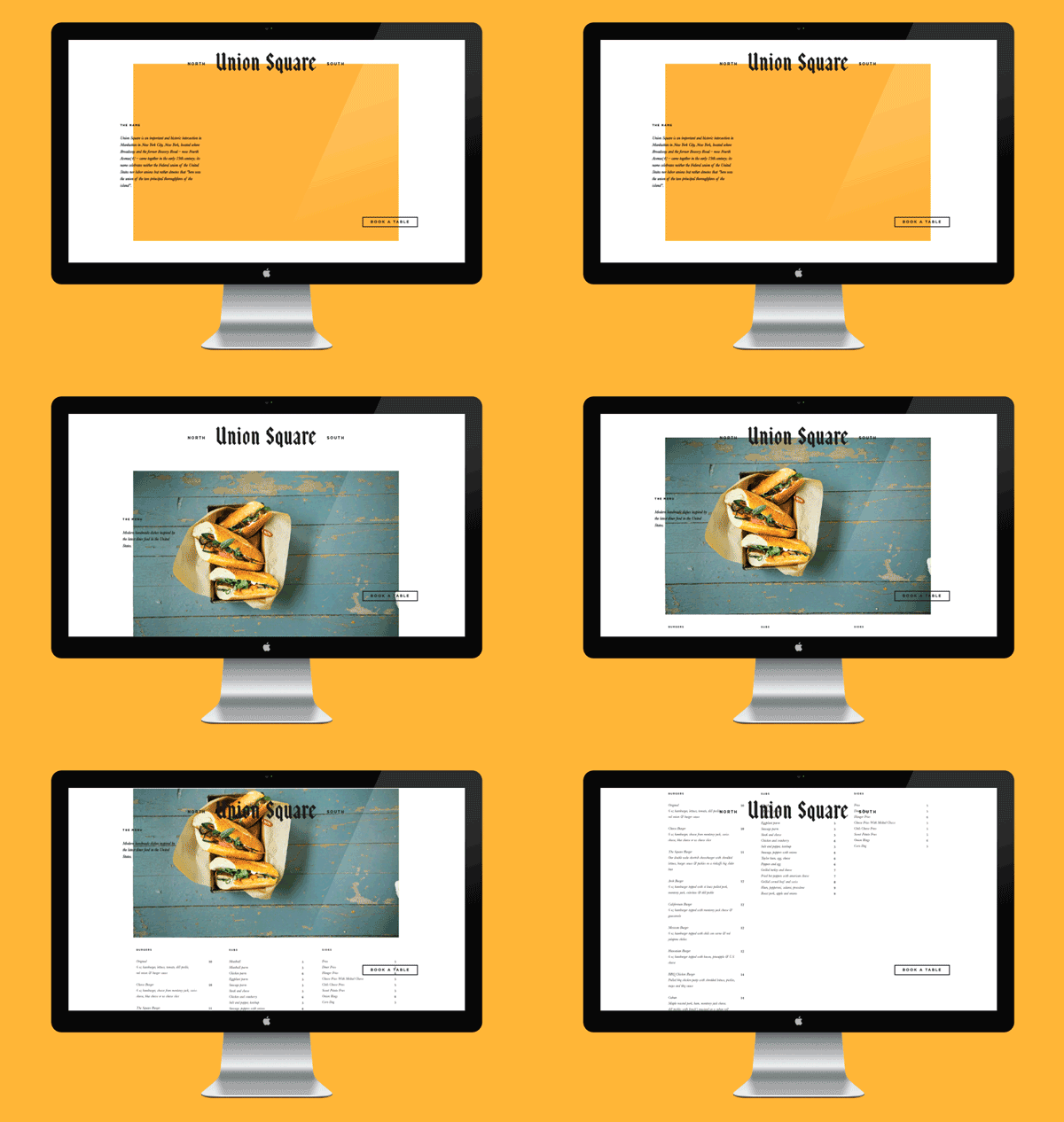
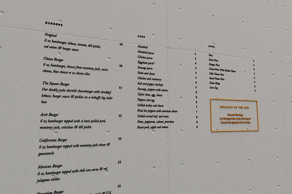
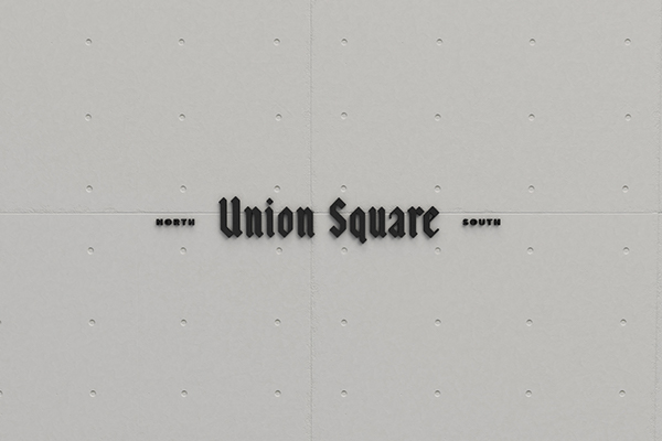
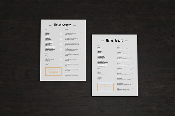
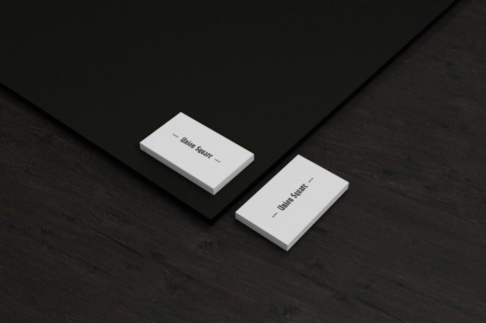
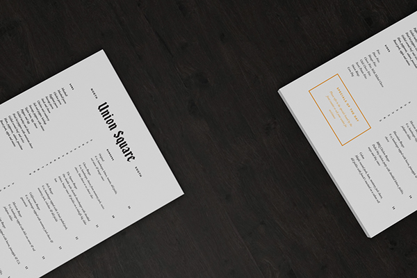
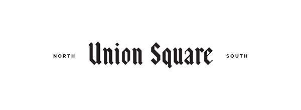
Usually black letter typography turns me off. It’s so old school and it’s mostly used for old english pubs as if it’s the only style choose available. However with the brand identity design for Union Square Design, the black letter loveliness truly shines. It’s simple enough to not be overdone, but interesting enough to capture attention. Setting the type layered over other elements adds a new, unexpected effect of texture and design. Well done by Sorbet Design.
