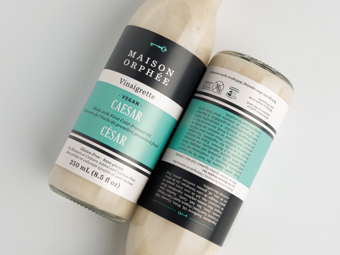
Maison Orphee package design

Real quick: Big apologies for lack of updates. We had a bit of a security breach on our servers which soaked up every second of time over the last few weeks. Nightmarish. There’s a special place in hell for hackers. Let’s all hope they find their way there soon. Onward and upward.

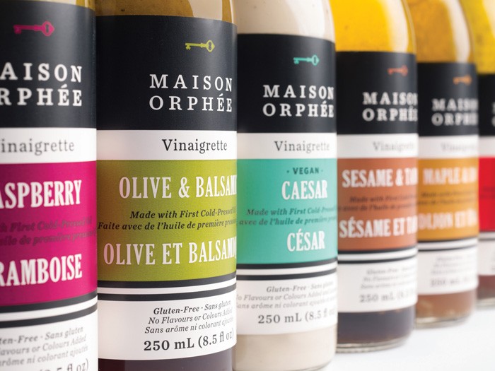
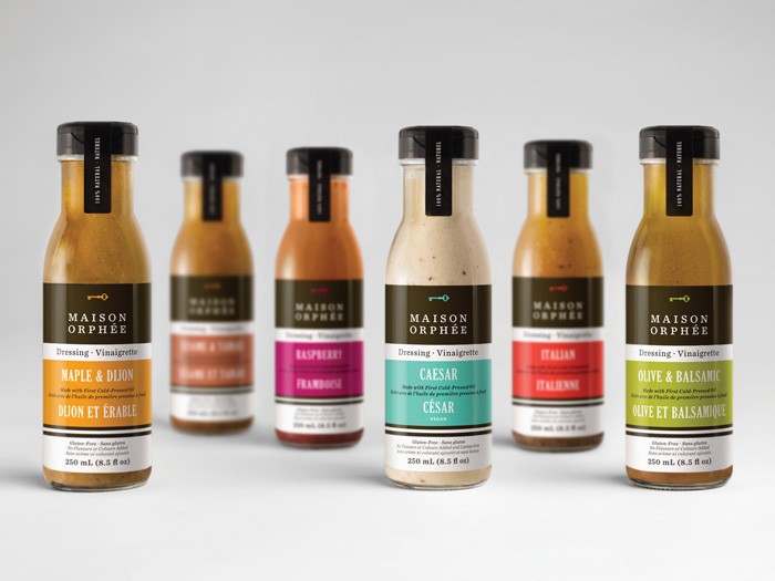
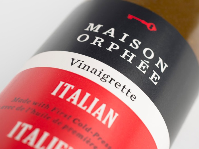
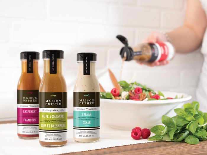
I wanted to share this stellar package design from the brains at LG2 Boutique in Montreal Quebec. Maison Orphee is a family of salad dressings that are all natural and artisan. Although they tout their natural ingredients, the studio has avoided using cliche visual cues that normally imply “organic” and “natural.” Instead they’ve elevated the look with strong color planes, a predominate black bar across the top that holds the core brand identity elements in a highly modern composition. Colors are used to denote different dressing varieties bolstered by simple, yet interesting typographical layouts. The simplicity of the design creates a feel of high-end quality.
2ee3741b593df5976ba8c8d913a85ce9

6d407aea5f01360a787a98124d79037c

14867ff0ac19effb99c861f5b3ffb87b

43739a91931c6e9175824566a656df47

dd3122971ea8e41b5713161491881fa5


Discuss this Project

Leave a Reply

This site uses Akismet to reduce spam. Learn how your comment data is processed.

The Forktales Podcast™: Interviews with restaurant industry leaders and visionaries

Restaurant and advertising industry headlines and thinking

Reviews of restaurant experiences from around the globe 

Reviews of our favorite design, business, & restaurant books

Our favorite typography and fonts

Inspiration in your inbox

Get the latest inspiration in your inbox every Monday morning, for FREE!

"*" indicates required fields

This field is for validation purposes and should be left unchanged.

Delicious Bits in your Inbox!

Get the latest and greatest content delivered to your inbox for free!

"*" indicates required fields

This field is for validation purposes and should be left unchanged.