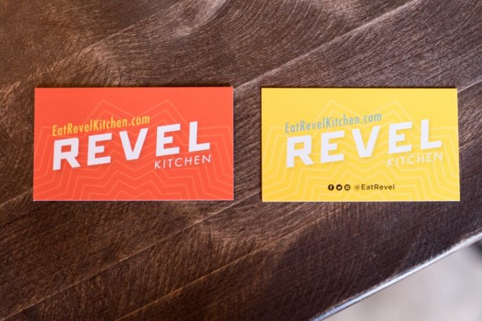
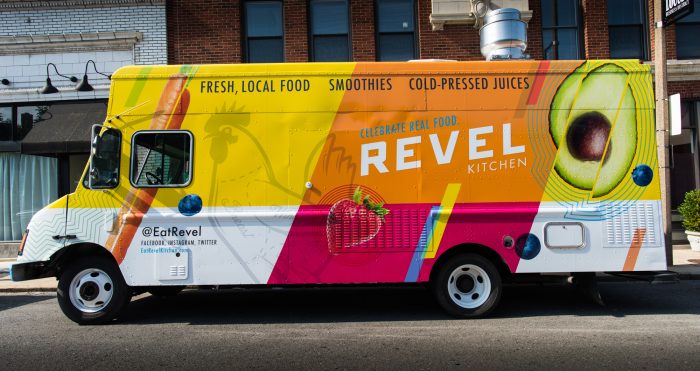
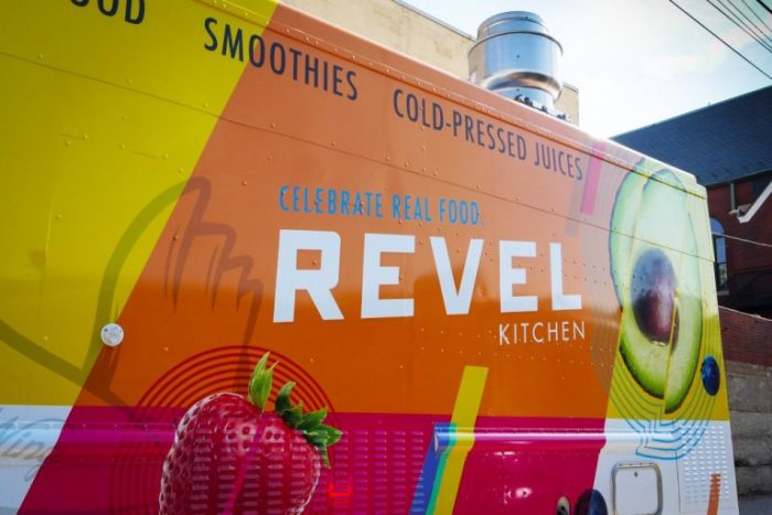
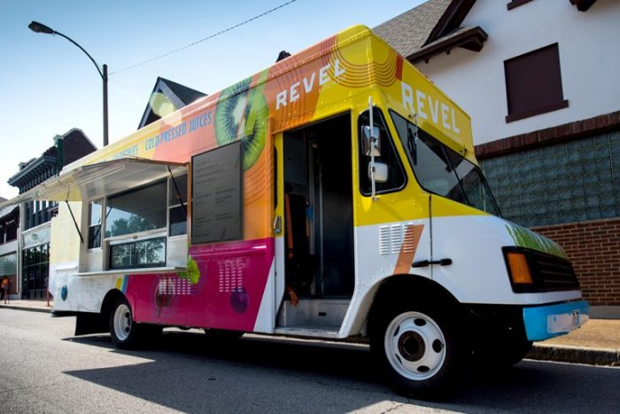
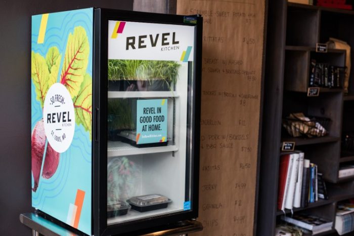
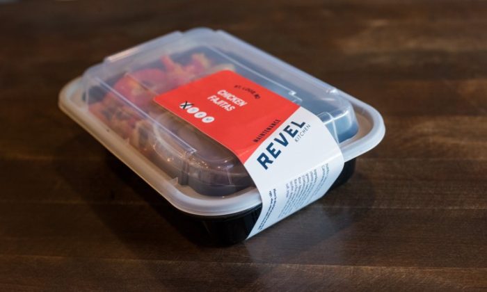
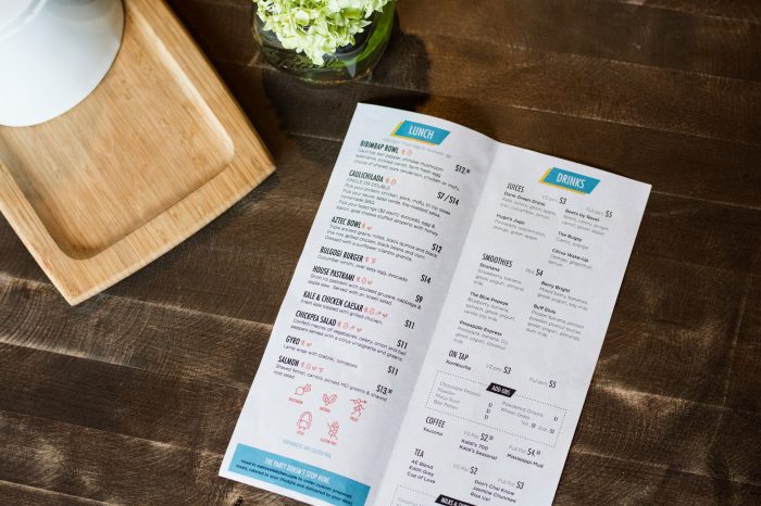
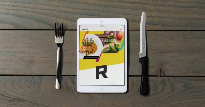
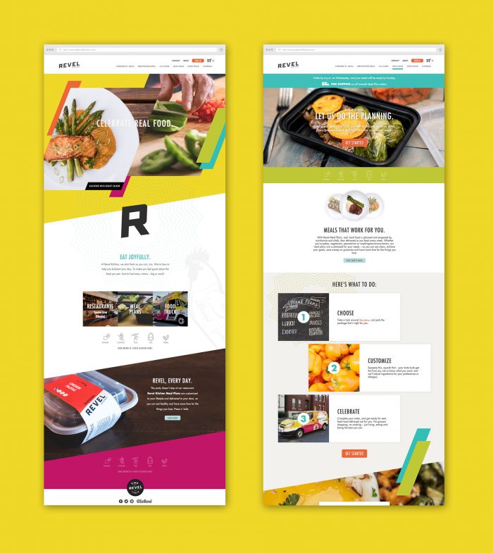
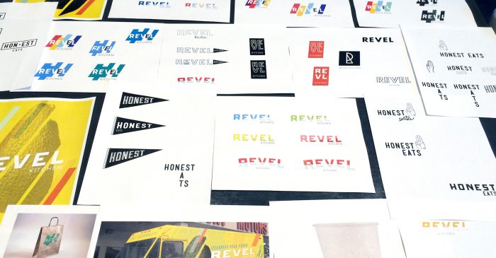
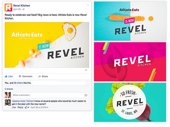
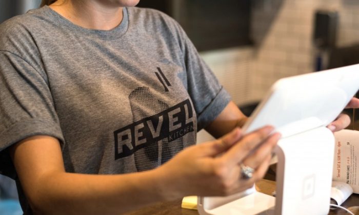
Another gem of a brand identity by Atomic Dust. They’re the brains behind Porano Pasta. I also did an interview with Mike, the founder, that you have to check out. Let’s chat about Revel Kitchen’s brand identity design work. It’s bold. It’s bright. It’s daring and a hell of a lot of fun. The solid planes of colors collide with simple, strong modern typography to create a 90’s inspired feel. This speaks perfectly to the health-focused market that Revel seeks to attract. Getting these colors to work in composition is no easy task. Originally the brand was focused on athletes as their mainstay limiting the potential. The rebrand opens the doors to the lively, active community inviting everyone to the party. Have fun soaking this one up!
Designed by AtomicDust
