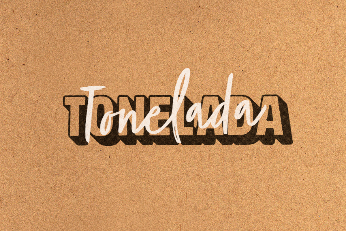
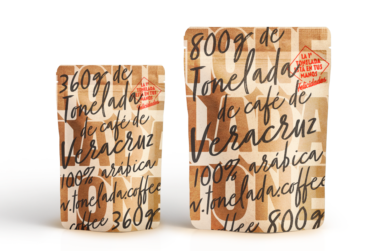
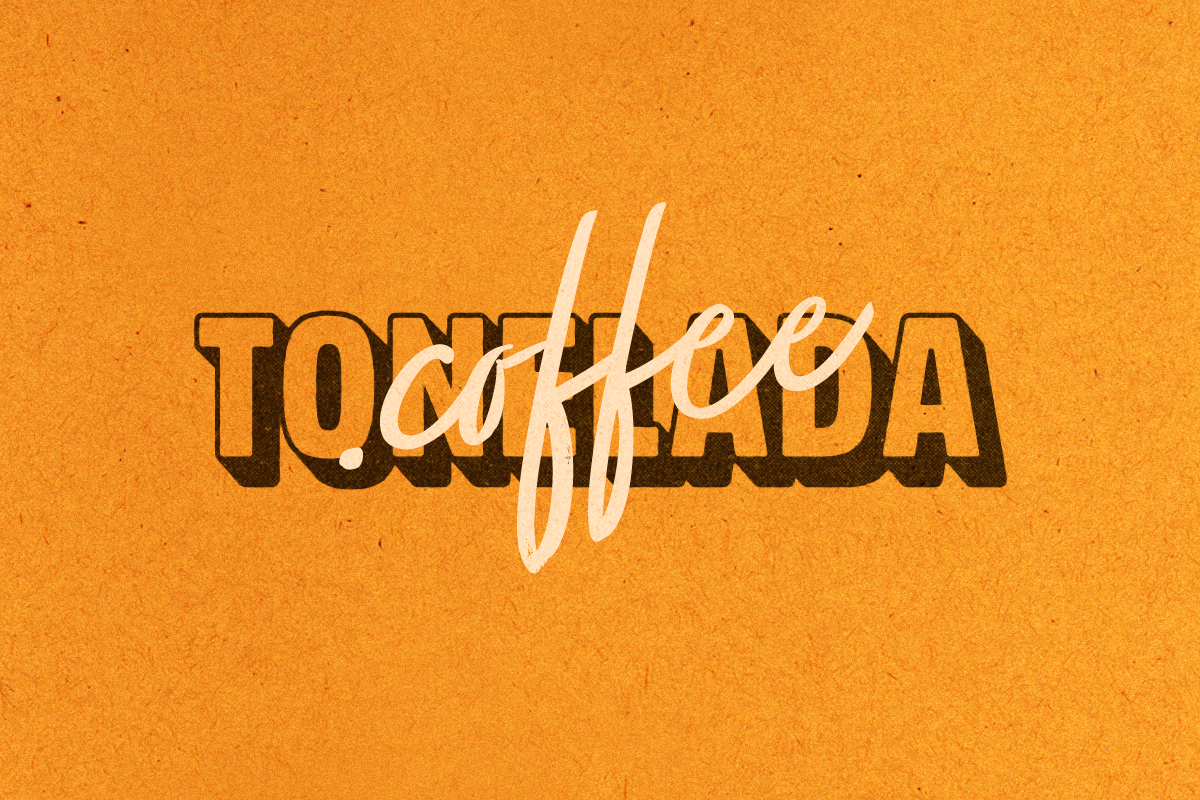
Happy Monday, folks. Today, we’ve got another caffeinated case of branding and packaging for you, featuring Mexican brand Tonelada Coffee. YuJo! Creatividad Aplicada (Applied Creativity for the non-spanish speakers) did the dynamic branding and packaging for this brand.
Pulled from Packaging of the World, they have this information to offer on Tonelada’s brand story, and some of the concept that went into the design:
Grown at 1,192 meters above sea level, handpicked for maximum ripeness, wet processed and roasted by Filiberto Ruiz and his family, Tonelada® is some of the best coffee produced each year in Coatepec, Veracruz, Mexico.
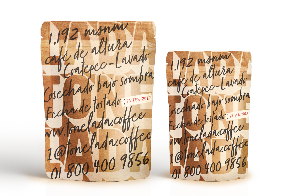
Batches of 1,000 kilos each are independently produced and sold to ensure the bean´s quality remains unparalleled. Aiming for a product that appeals to both, coffee enthusiast and experienced baristas, Tonelada® is far from its mass produced industrial competitors pointing its roast date and hour in the back.
A food grade-standup-kraft paper bag is manually screen printed overlapping the beans qualities in black handwritten type against bold ivory characters that spell the brands name across the package. Finally, a red stamp indicates the badge that each bag belongs to, giving you a sense of when in Tonelada´s history you become part of this journey to discover everything a coffee brand can become when producers, designers and consumers unite.
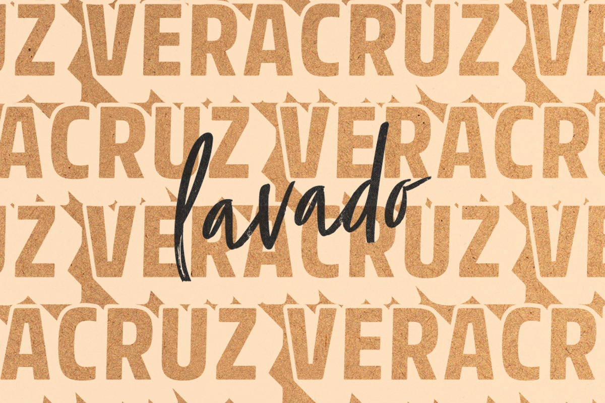
I personally love the textured contrast in this brand, and the layering of the typography on the packaging. It is energetic and unique, and I appreciate the hand-written font stamped over the bag to add a personal touch to each bag, making the consumer feel that a member of the Ruiz family scribbled on the bag themselves. I also appreciate that the kraft texture is carried through onto other brand materials; you can see how prevalent it is by glancing at their Instagram feed.
Branding and packaging design by YuJo! Creatividad Aplicada
