These days we’ve been seeing a lot of restaurant branding go the Instagram direction. With their aim to go viral, restaurants are designing their interiors to be instagrammable. Millenials are starting to open restaurants and they have their fellow Millennials in mind.
I honestly feel like being Instagram-centric is a major trend that is going to show its age in a few years but I have to admit that I am loving it. See California’s Museum of Ice Cream to see more of what I’m talking about. It’s so pretty, but I know it can’t last forever. It’s a perfect example of what would happen if My Little Ponies and Rainbow Bright went on a date for ice cream and made a baby, and that baby has an expiration date like the rest of us. RIP.
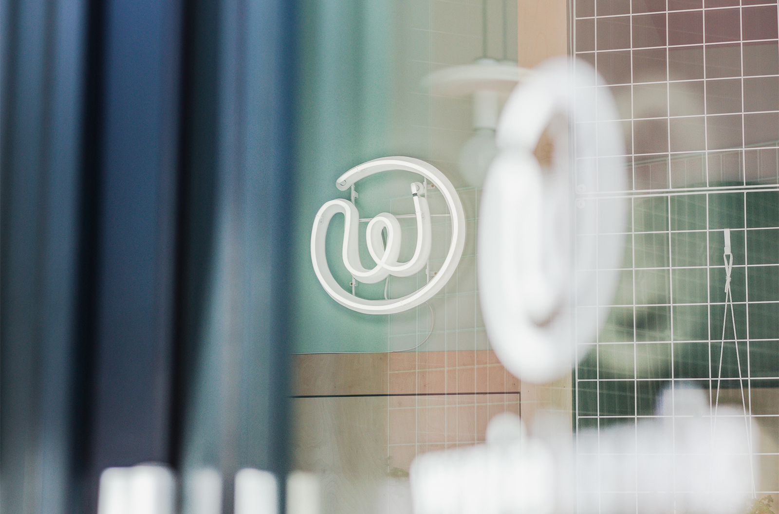
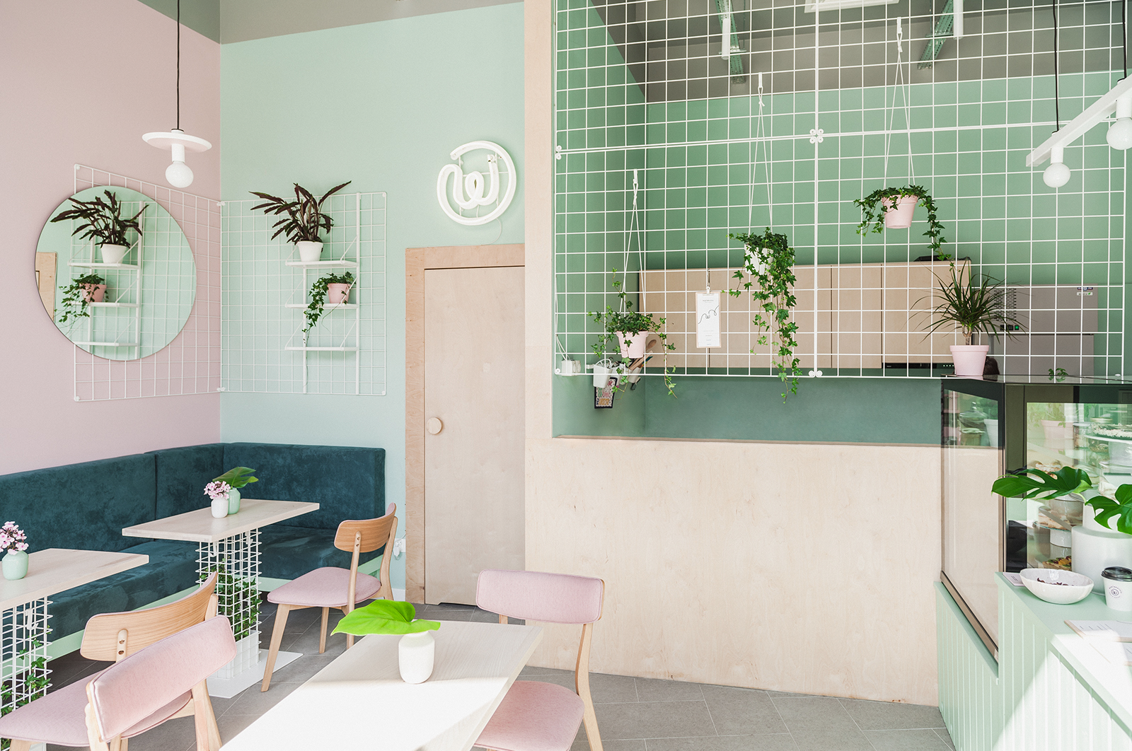
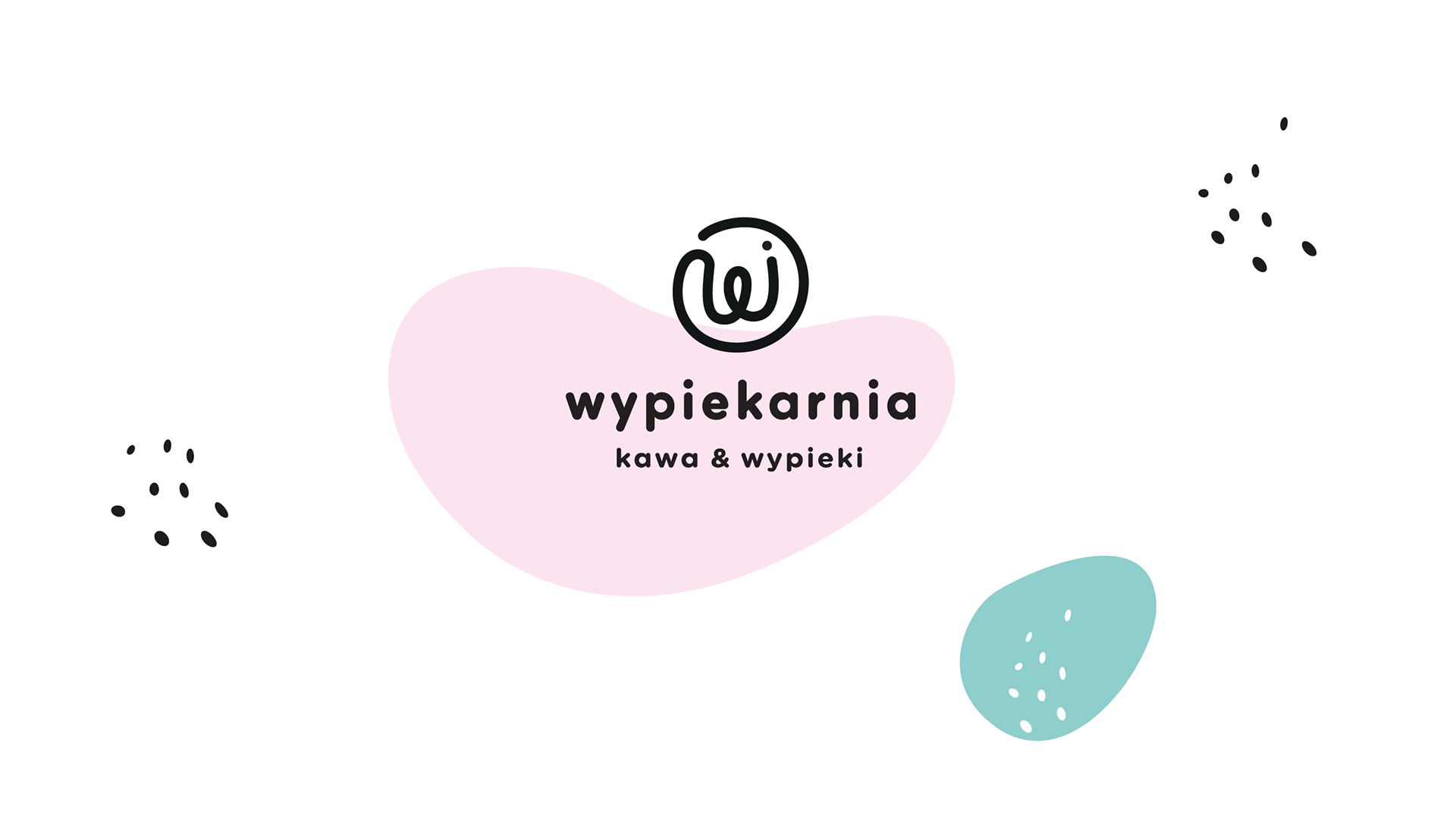
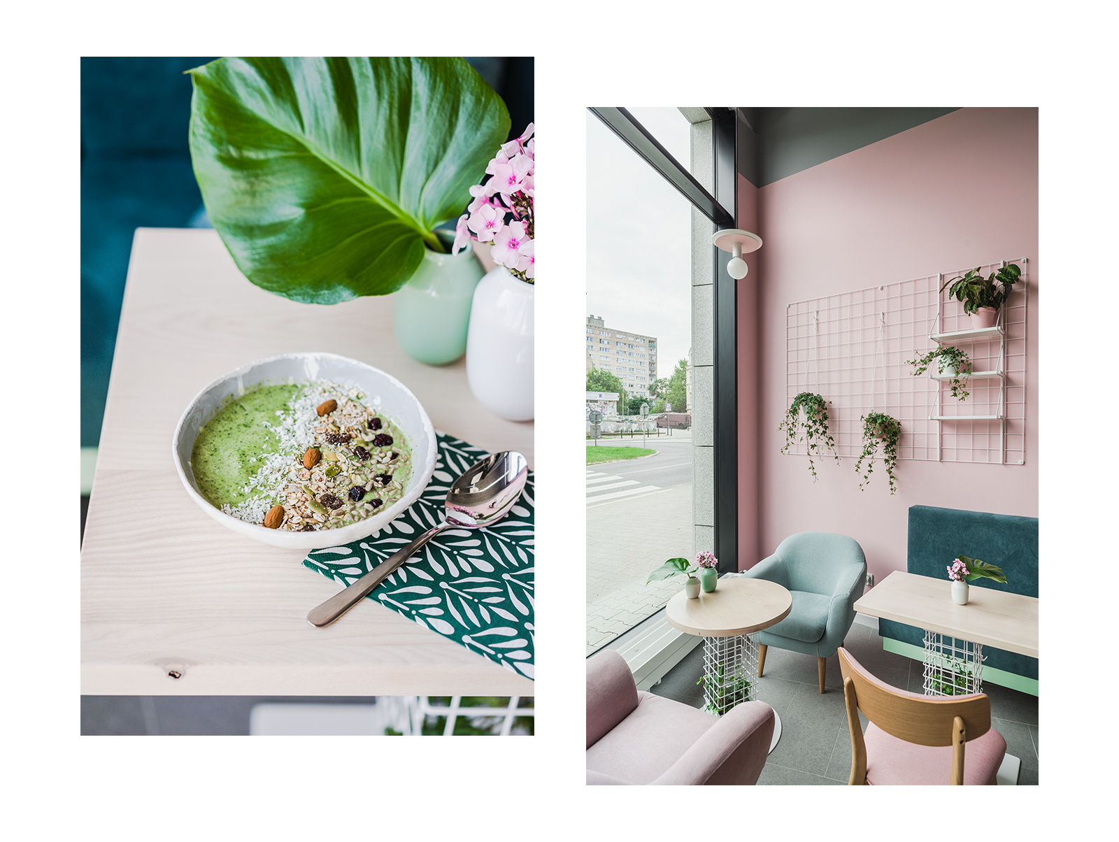
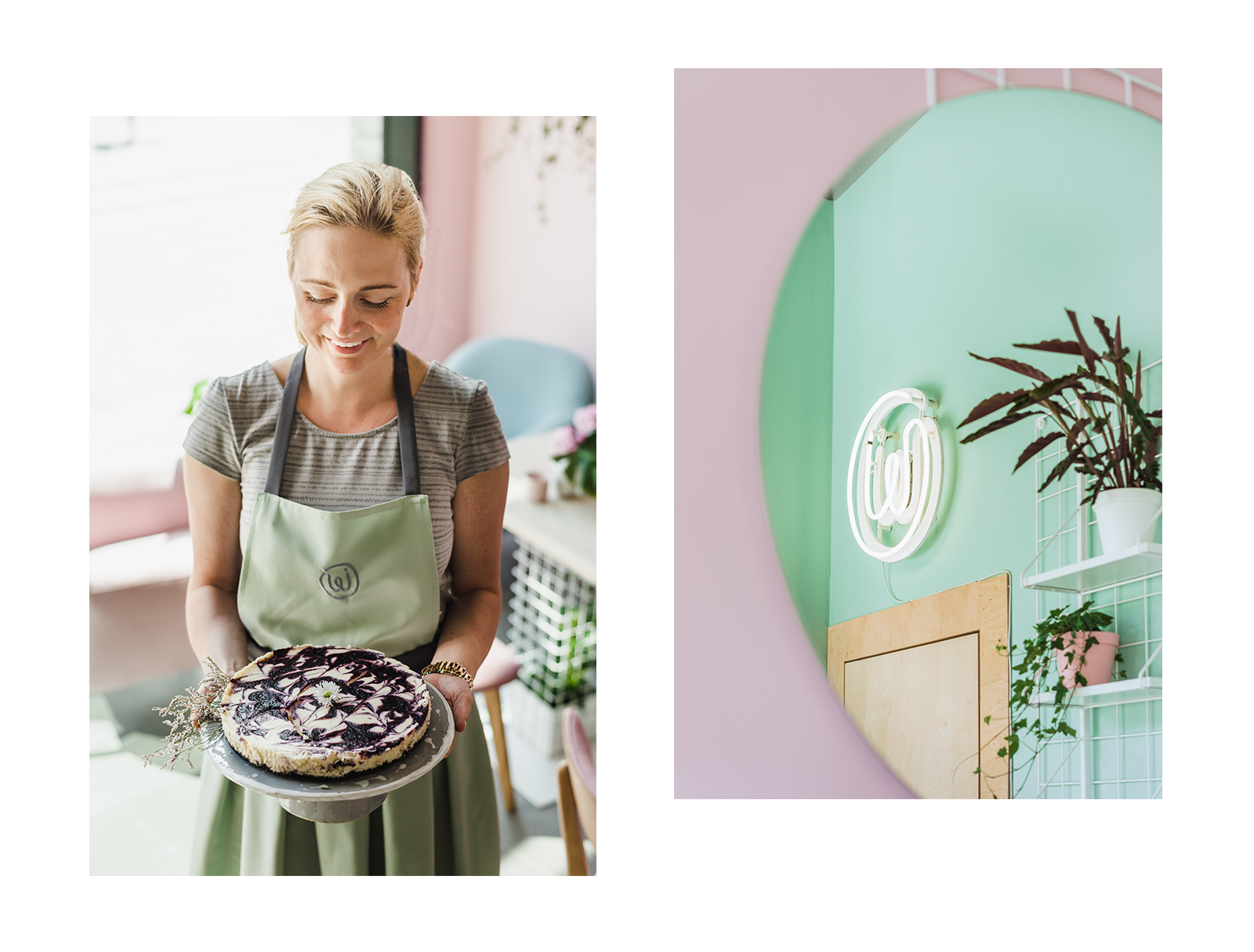
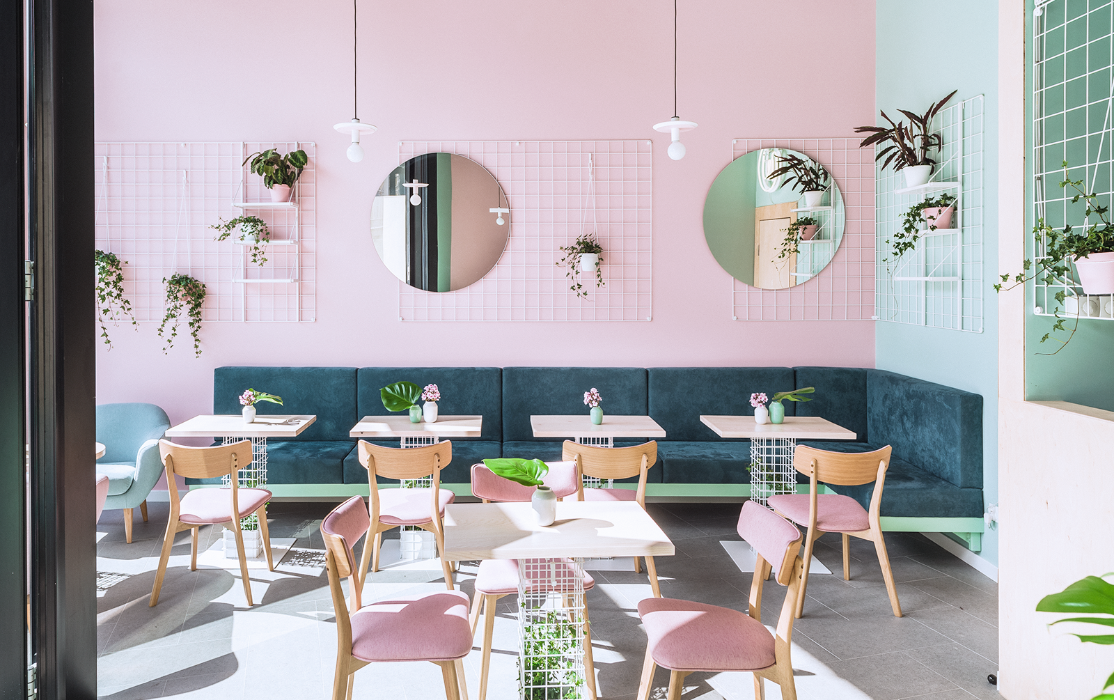
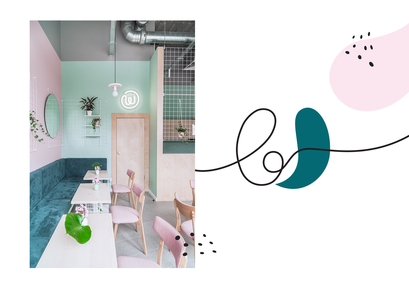
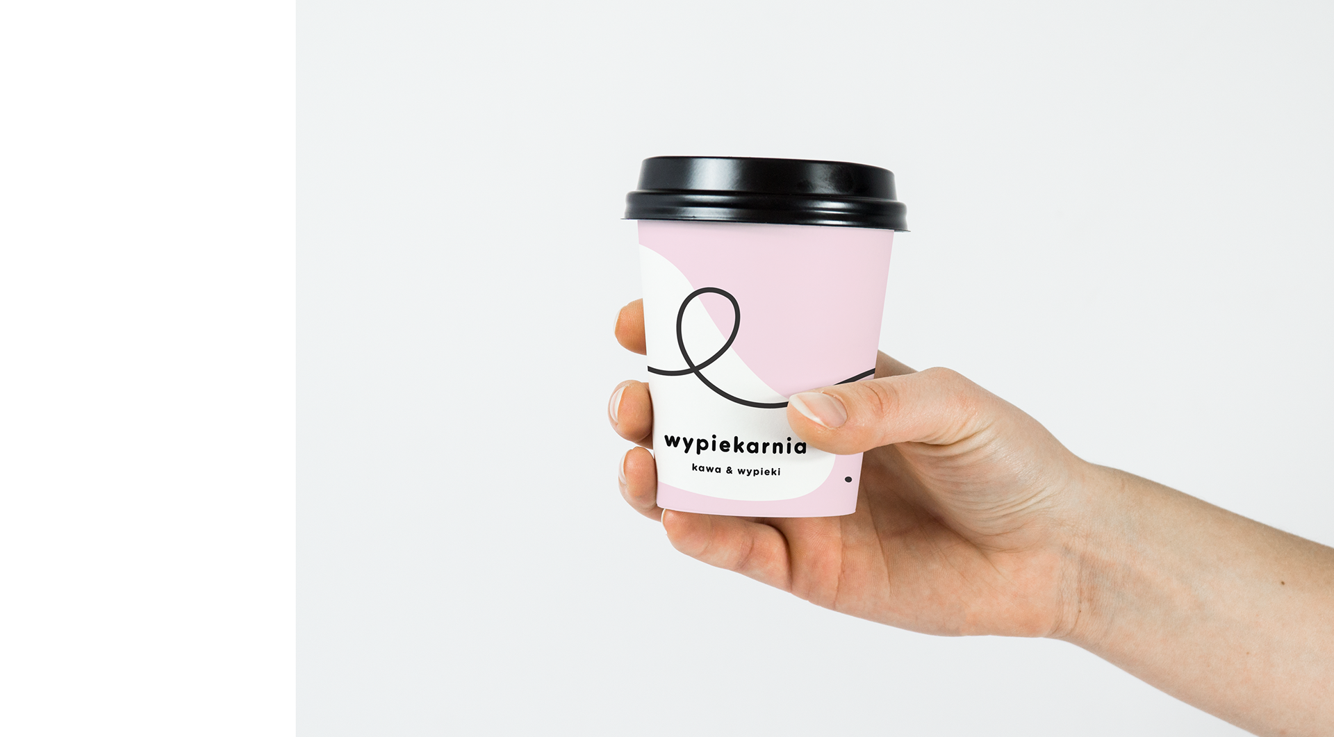
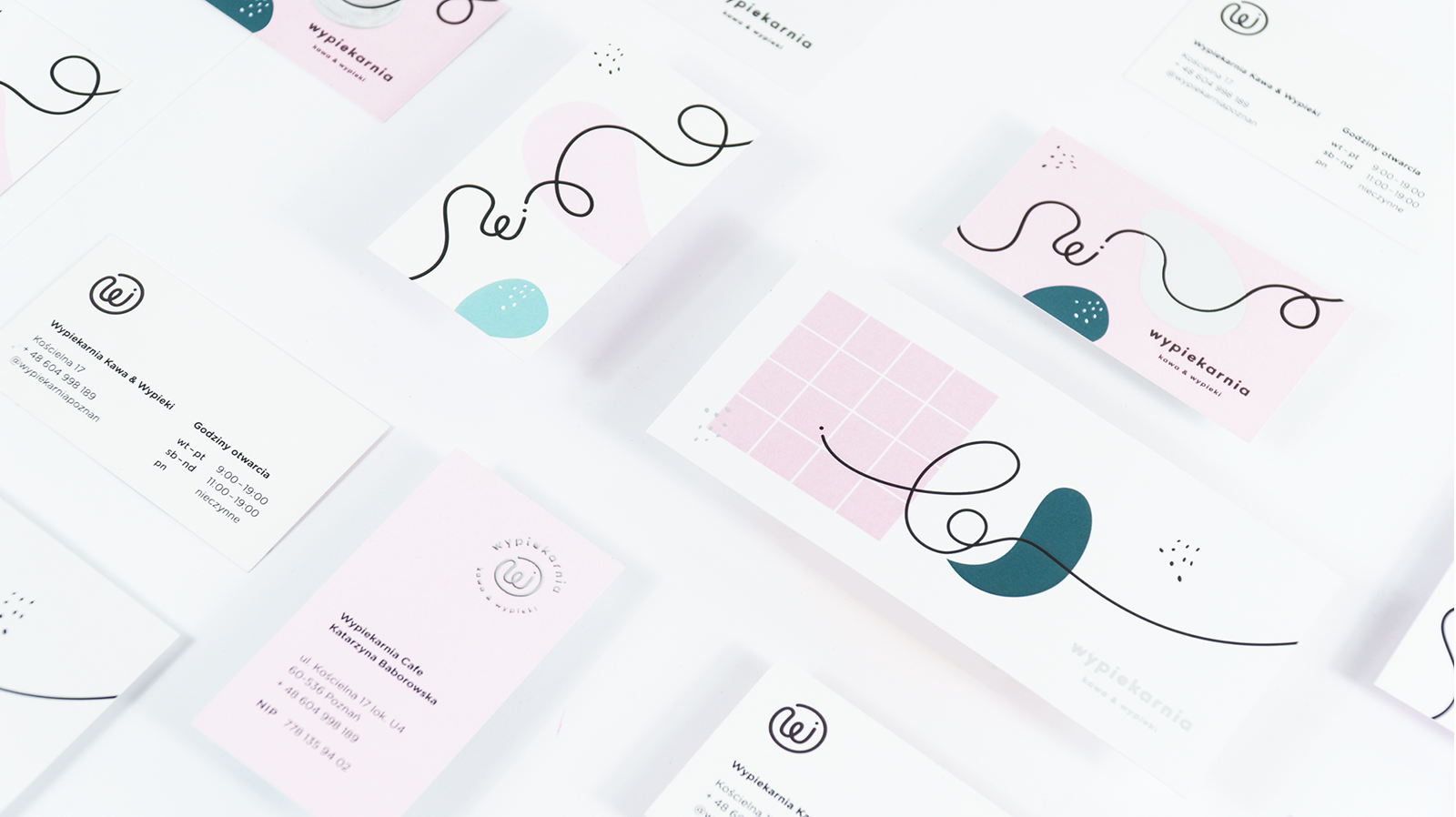
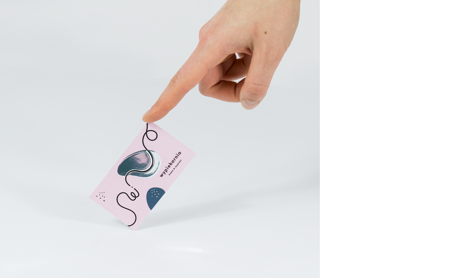
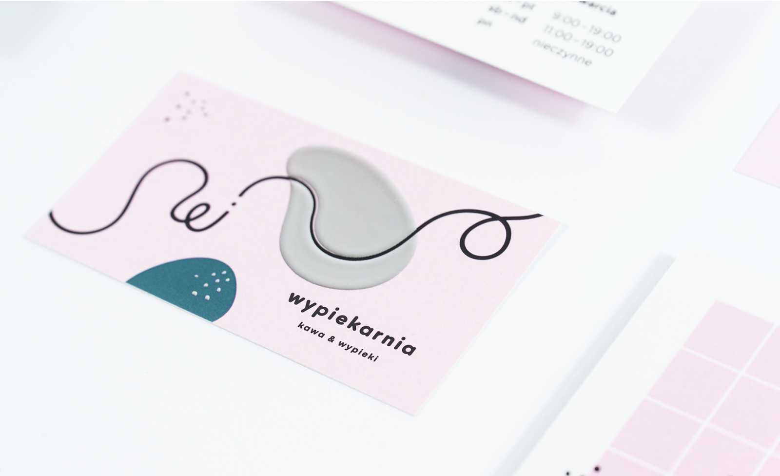
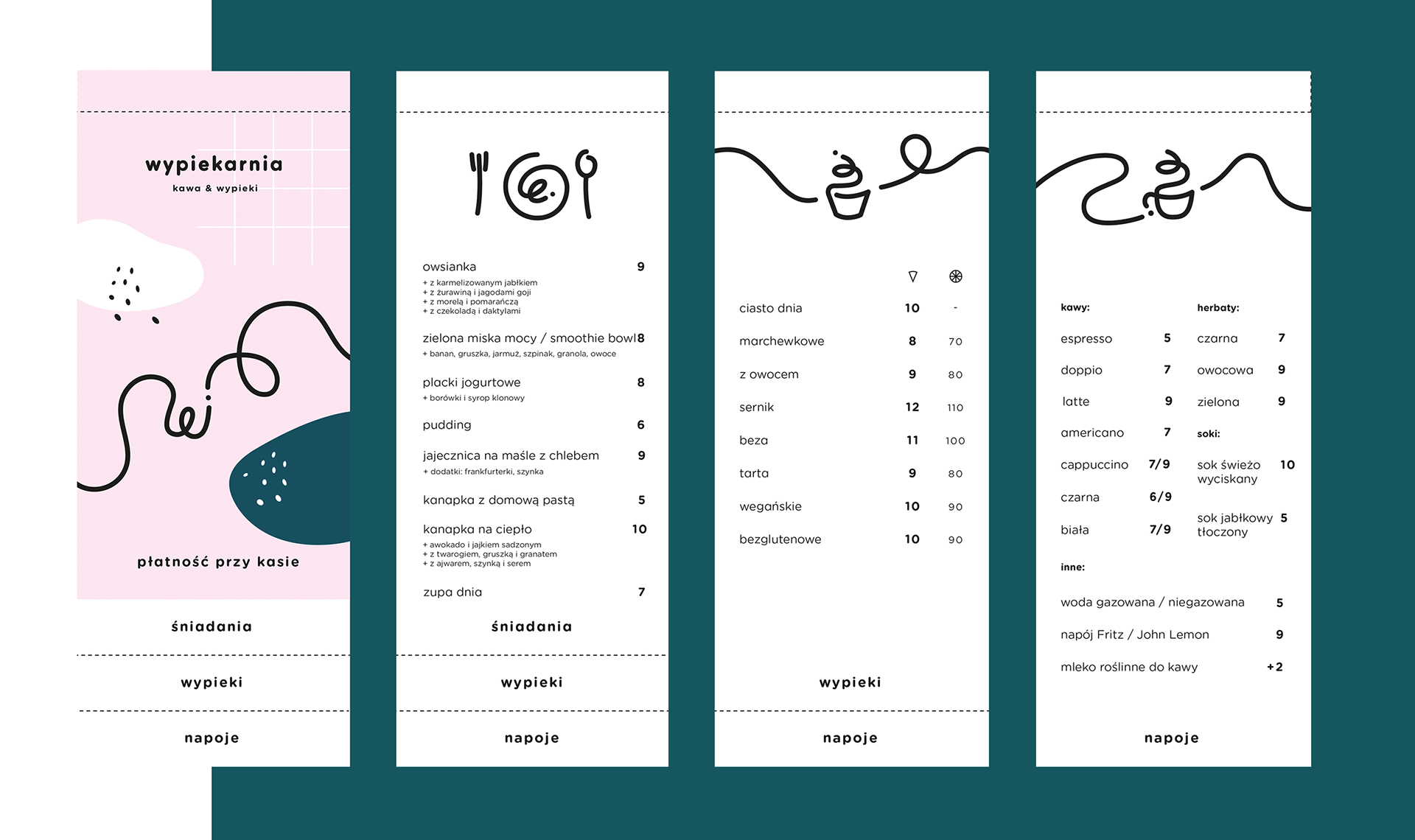
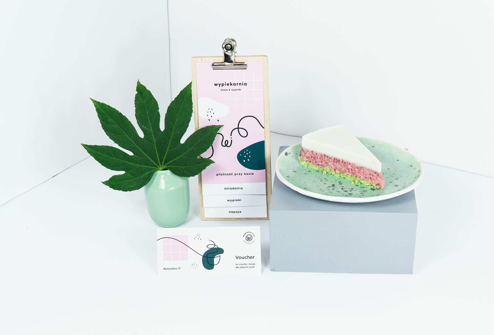
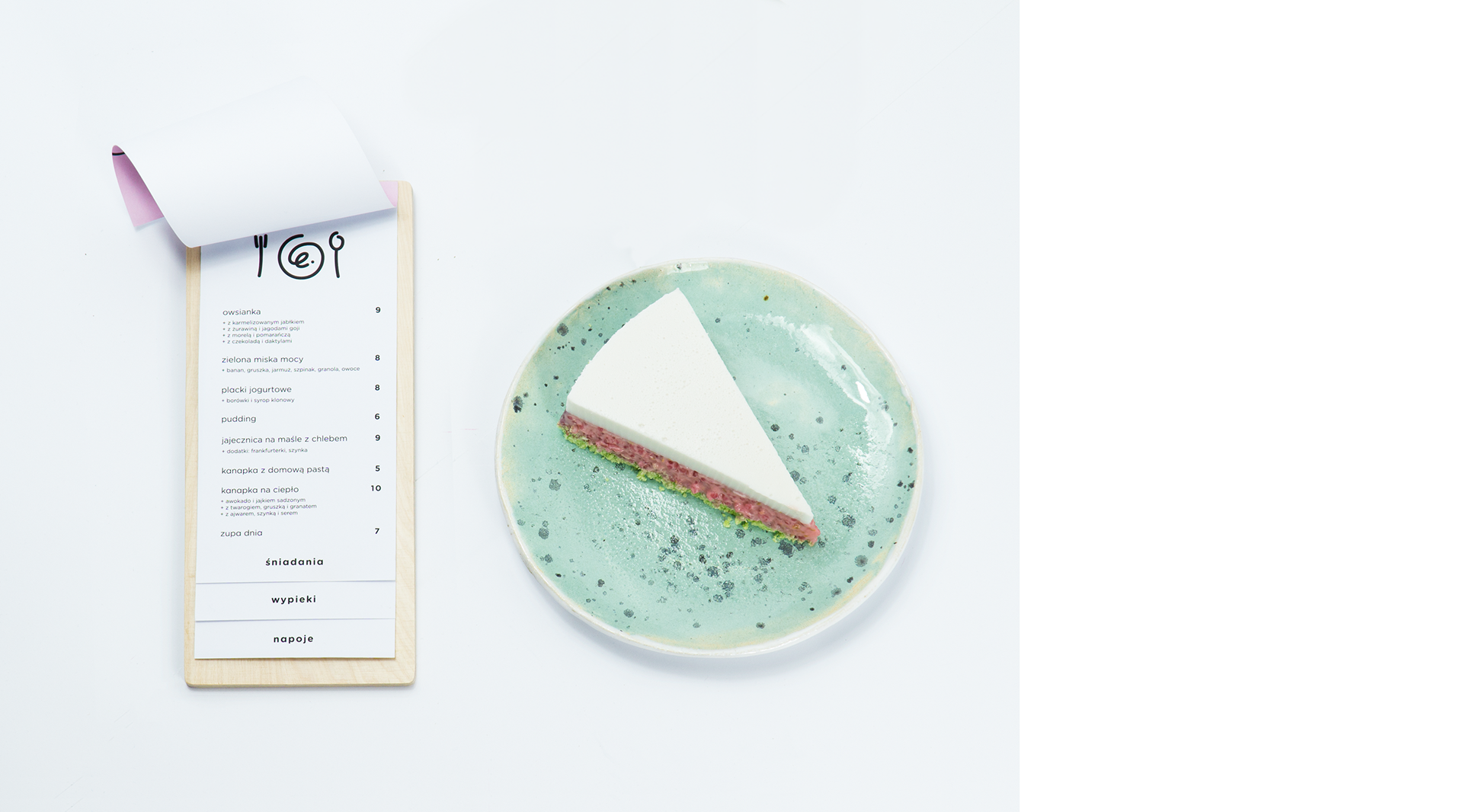
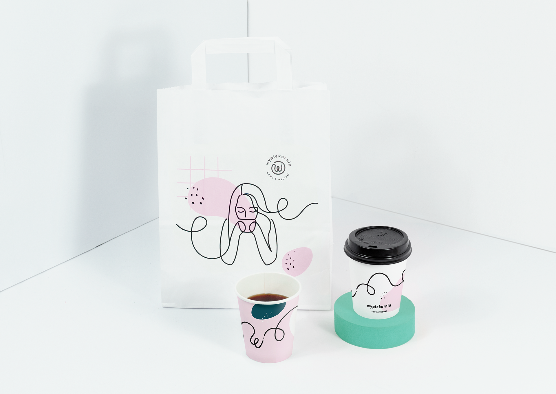
For Wypiekarnia Bakery in Poznan, Poland the pastel walls, natural light flooding through the windows and plants on every table, it’s a backdrop made for snapping multiple photos of a not-eaten-yet smoothie bowl. The logo was made to be easily iced on top of a cake if need be and the rest of the design elements were inspired by homemade baked goods with ingredients strewn across the kitchen counter. And they have a neon sign! (I just really want to design a custom neon sign and hang it in my house, okay?!) I have to be honest again, I pinned a couple of these photos in my home decor Pinterest board… no shame, I know I’m basic.
This project was the brainchild of Natalia Zerko, and Kommunikat Studio in Poznan, Poland.
SaveSave


