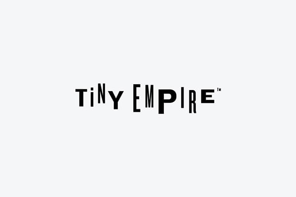
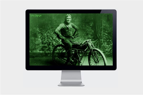
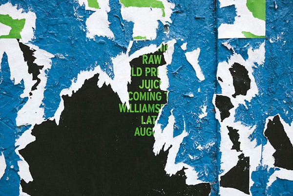
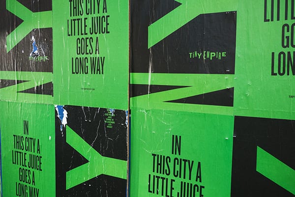
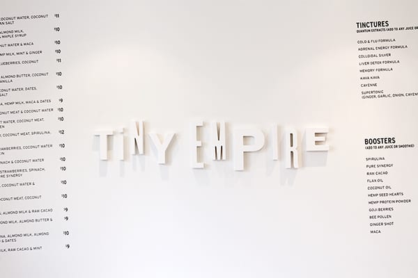
“In this city, a little juice can go a long way.” Tiny Empire’s brand language is built around individuality and diversity. The eclectic logotype illustrates this by utilizing several typefaces, weights, and styles in a way that, together, is compositionally resolved. Unafraid to be a bit weird, the letters in the logotype are cleverly used as abstract road-like graphic elements for their print collateral to further parallel their small, humble existence in NYC. Their brand colors capitalize on the vibrancy of their juices while maintaining a delicate balance between organic tones and high saturation urban signage.
In a way, Tiny Empire’s visuals encourage their customers to be unapologetically themselves through their own unabashedly weird but intelligent visuals.
Tiny Empire by Javas Lehn Studio.
