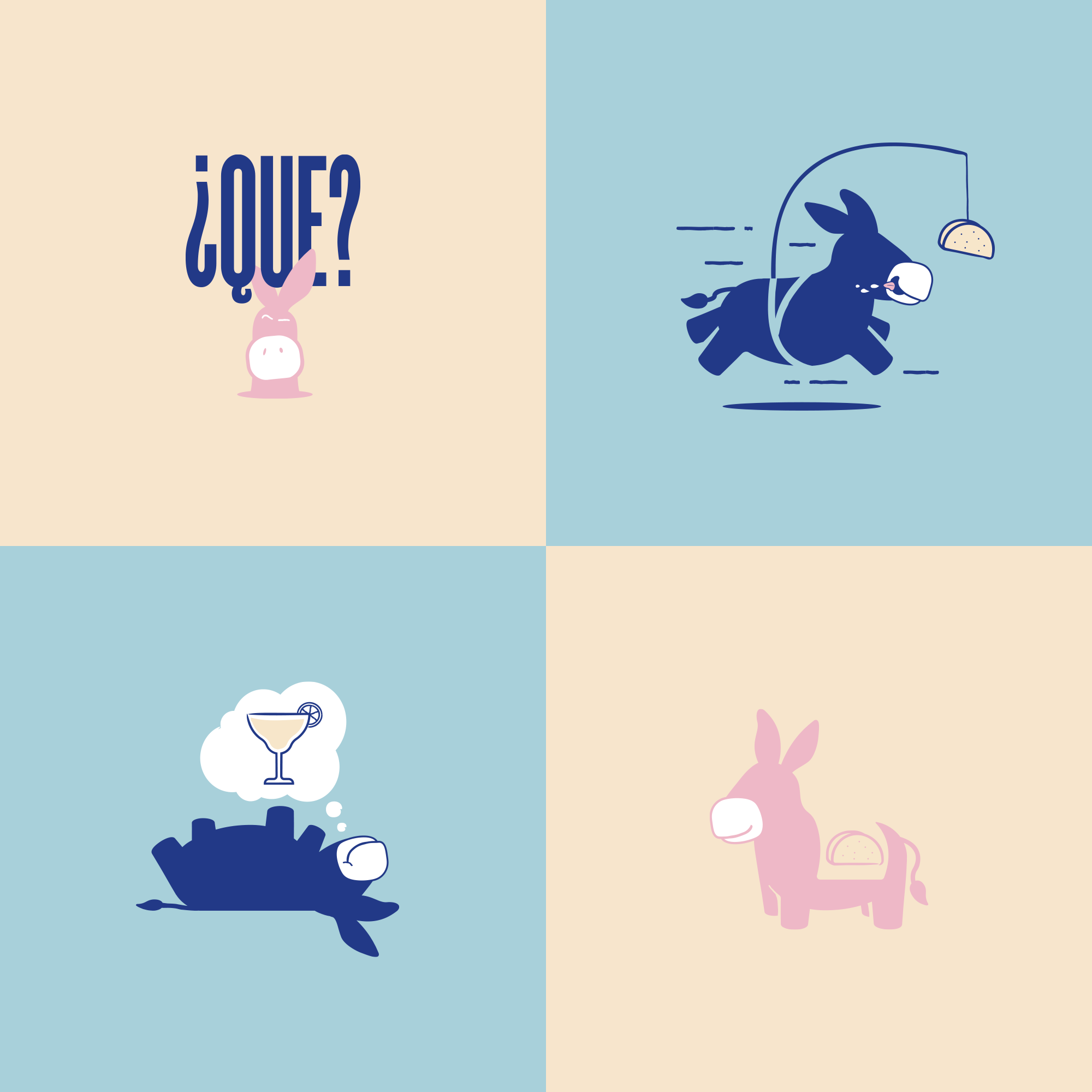
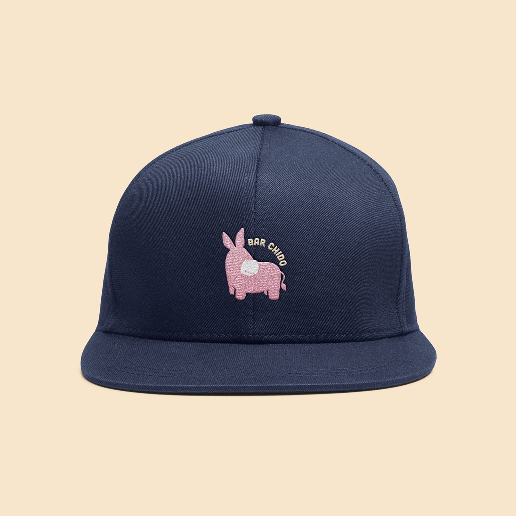
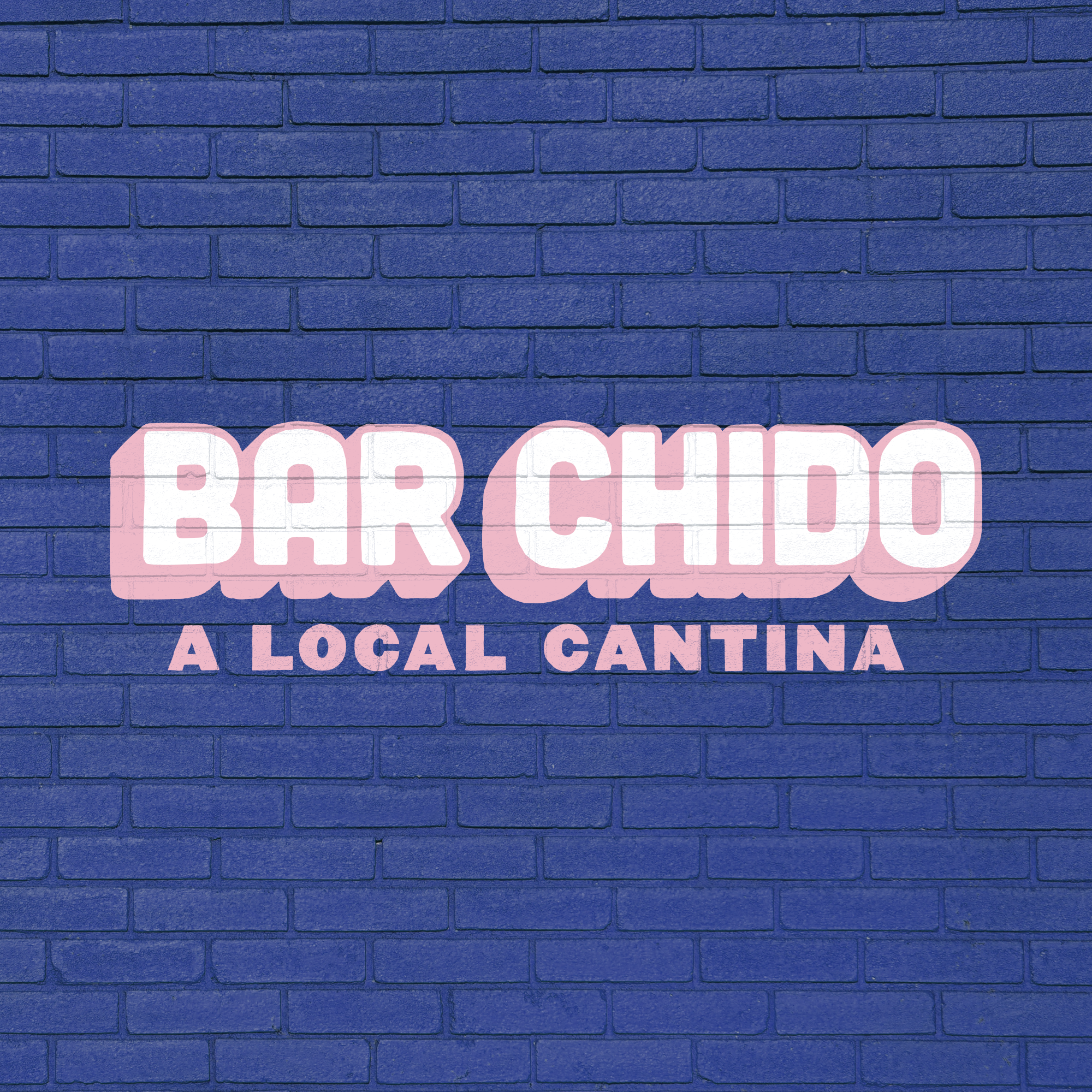
Who doesn’t enjoy a little taco-lovin’ donkey? The folks at Bar Chido certainly flex their adoration in the brand’s new visual identity designed by EightySeven.
Bar Chido is a Mexican restaurant located in Chicago, Illinois that serves up some delicious tacos and other Mexican food and beverage staples. The leadership of Bar Chido embarked on a rebrand after seeing the writing on the wall with the COVID-19 pandemic. Their goal was to reimagine their concepts, starting with Bar Chido, to address the needs and behavioral shifts that the pandemic was sure to cause. EigthySeven answered with a beautiful visual identity that succeeds in a few ways.
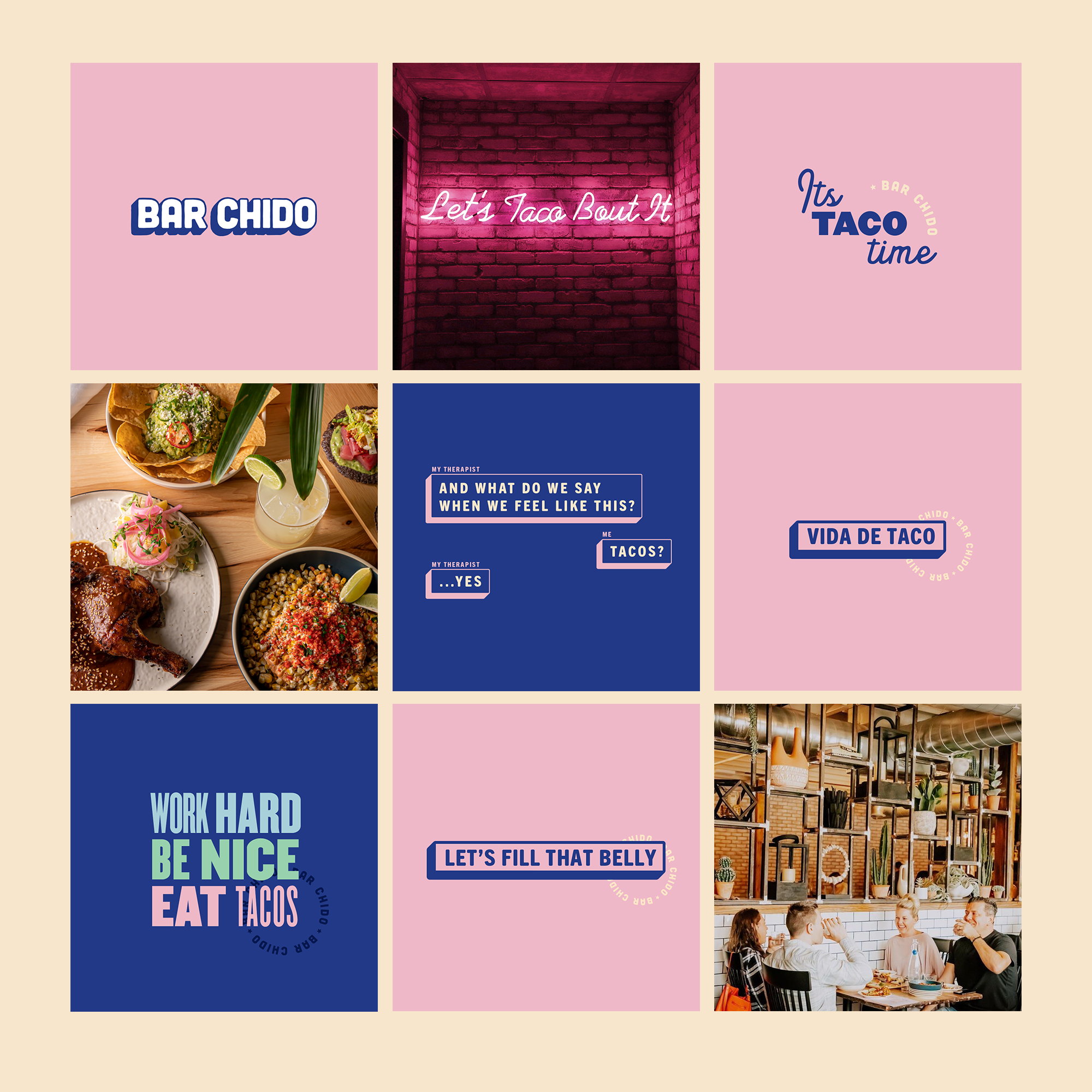
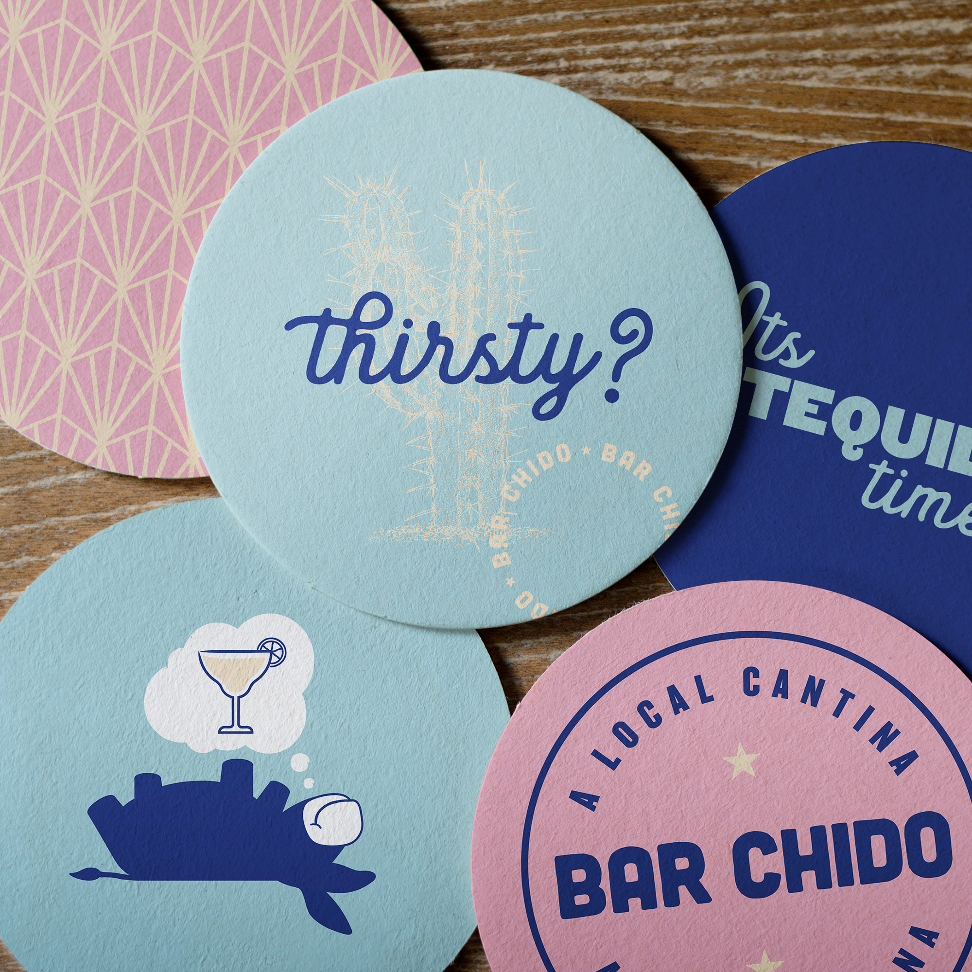
Bar Chido’s visual identity is one of playfulness, whimsy, and a calming pastel color palette. Spearheaded by a funny, playful little donkey lovingly named Señor Chido, the brand has a ton of personality adding some brightness to the day. Considering a year of fear and uncertainty, this brand’s identity is a welcomed relief.
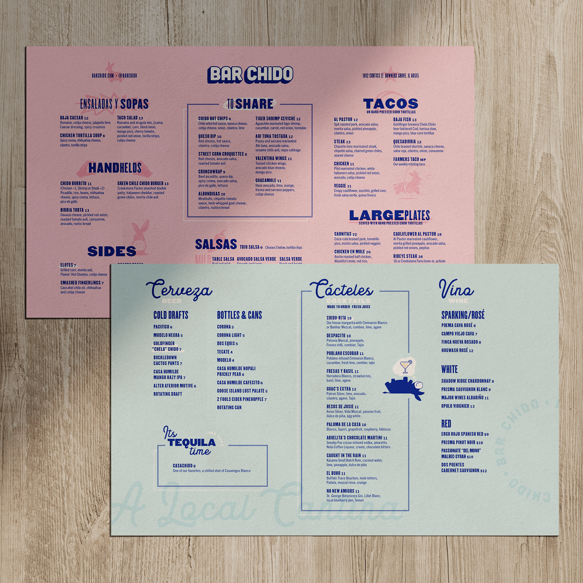
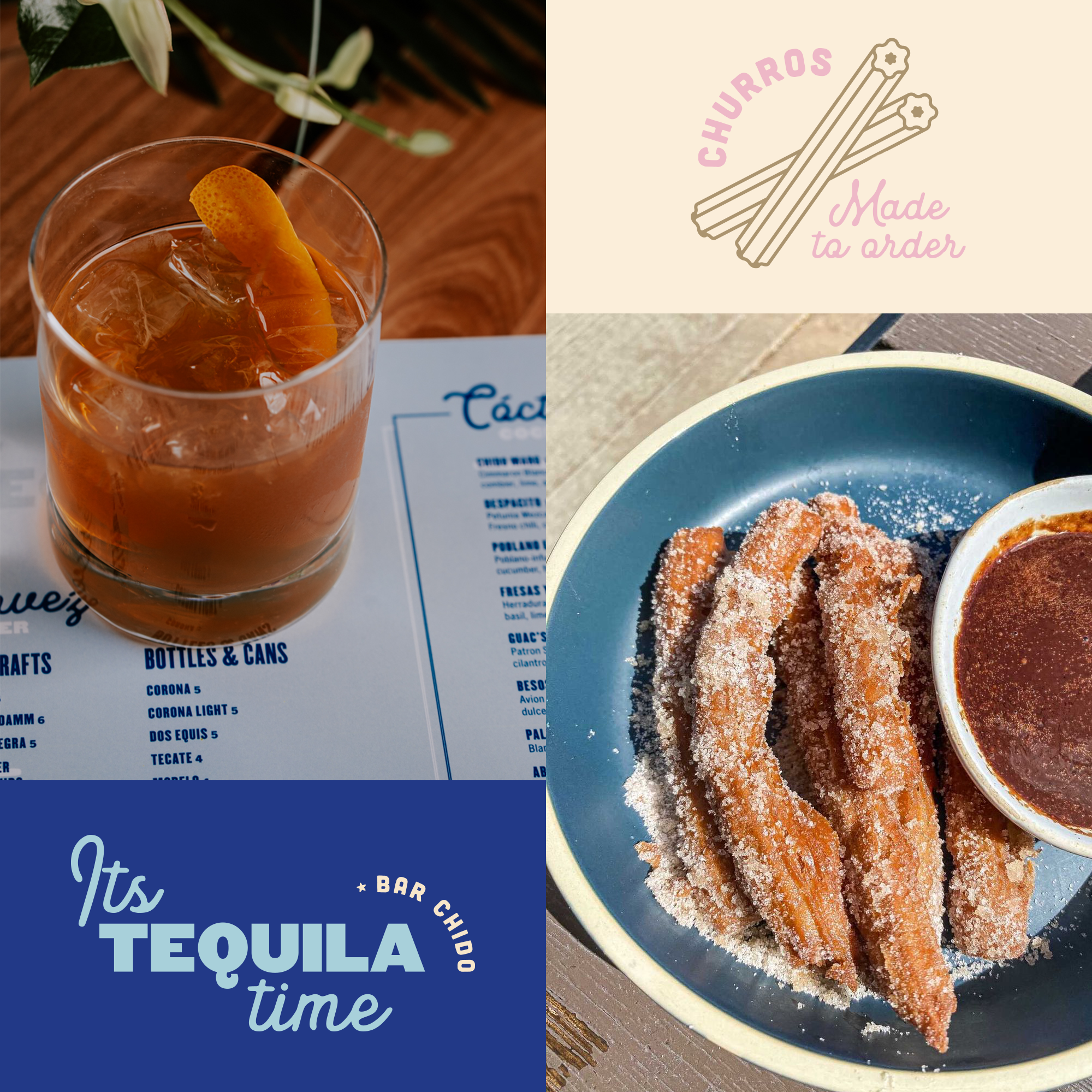
Taco-loving, colloquial phrases spearhead the brand’s tone of voice across multiple touchpoints creating connectivity to their core audience. Typography is set in a softened sans-serif grotesque that leverages imperfections and inconsistencies to create intrigue and deliver the brand’s vibe perfectly.
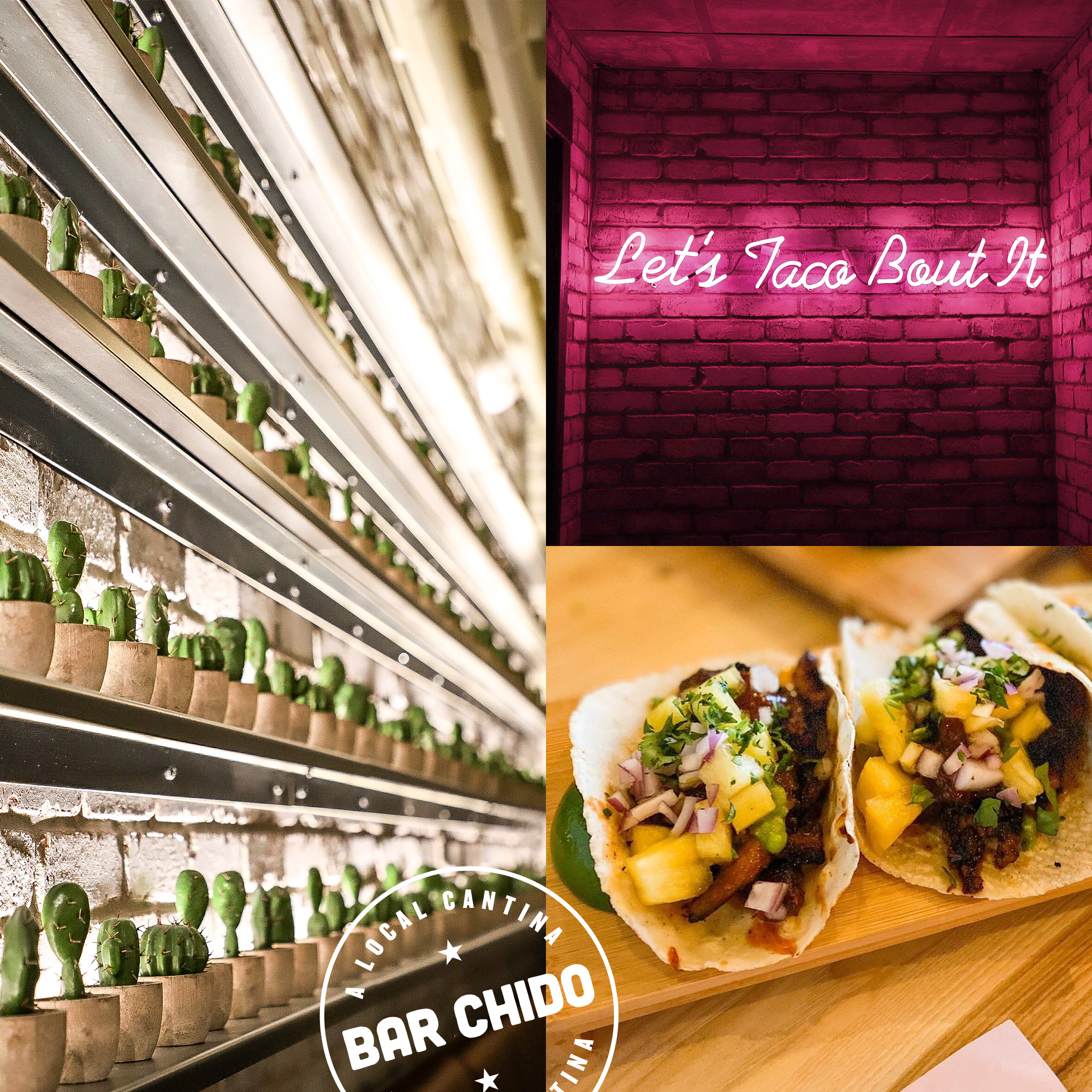
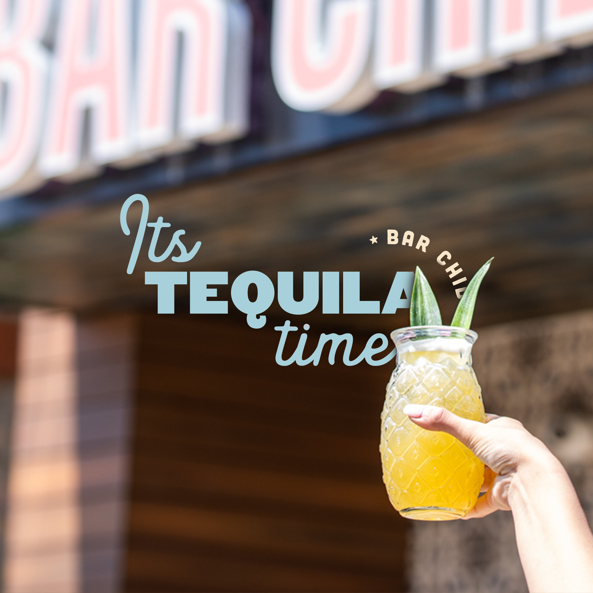
My one nitpick is the lack of interior design imagery where we can see how this brand comes to life in the four wall experience beyond the token LED feature. Outside of this criticism, Bar Chido looks to be effectively differentiated and poised for success moving forward.
Designed by EightySeven
Photography by Kira Anderson Photography

