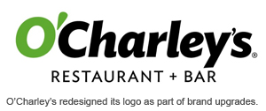
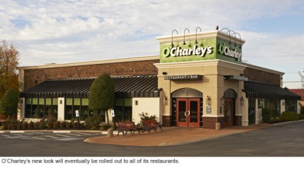
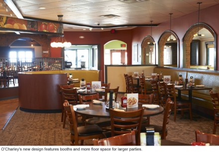
The restaurant O’Charley’s has used the same logo for about 40 years, but recently they introduced a newly-designed logo along with a refurbished menu and updated store interiors. This is all part of O’Charley’s plan to revitalize the brand in an effort to attract new franchisees. The logo itself is much cleaner with a less-traditional script, making it easier to interpret visually. The older logo was too old fashioned and didn’t convey the actual experience the restaurant was aiming for.
The Forktales Podcast™: Interviews with restaurant industry leaders and visionaries
Restaurant and advertising industry headlines and thinking
Reviews of restaurant experiences from around the globe
Reviews of our favorite design, business, & restaurant books
Our favorite typography and fonts
Inspiration in your inbox
Get the latest inspiration in your inbox every Monday morning, for FREE!
"*" indicates required fields


