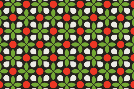
Russian designer Hattomonkey handled this identity for an Italian restaurant and bakery and used a few traditional elements associated with Italian cuisine to make it really work. Red, white and green symbolize some of the key ingredients in some of Italy’s most famous dishes and Hattomonkey took those and added a pop art style to bring what is a very traditional and old-fashioned cuisine and style into the modern era. Hattomonkey also manages to capture the home-style feel of Italian culture in his branding as well with the work on the to-go bags, bringing to mind a table cloth covering a large table for a family meal.


