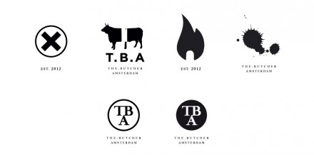
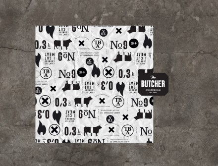
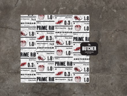
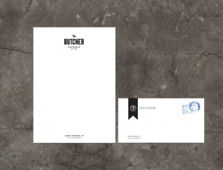
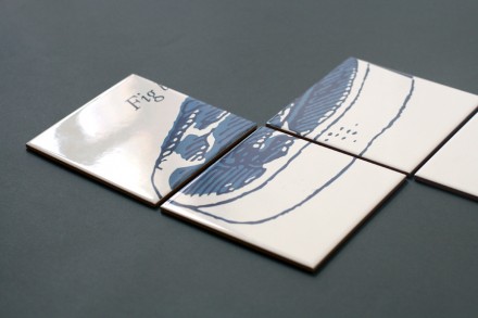
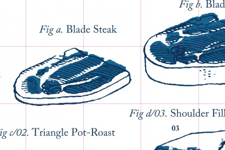
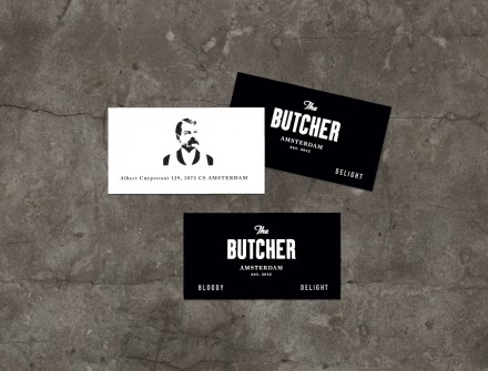
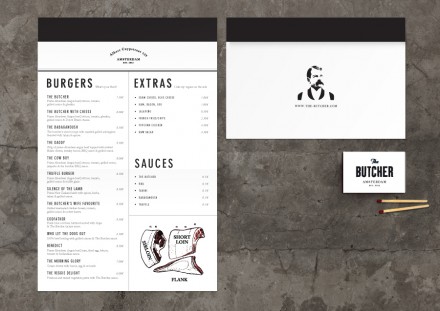
The branding for Amsterdam’s The Butcher, a hamburger joint and bar, is bold and sheds light on the restaurant’s desire to provide high quality meats in their food. Much of the branding uses imagery of cuts of meat and the mustachioed figure in the secondary logo gives a hint of authority to what they’re trying to accomplish. Using bold, black lettering, The Butcher presents potential customers with this proposition: Do you wish to go to another hamburger joint, one filled with flair and pizzazz, perhaps to the point that it overlooks the food, or do you want traditional burgers from a traditional place with traditional (and really good) ingredients? If you chose the latter, The Butcher’s branding likely speaks to you. Koniak Designs put together The Butcher’s branding and they did a solid job, creating a brand that reads as influential in the world of meats. The Butcher’s branding is another example of –similar to Tuesday’s Susie Cakes— a branding mark of an fabricated individual who represents your brand with influence.


