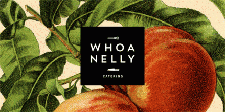
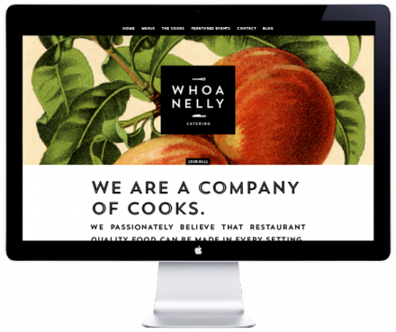
Whoa Nelly begins with a good name. It’s not a great name, but it’s a good, fun, solid name. It seems the name wasn’t enough for the brand in the past so they got together with San Diego based Caava Design and Cody Small to change all of that. The old image didn’t create the high-end vibe that Whoa Nelly caters to, so that needed to change. It’s an easy choice to have a catering branding job include food, but I love how it’s presented. With large images that look dated, Whoa Nelly has the backdrop to the brand. The logo is a simple black square with the name and a knife and whisk for good measure–just to be clear! I think the result resembles a cookbook, the iconic ones from the ’50s that really began to change the way people cooked and ate food. The design is smart because it relies on the colorful and beautiful natural design of food. For caterers whose product is what they can do with that beauty, a branding decision like that is smart. The result of Caava’s work is clean, direct and polished, not unlike what they’re serving to their customers.


